"You know what I do to squealers? I let 'em have it in the belly, so they can roll around for a long time thinkin' it over." (maniacal laugh)

W hile looking for my old hand-copied Feiffer cartoons the other day I came across these instead and they reminded me of a couple of years I spent immersed in film noir and the books of Raymond Chandler and Dashiell Hammett. It's relevant to my new book, which could certainly be described as a gangster story though the setting is earlier than the classic period. And furthermore, I've been lately reacquainting myself with that old stuff and want to write a review of a recent book in a day or two. Meanwhile, these are pencil drawings hand-copied (I was a hand-copying maniac, and rightly so) from 1940s movie stills. I can no longer remember what the movies were, but I expect our friend John C. or another of my regular commenters will recognise them instantly. I do know that was Raymond Burr in the top piccy, and Richard Widmark next. third, that wouldn't be our old pal Miss Blandish would it? The one at the bottom isn't from any movie, and is just out of my head, but it's useful in being the only one dated. It's July '75, which makes me 19 at the time, and the figure drawing isn't too shabby; the girl's arms are nicely observed.


*The header is a line spoken by Richard Widmark as the psychopathic Tommy Udo in the 1947 Kiss of Death
******
You're right, Tom, I do have something to say.
Two reviews of Bryan Talbot's new one, Alice in Sunderland. One (Jog on his Blog, 3/31/2007) begins like this:
"Now here, my friends, is a book for which too much is never quite enough. On one level, that won’t come as too much of a surprise to seasoned readers of writer/artist Bryan Talbot..."
the Percy version begins like this:
(Rachel Cooke Sunday April 1, 2007-The Observer )
"I have been thinking about what I am going to say in this piece for days, and yet still I don't quite know how to put it. The truth is that the book I want to tell you about is rather difficult to describe. Its publisher, Jonathan Cape, is calling it a graphic novel. Well, it is certainly a picture book, but a novel? No. It's a history book, really, though that makes it sound too dull -"
No doubt you'll be hearing more from me when I get my hands on a copy.
Labels: "it's not a graphic novel percy", crime






23 Comments:
I am like, so looking forward to getting my hands on Alice in Sunderland. It looks like, so spankin. Sorry, I've been teaching a lot of teenagers today, and that's what they talk like. It's really a joy, listening to them. Lovely drawings. Sometimes I wish I could draw like I did 10 years ago. I spent so much time trying to get better at it, that I couldn't see how good what I was doing was.
Bryan was interviewed on BBC Radio 4's Today programme on Monday morning. At no time did the interviewer, the venerable John Humphreys, mention the terms comicbook or Graphic Novel. He referred to Alice in Slumberland as a "novel" - I'm sure to the ears of many Radio 4 listeners this lended the book a great deal more respectability.
Hope you're well, Eddie. I'm looking after baby Lauren this morning so it gives me another excuse not to do any drawing.
Amazing stuff. It's always funny to me to see an artist criticising his work from an earlier time...stuff that's so good I could never duplicate that level of talent myownself.
Is that "give it to 'em in the belly" quote by Neville Brand?
Thought you might.. I read that piece on Sunday afternoon and while I think she was generous to Bryan and the book in question, she chickened out of attempting to define her subject. Left me with the impression that if you're not going to engage with the definition, then why bother incuding that paragraph at all. Ah well.
For an academic slant, though, here's Julian Wolfreys on Iain Sinclair. Warning: Includes sweeping generalisations, but some interesting notions on spatial reading and visual storytelling.
http://tinyurl.com/35twxf
I'd hazard a guess that the second pic is Widmark and Gene Tierney from Night and the City, a great film and unusual for being set in London. Lots of fascinating period detail in the street scenes. Oddly enough I was looking at a blog post yesterday from the guy who designed the cover of the recent Criterion edition of that film:
http://www.criterionco.com/blog/2007_03_01_archive.html#2514877504297839578
Third pic looks like it may be the wonderful Ms Tierney again. The Shanghai Gesture, maybe?
I was rather obsessed with film noir in the 80s, watched tons of these things. In the back of my memory there's a sprawling meta-film of rain-washed streets, shadowed bars and anonymous hotel rooms, peopled by Roberts Mitchum and Ryan, Dan Durea and Sterling Hayden, Veronica Lake and Dana Andrews, Ida Lupino and John Garfield... I swiped a few shots here and there when I was doing the Lovecraft stuff, as I recall, although Call of Cthulhu owes more to King Kong.
Oh, and the first one is the great Orson and Rita Hayworth in Lady from Shanghai:
http://www.filmreference.com/images/sjff_01_img0276.jpg
Tom
I took a first look at the essay on sinclair... bloody academia... it's like reading a contract... but I do respect that kind of precision. I'll persevere.
John C.
yes, something you said earlier made me think you'd have an encyclopedic memory for film noir movies.
I've just finished reading the recent Quercus volume, Pulp Fiction: the Crimefighters. I should have an essay on that before long. I can't imagine you not having already checked it out/ read it thoroughly.
Grandad Phil!!!
well you're a step ahead of me in that department. Good to hear from you. I wonder if Bryan thoroughly briefed the interviewer beforehand.
Christopher, James, thanks for the words.
My passion for that kind of pulp seems to have been diverted into other areas although I did read some Dashiell Hammett recently. Oh, and a friend sent me a DVD of Nightmare Alley which I'd never seen before. A great noir-esque tale of duplicity among carny workers.
Not that you needed additional confirmation, but as "the guy who designed the cover of the recent Criterion edition" (and I appreciate the shout-out, Mr. "C"), I can confirm that image is, in fact, Richard Widmark and Gene Tierney in a production still taken for Night and the City.
Beutiful drawings!
Thanks, Eric, nice to know my visual memory is still up to par! Excellent work, btw, and good to see the design process deconstructed, not so far removed from some of Eddie's posts here.
Thanks, John--Eddie's blog is one of the most consistantly interesting on these internets, so I consider the comparison high praise.
By the way, I've been posting some things similar to that Night and the City blog over at ericskillman.blogspot.com--I'd be interested to hear your thoughts on those.
Eric,
You should also take a tour of John C's site. you will find much to marvel at there.
That's John Coulthart, the illustrator an designer, by the way.
http://www.johncoulthart.com/feuilleton/
(not sure from your previous "C" whether you were in the know)
and thanks for the good words.
eddie
Had not been in the know; am glad to be now. I'm familiar with some of John's fine work, but wouldn't have known him by name (or, in this case, initial).
Good to see more of your work, Eric, must be nice to have the opportunity to present some of these classic films. The Yi Yi one is great. Companies like Criterion have often done a better job at DVD design than their UK counterparts, in fact their example has recently been imitated by Eureka here. I don't know if the difference is down to lack of resources (or money) or a bit of both.
John--
Yeah, I'm pretty spoiled in terms of what projects I get to work on--it's tough to go wrong when you're starting with such great visual templates.
I don't know if it's a question of money (or if it is, someone's holding out on me), so much as the fact that we're still a relatively small operation and lucky enough to have higher-ups with pretty decent taste and the will to treat the films as art more than product. My bosses, thankfully, have as much scorn for the Hollywood "Triple Big Head" as all right-thinking people.
It's interesting to me that you'd think of that as a US/UK divide, since when I think of, say, book design, I tend to think of UK publishers as more daring than their American counterparts--compare Jamie Keenan's Penguin Classics books to the American Penguin Classics, for example (those comics-covered "graphic classics" not withstanding). But maybe it's just a question of what you're used to--some of that might seem less "commercial" to me just because it's aimed at a slightly different market.
(Sorry to hijack your comments thread, Eddie.)
Penguin aside, I sometimes think that US book covers are better than their UK versions--one book whose interiors I designed certainly was in the paperback copies--but it's difficult to say. I've made a couple of posts about variations in book design that refer to this but I think you may be right that it's probably familiarity as much as anything. We get used to seeing a certain style that's prevalent in our own countries so something from outside seems fresh and different.
Having said that, I can think of two DVD titles--Wages of Fear and Naked Lunch--both of which had superior covers in their Criterion editions. The UK Naked Lunch has now adopted a slightly similar look but without Criterion's finesse. CD design is so much easier: you do one package and that's it for the whole world!
(And I don't think Eddie minds too much, we're still vaguely on topic!)
Hey, Wages of Fear, that was one of mine! (Naked Lunch was designed by the great Neil Kellerhouse.) I liked that one fine, but I always secretly had a fondness for this rejected version: [ www.ericskillman.com/Wages7.jpg ] Mostly just for the "gut-punch" typography.
(By the way, I just looked up the UK Wages DVD... Ouch. I don't like to speak ill of others' work, but what is going on with that type? It looks like it came from a Winger album cover.)
Why is it, do you think, that albums are so inextricably linked to their covers, but not so with books and films? No one would ever think of changing the cover to Sticky Fingers or London Calling, or even lousy album covers, in a new edition, but every new edition of a book or DVD has to have a new cover. Doubly weird, considering that film is a visual medium to begin with, so it would seem all the more important to have a fixed and identifiable design. It's only a very select class of movie posters (i.e. Vertigo or Metropolis or Kubrick's Lolita) that get permanently associated with the films they represent.
And I can't think of any books off the top of my head that are permanently linked to their covers, except maybe some of Salinger's books, and he had to get those all-type designs explicitly written into his contracts! Not even graphic novels—again a visual medium, and one where you'd think the whole unit would be of a piece—manage to hang on to their covers from edition to edition.
Not that I'm complaining—if we didn't have the freedom to redesign these older films, I'd be out of a job!
ERIC,
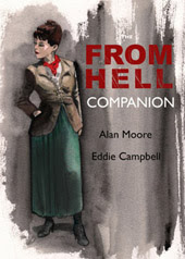
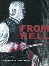
don't know if it's quite the same thing, since it's all my own work, but I just last year wrestled with top Shelf because i wanted to put a new cover on From Hell. Got my way in the end and I think it gave it a fresh presence on the shelves. In the evolving iconongraphy of the thing, we originally didn't want 'jack the ripper' on the cover, because we figured that would be poor taste, but over the years that notion of the surgeon with his bloodied cuffs became a strong identifying image for the story, at least in my own head. The topshelf guys were worried there was too much blood on there for the mainstream bookstores. but everbody agrees now it was to the good.
http://www.topshelfcomix.com/catalog.php?type=12&title=226
Eddie
I've never figured out the albums v. books disparity apart from vague speculation along the lines of books (fiction, anyway...) being slightly separated from their creators by story and character. So the cover is usually an illustration of some story element. Albums, on the other hand are a more direct representation of the band or musical artist (not always, of course) and, in the worst instance, album and CD sleeves are simply a big picture of the artist with a line of type.
I can think of very few novels that have maintained their cover designs past the first printing. David Pelham's iconic design for A Clockwork Orange in its Penguin edition was used for a long time but not any more. Bold graphic approaches like that seem to remain if they work, but then they all get replaced for foreign editions anyway.
I was surprised by the poster design for the From Hell film, that streak of blood from the sky like an arc of lightning or a tongue of flame. A lot more subtle than the usual Hollywood fare. And a smart use of sans serif type as well.
It's probably a slightly different animal when the author's behind it--more akin to a revised text--but I like the idea of reflecting the "evolving iconography." I think it's interesting, for example, to watch the various new editions of Goodbye Chunky Rice working their way towards some sort of platonic ideal of what that book should be.
(Though I have to say, I always did admire the top hat and grapes cover (though the new one is nice, too.))
John--
That's an interesting idea--maybe there's something to the notion that a narrative invites more direct interpretation, being one coherent unit rather than a collection of loosely related songs? ("concept albums" notwithstanding.) So maybe where book covers are easily parsed as interpretations of the contents (and thus, separate from the contents), album covers, since their relationship to the music is more abstract, are understood as part of the whole?
(And now that I think about it, there's probably also the perfectly pedestrian explaination that books generally have at least two editions (hardcover and paperback), from the get-go, often from two different publishers, so no one image has a chance to get locked in.)
Have you seen this site, by the way?
http://www.briankroeker.com/coversongs/
It's this guy who, as a design exercise, makes covers for individual songs. It's an interesting project, because he gets to engage directly with the themes of the particular song (i.e. one coherent unit), and they do wind up looking a lot more like book covers than album covers. (Though that might just be because he's a book designer.)
since their relationship to the music is more abstract, are understood as part of the whole?
"The whole" is the key, I reckon. Bands/music artists are projecting a package of themselves as artists and performers, of which the album is often only a part. Writers, on the other hand, work from book to book and--unless they're high profile celeb types--tend to stand apart from their works. The stuff I was doing for Cradle of Filth had to be reworked as t-shirt designs, posters and even stage backdrops (very bizarre seeing a small piece of your artwork scaled up to the size of a house).
There's other issues as well with books, like some distributors actually demanding covers be changed to make them "more commercial". Hard to imagine many bands standing for that these days.
Yes, Brian Kroeker's designs do look very book-like. Some clever stuff there. Took some thinking to figure out the relation of the rope to the Leonard Cohen song until I remembered the line about tying to a chair.
Post a Comment
Subscribe to Post Comments [Atom]
<< Home