About drawing paper. (part 7- final)

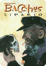
A note about the translucent ivory board I mentioned before. Looking in my archive I see that I started using it almost eactly at the time I found myself without a day job. I recall the old chap in the art shop having a word with us (Dave Harood and me) and suggesting that this other card might suit our purposes just as well as the expensive bristol board we were buying. It suited me fine. In contrast to the bristol it's whiter, almost blue white, and I've photographed two for comparison above, being pages from Alec: The King Canute Crowd, from 1981 and 1986. I adjusted the image in curves for the purpose of showing up the contrast. Later when I lived in Brisbane and found a supply of it, I used to order it in big slabs and have it delivered onto my verandah by the manufacturer, and I say this in case I gave the impression that I just steal whatever the kids bring home from school for their projects. I started a fad of sorts and Evans and Mullins used to come around for armfuls of the stuff at intervals. Having an ultra smooth finish it was right for all the penwork I was doing during this period, so long as I didn't gouge, so that From Hell and After the Snooter and all of Bacchus were drawn on it. Either the translucent smooth or on special occasions the textured as illustrated earlier. On the other hand, it's not suited to conventional comic book brush inking with 'feathering', having no tooth or grip, though Pete could ususally pull it off well enough if we needed that kind of effect. I started buying directly from the manufacturer after there was a dip in quality in the stuff I was buying at the art store, with ink lines tending to bleed slightly, and I fretted for weeks over the problem. In fact, I seem to recall it was Mick Evans who found the solution of buying direct for me. Paper quality is not a matter to be taken lightly. I'd get four A3s out of each big sheet. It was one of Anne's jobs to cut it and rule it up to order using the different templates I had cut for each job type, i.e. 9-panel grid, or 'comic book' format or special other (which is why it was no good to me to have stuff printed with blue-lines, though in retrospect, From Hell went on long enough that it might have been a good idea for that template at least.)
 Another thing about these old pages, and these are the original and only, is that I once read that I had redrawn almost 60% of the art. There are some touches of white on the page on the left, mostly some fine tuning of jaw and hair lines, but none at all on the page on the right, which is more typical of the whole book. The correction white always showed up bluish on the bristol and yellowish on the ivory.
p.s. Shawn in comments for july 6 queried my view on preservation. I'm certainly not cavalier about the issue, and you can see that the pages above are looking healthy after 25 years. Curiously though, there is a problem with the more expensive card, the bristol, because one of my publishers used a gum to put backing sheets on all the pages (many have abandoned attempts on them which may have confused the printer) which has reacted chemically with the card causing the beginnings of brown stains which caused slight problems when Preney photographed the pages in 2000. The cheaper paper, oddly, was not affected at all. On the page on the left above you can just about see the brown coming through from the back at the outer corners of the inked area. If your work is in any way successful so many people are going handle it over time and You have to allow that you can't control everything. I once got a cover original back that had been accidentally torn in half. The publisher was most apologetic and made good, which i thought was grand as they gave me more than I would have charged for the same original in good condition.
**********
Just received one of those circulating emails, The Kid from Eromanga. This was so well constructed (and very funny) I immediately thought to myself, what's the origin of it? Eric Shackle has already tracked its lineage, but I note this was a couple of years back. I may be the last person in the world to read it. Its variations as it travelled and its origin in Hillbilly Zeb from Texas are intriguing.
**********
Well, I have now got to the end of The Amazing Remarkable Monsieur Leotard (I think I'll go with the French form). There are a couple of pages spare so I've gone back and inserted some new business between pages ten and eleven. I now have a month to get through it page by page and fix all kinds of problems, including continuity, logic, feeling lazy some days, etc.




7 Comments:
Hmm... I had a very bad paper experience which I'll share in the hope that it doesn't happen to anyone else. I had drawn approximately 250 pages of a large project on Winsor & Newton "Lana" 220gsm smooth cartridge. It was not cheap, but it had a nice finish, the ink sat cleanly (even slightly raised) on top of the surface, and it had a good, non-shiny but non-toothy feel under the nib. So far so good.
Then I opened a new pad of the same stuff to pencil the LAST 50 PAGES... When I'd finished the pecilling and cutting out (each frame was on a separately cut out bit of the paper), I began to ink, and... horrors: the ink bled into the paper. I tried everything - remixing the ink, drawing on the back of the pages etc, but it was no use. The entire pad was dodgy. I had to re-pencil and cut approximately 200 frames, using (reluctantly) another pad of the same paper - which was fine. W&N have done their dash, I feel. Has anyone else had this experience with their products?
While I'm on here - Eddie, we have not met, but it appears that we are on a couple of panels together this year at some writers' festivals. So I wondered if you would like to catch up and chat. I will be in Brisbane this week on Wednesday for work (very short notice, I'm sorry) so if you happened to be free in the evening and would like to catch up, please drop me an email. I guess you have my email details since I entered them on the blog?
Cheers
Nicki
After reading about Jackaroo Jill, I miss my ex...
Thanks for the link. That one's going in my journal.
Nikki!
great to hear from you.
Clicking on your name doesn't reveal anything, so we'll have to try some other way.
Are you about wednesday lunchtime (between 12 and 3)?
Re: Hillbilly Zeb...
I think Mac Hyman did this sort of thing first...prob'ly sixty years earlier. NO TIME FOR SERGEANTS. A very young Andy Griffith fleshed it out for him on film.
This comment has been removed by a blog administrator.
Above post removed so that we don't get Tom, Dick and Harriet turning up at our rendezvous.
meanwhile, re. Nicki's cautionary tale about the paper. That's why the first thing i do on every page after the template lines have been pencilled on, is scribble a notational i-d in ink along the bottom. It was always supposed to be outside the printed area, but on a great deal of my printed work it's been left showing deliberately, and not just in the stuff I published myself. In the new From hell I aske Brett to remove all those i-d details (there were some problems with some of them that he was trying to repair). he was surpried when i said they were never supposed to be printed in the first place.
Hello Mr Campbell,
I've recently started making my own comics, and found these bits on paper very interesting and useful. So, thanks for putting them up.
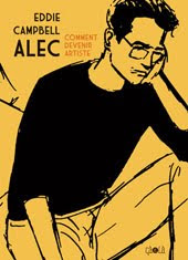
I'm also writing about your work in an essay for university - and I know you must get this all the time - but could I be cheeky and ask you a couple of questions about your early career in comics? I've just ordered a copy of "Alec: How to be an Artist" from a seller in America via Amazon, and that should answer some of my questions, but I'm not sure how quickly I'll receive it.
My email address, in case you can't find it on the blog I just set up, is: rethpec@hotmail.com
I'll understand if you're too busy to get in touch with me.
All the best,
Will Dowling
Post a Comment
Subscribe to Post Comments [Atom]
<< Home