something my fellow artist Seth said in the recent Interview at the daily Crosshatch:
The story of Frederick Deeming sated the British public's appetite for gruesomeness on at least a dozen consecutive covers of this paper (called 'the worst newspaper in England only six years earlier, see notes below). Deeming was even suggested as a candidate for the still unidentified Jack the Ripper for a while, which is why I have this stuff in my files. He had already been arrested for the murder of his wife in Australia when the earlier murders of his previous wife and family in Rainhill near Liverpool in England were uncovered. The Police News reconstructs it. As per the narrative technique that Seth describes, the artist recreates the scene by following the villain around his house as he dispatches the members of his family. (apologies to Seth for mentioning him in the same paragraph as this awful stuff)
April 23 1892

In the cover from a fortnight later the story gets a spot in the tier along the bottom. Of technical interest on this page is the fact that the artist combines landscape images in an arrangement with portraits, creating the effect of photos or drawings spread on the table in front of us. In the upper tier he has some dramatic juxtapositions. My point is that the jarring variations in scale caused by 'cutting' from close to long is not an effect that owes everything to film.
May 7 1892

Advancing a couple of weeks again (there are a dozen relevant covers in this narrative series, from which I'm selecting four), to the depiction of Deeming's execution. To put the effect over, the artist has been given a full page, another effect that we associate with the comic books (as in 'splash page'.) Notice also how the perspective positions the viewer among the immediate witnesses of the event.
May 28 1892

The following week they were pressing the last drop out of the story and we see Deeming's final troubled sleep, with the narrative of his crimes played out in an imaginary smoke in the pictorial space above him, which comes pretty close to being a big damn thought balloon.
June 4 1892

To say that the earliest adventure comics, such as the example below, lack dynamism because they were waiting for somebody to come along and introduce techniques analogous to those of the cinema is problematic.

The techniques were already in circulation. They were, in Seth's words, 'More about vision in general', or simply basic typographical procedures, ways of arranging printed matter on the page for sensational effect, to put the viewer close to the action, or in among it, rather than watching it acted out on a stage. They were the techniques of the lowest kind of illustrated journalism. Scholarly blogger John Adcock recently posted the excavated text of an old article concerning the Police News:
“THE WORST NEWSPAPER IN ENGLAND” an Interview with the Proprietor of the “POLICE NEWS.” Pall Mall Gazette 23 Nov 1886.
footnote: there are many lazy and confusing pictorial ideas that comic book artists have certainly inherited from cinema, but that is a separate article.
Do you envision your books cinematically, when you’re working on them? Do you think like that?I thought it could be interesting to run a test on this idea that 'cinematic' is a term that describes an effect that illustrators may have arrived at by other means without the help of film. I've delved back to 1892 and a series of front covers from the weekly Illustrated Police News of London. The paper was a single sheet, I believe, folded, with the typeset stories inside, all luridly wrapped in wood-engraved drawings representing the news items. It looked every bit as horrible as the worst sorts of comic books. It predates both comics and moving film, and also photojournalism.
Not generally. Some of my stuff is cinematic in the way the “camera”—if you want to call it that—follows the characters around. I call that naturalistic storytelling. Of course I don’t really think of it as a camera. I actually envision it as the reader following the character around, as if you’re a disembodied head. In Clyde Fans, you’re following the character walking through the house. I think of that as how you experience the world through your eyes. Above shots, close-ups etc. They are film terms but I think of them as simply techniques to mirror how we experience vision. Film, being the more popular, has created the vocabulary to label these things but they are not purely actions of a camera. It’s more about vision in general.
The story of Frederick Deeming sated the British public's appetite for gruesomeness on at least a dozen consecutive covers of this paper (called 'the worst newspaper in England only six years earlier, see notes below). Deeming was even suggested as a candidate for the still unidentified Jack the Ripper for a while, which is why I have this stuff in my files. He had already been arrested for the murder of his wife in Australia when the earlier murders of his previous wife and family in Rainhill near Liverpool in England were uncovered. The Police News reconstructs it. As per the narrative technique that Seth describes, the artist recreates the scene by following the villain around his house as he dispatches the members of his family. (apologies to Seth for mentioning him in the same paragraph as this awful stuff)
April 23 1892

In the cover from a fortnight later the story gets a spot in the tier along the bottom. Of technical interest on this page is the fact that the artist combines landscape images in an arrangement with portraits, creating the effect of photos or drawings spread on the table in front of us. In the upper tier he has some dramatic juxtapositions. My point is that the jarring variations in scale caused by 'cutting' from close to long is not an effect that owes everything to film.
May 7 1892

Advancing a couple of weeks again (there are a dozen relevant covers in this narrative series, from which I'm selecting four), to the depiction of Deeming's execution. To put the effect over, the artist has been given a full page, another effect that we associate with the comic books (as in 'splash page'.) Notice also how the perspective positions the viewer among the immediate witnesses of the event.
May 28 1892

The following week they were pressing the last drop out of the story and we see Deeming's final troubled sleep, with the narrative of his crimes played out in an imaginary smoke in the pictorial space above him, which comes pretty close to being a big damn thought balloon.
June 4 1892

To say that the earliest adventure comics, such as the example below, lack dynamism because they were waiting for somebody to come along and introduce techniques analogous to those of the cinema is problematic.

The techniques were already in circulation. They were, in Seth's words, 'More about vision in general', or simply basic typographical procedures, ways of arranging printed matter on the page for sensational effect, to put the viewer close to the action, or in among it, rather than watching it acted out on a stage. They were the techniques of the lowest kind of illustrated journalism. Scholarly blogger John Adcock recently posted the excavated text of an old article concerning the Police News:
“THE WORST NEWSPAPER IN ENGLAND” an Interview with the Proprietor of the “POLICE NEWS.” Pall Mall Gazette 23 Nov 1886.
On perceiving that the readers of the Pall Mall Gazette who express their opinions on current topics through the medium of our Prize Puzzle Column had voted the Police News to be the “worst English newspaper,” one of our representatives betook himself to the office of the journal which has required so unique a distinction, in order to learn something as to its character, career, and circulation, and to discover what points its conductors could plead in defence of the publication. He was without delay introduced to the proprietor, Mr. George Purkess, who received the “verdict of the jury” with great good temper, not to say complacency, readily answered when put to the question, and urbanely volunteered much interesting information as to the history and position of his illustrated weekly calendar of crimes, casualties, and curious incidents...
--"If a tragedy were to occur in London to-day, we would send an artist straightway to the scene; should a terrible murder or extraordinary incident be reported from the country, we would at once dispatch a telegram to one of the artists whose names are in the book I have shown to you, or, if we are not acquainted with an artist in the locality, we would advise a newsagent to instruct one on our behalf. Often artists will send up sketches without previous communication of any kind; sometimes they will warn us by telegram to expect a sketch. The artist of course always endeavours to get a view of the scene of the tragedy, outrage, suicide, or accident, and we always give a picture of the house in which the inquest is held; but naturally, in sketches of this kind, from the very character of the incident, the imagination must be given some freedom. Our artists always try to obtain portraits of the actors in the scenes which they depict, but when these cannot be had they are driven to work upon verbal or written descriptions of the persons portrayed. If people would only think of it, they would instantly perceive that the accuracy of our illustrations is one of the secrets of our success. " (a great deal more at the link)
footnote: there are many lazy and confusing pictorial ideas that comic book artists have certainly inherited from cinema, but that is a separate article.
Labels: comics crit 2, crime


7 Comments:
Hi Eddie
Have you seen the Deeming letter we have at the State Library of Vic?
If not, I might be able get you a copy.
PS if you type the keyword "Deeming" into our catalogue you get lots of related newspaper illustrations, included one identifying him as "Jack the Viper".
Cheers
Greg.
thanks, Greg.
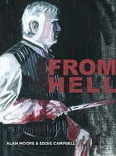
I'd only be depressed to know any more about Deeming than I already do. Oddly, I thought he appeared in The Dance of the Gull Catchers, the illustrated appendix in From Hell, but just now when i went back there to note the page numbers, i find that I must have imagined it.
I can understand that... The research life can have its down moments. Martha Needle is someone I know far too much about (only because other people ask, a lot). Luckily, we also have stuff by folks like EW Cole, who tends makes me smile.
Someone in Vic is keen on dragging out the Deeming/Whitechapel thing again - I feel like handing him a copy of Dance.
PS - have you seen this piece of Watchmen writing?
http://andrewrilstone.blogspot.com/2009/08/to-download-right-click-on-image-and.html
Interesting blog post.
I couldn't help but think about Winsor McCay and some of the most striking images and panel compostition - way beyond cinematic techniques, even now. And back in 1905, before cinema was even fully realised.
Immediately, I'm seeing all those Nemo characters in the hall of mirrors - and walking bed from below - and the way scale is thrown comleptely into redundancy in the mere shift from one panel to the next.
On the other hand I also enjoy the way comics can utilise "flatness" as a point of view. I'm thinking Gilbert Hernandez as a good example and to some degree Seth himself.
I had a small obsession with medieval art in my early 20s, and began to realise the impact of a "staged" image (usually teaming with metaphors!)and how this "flatness" could ooze so much intensity than a more "natural" view point.
So, I'm scanning this post on my 'blog reader, and I think "I should forward this to Eddie, he'd like it".
*sigh* BrainFail.
Great post, Eddie Campbel!
There's a good anthology of essays titled "Film Before Griffith" (out of print but available through Amazon and others) with an essay about "cinematic" storytelling on stage, in Dickens, and in pre-cinema comics. What I got out of the essay (when I read it in the 80s) was that the idea of the moving eye as a storytelling device was well-developed before film.
Post a Comment
Subscribe to Post Comments [Atom]
<< Home