It's just comics- part 15
Three or four years back I was to appear on a TV arts program which intended to explain the idea of 'the graphic novel.' When I arrived I realised that my words had already been planned for me. I was supposed to say that comics used to be about superheroes and now thay can be about anything. I refused to say this and it all went badly after that. The fact is that you find the greater variety in comics the further back you go. As I have explained already, I've always valued comics which communicate something about real experience and I'm finding a measure of what appeals to me in a few of these old ROMANCE comics, though you have to sift through a lot of stuff to find one as good as the one I'm going to write about here. It's simple and unpretentious and remarkably naturalistic for its genre and once again it's from Quality. It falls in the second of the three phases I described last time, between the Love Glut and the establishment of the Comics Code. In terms of its outlook, the period of experiment and exoticism is gone; the romances generally are now very domestic. Here's the splash page:
 Love Confessions #29, Apr 1953, lead story, 9 pages
As to who wrote it, we'll never know. There are many instances in art history of which all we know is what we can glean from the body of written complaint that accompanies every age. Take, for example, this passage from Frederic Wertham's Seduction of the Innocent, published in 1954, the year after the story under current scrutiny:
Artists are easier to place. Our story is pencilled (an educated guess) by Charlie Sultan, who was stylistically in Lou Fine's shadow in the early 1940s. Sultan's career path is typical of the first generation of comic book artists. As young guys just out of school they enthusiastically rendered the muscles and poses of the first superheroes. They worked in 'shops' as part of a team. We can catch glimpses of this artist in the background of George Tuska's rememberings, working in the Eisner-Iger shop, and then Harry Chesler's. By the late 40s/early 50s you find the same artists working at home on short stories: crime, romance, horror, war, western, science fiction, alternating them for variety. I like looking back at many of these artists becoming family guys and developing a more rounded sense of the human situation, as in this story.
These artists would visit the city with regularity to pick up assignments from one or more of a large number of comic book publishers whose offices were all situated fairly close. That's speaking from today's perspective, from which a bunch of thirty publishers all in Manhattan sounds pretty damn amazing. At this time, most of these publishers would assign the whole art job to one artist. But Quality, as I outlined in part 11, used a coterie of favourite inkers by which method they maintained a tightly controlled house style. The inker on this one is known in my files as 'fat line inks.' They look not unlike the fat lines used ten years later by Chic Stone, an artist whose movements in the early fifties are not well documented. But I wouldn't be so bold to make an attribution as I get that sort of thing wrong at least twice a day.
The splash page above is a great view of rural America, unusual in a romance comic as hard work does not usually play a part in the proceedings. The woman appearing in bare feet and ragged hem overstates the case somewhat, but by convention the splash is a nutshell summary of the argument.
 Love Confessions #29, Apr 1953, lead story, 9 pages
As to who wrote it, we'll never know. There are many instances in art history of which all we know is what we can glean from the body of written complaint that accompanies every age. Take, for example, this passage from Frederic Wertham's Seduction of the Innocent, published in 1954, the year after the story under current scrutiny:
Their ambition is to write a "Profile" for the New Yorker, or articles or stories for national magazines, or to write the great American novel. The scripts or scenarios they write for comic books are not anything which they wish to express or anything they wish to convey to their child public. They want to get their ten dollars a page and pay the rent. They do not write comic book stories for artistic or emotional self-expression. On the contrary, they write them in the hope of finding eventually the chance for self-expression somewhere else.I imagine that I catch a glimpse of the kind of writer I spotlighted in my parts 12 and 13 in the above, and It's logical to assume that there would be well known writers of the latter half of the 20th century from tv and books who anonymously wrote comic book stories in their early days. We would undoubtedly be surprised to find out, just as we are surprised the first time we hear that artist Kinstler, whom I discussed in part 9, went on to paint presidential portraits.
The ideas for their stories they get from anywhere, from other comic books, from newspapers, movies, radio, even jokes.
Believe it or not, some comic book writers are good writers. And the paradox or the tragedy is that when you read a comic book story that is a little better it does not mean that a bad writer has improved, but that a man who was a good writer had to debase himself...
But of course, like comic book vendors, they have to be afraid of the ruthless economic power of the comic book industry. In every letter I have received from a writer, stress is laid on requests to keep his identity secret. I have one letter from a man, evidently a very intelligent writer, who mentions this three times in one letter!
Artists are easier to place. Our story is pencilled (an educated guess) by Charlie Sultan, who was stylistically in Lou Fine's shadow in the early 1940s. Sultan's career path is typical of the first generation of comic book artists. As young guys just out of school they enthusiastically rendered the muscles and poses of the first superheroes. They worked in 'shops' as part of a team. We can catch glimpses of this artist in the background of George Tuska's rememberings, working in the Eisner-Iger shop, and then Harry Chesler's. By the late 40s/early 50s you find the same artists working at home on short stories: crime, romance, horror, war, western, science fiction, alternating them for variety. I like looking back at many of these artists becoming family guys and developing a more rounded sense of the human situation, as in this story.
These artists would visit the city with regularity to pick up assignments from one or more of a large number of comic book publishers whose offices were all situated fairly close. That's speaking from today's perspective, from which a bunch of thirty publishers all in Manhattan sounds pretty damn amazing. At this time, most of these publishers would assign the whole art job to one artist. But Quality, as I outlined in part 11, used a coterie of favourite inkers by which method they maintained a tightly controlled house style. The inker on this one is known in my files as 'fat line inks.' They look not unlike the fat lines used ten years later by Chic Stone, an artist whose movements in the early fifties are not well documented. But I wouldn't be so bold to make an attribution as I get that sort of thing wrong at least twice a day.
The splash page above is a great view of rural America, unusual in a romance comic as hard work does not usually play a part in the proceedings. The woman appearing in bare feet and ragged hem overstates the case somewhat, but by convention the splash is a nutshell summary of the argument.
At the beginning: in the flush of young love, Don and Phyllis are married and he supports her with his job at the filling station. They've obtained 'a cute little attic flat' (this is the first time I've noticed the word 'flat' in a US context)
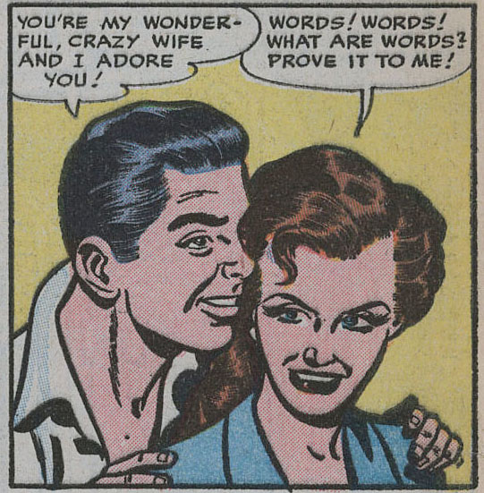
 One of the set-pieces of the genre is an early close up of the protagonist, as strikingly beautiful as the artist can make her, but that doesn't happen here. The guy is remarkably ordinary too. I like that these characters are regular people without any glamorization about them. There are no attractive leads to seduce us into inhabiting this story vicariously.
 The first thing he thinks of is buying a farm with his buddy 'Jim', and going into business.
 It doesn't last long. Jim bails out and Phyllis is about ready to give up too. Don got into rabbits in a big way and they don't have enough money to feed them. For a whacky business idea in our own times, publishing your own comic books would serve the same narrative purpose.

 Don holds his ground and sticks with the farm. Back home, Phyllis starts seeing another guy, Paul. he's dependable if somewhat predictable.
 This is the point at which the story veers into territory that wouldn't be permissible after the Comics Code, 'with its strict rules about the depiction of marriage', as Michelle Nolan noted. In particular, divorce could not be depicted as desirable, and the above image of the married woman kissing another man would be unacceptable. But in 1953, Phyllis gets a divorce so she can marry Paul:
 She's already having misgivings before she's out of the church. The misgivings are spreading like weeds as she lies in her bed at night (a separate bed, as in the movies of the time.)
 Over four panels they have a baby girl who grows into a toddler.
 Then things get thrown out of shape. Phyllis hears that Don is visiting the old neighborhood.
 She can't stop herself from contriving an accidental meeting.
 She realises she has made a big mistake.
 She should have stuck with Don and his daft business ideas.
 Something I mentioned before (part 11): Quality's colouring at this time was always so carefully done that they could drop a bright red in where you wouldn't think it belongs, without causing any disturbance, as in the park bench at night-time in the above scene. Relatively absent after the title header, here it underlines a frisson of danger as once again she's in the arms of the one she's not married to, except the positions are reversed now.
 However, Phyllis does appear to have gotten herself into a difficult one here since it now involves not just two guys but also a child. The story problem is usually weighed up in the set-piece in which the woman lies on her bed in her solitude. There is no hint of voyeurism in the one above. She has made the decision to go back to Don when a bunch of flowers arrives and jolts her into a realization:
 This is not your mad Heathcliff and Catherine whirlwind-of-destruction kind of romance. Nor has anyone yet made commonplace the option of a later era, of 'doing your own thing'. Phyllis has to make a pragmatic decision.
 She mails her final letter to Don and having done it, the story ends with a silent panel of her standing, framed in the shape of the cloud, in tears by the mail box.

Michelle Nolan, who knows more about such things than I do, notes that of the 36 stories published in Love Confessions in 1953, this is the only one that doesn't end with the romantically afflicted in each others' arms.
entire story at the digital comics museum
 One of the set-pieces of the genre is an early close up of the protagonist, as strikingly beautiful as the artist can make her, but that doesn't happen here. The guy is remarkably ordinary too. I like that these characters are regular people without any glamorization about them. There are no attractive leads to seduce us into inhabiting this story vicariously.
 They're having a hard time making ends meet, but he'll 'think of something, Phyllis.'
 The first thing he thinks of is buying a farm with his buddy 'Jim', and going into business.
 It doesn't last long. Jim bails out and Phyllis is about ready to give up too. Don got into rabbits in a big way and they don't have enough money to feed them. For a whacky business idea in our own times, publishing your own comic books would serve the same narrative purpose.
She gets a neighbor to drop her in town in his pick-up. There's a casual detail at this juncture where the neighbour mentions he noticed the delivery of catalogs about raising hamsters. None of Don's crazy schemes are working out.
 Don holds his ground and sticks with the farm. Back home, Phyllis starts seeing another guy, Paul. he's dependable if somewhat predictable.
 This is the point at which the story veers into territory that wouldn't be permissible after the Comics Code, 'with its strict rules about the depiction of marriage', as Michelle Nolan noted. In particular, divorce could not be depicted as desirable, and the above image of the married woman kissing another man would be unacceptable. But in 1953, Phyllis gets a divorce so she can marry Paul:
 She's already having misgivings before she's out of the church. The misgivings are spreading like weeds as she lies in her bed at night (a separate bed, as in the movies of the time.)
 Over four panels they have a baby girl who grows into a toddler.
 Then things get thrown out of shape. Phyllis hears that Don is visiting the old neighborhood.
 She can't stop herself from contriving an accidental meeting.
 She realises she has made a big mistake.
  She should have stuck with Don and his daft business ideas.
 Something I mentioned before (part 11): Quality's colouring at this time was always so carefully done that they could drop a bright red in where you wouldn't think it belongs, without causing any disturbance, as in the park bench at night-time in the above scene. Relatively absent after the title header, here it underlines a frisson of danger as once again she's in the arms of the one she's not married to, except the positions are reversed now.
The romance story typically involves a dilemma. You will have noticed it in the story of the magistrate in my part 12 where she was lured away by the cheeky charlie but came to know that the District Attorney was the guy she should have been sticking with. John Benson has pointed out that it is often the fallacious 'false dilemma' or a choice between a and b, when in fact there is the option of neither.
 However, Phyllis does appear to have gotten herself into a difficult one here since it now involves not just two guys but also a child. The story problem is usually weighed up in the set-piece in which the woman lies on her bed in her solitude. There is no hint of voyeurism in the one above. She has made the decision to go back to Don when a bunch of flowers arrives and jolts her into a realization:
 This is not your mad Heathcliff and Catherine whirlwind-of-destruction kind of romance. Nor has anyone yet made commonplace the option of a later era, of 'doing your own thing'. Phyllis has to make a pragmatic decision.
 She mails her final letter to Don and having done it, the story ends with a silent panel of her standing, framed in the shape of the cloud, in tears by the mail box.
Michelle Nolan, who knows more about such things than I do, notes that of the 36 stories published in Love Confessions in 1953, this is the only one that doesn't end with the romantically afflicted in each others' arms.
entire story at the digital comics museum
Labels: It's just comics 4
posted by Eddie Campbell at
19:27
![]()
![]()


2 Comments:
Merry Christmas Eddy, and a happy new year when it gets here (though I am getting to the stage when every new year feels like it came from the second hand shop)...
Thanks for the Its Just Comics posts, never really paid serious attention to romance comics before and I am finding these posts very enjoyable.
Gorgeous splash panel.
Makes me feel like I'm looking at a bit of Lee Elias' stuff.
Some of the other panels have drapery shadows like his, and the two-or-three-thin-line cheek bones thing is like him as well.
The one with blokey saying "He'd let you go if he knew ..." has both those things in effect.
(I may be opinioneering, but at least I can sort of justify it.)
The woman's mouth, too, and the general tenor of her cuteness.
I like the handwriting-style lettering, but that reminds me of Howard Nostrand.
Both artists I've mentioned worked extensively on Harvey comics, so perhaps I'm operating in a parallel universe.
Post a Comment
Subscribe to Post Comments [Atom]
<< Home