Typographical anomalies.

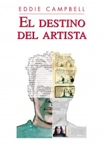
In my Fate of the Artist I sarcastically refer to deliberate irregularities of any sort in the physical text of the book, from a serif in the middle of a paragraph of sans say, to a whole illustration, as 'typographical anomalies'.
Umberto Eco employs as many as 221 images in his The Mysterious Flame of Queen Loana: 'an illustrated novel' (2005). At first it's all reproductions of covers and illustrations from pulp magazines, comic books and sheet music, and at the end, montages and adaptations that he made himself from the same kind of materials.
From the Village Voice article/interview
"Overwhelmed by faces and names, he (the protagonist, Yambo) escapes to his boyhood home in the Italian Piedmont, where he confronts a different inundation—the novellas and comic books from his adolescence. The second section has Yambo delving into this kitsch pool of superheroes, damsels in distress, and cartoonish fascists—relics of Italy's Mussolini generation.

'Obviously, when you write a novel about memory, you have the ghost of Proust blackmailing you,' says Eco. 'But this isn't the case here. Proust goes inside himself to retrieve personal memories, while my character has no personal memories, or madeleines, and is dealing with collective, mineral memorabilia. He's working with external material, not internal material.' Eco has reproduced much of this "mineral memory" in the form of illustrations—period book covers, movie posters, and propaganda material. "The graphics don't illustrate what I've already verbally described," he explains. "They have the function of an 'etcetera,' to give the impression of the abundance of material that I found in my attic."
Eco says he structured Mysterious Flame to mimic the free-associative behavior of electronic navigation."
Eco calls his anomalies 'etcetera'. Another term is loosely coined in the following interview with Jonathan Safran Foer, who has some sixty pages of photos and other novelties (not counting actual manipulations of type and blank pages) interpolated into his Extremely Loud and Incredibly Close (2005), including fifteen pages of flip-book at the end:

"RB:"The graphic tschotskes that are in this book...
...JSF: I am from a generation that was raised with the Internet... It makes a huge difference. And I was raised with a different kind of television and music. Music for example that depends very much on borrowing from different traditions, sampling pieces of other music and overlaying different rhythms and melodies and I think that is reflected in my writing. It was not intentional and it was not an attempt to reflect something about the culture in which I grew up, but it's what I know. And I think that comes across in the typography and in the style in the combination of voices. The world is more of a collage everyday."
I'm sure we're all talking about the same thing.
Labels: new books (1)



12 Comments:
Instead of offering sketches to the first commenter, you should offer your copies of the books you reference in each post. YES GOOD PLAN PATRICK!
For once, I (long-time Campbell reader, first time Campbell commenter--I never feel I have much to say) am up in the middle of the night, and the illustration is not up for grabs. Ah well, fascinating post anyway. :-)
A lot of the charm of Eco's book is indeed in the illustrations and song lyrics that offer an interesting snapshot of a period.
This stuff makes my brain hurt.
I've taken to calling such works groddities-- graphic oddities. Saves time & typespace.
THE EYEBALL KID DOUBLE BILL arrived today.
THE EYEBALL KID DOUBLE BILL arrived today.
JAMES!!
The Double Bill arrived twice!
The Picture of Doreen Grey. OH what fond memories that one brings back. I used to sell dark horse a 'six parter' like that and then make it up as i went along. They always trusted me to know what i was doing. Aint life sweet.
Bill
I looked at your post. I haven't seen either of those books. Will check them out! Thanks!
Jonathan
better luck next time
thanks to all
DOUBLE BILL:
So far, it's my favorite "Bacchus" book--although if he's in there, damned if I saw him.
I will assume the Ditko allusions were all intentional. From the creepy capitalist villain to his wacky philosophy. No "Lee"-Ditko tribute there--all to the credit of Mr. Ditko (at least the way I read it). Loved the Kirby-esque cover art reproductions and the nod to Big Barda(Yes, I admit to being a drooling Silver Age fanboy.)--and you squeezed in what appears to be Sim's physical version of Oscar Wilde.
Seems I recall that someone--was it Steve Bissette?--damn, I'm not sure--telling me way back when that Dark Horse was trying to recruit you to oversee a superhero line of comics there. Is that true? At the time, all I recall thinking was "GODDAMN!"
yes, that was my tribute to Kirby and Ditko.
As for writing superheroes for dark Horse. I was on their team when they did that big line of superhero books way back in '93. Wrote Catalyst, Agents of change, but it didn't work out. don't go looking for them, please. Wound up getting chucked off the team however, and there was a feeling around the place that Campbell wasn't a team player. One reason i was pleased to do the Captain America job ( see today's post) was that i wanted to spread the idea that campbell actually can do the team thing. Just in case i need the work one day. And out of a sense of pride i suppose.
Eddie
I hope you never need such work. I'll buy your new books in an attempt to push such an event a tad farther out of the domain of probability.
well done that man!
you know, not a day goes by when i don't wonder when the illusion that I'm making a living from my art is going to dissipate. So I'm always storing up the savings against such an inevitability. the wife doesn't see it that way. She thinks I'm a stingy bastard.
Eddie
Post a Comment
Subscribe to Post Comments [Atom]
<< Home