Thursday, 23 August 2007

"Rabbi Heskel Shpilman is a deformed mountain, a giant ruined dessert, a cartoon house with the windows shut and the sink left running."

I 've been carrying Chabon's new novel around on my travels in the hope of reading it a second time, but I'm being overtaken by myself going the other way, so I'll say something now. My copy doesn't have the attractive cover design at left. I wonder; why is that? I mean, what theory is at work that decides Australia, or wherever else, needs the one with the careening 1940s car? It strikes me as misleading. Chabon says he started to get the idea for the book while reading Raymond Chandler (interview), but we shouldn't forget that they belong to quite different eras of writing. Chandler is one of those writers that more people have something to say about than have ever read him. Mickey Spillane on the surface may be seen to be mining the same genre milieu, that of the heroic private detective, but he too, in his early 1950s post-war conservative mindset was a million miles from Chandler, as noted in this insightful piece by Will Cohu in the Uk's daily Telegraph:
His (Spillane's) books were strip-cartoons, written in brutal prose, with an insistent reactionary heartbeat, the thump-thump of the first person singular and the fist as Hammer smashed another face to a bloody pulp. Chandler aimed for the elite; Spillane for the mob. His books were descendants of the "penny dreadfuls" - mass produced, widely distributed and cheap. Their artwork was almost pornographic (I, the Jury showed a picture of Mike Hammer pointing a gun at a semi-clad woman). He flaunted his lack of literary credentials, calling himself a "writer" and taunting the "authors". He developed an anti-aesthetic.
Chabon's detective story has the literary air of Chandler, with the shiny polished lines: "He wasn't a handsome kid. He had a second chin and the hint of a third, without the benefit of a first." but Chabon's milieu is our own feminized world in which the cop's ex-wife is his superior officer, and in which the details of his partner's kids' 'polar bear jammies' are noted. I don't remember the presence of any kids in any of Chandler's novels, though I'm sure I could be mistaken.

But then it is not exactly 'our own' world, though we might say that in our world an author doesn't need to take time out to explain the concept of 'alternative history.' It wasn't exactly unknown in Chandler's years, given some currency by JC Squire's 1931 anthology If it had Happened Otherwise, containing among other 'what ifs', If the Dutch had Kept Nieuw Amsterdam by Hendrik Willem Van Loon, but five or six decades of science fiction broadcast into our living rooms have made it a commonplace. However, as occasionally happens with a book you have no intention of not reading, I sat down to The Yiddish Policemen's Union without having read or heard a single word about its unusual and imaginary setting. For a while I was mystified and kept on my theoretical toes wondering when and where the hell this was taking place, because the author hasn't posted any signs to tell us. He mostly leaves us to figure it out, though by the time things get complicated he had me looking extratextually for a specific answer. Chabon's theoretical Yiddish community is thoroughly worked out in its hierarchies and underworld with its slang, where a gun is a 'sholom' (peace) and a mobile phone is a 'shoyfer' (ritual ram's horn). I love this book. Y'know, I really should just cancel a week of stuff and read it again.
*************

At some point in the draft of the above I was speculating on Chabon's difficulties in following up on his Pulitzer winning Kavalier and Klay when my thoughts turned to another great writer who ran into follow-up trouble, Ralph Ellison. (and I love this title...)
The Invisible Manuscript- Washington Post-Sunday, Aug 19-

Ralph Ellison died leaving four decades'worth of scribbled notes, thousands of typed pages and 80 computer disks filled with work on an ambitious second novel. For 14 years, a pair of literary detectives labored to fit the pieces together. Now they're ready to share with the world.

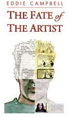
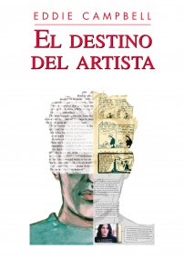
I almost wrote about Ellison's supposed writer's block in my Fate of the Artist but sensed that I was way out of my depth:
It was only after Ellison's death that Fanny Ellison chose Callahan to become literary executor. This was an honor, but it soon became clear it was also a Herculean task. Manuscript pages, computer disks and scribbled notes lay helter-skelter, everywhere in his home. Ellison had not suffered from writer's block, after all. He had writer's fury. He had written and written and written. A gush of words, and chapters and notes about the chapters. There were background notes -- musings on writing and America and fiction -- much of it also beautifully written; notes about plot outlines and more characters, built word by word, then buried under more notes. It was a spouting gusher of artistic creation, fat manuscripts covering other fat manuscripts, almost all related to that second novel.
(via Bob Morales)

Labels: , , , ,

Tuesday, 21 August 2007

The Great Gatsby

The first time I saw Nicki Greenberg's little characters I thought they were surely too facile to bear the weight of a tragic novel from the canon of American Literature. But more and more they've come to remind me of a type of pictorial invention that goes back centuries. The first hint was when I found myself thinking of the grotesques you find in the fourteenth century Luttrell Psalter, which are highly particular even among their type. Describing the beings populating the margins of the psalter, the babooneries, or 'babewyns' as he called them, the late Michael Camille wrote:
'Created from a variety of textures- greasy, slimy, hairy, subcutaneous, phosphorescent. rubbery, metallic, velvety and vegetal- they exhibit every possible variation of malformation, often on one page. a pug-nosed piggish human face with speckled yellow legs stares in dismay as his own cabbage tail sprouts up from between his legs with a tentacular, ejacuatory gush. Above on the same page, a sneering hooded fellow with a metallic blue body and flippery feet wears a kitchen cooking pot with the aplomb of a fashonable hat.' (from Mirror in Parchment)
You may say that such grotesques are not apt in the context of a modern novel, but they were hardly appropriate to the psalms either.
Part of the catalogue of individuals seen at Gatsby's parties:


The book's major pictorial conceit puts it squarely in the twentieth century. It begins with Nick Carraway pasting photos into an album. In Fitzgerald's novel he simply narrates, reopening the wounds of the past.


It's one of those old fashioned photo albums with the matt black pages, and the photos are all in sepia. The book is printed in full colour in order to make this sepia, even though we never see a hint of colour in the story pages. Chapter headings remind us that a full range of hues is in use. As the stylistic device runs for the whole 306 pages, it is likely to slip your mind that you are ostensibly looking at photos, with their serrated edges and occasionally casting a shadow, until late in the book a character is removed by being literally torn out of the picture. A peculiar thing: the publicity dept. at Allen and Unwin sent clean jpegs of the above, but they seemed to me to lack some important ingredient by being removed from the actual paper of the book, so I scanned them myself. It's one of those packages where every detail is in harmony, including the binding and type of paper. It's pleasing to just hold it and contemplate it as an object.

Gatsby is to be released in September here in Australia. It may not be available where you are until 2008 (UK) or even 2010 (USA) as copyright restrictions on Fitzgerald's novel run out at diifferent times due to varying international legalities and original publication dates. Greenberg is a qualified lawyer who explained it all to me carefully, but she did so in a bar, and if you find my version unconvincing, get a better one later.
I like her book a great deal; it is a singular achievement. She puts her little cast of 'babewyns' through a faithful if slightly condensed version of the text, and by the time you finish, her cast seems neither more nor less up to the task than the one that includes Robert Redford and Mia Farrow.

Nicki has a website.
and a blog too.
**********
And speaking of Australian women:
Australian Woman Killed By Amorous Camel
(thanks hayley)
**********
And of beings that are half human and half something else:
Dwarf's penis gets stuck to vacuum cleaner
The attachment broke before the performance and Blackner tried to fix it using extra-strong glue, but unfortunately only let it dry for 20 seconds instead of the 20 minutes required. He then joined it directly to his organ. The end result? A solid attachment...
(thanks Gareth)

Labels: , ,

Saturday, 11 August 2007

D.I.Y.

A promotional idea that was started by Marcus Gipps (sometime commenter in this parish and the accidental source of our catchphrase 'it's not a graphic novel, percy') of Blackwell's bookstore in London. I'm not sure how it's working out, or if he managed to get it off the ground, but I want to show my effort here while the thing is still timely. It's all about the penguin blank covers:
My Penguin -Books by the Greats, Covers by you
Design your own front cover... On 30 November (2006), we're publishing six of our favourite books with naked front covers; Crime and Punishment by Fyodor Dostoyevsky, Emma by Jane Austen, Magic Tales by Brothers Grimm, Meditations by Marcus Aurelius, The Picture of Dorian Gray by Oscar Wilde and The Waves by Virginia Woolf.
What’s on your cover? Buy the book, design a front cover and then send your masterpiece via email to gallery@penguin.co.uk. We'll be showcasing a selection of your designs. Visit my Penguin to view the gallery so far!

Having checked those links just now, I see that they already have a second set of covers out. oh, well no matter. I picked the two most unlikely covers and decided to show Marcus Aurelius and Jane Austen's Emma having a conversation with each other. Finding matching quotes was something of a literary sleight of hand, but here's how it worked out. Click to zoom..

The complete text of each work is behind those two covers. I found the paper surface quite pleasing to work on. here's a close-up:

Labels:

Monday, 16 July 2007

"For some people to love it, other people must loathe it."

T his will be the first time I've ever written about Harry Potter. I watched The Prisoner of Azkaban on saturday as our local tv channel makes its build-up to the big release of the fifth movie here in a few days and I really must say how grand it all is. Most of the books have passed through our house and have been loved on and off, but bloody hell, where did those ten years go?

I went to Wikipedia to review the score. There were to be seven books and there turned out to be seven, the last to be released at the end of this week. Five movies so far, the fifth released last week, with two in the pipeline. All with the same principal actors, allowing for losing a couple of old people, and since they all hide behind beards anyway, who's to know? What could the chances have been of everything working out so perfectly? And don't you just love the lady herself!

J K Rowling is "the first person to become a US-dollar billionaire by writing books." and "In 2006, Forbes named her the second richest female entertainer in the world, behind talk show host Oprah Winfrey."
Success of any sort wasn't obvious at the start: "the book was handed to twelve publishing houses, all of which rejected it."
I like the way Rowling has stuck to her guns on many issues:
Rowling has not allowed the first six Potter stories to be released as e-books and has no plans to change that for the seventh and final work. I applaud! (I stuck to that too in a contractual discussion, but it was only when I pointed out to Random House Australia that neither they nor I could ever be bothered to scan all of From Hell that they realised there was nothing to argue about.)
And regrets the one she let go:
Scholastic published Philosopher’s Stone in the US under the title of Harry Potter and the Sorcerer’s Stone: a change Rowling claims she now regrets and would have fought if she had been in a better position at the time.
I have oft wondered if the editors at Scholastic thought it didn't matter what it was called, or worse, that they didn't know what the philosopher's stone actually is, and never thought of looking it up. Worst of all, maybe they never read The Fabulous Philosopher's Stone, the full-length 1955 comic book Uncle Scrooge story by Carl Barks.

But she got her way with Warner's:
In contrast to the treatment of most authors by Hollywood studios, Warner Bros. took considerable notice of Rowling's desires and thoughts in their attempt to bring her books to the screen. One of her principal stipulations was the films be shot in Britain with an all-British cast, which has so far been adhered to strictly. In an unprecedented move, Rowling also demanded that Coca-Cola, the victor in the race to tie-in their products to the film series, donate $18 million to the American charity Reading is Fundamental, as well as a number of community charity programs.
Warner's won a few points too:
Rowling's first choice for the director of the first Harry Potter film had been Monty Python alumnus Terry Gilliam, being a fan of Gilliam's work. Warner Bros. studios wanted a more family friendly film, however, and eventually they settled for Chris Columbus.

If I recall correctly, Potter was Robbie Coltrane's next gig after From Hell, and regarding the all-British cast thing, and no disrespect to the acting abilities meant here, Robbie would have been my choice for Abberline instead of Depp (and any of the British actresses on the set instead of Heather Graham). But those American studios will insist on US actors. Once again, huge applause to Rowling and her support team for winning that one. Me, I just took the money and ran. I'm left with the conviction that Rowling's deserved success can be attributed before anything else to her love for the books she has written, and a suspicion that if the rest of us loved ours more we could go farther. A sharp and honest wit does no harm either: "Anyone who thinks I could (or would) have 'veto-ed' [Spielberg] needs their Quick-Quotes Quill serviced."

The new movie is packing them in:
LOS ANGELES (AP) — The Warner Bros. fantasy sequel "Harry Potter and the Order of the Phoenix" conjured up a $77.4 million debut to lead the weekend box office,according to studio estimates Sunday. That raised the movie's total domestic gross to $140 million since opening Wednesday. "Order of the Phoenix" also has taken in an additional $190.3 million in 44 other countries where it began rolling out Wednesday.

The Times of India speculates on the contents of the final book:When an off-camera filmmaker congratulates her, Rowling admits that there will be some Potter fans who will 'loathe' the book. "Some people will loathe it, they will absolutely loathe it. For some people to love it, other people must loathe it. That's just in the nature of the plot," the Scotsman quoted her, as saying. And though Rowling insists in the documentary that she's "actually really, really happy with it", a moment later she bows her head on the keyboard and says: "Oh my God!"
Rowling, who confessed that she "sobbed her heart out" and drank a half bottle of champagne shortly after ending the book, has already warned fans that two main characters will die in the final book in the series.

Isn't it great how it's making kids actually sit down and READ!:
Meanwhile, nearly a fifth of Potter fans say they will skip straight to the last page of the final book to find out what happens to the boy wizard, a survey showed on Saturday.
And then it will all be over:
Nine out of 10 think it will be sadder saying goodbye to Harry than Prime Minister Tony Blair, the survey said.
*******

The Tintin furore: brilliant piece by India Knight in the Sunday Times. (link thanks to mr j):
Books stand as testament to the errors and horrors of history. They are vitally important.

Labels: ,

Thursday, 22 March 2007

"One of those close English friendships that begin by excluding confidences and very soon dispense with dialogue."

Somebody has put the whole Codex Seraphinianus on Flickr (some 350 pages). (Thanks for the heads-up to drjon in the comments yesterday for my March 12 post)
Codex Seraphinianus, by Luigi Serafini - 1983, US edition. Not that it matters what edition it is as the whole book is written in an alien script of the author's invention. It's an imaginary encyclopedia. As usual with this sort of thing, I arrive to find John Coulthart is there before me:
"The Codex Seraphinianus is unique in placing its invented world centre stage and, even more uniquely, purporting to be a product of that world itself. Its creation seems the inevitable result of a trend of fantasy writing that delights in invention purely for its own sake, particularly invention that goes to great lengths to seem authentic or authoritative, academic even. The great precursor here is Borges’ short story ‘Tlön, Uqbar, Orbis Tertius’ which relates the invention of a Britannica-style encyclopedia describing with the greatest detail and authority a completely fictional world. Typically for Borges (as for Harrison), the story is also a commentary upon this kind of invention, as well as the effect it can have on our “real” world—for Borges and Harrison reality is more mutable than people like to think. Luigi Serafini takes the whole game a very difficult step further, by creating a complete work which describes his own fictional world in detail, with numerous colour illustrations and the whole written in a completely invented language and alphabet."

This guy's telling you how to get a print copy.

Codex Seraphinianus, Hallucinatory Encyclopedia, an essay on the work by Peter Schwenger.

More, with some other works by the artist.

The story by Borges, Tlön, Uqbar, Orbis Tertius referred to by John above can be read in English here.
"Some limited and waning memory of Herbert Ashe, an engineer of the southern railways, persists in the hotel at Adrogue, amongst the effusive honeysuckles and in the illusory depths of the mirrors. In his lifetime, he suffered from unreality, as do so many Englishmen; once dead, he is not even the ghost he was then. He was tall and listless and his tired rectangular beard had once been red."
I like Borges' take on the British.
"He and my father had entered into one of those close (the adjective is excessive) English friendships that begin by excluding confidences and very soon dispense with dialog."

anyway, the meat of the matter:
"Now I held in my hands a vast methodical fragment of an unknown planet's entire history, with its architecture and its playing cards, with the dread of its mythologies and the murmur of its languages, with its emperors and its seas, with its minerals and its birds and its fish, with its algebra and its fire, with its theological and metaphysical controversy. And all of it articulated, coherent, with no visible doctrinal intent or tone of parody."

and our favourite subject here at campbell blogspot:
"In literary practices the idea of a single subject is also all-powerful. It is uncommon for books to be signed. The concept of plagiarism does not exist: it has been established that all works are the creation of one author, who is atemporal and anonymous. The critics often invent authors: they select two dissimilar works - the Tao Te Ching and the 1001 Nights, say - attribute them to the same writer and then determine most scrupulously the psychology of this interesting homme de lettres..."
******

Michael Evans links me to this piece by Rick Poynor about the various covers over the years on the front of J G Ballard's novel, Crash
Collapsing Bulkheads: The Covers of Crash Mon 12 Mar 2007
"J. G. BALLARD’S Crash tests the limits of the reader’s taste and sympathies in the most profound ways and it has always provoked strong reactions – positive and negative. British novelist Will Self has said, ‘I only have to look at a few paragraphs of Crash to feel I am in the presence of an extreme mind, a mind at the limits of dark imagination.’ He meant this as a commendation. Even Ballard sometimes seemed ambivalent. ‘How many people are there who’d want to read a book like Crash?’ he once asked. ‘Not many.’"

sure enough, there's John Coulthart in the comments
****

I just noticed it was Poynor, mentioned more than once in my archives, who started EYE magazine. I noticed it in his biog at The Design Observer site, where I went to read a review by Dan Nadel, the fellow who put together the Art Out of Time book last year. I liked the book, but as for this review of his, I'm starting to think Nadel may be what we call in our house a 'surface dweller'. He knows a lot of names but doesn't leave me with any feeling of increased wisdom.
*****

Apropos of my talking about The state of reading awhile back:
thislondon.co.uk: 20 March: Schools refuse gifts of 'boring' classics
"Dozens of schools have rejected gifts of free classic books because today's pupils find them too 'difficult' to read, it has emerged.
Around 50 schools have refused to stock literary works by the likes of Jane Austen, William Shakespeare and Charles Dickens after admitting that youngsters also find them boring.
The worrying figures were released by the Millennium Library Trust, which donates sets of up to 300 books to schools across the country.
David Campbell, who runs the Trust, also revealed that a further 50 schools had sent back the gifts."


I don't know what to say. Let them eat comics
******

Finally, on the subject of cake, and relevant to yesterday's post, Jim Burrows has an illustrated history of the pin-up. What I like most about his site is that at the bottom of his opening page he has negotiated an ad with cheesecake.com: "our gourmet cheesekakes are made entirely by hand, from scratch, and fresh to order. Discover for yourselves why food critics call ours 'The world's most indulgent cheesecake' "

Labels:

Monday, 12 March 2007

A Humument

I came by my copy of this unique work through a series of synchronistic connections. It started with one of those Amazon.com recommendations that keep popping up when you're not in the least bit interested, you know: 'customers who bought this item also bought this other one'.
Last year two quite different parties at different times had told me I should check out Danielewski's House of Leaves, so in due course, having failed to cross paths with it in my day to day perambulations, I got around to looking for it on Amazon, and found: 'Customers who bought House of Leaves also bought Fate of the Artist by Eddie Campbell'. Well, I don't know how that mechanism works, but it did seem to me that the gods were slipping me a message. So, shortly afterwards when Hayley Campbell told me to get a hold of Woman's World by Graham Rawle and the Amazon machine paired it with A Humument, I was paying attention to the signs and I picked up that one too. I hasten to add that I have gone back to dismissing the recommendations, and Fate has gone back to being paired with assorted graphic novels, but meanwhile the two books arrived together, and I have already talked about Woman's World here.

A Humument by Tom Phillips is a 'treatment' of a copy of the 1892 novel, A Human Document by one WH Mallock, presumably selected mostly for its anonymity. Phillips has taken each printed page of the original and converted it to his own purposes. The process begins with the selection of words and phrases from the text on the page to arrive at a new text. The resulting new text is by turns poetic:
'the cakes and cream and- pleasures of life, and- butterflies-and her lips- her voice-and- words broken- And- my real- you'
and ribald:
'The Princess with effusion held out a wrinkled- pologe- Grenville - scanned the sofa- to see- Miss Markham,- raising her- dress- half parted'

Phillips achieves this construction of new texts first by lassoing the word or phrase and then connecting it to the next by an umbilical cord, making a channel between words and lines using the white of the page. Then the unwanted parts are pictorially obscured. I said lasso there to avoid using the term 'word balloon' which I'd automatically use in another context, because there are places where Phillips wishes to allude specifically to that context as in his page 266, where he has found an amusing satirical text:
'bush- remember- bush- bush- remember that bitter name- remember him- that rude-stare-at- destiny'
The pictorial content of this page uses collaged images from American romance comic books. Elsewhere, painterly qualities prevail in a patient accumulation of both the abstract and representational.

A Humument is a continually ongoing project for Phillips. Since treating that first copy of Mallock's book he has obtained other copies and started in again. An example of how he extracts two different texts from the same printed page may be seen by comparing the covers of the third and fourth (current) editions, which I've shown here.
The third reads:
'my poor little book- very rich for- eyes"
Using the same Mallock page as the base, in the fourth edition it becomes:
'as I come to- change half- my-little book- airy stories- journey- on---my-friend of-time- till very rich.'

You can find the earliest edition from the'70s online, (many of pages of which have survived into the latest edition), though the version at Rosacordis seems to be missing the large view option at the moment. Phillips' own site may supply that. At the beginning the artist's technique owed more to simple pen and ink. With time he came to use quite elaborate pictorial devices, and gouache paint, going so far as to recently include collage as mentioned above. You can see some of the more fully worked pages by altering the numericals in this url between 02 and 10
06 is an attractive self-portrait in gouache. The author introduces himself on page fifty, at fifty years of age::
'Play- the shadow of- fifty years- imagine only- a century- at last welcome- my own- my self I'
This page has been considerably altered since that version, as you can see in the most recent edition.

A Humument is usually described as an 'artist's book', a medium which perhaps begins with Max Ernst's collage novels. And within that medium the idea of altering earlier texts is not unique; there are some examples here (the 'Altered Page' exhibition) including somebody's 'treatment' of the Yellow Pages. A Humument has its own particular relationship to narrative. To begin with, the characters of the original novel exist as marine life beneath the typographical surface, their movements occasionally catching the light by way of a name selected by Phillips for his new texts. But there is more than that. Phillips contrives to create an entirely new character whose existence is not even hinted in the original. This is Bill Toge (his surname formed from the four-letter sequence found only in 'together' and 'altogether'), a casualty of love stumbling through the book.
'The shyness of -toge- he looked- under - her dress- -anemones arrested- him--- and a woman's well poised eagerness"
and:
'toge- accepted his -thrown value--and recognized yesterday- had to laugh'.
This, the underlying source text and a small assortment of visual cues, such as a window that Toge is usually sitting near to, even though there is no cartoonist's continuity about what Toge is suppose to look like, just a few typographical rules that hold him 'together', bind the 366 pages of the 'novel' into a singular reading experience. By the end of it, Toge and his neuroses are real enough. (Phillips once said that when he arrives in a new town he tends to check the phone book in the vague expectation of finding a real Bill Toge.)

Another relevant link: Exhibition of prints by Tom Phillips including some Humument variations.

For me one of the precious things about A Humument is that it is another example of the exciting developments in the world of The Book that I have written of here already, and of which Woman's World and House of Leaves etc. are also examples. It is occurring in the blurred areas between things. Phillips took a cheap printed novel and made it into an artist's book, foregrounding the aesthetics of painterly surface and of poetry. But in reintroducing narrative and character and incident, however loosely, he has gone halfway to reconverting it back into a novel, a different novel. A different kind of novel altogether, with pictures. For its daring in just existing, this book wins my respect, but for its sense of HUMour and its sense of the HUMan I will be keeping on my shelf as long as I have a shelf.
'go into the world toge- sing our times and seasons,- sing of childhood,- twilight- swing- toge- in the- opera- they- forgot'

Labels:

Thursday, 15 February 2007

Woman's World

One reason I started this blog is that I had amassed a considerable pile of books that seemed to be telling me that we are in the middle of an important artistic event in the life and history of the BOOK. We're too close to this cluster of phenomena and it's too early to suggest a schematic showing accumulated interrelationships and anyway I have come to distrust critical writing that casually connects more than two things in one move. And so the blog turns out to be the best way to put it all across, in single mouthfuls, with weeks in between. I've already written of the crisis in the field of illustration and the idea of 'authorial illustration', of picture books, who are they for?, and a playfulness with typographical novelties in the current novel here, here, and here.
Woman's World by Graham Rawle is one of the most extraordinary books I have come across in the last couple of years. Rawle has been plowing his own furrow in the world of popular amusements for a number of years, with his various cartoon/collage series including Lost Consonants and When Words Collide. He had a book out in '98 titled Diary of an Amateur Photographer: a mystery. If we had to relate it to something else in order to describe it, we'd call up thoughts of Nick Bantock with his Griffin and Sabine series of picture books. My pal Sean MacKinnon at Bent Books has mentioned that Bantock's works are very popular with the ladies, and I can imagine that would be so, with their bright and charming sentiments. They reside in a place of the mind where the habitual fans of the graphic novel would probably not trip over them. Rawle's work is quite different. Diary has its own kind of masculine neurosis, with a grubby protagonist who passes time on his daily bus rides playing a mental game where he must have sex with every tenth woman he sees. This starts to involve considerable circumnavigation and timed closing of eyes in order to provide a pleasing result. The entire book is 'pictorial', with photos and cuttings and everything glued in and photographed. Even the typed parts of the story are typed onto to old murky papers and glued in. There is a ponderous feeling to all of it which makes approaching it an act of will. And if you are like me you will find the effort worthwhile.
You can find an interview with Rawle in the British Association of Illustrators (AOI) Journal of September 2003. This is the 'authorial issue' which I mentioned in the first link above. Lethem also mentioned Diary in The Ecstacy of Influence, his Harper's essay on Plagiarism much celebrated in this blog last week. couple of reader reviews here

Rawle's second 'novel' takes us somehwere else entirely. It is wholly constructed from words, phrases and even paragraphs, all cut with scissors from 1960s women's magazines. The illustration at right, taken from Rawle's website, will give you the idea. The whole book is done like that, all 437 pages. It's reviewed here, by Tom Phillips, (himself an interesting figure-more on him another day), and in Eye magazine, by Rick Poynor, a key critical witer in the 'authorial illustration' movement mentioned above'. I won't talk about the plot here as it makes an interesting experience to start into it not knowing the premise let alone the plot. So if my recommendation isn't enough for you, check those reviews warily.

Woman's World is a touching and beautiful work with psychological depth, belying its unusual origin. I would have expected from the circumstances not much more than a facetious job. You could get rid of all the cut-outs, copy the words into regular type, and it would be an impressive piece of writing. The manner of the book's composition would cast its influence as a sub text of course, since the particular words and 'found phrases' are integrated into the very substance and meaning of the work. Rawle's accomplishment is that he has written a first rate modern novel, which at its end is quite deeply moving and unforgettable.

The hardcover has 2005 date, and on its dust jacket it is described as 'a novel'. The softcover which you can see at the top of my post, tries a new gambit: Woman's World: a graphic novel. A 'graphic novel' indeed, and it was reviewed as such alongside Burns' Black Hole, Clowes' Ice Haven and the latest Acme Novelty Library from Ware in the London Times of Dec 3 2005.

If you have been following this blog since I contemplated putting "It's not a graphic novel, Percy" on a t-shirt, you'll know i have no time for arguing about labels, but I wondered who had thought that putting 'graphic novel' on the cover was the correct strategy and suspected the publisher. I introduced myself by email and asked Graham Rawle himself, who replied:
"I have no idea what the term ‘graphic novel’ means. Then why is it on my book?
Well, when the hardback came out, I wanted it to be viewed as a novel, not a novel-ty. As you know, text and image (graphic novel?) combinations tend to be lumped together with those cheap crappy Christmas books and I rather grandly wanted mine to be taken seriously. Initially I even suggested we printed it as ordinary text. For me the story was more important than the method by which it was created, but I finally decided that the two, the story and the method, were inextricably linked. It would have been daft not to show the pages. My publishers agreed and suggested it should be a traditional novel format and that we should add ‘a novel’. Just to give a clue. The result was that it got reviewed as a novel, which was good, but that browsing customers didn’t look inside to see the rip-roaringly lovely visual delight of each page. It was (my) publisher’s idea to add ‘a graphic novel’ to the paperback. They recognised they had missed out on the ‘graphic novel’ market (whatever that is), or more accurately that art bookshops, museums etc. were less inclined to stock the hardback because of the ‘a novel’ tag. I think people expect graphic novels to be comic books these days. Mine will no doubt be a disappointment to this audience because there are no drawings.
I don’t think about these labels much. I don’t know why we put ‘a novel’ and not ‘a story’. I think I suggested ‘a collaged novel’, but the publishers advised me against it. I also suggested putting some of the text scraps on the front to give some indication of what was inside. They said that would make it look less like a novel. I don’t know. I just want people to read my book. There is talk now of a film of WW. Now is that a ‘romantic comedy’ or a ‘comedy drama’? The film people want to know."


I can see this property as a movie. It wouldn't be too hard to find televisual analogues for all the quoted advertising phrases. But I can also see it ending up in American hands and the chances are they'd misunderstand the delicate beauty of it. In which case all we could hope for would be that Rawle would pocket enough dosh to go to ground for another five years (the time it took to make Woman's World) and produce another gem.

Labels:

Sunday, 28 January 2007

Tower twins

I’m mentioning Foer’s Extremely loud and Incredibly Close a third time on this blog, not because I like it more than books I’ve mentioned only once, but because it’s parked nearby and I keep tripping over its mooring ropes. The business at the end of the book …

Spoiler. If you’re precious about endings go and read somebody else’s blog.

The thing about this ending is that it’s a flick-book, which means that you see and read that part of it before you get the book out of the shop. Stills from the video of a man plunging from one of the doomed towers are reversed so that he is defying gravity and going back up. I had thought there would be a whole genre of books putting the matter of the towers right by just imagining it backwards. Foer’s ending works in its context, "He would've spit coffee into his mug, unbrushed his teeth and put his hair on with a razor..." and I don’t mind the sentimentality, as some have done. This reviewer does but allows that the book is a linguistically sophisticated fable, and 9/11 is a smokescreen obscuring its true nature.

I found myself dutifully illustrating a similar wish fulfilment in Captain America when I drew the art for two issues in Early 2004 (it's the last 44 pages in the 176 page Captain America: Homeland, with all the art otherwise by Chris Bachalo. A tough act to follow, what? But don't go buying it unless you're interested in that sort of thing.). The script was by Bob Morales, and it worked on its own terms. Or it would have if Marvel hadn’t nobbled it. But Bob was way too hopeful. First he wanted to make Steve (Cap) Rodgers president of the USA. When Marvel nixed that one, just so he could get the story done, he had Cap whisked away to an alternate time-stream where the black Cap, Isaiah Bradley, got to be president. When we finally get to see him, Isaiah is wearing a t-shirt that says, “Han shot first!” which, in due course, gives Cap the idea of going back and changing history. Marvel nixed the t-shirt too, not wanting to invite a tangle with Lucas. That was after all the art had been done, so I got my assistant on this job, Stewart Mckenny to put a different emblem on all the t-shirts through the piece (I think I still have xeroxes with the original version somewhere around here…) and the narrative logic doesn't quite scan now. There was also a bit of time-twister malarkey where a problem gets solved in panel 4 of a page and then chucked back into panel 1 to head the problem off in the first place, but Marvel decided that metafictional devices don't occur in the Marvel universe. And that seems fair enough to me. You wouldn't want piss takers in your camp. I don’t know what gave Bob the idea all this was feasible in the first place. Me, I just wanted to do a job and get paid. But anyway, it all ends with the towers back up, suitably not quite right with huge blimps moored to them. It's the final page in the book:


(click to enlarge.)

It’s Sunday afternoon in Brooklyn, and happy people are out walking in the sunshine and yachts are sweeping by on the river in this sidelined continuity that never happened. Nobody has ever commented on this before, and I guess Marvel didn't notice it either, but I made the cheerful strolling people into poignant stages of might–have–been in the finished romance between Steve and Rebecca. They are the two children playing in the fountain, they are young parents with a baby-carriage and a toddler, and they are the elderly couple with the poodle in this sad sunday afternoon metafiction of impossible reversals.

Labels: ,

Saturday, 27 January 2007

Typographical anomalies.


In my Fate of the Artist I sarcastically refer to deliberate irregularities of any sort in the physical text of the book, from a serif in the middle of a paragraph of sans say, to a whole illustration, as 'typographical anomalies'.

Umberto Eco employs as many as 221 images in his The Mysterious Flame of Queen Loana: 'an illustrated novel' (2005). At first it's all reproductions of covers and illustrations from pulp magazines, comic books and sheet music, and at the end, montages and adaptations that he made himself from the same kind of materials.
From the Village Voice article/interview
"Overwhelmed by faces and names, he (the protagonist, Yambo) escapes to his boyhood home in the Italian Piedmont, where he confronts a different inundation—the novellas and comic books from his adolescence. The second section has Yambo delving into this kitsch pool of superheroes, damsels in distress, and cartoonish fascists—relics of Italy's Mussolini generation.

'Obviously, when you write a novel about memory, you have the ghost of Proust blackmailing you,' says Eco. 'But this isn't the case here. Proust goes inside himself to retrieve personal memories, while my character has no personal memories, or madeleines, and is dealing with collective, mineral memorabilia. He's working with external material, not internal material.' Eco has reproduced much of this "mineral memory" in the form of illustrations—period book covers, movie posters, and propaganda material. "The graphics don't illustrate what I've already verbally described," he explains. "They have the function of an 'etcetera,' to give the impression of the abundance of material that I found in my attic."
Eco says he structured Mysterious Flame to mimic the free-associative behavior of electronic navigation."


Eco calls his anomalies 'etcetera'. Another term is loosely coined in the following interview with Jonathan Safran Foer, who has some sixty pages of photos and other novelties (not counting actual manipulations of type and blank pages) interpolated into his Extremely Loud and Incredibly Close (2005), including fifteen pages of flip-book at the end:
"RB:"The graphic tschotskes that are in this book...
...JSF: I am from a generation that was raised with the Internet... It makes a huge difference. And I was raised with a different kind of television and music. Music for example that depends very much on borrowing from different traditions, sampling pieces of other music and overlaying different rhythms and melodies and I think that is reflected in my writing. It was not intentional and it was not an attempt to reflect something about the culture in which I grew up, but it's what I know. And I think that comes across in the typography and in the style in the combination of voices. The world is more of a collage everyday."


I'm sure we're all talking about the same thing.

Labels:

Friday, 26 January 2007

Typography.

I've been following my own chain of connections on the subject of typography. It started with The Lunar Men (2003) by Jenny Uglow. With regard to subject matter, here's an excellent review.
It's the 18th century, my favourite time in the history of the world, an age 'when great men were as common as gooseberries'. A couple of hundred pages into it I found myself riveted by a thought.
"The journeys of men who profoundly dissent do not end with death... After the house is sold in 1788, the small conical museum is removed, and so, the owner thinks, is the body..." (Uglow narrates, at some length, the peculiar story of the movements of the remains of John Baskerville, the great 18th century type designer.) "Finally, in 1898, he moves to Warstone Lane in the middle of Birmingham's jewellery quarter. He is still there now. I think. And his beautiful type lives on, and you are reading a version of it in this book."

The text of this paperback book is 'aware' of the type in which it is set!

Conventionally, the text of a book is completely unaware of its typographical environment. That kind of thing is decided after the author has handed the work in, it's been proofread, and she/he's too busy working on her/his next one to be available for consultation on such matters.
Later, a similar event.:
"The following summer, in front of a crowd of a hundred and fifty thousand, he (Captain Vincenzo Lunardi) arranged to take the famous beauty and actress Mrs Sage, and their friend George Biggins -amateur chemist and invetor of the coffee percolator- into 'the blue Paradisial skies', as shown on the cover of this book."
I hadn't read Uglow's work before (to my shame) and checked to see how she could have pulled such marvellous tricks. Thus I note that she works as an editorial director at a big publishing house, which I guess would give her the inside track on getting a book done exactly as she wanted it.

Mark Danielewski didn't have that advantage when putting together his House of Leaves (2000). (interview)
"We were heading for a train wreck, and (Pantheon) wanted to do it a completely different way — or didn't want to do it. So I actually, on my own dime, flew to New York and set up shop. They found a freelance computer on one of the floors... and I worked on it. It took me three-and-a-half weeks."

The interviewer is naturally incredulous that it could have been achieved in that time:
"The labyrinth section (the most complex section of the book) took, like, nine-and-a-half months to storyboard," Danielewski says. "So it was almost like a shooting schedule."
Leaves is a baroque extravaganza of typographical liberties. I like the way he composes endless lists of architects names or examples of architectural styles or technical terms, which seem pointless from a reader's point of view, until you realize that he has used the sheer physical density of the type to create walls and passageways or, by having a square of text mirror-reversed on the flipside of a page, blind windows.

For anone who needs an idea of what House of Leaves is 'about', I guess it's a psychological horror story about a house that goes wrong. Here's the first chapter transcribed out of its typographical environment, which is how most prose expects to get around in the world.

Labels: ,

Thursday, 18 January 2007

The blank page

You have to read Laurence Sterne’s Tristram Shandy in a facsimile of its original presentation (complete text there, bookmark it) or you can’t get a clear view of all that hankypanky with the typography. Famously there is the blank page where the reader is invited to draw his own portrait of the Widow Wadman: (scroll halfway down) “And possibly, dear reader, with such a temptation… paint her to your own mind… as unlike your wife as your conscience will let you”... ( and on the right, a blank page)

I’ve seen Sterne’s same blank page pop up in a couple of recent books. It is definitely Sterne’s and has been borrowed in an act of homage. The writer is acknowledging a spiritual mentor by correct gestures of obeisance.

Firstly, Dave Eggers You Shall Know Our Velocity (2002)
"The boat was skipping and then there would be a larger wave, or we would hit a regular wave a certain way, and the pause between when we became airborne..." (and on the right, a blank page, followed by two more blank pages, then another half) ... and WHACK when we landed..."
It starts on page 156 in the copy I have, but I smell a rat because I gather that the original presentation started with the first page of text on the cover, like so:


and if they've shifted that indoors then the numbering's all 'whacked", and I'll need this one also in 'a facsimile of its original presentation' .

Secondly, Jonathan Safran Foer in Extremely Loud and Incredibly Close (2005). The blind woman has been writing her life story, hundreds of pages, not knowing that the ribbon was removed from the typewriter some time before. The husband: "I picked up the pages and wandered through them, trying to find the one on which she was born, her first love, when she last saw her parents, and I was looking for Anna too, I searched and searched, I got a paper cut on my forefinger and bled a little flower onto the page on which I should have seen her kissing somebody, but this was all I saw:" ... (and on the right, a blank page, followed by two more blank pages, then)..."I wanted to cry..."

In Playboy, jan 2004, Foer, the unstoppable collector, wrote a whole essay about blank pages "I'm writing this essay for a magazine that, for all of its other attributes, is distinguished by its unclothed women. What about an unclothed page?"
"I started collecting empty paper soon after I finished my first novel, about two years ago. A family friend had been helping to archive Isaac Bashevis Singer's belongings for the university where his papers and artifacts were to be kept. Among the many items to be disposed of was a stack of Singer's unused typewriter paper..."
He keeps the topmost of these blank pages and it becomes a spiritual talisman, launching an obsessive quest that leads Foer to many blank pages, and ultimately to Freud and Anne Frank in an extraordinary little article found in a most unexpected place.

Labels:

Monday, 11 December 2006

The Arrival.

On Nov 7 Tom Spurgeon ran a recommendation from me for Shaun Tan’s book, The Arrival. I had some notion then of being a ‘guerilla blogger’, and if I wanted to make a thought or link known I’d offer it to Tom or somebody else if I didn’t go so far as to write a whole essay for my publisher’s blog, and if it was a quote I'd see If Dirk Deppey had a place for it in his 'thought for the day' (he always credits these offers and I’ve seen some thrown into the hat by other folk. They’re always on the ball and worth writing down.) But now that I’m on my home turf here I should say a few more words about Shaun's book. I first made the acquaintance of Shaun at a sci-fi convention in Perth Australia in 2004. That was a show I really enjoyed for some reason I can’t put my finger on. I met a great bunch of people for one. Great town too. I was introduced to Shaun’s work by my pal Justin Ackroyd of Slow Glass books. Justin doesn’t have a store front these days, but when he did, in Melbourne, and I first walked past it I strode into the place and demanded to shake the hand of the proprietor, who didn’t happen to be in at the time. Justin is one of those very rare store guys who would phone me up and patiently request that I send that damn invoice from however long ago so he could pay me and clear the nagging thought out of his brain. A couple of hours later I found myself on a panel with Shaun (one should always prepare oneself. I say ‘one’ because I don’t mean me. I do.)
Shaun’s work has always clearly fallen into the category of ‘children’s book’, and when we have read and enjoyed them, we have done so cheerfully and willingly as adult children, and without any sense of there being anything wrong with that. I say ‘we’, but if you’re outside of Australia you may have to exclude yourself from that as I’m not sure his work has been disseminated widely enough. Hopefully this is about to change.
Of Shaun’s earlier work I have the two that he authored himself. (connect this with my essay a few days back on ‘authorial illustration’. Everything connects in here and I’m building up to something big, so you’d better pay attention. ) Firstly The Lost Thing of 2000, and The Red Tree of 2001. The power of both of these books has something to do with their evocation of a feeling of alienation from physical things. One double page picture in the Red Tree has a huge reeking fish suspended over a workaday street and nobody notices it. I imagine I hear the clanking soundtrack from David Lynch’s Eraserhead. The little girl who is the protagonist of the story finds security and warmth in a red tree growing in her bedroom.
The Lost Thing reverses the situation. It’s about a sentient thing for which there is no use in the world. It looks like a big industrial steam kettle with assorted appendages that it could be breaking in for Cthulhu. It eventually finds its place in the universe, in a dream that Dali probably had.

In The Arrival Shaun tan carries his themes forward into a fully realized ‘graphic novel’ (I’ve run it through the Campbellian program and I think all four schools thought would accept it withpout argument) (I’ll only use the term if I see no obstruction to communication, and even then only in quote marks) The author has told the essential story of the universal immigrant using a photoreal style of period clothing and artifacts, except that there also all his trademark alienated things. In fact the cover is a brilliant introduction to the whole shebang. The traveler in this book is wearing clothing that is familiar to us from old photos and film, and everything he meets is an extraordinary alien creation. The purpose of things cannot be deduced from their appearances and the labels and the instructions on them are all in an alien script. The book is a hardback of 120 pages (in contrast to the softcover 32 page volumes of his childrens' oeuvre), with a division of the page more often than not into twelve pictorial parts, though there is are sequences with twenty and thirty parts each. And elsewhere sprawling vistas across two pages. You will think yourself an arrival at New York’s Ellis Island, but wait, that is not the statue of Liberty, and what is that odd looking longtailed beast on its shoulder? In all of this, not a single word. At least none that you or I could understand, being ‘lost things’ ourselves in front the majesty of this masterpiece. It’s a beautifully moving and human work, and my favorite picture story book of the year.
When I asked Shaun about the book he told me: "It's the first book of mine to be picked up by a US publisher, who I think were previously unable to categorise my 'children's' books. This one has a lot of references to Ellis Island that a US audience might pick up even more acutely than an Australian one. Scholastic should be putting it out fairly soon." I don't have a date , but if I get one i'll let you all know.
At his own website the author has an essay: Picture Books: Who are they for?,
"One of the questions I am most frequently asked as a maker of picture books is this: ‘Who do you write and illustrate for?’ … It is interesting to observe that when I paint pictures for gallery exhibitions, I am never asked who I am painting for." This would be worth discussing except that I know from many years experience that this argumnent always degenerates bathetically into one about filing. I once suggested that Seth's Vernacular Drawings was to be counted among the great 'graphic novels' (when I still admitted the use of the term) but was met with the retort that it should instead be filed with the 'art books'. Comics fans being what they are, vocational filing clerks, it ends up being about where things get put in the store, which is not what we really should be concerned with. What we should be asking is where do we file it when we get it home? Do we file it with the other monuments of Parnassus, with our Mozart and our John Donne and our Cervantes, or do we keep it upended in the water closet of our cultural memory, as an accompaniment to our bowel movements?

There is more info here: "Shaun Tan was born in Australia in 1974. In 1992 Shaun won the International Illustrators of the Future Contest, the first Australian to achieve this award. He has been illustrating young adult fiction and picture books since 1996. If you live in or visit Perth take time to drop into the Subiaco Public Library to view Shaun's amazing mural, which spans 20 square metres of wall in the children's section." And how we envy them wee'uns.

Labels: ,

Saturday, 9 December 2006

Addenda.

I got a response to my Dec 6 post that began "we don't need any more names for the same thing." My opening paragraph was intended to inform that I have no interest whatsoever in arguing about what the medium is called and what's allowed in it. You keep the old thing and you call it what you like. I'm not in the business of naming. Here we are all about UN-naming. I'm not interested in comics as they are defined and I'm not interested in the graphic novel as it is defined (at least four different ways). Just for the record, I'm not interested in 'defined.' I'm interested in the movement of ideas and aesthetic impulses from here to there, and from there to somewhere else. I'm interested in making Life better. I'm interested in the Book and what the Book is in the process of becoming, which is to say, a book of a different stripe, and I'm interested in the ways it will find to tell the stories that need and/or ought to be told in order to make Life Better and us wiser.
That above was the slogan on a t-shirt I bought and used to wear at conventions till I accepted that Chris Staros didn't like it, though to be fair, it was proably the obnoxious cartoon cat speaking the words on the original that offended Top Shelf's sensibilities. I gave it to wee Callum Campbell, who wears it out skateboarding. He's not in the shit business either. First to ask for it in 'comments' can have it in the mail (the sketch, not the t-shirt.)
* * *
On the same theme, I left that post of Dec 6 with a confession that I was unfamiliar with the writings that Steve Braund of Falmouth U. credited with positing the idea that an 'authorial' presence may elevate the profession of illustration out of the crisis it has found itself in over the last twenty years. Illustration is a field that provides a service, fulfills a brief, satisfies a client, so that in a way the notion of an illustrator speaking in his own voice could be seen as coming from outside of the process. But If we stop to think about it we are remiinded of many great illustrators of the past who certainly spoke with their own voice, though it in turn may have spoken for entire generations; the work of Norman Rockwell for instance (and others mentioned below).
Steve has responded by supplying me with some references:
"Susan Aldworth interviews Robert Mason from Artists & Illustrators magazine in the UK from 1999, entitled.. 'Is Illustration Dead?' Here's a quote from it with comments set against the UK recession of the early nineties..
'Mason's research also showed that while there is currently less work in areas of illustration like book jackets and editorial, there is a reemergence of
authorial work and a renewed interest in handmade illustration. Authorial work is a term being used to describe long-term projects like children's books, graphic novels or picture essays, illustration which demands more from the illustrator than a clever one-off image. In the States, Mason explains, some important magazines like... Esquire are commissioning illustrators to go to events from serious news stories to fashion shows, to draw what they see. He goes on to mention Posy Simmonds as part of this authorial movement ('Gemma Bovery' in the UK's The Guardian.')
Rob wrote a book in 2000 surveying illustration in the UK through the 90's called 'A Digital Dolly' (after 'Dolly' the first cloned sheep). Publr: Norwich School of Art & Design. Isbn. 1 872482 39 2. It offers a really clear reflection on illustration through that period with a real sense of the importance of encouraging a return to the 'authorial' integrity of many illustrators of the past.. Lear, Heath-Robinson, Peake, Gorey (one of my personal heroes). I think that's the point about the term 'authorial illustration'.. Illustration has always produced truly unique and personal 'authorial' talent.. Those witth a strong personal voice. So the term 'authorial illustration' was first used by somebody, 'one of us', who wanted to point back down the road at that tradition. I remember having a converstion with Robert Mason in a pub in South Kensington around 2000 where we looked at each other and simultaneously uttered the same words.. 'I'm thinking of writing an MA in authorial illustration!' It turned out we were further on with our course plans, so Rob was kind of happy to let us proceed. But it was
very much his influence on my ideas, along with Vienne and others, that led me to want to do that in the first place.
These might be useful:
'Pictures & Words. New Comic Art and Narrative Illustration by Roanne Bell and Mark Sinclair. Publr: Laurence King, London.
Ric Poynor - 'Illustration's last stand' (Graphis No.321 May/June 1999)
Ric Poynor - (Eye No.22 1996) 'The client says he wants it in green.'
Veronique Vienne - (Graphis No.316 July/Aug 1998) - 'Illustration and the Politics of Polite Outrage'
She says.. 'To reclaim their rights, illustrators would do well to shed their artiste persona and reposition themselves as authors - as equal partners in the storytelling process. There are some hopeful signs - the increasing popularity of animation, the growth of children's literature - indications that some illustrators are no longer willing to simply embellish the page. They've realised that asserting their authorship is the only way to transcend the conundrum of ownership.' "

"On March 16th next year we are putting on a one-day Forum here at Falmouth on the theme of Publishers talking about publishing graphic literature. We are putting together (a real mixture) the following speakers: Yvan Alagbe from French publisher Fremok (www.fremok.org (Atlanic Press has just helped them publish the original drawings and text of 'Alice Underground' with a French translation); Gita Wolf from Tara Books in Chennai, India, Chris Oliveros from Drawn & Quarterly and The UK's Dan Franklin at Jonathan Cape/Random.The day will be chaired by Paul Gravett 'Comica' etc.
"

Thanks for filling in these details for me, Steve. More power to you! And whaddayouknow? there's my old pal Paul Gravett, 'the man at the crossroads', right in the middle of it.

Labels: ,

Wednesday, 6 December 2006

Shirley it is a graphic novel.

A thing is what it is. When persons argue about what to call it, what they are really talking about is their relationship to it. For instance, Person A: is he a friend or an enemy? Obviously there is no absolute answer; it depends on where you’re standing.

And you’re standing on a shifting funhouse floor. At least where matters of artistic culture are concerned.

Take Illustration.

To the present day art world, anything figurative is likely to be regarded as illustration, anything in fact that refers to something outside of itself. Thus a painting that refers to actual things in the world outside of the materials of the painting, its pigments and canvas surface, may be said to be illustrative.

Illustration was once the most important thing in art. In the mid-Victorian era, knowing the classics and being able to quote and recite poetry was the mark of an educated person. The visual arts did this too, pictorially. That kind of art still has its adherents of course. The Art Renewal site has done a marvellous job of rescuing the art that fell through the cracks after modernism arrived: “Nothing has been more restricting and debilitating than the theories of modernism…” This site has a huge display (and is adding all the time) of forty works by Jules Lefebvre, an artist I wrote at length about in my Egomania magazine (issue #1) and a copy of whose painting Chloe is hanging over our dinner table.
But after immersing myself in it, I usually start to feel that in spite of all the beauty and intelligence, there is also a kind of flat-earth mentality at work. David Apatoff is a crankier example of this kind of thinking: “Art sits back, licking its chops and waiting for the next fool who believes art can be explained rationally. I've never been that kind of fool.” I admire his proclamation that he is going to uphold the faded reputations of all those artists the world now files under ‘hack’. But then he takes pains to explain why Chris Ware is no good, and why Norman Rockwell is a better painter of light than Claude Monet. Only a philistine and a crank would think it was necessary to rubbish Monet in order to make Rockwell look good. (this guy's links may not work. It's http://www.illustrationart.blogspot.com/ ( jan 28 '06, jan 16, '06)
Narrative illustration found that it and 'the art world' long ago went separate ways, but its principles lived all through the modernist era in magazines. Leif Peng is a cheerful and engaging enthusiast who wants to preserve as much of it as he can. Get on his mailing list if you like to enjoy this kind of work without having some cranky geezer railing at you while you’re doing so.

From the comics point of view, illustration is apparently a bad thing. It represents redundancy.

I gleefully drew a page in my Fate of the Artist as a kick up the arse to all those who say that writing a sentence, and then putting the same information in a picture beside it, is automatically a bad thing. There has been too much pontificating about what should and shouldn’t be done in comics. In June this year I wrote a piece about Audrey Niffenegger’s List Of Illustrated Books to read at Amazon.com. There are two ‘graphic novels’ in her list and what I liked about it was that Audrey chose to regard the graphic novel as just another kind of illustrated book. Here’s Audrey’s latest, The Adventuress. It has a peel-off label describing it as ‘A novel in pictures.” I’ve seen it filed in the graphic novel shelves at Border’s. Hayley Campbell, more of a friend to the literary famous than I’ll ever be, asked her on my behalf what she thought of that. Audrey said she didn’t call it a ‘graphic novel’ because she didn’t want to stand on anyone’s toes, imagining, I guess, that there is some kind of graphic novel community with a clear consensus on what a graphic novel is supposed to be. (in an earlier post I hinted that I have enumerated four clear concepts of the ‘graphic novel’ currently in usage and here it is in brief: a) it’s a synonym for comics, any comics. You can have a two page graphic novel, and anything that doesn't look like comics isn't in it (,Percy). b) it’s a format, i.e. comics in a book with a spine, no floppies. The floppies get rounded up and turned into a graphic novel. c) it’s a comics equivalent of the prose novel, which is to say that it’s fiction and non-fiction isn’t in it. d) It’s a new art form altogether which has its origins in the comic book, and for practical purposes let’s say that means it’s grander in ambition as well as longer in form, so the old fashioned comic book isn't in it. Thus you can see that 'a' is mutually exclusive of 'd' etc. Now, don’t get in an argument. I’m just calling it as I see it. If you favor one or other of these, keep it to yourself. Personally. I’m having nothing more to do with it, which you’ll see if you stick with my blatherings long enough.)

That was a long bloody parenthesis. We need a picture. Here’s one of Audrey taken at the famous Highgate cemetery, by Hayley Campbell. Audrey , when she's in London, likes to take the official role of a guest tour-guide in the cemetery, which contains among many other noteworthy graves, that of the other famous red-haired beauty, Lizzie Siddall, called ‘a Pre-Raphaelite supermodel’ in a recent biography, who was last exhumed in Snakes and Ladders, in itself my 48 page illustration of a spoken performance by Alan Moore. (I needed to shoehorn at least one more of my own books in here to justify this colossal writing exercise.) (and I prefer illustration to adaptation in order to steer clear of those clots who say 'adaptations don't work'. Illustrating has an undeniably long history.)


From the working illustrator's point of view, illustration is no more than the next paying job. I get the impression that Illustrators would have no interest in any of this contemplation unless it might show a way of gaining an edge on the competition.

Recently, at the British Association of Illustrators (AOI) site, I came across a description of an illustration course at Falmouth University in the UK., in connection with which someone has apparently coined the term ‘authorial illustration'.
"It is a revealing observation that an illustrator’s best work is often self-originated, or the result of deep involvement in origination and development, as opposed to fulfilling the requirements of a prescriptive brief to a pre-determined concept. With the present merging and blurring of boundaries within visual arts practice, it could well be the case that practitioners from neighbouring worlds such as Fine Art, Photography or Graphic Design will be (are?) moving into spaces traditionally the preserve of the illustrator. We feel that Illustration needs to respond to this development.”
Note the ‘blurring of boundaries'. I want to write more about that later.
As examples of ‘authorial illustration', these: “…recent work by Graham Rawle, David Shrigley, Andrzej Klimowski and Sara Fanelli, among others. Perhaps the most significant achievement has been Chris Ware’s, in winning the Guardian First Book Award with his graphic novel "Jimmy Corrigan, the Smartest Kid on Earth.”
Note that, as in Audrey’s list, the graphic novel (Ware) is positioned as simply an illustrated book among other illustrated books..

Steve Braund is the man behind all of this , and also the man behind Atlantic Press, publisher of The Funeral by Barnaby Richards, (see right, copyright Richards) described in the publisher’s catalogue as a “Comic Book, 20 page softback, staple bound… edition of 1000 copies”. I wrote and asked him where this idea came from.
“…the term 'authorial illustration'... began to appear in the UK about 10 or 12 years ago and really struck a chord with me. I'd done a small book, 'Something Amiss on the Moor' which seemed to me to be a piece of 'authorial illustration' after many years of commercially prescriptive work.There were a few articles back then by Veronique Vienne, Ric Poynor (Eye) and Robert Mason which used this term.”
I haven’t read any of the above names, but I note that Vienne wrote the recent monograph on Chip Kidd
Braund guest-edited an issue of the AOI Journal which is very revealing if you want to pursue this line of enquiry further. Graham Rawle talks about his work (as will I further down the track) and there is a review of Kochalka. Plus Franciszka Themerson, Martin Tom Dieck, Illustrators and comics people, all mixed up together.

And what is my point? it is that I have become very interested in the blurred areas between one thing and another, and I have a lot more to say on the subject.

But for all those who canna take it, tomorrow I shall go back to being a smartarse.

Labels: