Saturday, 27 January 2007

Typographical anomalies.


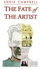
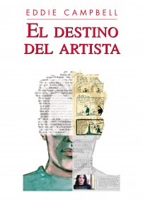
In my Fate of the Artist I sarcastically refer to deliberate irregularities of any sort in the physical text of the book, from a serif in the middle of a paragraph of sans say, to a whole illustration, as 'typographical anomalies'.

Umberto Eco employs as many as 221 images in his The Mysterious Flame of Queen Loana: 'an illustrated novel' (2005). At first it's all reproductions of covers and illustrations from pulp magazines, comic books and sheet music, and at the end, montages and adaptations that he made himself from the same kind of materials.
From the Village Voice article/interview
"Overwhelmed by faces and names, he (the protagonist, Yambo) escapes to his boyhood home in the Italian Piedmont, where he confronts a different inundation—the novellas and comic books from his adolescence. The second section has Yambo delving into this kitsch pool of superheroes, damsels in distress, and cartoonish fascists—relics of Italy's Mussolini generation.

'Obviously, when you write a novel about memory, you have the ghost of Proust blackmailing you,' says Eco. 'But this isn't the case here. Proust goes inside himself to retrieve personal memories, while my character has no personal memories, or madeleines, and is dealing with collective, mineral memorabilia. He's working with external material, not internal material.' Eco has reproduced much of this "mineral memory" in the form of illustrations—period book covers, movie posters, and propaganda material. "The graphics don't illustrate what I've already verbally described," he explains. "They have the function of an 'etcetera,' to give the impression of the abundance of material that I found in my attic."
Eco says he structured Mysterious Flame to mimic the free-associative behavior of electronic navigation."


Eco calls his anomalies 'etcetera'. Another term is loosely coined in the following interview with Jonathan Safran Foer, who has some sixty pages of photos and other novelties (not counting actual manipulations of type and blank pages) interpolated into his Extremely Loud and Incredibly Close (2005), including fifteen pages of flip-book at the end:
"RB:"The graphic tschotskes that are in this book...
...JSF: I am from a generation that was raised with the Internet... It makes a huge difference. And I was raised with a different kind of television and music. Music for example that depends very much on borrowing from different traditions, sampling pieces of other music and overlaying different rhythms and melodies and I think that is reflected in my writing. It was not intentional and it was not an attempt to reflect something about the culture in which I grew up, but it's what I know. And I think that comes across in the typography and in the style in the combination of voices. The world is more of a collage everyday."


I'm sure we're all talking about the same thing.

Labels:

Friday, 26 January 2007

Typography.

I've been following my own chain of connections on the subject of typography. It started with The Lunar Men (2003) by Jenny Uglow. With regard to subject matter, here's an excellent review.
It's the 18th century, my favourite time in the history of the world, an age 'when great men were as common as gooseberries'. A couple of hundred pages into it I found myself riveted by a thought.
"The journeys of men who profoundly dissent do not end with death... After the house is sold in 1788, the small conical museum is removed, and so, the owner thinks, is the body..." (Uglow narrates, at some length, the peculiar story of the movements of the remains of John Baskerville, the great 18th century type designer.) "Finally, in 1898, he moves to Warstone Lane in the middle of Birmingham's jewellery quarter. He is still there now. I think. And his beautiful type lives on, and you are reading a version of it in this book."

The text of this paperback book is 'aware' of the type in which it is set!

Conventionally, the text of a book is completely unaware of its typographical environment. That kind of thing is decided after the author has handed the work in, it's been proofread, and she/he's too busy working on her/his next one to be available for consultation on such matters.
Later, a similar event.:
"The following summer, in front of a crowd of a hundred and fifty thousand, he (Captain Vincenzo Lunardi) arranged to take the famous beauty and actress Mrs Sage, and their friend George Biggins -amateur chemist and invetor of the coffee percolator- into 'the blue Paradisial skies', as shown on the cover of this book."
I hadn't read Uglow's work before (to my shame) and checked to see how she could have pulled such marvellous tricks. Thus I note that she works as an editorial director at a big publishing house, which I guess would give her the inside track on getting a book done exactly as she wanted it.

Mark Danielewski didn't have that advantage when putting together his House of Leaves (2000). (interview)
"We were heading for a train wreck, and (Pantheon) wanted to do it a completely different way — or didn't want to do it. So I actually, on my own dime, flew to New York and set up shop. They found a freelance computer on one of the floors... and I worked on it. It took me three-and-a-half weeks."

The interviewer is naturally incredulous that it could have been achieved in that time:
"The labyrinth section (the most complex section of the book) took, like, nine-and-a-half months to storyboard," Danielewski says. "So it was almost like a shooting schedule."
Leaves is a baroque extravaganza of typographical liberties. I like the way he composes endless lists of architects names or examples of architectural styles or technical terms, which seem pointless from a reader's point of view, until you realize that he has used the sheer physical density of the type to create walls and passageways or, by having a square of text mirror-reversed on the flipside of a page, blind windows.

For anone who needs an idea of what House of Leaves is 'about', I guess it's a psychological horror story about a house that goes wrong. Here's the first chapter transcribed out of its typographical environment, which is how most prose expects to get around in the world.

Labels: ,

Thursday, 25 January 2007

FROM HELL: 5/5

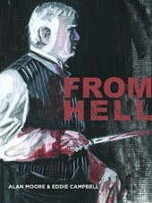
First of a couple of scenes from Alan Moore's FROM HELL scripts that the movie people liked enough to include in the FROM HELL film.


Chapter 5
PAGE 5.
PANEL 1.
ONCE AGAIN, THE PAGE IS DIVIDED UP INTO THREE HORIZONTAL PANELS, EACH TAKING UP A FULL TIER. IN THIS FIRST PANEL WE HAVE A CLOSE UP SHOT OF POLLY NICHOLS, ASLEEP, TO MATCH THE IMAGE OF THE SLEEPING WILLAIM GULL THAT CLOSED OUR LAST PAGE. SINCE THE NEXT SIX PAGES DEPEND TO SOME DEGREE UPON THE RHYTHM OF THE ALTERNATING CROSS-CUTS BETWEEN GULL AND POLLY, MAYBE IT WOULD LOOK GOOD IF YOU FOUND SOME SIMPLE VISUAL WAY TO DIFFERENTIATE BETWEEN THE WORLDS OF THE TWO CHARACTERS. PERHAPS, FOR EXAMPLE, YOU COULD UTILIZE A LOT OF EMPTY WHITE SPACE IN THE IMAGES OF GULL, WHILE WITH THE SHOTS OF POLLY YOU COULD MAYBE USE THAT LITHOGRAPHIC CRAYON OR WHATEVER IT WAS THAT YOU USED IN CHAPTER 2, WHICH WOULD GIVE A FLICKING DARK-LIGHT-DARK-LIGHT-DARK RHYTHM TO THE VISUAL PROGRESSION OF IMAGES. AS EVER, IT’S ONLY A SUGGESTION AND THE END RESULT IS UP TO YOU. HOWEVER YOU DECIDE TO HANDLE IT, THIS PANEL SHOWS A CLOSE UP OF POLLY, ASLEEP. NOW, I CAN’T FIND ANY REFERENCE TO EXACTLY WHERE POLLY STAYED ON THE NIGHT OF THE 29TH /30TH OF JANUARY, ALTHOUGH IT WOULD SEEM THAT IT MUST HAVE BEEN IN EITHER THE COMMON LODGING HOUSE AT THRAWL STREET, OR IN THE COMING LODGING HOUSE AT FLOWER AND DEAN STREET. BASICALLY, WE CAN TAKE OUR PICK. WHAT I WOULD LIKE TO SHOW, IF IT SEEMS RIGHT TO YOU, IS THE PRACTICE OF “SLEEPING ON A CLOTHESLINE” WHICH WAS SEEMINGLY COMMON IN THE DOSS HOUSES OF THAT PERIOD. THE VAGRANTS UNABLE TO AFFORD EVEN THE LOWLIEST BED FOR THE NIGHT WOULD PAY A PENNY TO SLEEP SITTING UP IN A ROW AGAINST THE DOSS HOUSE WALL WITH A LENGTH OF CLOTHESLINE STRETCHED OUT IN FRONT OF THEM TO STOP THEM FALLING FORWARD COMPLETELY IN THEIR SLEEP. I’D LIKE TO INCLUDE IT BECAUSE OF THE STRANGENESS OF THE IMAGE, AND ALSO BECAUSE IT WOULD PROVIDE A MORE STRIKING CONTRAST WITH THE IMAGES OF WILLIAM GULL AWAKENING TO A SUNNY, WELL-FURNISHED BEDROOM IN BROOK STREET. ON THE OTHER HAND, IF YOU HAVE A BETTER IDEA, OR A DIFFERENT DEPICTION THAT YOU’RE MORE COMFORTBALE WITH THEN PLEASE STICK IT IN. IF YOU DO DECIDE TO GO FOR THE CLOTHESLINE IDEA, HOWEVER, THEN WHAT WE SHOW IS AS FOLLOWS: HERE WE SEE A CLOSE UP OF POLLY, WHO IS SITTING WITH HER BACK TO THE DAMP AND STAINED DOSS-HOUSE WALL, WHICH IS OVER TOWARDS THE RIGHT OF THE PANEL. SHE IS ASLEEP, FULLY CLOTHED, AND THE UPPER HALF OF HER BODY SAGS FORWARD AGAINST THE STOUT ROPE OF THE CLOTHESLINE, HER HEAD NODDING DOWN ONTO HER NARROW, BIRD-LIKE BREAST. PERHAPS A THIN STRAND OF SOUR DROOL ESCAPES ONE CORNER OF HER MOUTH AND SETS OUT ACROSS THE BIG ADVENTURE OF HER CHIN. HER EYES ARE CLOSED AND HER FEATURES SLACK. HER HAIR IS AWRY, WITH THE MOUSEY STRANDS ESCAPING WHISILY FROM THE BUN OF HER HAIR THAT IS SLOWLY LOOSENING AND UNRAVELLNG AT THE BACK OF HER HEAD. SHE IS RIGHT AT THE END OF THE LINE OF SLEEPERS, AND THUS THE ONLY ONE THAT WE CAN SEE HERE. TO THE LEFT OF THE PANEL, WE CAN SEE WHERE THE END OF THE CLOTHESLINE IS FASTENED TO EITHER A POST OF A RING IN THE WALL. A PAIR OF MALE HANDS ARE ENTERING THE PANEL FROM OFF, UNTYING THE KNOT THAT HOLDS THE CLOTHES LINE WITH DEFT AND PRACTICED FINGERS. THE INTERIOR OF THE DOSS HOUSE ROOM HAS A MIASMIC AND SOOTY DARKNESS, ALTHOUGH CHINKS OF MORNING SUNLIGHT FALL UPON THE WORN THREADS OF POLLY’S CLOTHING FROM SOMEWHERE OFF PANEL, WHILE SHE DREAMS ON. UNCONCERNED WITH POLLY’S DREAM, THE HANDS OVER TO THE LEFT OF THE PANEL CONTINUE TO UNTIE THE ROPE THAT IS HOLDING UP HER SLEEPING FORM.
No Dialogue

PANEL 2.
NOW A SHOT OF WILLIAM GULL. WE HAVE PULLED BACK FROM OUR CLOSE UP IN THE LAST PANEL ON PAGE FOUR, AND NOW WE CAN SEE MORE OF THE LARGE BEDROOM. THE BAND OF SUNLIGHT THAT WE SAW PROGRESSING UPWARDS ACROSS GULL’S BELLY HAS NOW REACHED HIS FACE, AND HIS EYES OPEN. HE PERHAPS EVEN STARTS TO SIT UP A LITTLE, PROPPED UPON HIS ELBOWS AS HE LOOKS AROUND THE ROOM AND ORIENTS HIMSELF. BESIDE HIM, AND FURTHEST AWAY FROM US AS WE LOOK TOWARDS THE BED HERE, MRS. GULL SLEEPS SOUNDLY, RESTING ON HER SIDE AND FACING AWAY FROM US. AS GULLS EYES MOVE ACROSS THE ROOM HIS FACE HAS NO EXPRESSION. THE ROOM IS LIGHT, AIRY AND EXQUISITELY FURNISHED, ACCORDING TO THE TASTES OF THE TIME. THE SUNLIGHT FALLS IN SLATS ACROSS THE PATTERN ON THE WALLPAPER. BESIDE THE BED, ON GULL’S SIDE, RESTING ON THE BEDSIDE TABLE, ARE A PAIR OF SMALL, WIRE-RIMMED READING GLASSES, A BOOK WITH A MARKER BETWEEN ITS PAGES, AND A BAG OF GRAPES.
No Dialogue

PANEL 3.
WE CUT BACK TO POLLY IN THE DOSS HOUSE. HERE, WE HAVE PULLED BACK A LITTLE FROM OUR SHOT OF HER AT THE TOP OF THIS PAGE, SO THAT NOW WE CAN SEE HER SITUATION MORE CLEARLY. WE CAN SEE THE OTHER VAGRANTS SITTING TO POLLY’S LEFT, TOWARDS OUR RIGHT IN THIS PANEL. THEY ALL SIT FACING US, AND ACROSS TO THE LEFT OF THE PANEL WE CAN SEE THE LOWER HALF OF THE MAN WHO HAS JUST UNTIED THE CLOTHESLINE, LETTING IT GO SLACK. AS HE DOES THIS, THE SLEEPING PAUPERS ARE ONCE MORE SUBJECTED TO THE NORMAL COURSE OF GRAVITY, AND ALL TOPPLE FORWARDS WITH A START, POLLY INCLUDED. HER GUMMY EYES COMING OPEN AS SHE WAKES TO FIND HER FACE PRESSED AGAINST THE FLOOR BOARDS. THE PANEL IS ARRANGED SO THAT POLLY IS OUR VISUAL FOCUS, WITH MOST OF OUR ATTENTION UPON HER AS SHE IS RUDELY AWAKENED IN THE CUSTOMARY FASHION. THE EXPRESSION CAUGHT BRIEFLY IN HER OPENING EYES IS ONE OF A SORT OF DISAPPOINTED BEWILDERMENT.
No Dialogue

Labels:

Wednesday, 24 January 2007

A Reader's Progress.

Sketch of the Snooter, whom you may remember from such books as After the Snooter, doing what he does best. Being an annoying bastard.


This is just pulled from my sketch folio.The Snooter's hand appearing to extend Campbell's nose is entirely accidental and means nothing. I think. First to ask for it in comments can have the drawing in the mail.
* * * *

Excellent gallery of the works of William Hogarth


I was talking about William Hogarth the other day and it carried over into the comments to the extent that I felt I owed a few more words on the subject. I was critical of the notion that "Hogarth’s sequential narratives... consolidated the graphic experiments of earlier prints and established a complex language of graphic devices that artists have borrowed from ever since". This has become accepted as fact among too many comics scholars.

My argument essentially is that it can't be so as I have never met a comics person who would know how to read Hogarth properly (myself included) let alone be influenced by his work. In support of my statement I quote this article by Martin Heusser reviewing
Reading Iconotexts:From Swift to the French Revolution. Peter Wagner. London: Reaktion Books, 1995.
"Reading Iconotexts is a study of 18th-century prints and their inscriptions, which Wagner prefers to call iconotexts in order to emphasize the high degree of mutual interdependence and interpenetration between word and image which they exhibit. In fact, Wagner claims that they form a specific genre, because in them, neither text nor image is free from the other."
"Reading Hogarth "right" is difficult for two reasons, one intrinsic and one extrinsic. On the one hand, these illustrations are in and of themselves heterogeneous; they represent both a critique and an enactment of 18th-century commercialization of culture and taste. On the other, modern interpretation suffers from a severely distorted view, because, over the generations, the immensely broad range of 18th-century cultural phenomena has been pared down to a very narrow body of samples.
Taking Hogarth's well-known first plate of
A Harlot's Progress as an example (shown above), Wagner convincingly shows what he means. To "understand" this picture - that is, to get the maximum information out of it and to grasp it - we have to be capable of decoding a wealth of sign systems running criss-cross through its visual appearance. On a pictorial level, we find both the re-enactment and the subversion of traditional subjects as diverse as the Penitent Harlot, the Choice of Hercules and the Visitation. Similarly complex but more difficult to trace and recognize are those references to what must have been first-rate contemporary tabloid material offered by the three central human figures: the rapist Colonel Charteris, the notorious prostitute Kate Hackabout, or the debauched Mother Needham. Then, there are the numerous emblems and puns present in the guise of seemingly accidental elements such as the dead goose and the bell, which may both well refer to the fate of the silly goose who may soon be a dead belle. By the same token, the horse whose excessive appetite causes it to knock over a pile of utensils demonstrates ad oculos how the consequences of gluttony affect the careless without delay.
The quasi infinite number of allusions generated by the quite finite space of Hogarth's engraving proves Kristeva's point that references do indeed evoke a "universe" of significances... "


Here's an extended argument over the details of the same image by two experts: READING HOGARTH By Ronald Paulson, Reply by Richard Dorment. They're making as much progress as you and I.

Labels: , ,

Tuesday, 23 January 2007

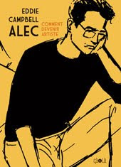
What the first version of Alec looked like.


It looked just like that. I thought it was lost forever. Then Hayley Campbell called to say she was rummaging around in my parents loft up in the north of England and she'd found this object (among many other wondrous objects) which she described to me. A Daily Mirror racing diary from 1979, with so many loose pages and napkins and beermats and tickets for this and that all inscribed with tiny narratives and stapled into it until the thing had taken on an almost cylindrical shape. It could onty be one thing. Thus it was that it arrived in the package from Hayley Campbell previously mentioned on this blog on jan 11.


I had carried it around in my coat pocket at first until I realised it wasn't going to be big enough to record the epic I wanted to put in it. So I'd write on whatever paper was to hand and then staple it in when I got home, sometimes three or four sheets of typing paper inscribed on two sides in tiny lettering. All of it recording everything I'd seen and heard and done that I thought was worth recording. I haven't read any of the contents yet, for fear I won't like myself when I was twenty three, or worse , that I'll find I've lost it all in the interim.


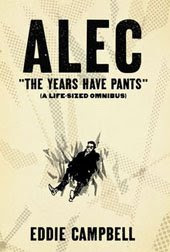
This object, containing my daily ramblings and observations through '79 and the beginning of '80 was the source of my first actual book, Alec:The King Canute Crowd, which was published in three parts in '84, '85, '86, and then collected with an unpublished fourth part in a big book from Acme/Eclipse in 1990. I put out a new edition on my own imprint in 2000, which is still available from Top Shelf. Today however, is a day for celebration as I have just recieved a handful of copies of the first French edition, from Ca et La. This is the first time the art has been reproduced digitally, believe it or not, and that involved quite a bit of hard graft to get it all to work, what with all those dot patterns. Here is the very first version side by side with the very latest.


While I was talking to Hayley Campbell I said, "And while you're up in the attic, if, among the wondrous objects, you find my painting of Anne in the nude, can you secure it in some way so that nobody else finds it. Okay, Hales, I'll talk to you again soon, and thanks for roning."

Labels: ,

Monday, 22 January 2007

FROM HELL: 11/22

Another favourite from the pages of Alan Moore's FROM HELL scripts. I like this one because it's the opposite of a typical page of Alan Moore script. There is very little detail (534 words compared to the 1448, 1572 and 1009 of three of the peviously shown pages). In fact, by the end of it, when he makes the crack about the (famous) bridge, we get the impression that Alan might have been feeling a bit irritable that day. If it was time for tax-accounting I could usually detect a rumble of aggravation in the scripts.


Chapter 11
PAGE 22.
PANEL 1.
NOW A SEVEN PANEL PAGE, WITH THREE PANELS ON EACH OF THE UPPER TIERS AND ONE BIG WIDE ONE ON THE BOTTOM. IN THIS FIRST PANEL WE SEE DRUITT DRIFT AIMLESSLY PAST US IN THE FOREGROUND, EYES DARTING ABOUT HIM FOR A GLIMPSE OF SOMEONE HE KNOWS. HE LOOKS TERRIBLY OUT OF PLACE. BEHIND DRUITT AND UNOBSERVED BY HIM HERE WE SEE A MAN LEANING AGAINST THE WALL IN THE IMMEDIATE BACKGROUND AND SIPPING A DRINK. HE IS GAZING SPECULATIVELY AT THE UNAWARE DRUITT, AND WE CAN SEE THAT IT IS MELVILLE MACNAGHTON, WHO WE MET EARLIER AT THE SUMMIT CONFERENCE WITH ANDERSON AND MONRO.
No Dialogue

PANEL 2.
SAME SHOT, BUT HERE MACNAGHTON SPEAKS TO DRUITT, CAUSING THE YOUNG BARRISTER/TEACHER TO TURN AND LOOK AT THE SMART LOOKING EX-MILITARY MAN. MACNAGHTON SMILES ENGAGINGLY AS HE SPEAKS, MAYBE EXTENDING HIS HAND FOR DRUITT TO SHAKE.
MACNAGHTON: Hello, there. You look as if you feel the way I always do at these
affairs: Fish out of water, eh?
MACNAGHTON: Name’s MacNaghton. Live across the street at number nine.


PANEL 3.
LONGSHOT OF THE TWO MEN NOW, FULL FIGURE AS THEY BOTH SHAKE HANDS. DRUITT STILLS LOOKS A LITTLE UNCERTAIN.
DRUITT: My name’s Druitt. Do you like it? Chelsea, I mean.
DRUITT: Not my name.
MACNAGHTON: Chelsea? It’s alright, I suppose. Too many art-wallahs for my
liking. What do YOU do?

PANEL 4.
CLOSE IN ON THE TWO OF THEM NOW, PERHAPS IN A SIMILAR SHOT TO PANELS ONE AND TWO. DRUITT IS STILL GLANCING ABOUT HIM NERVOUSLY EVEN AS HE SPEAKS TO MACNAGHTON. MACNAGHTON REGARDS DRUITT COOLY AND SCHREWDLY, WEIGHING THE MAN UP.
DRUITT: I’m uh, I’m a teacher. And a barrister.
DRUITT: I don’t really socialize a lot, as a rule. O-Other than through
cricket, I don’t suppose I have that many friends.
MACNAGHTON: Lone wolf, eh?

PANEL 5.
SAME SHOT, STILL LOOKING UNCOMFORTABLE, DRUITT MAKES HIS APOLOGIES WHILE MACNAGHTON DOES HIS BEST TO LOOK UNDERSTANDING.
DRUITT: I suppose I am. I’m afraid I don’t really feel at ease here. Perhaps
I should be going.
DRUITT: Please don’t think me rude. I’m very glad I met you.
MACNAGHTON: Mutual, dear chap, I assure you.

PANEL 6.
SAME SHOT, BUT NOW DRUITT HAS GONE, LEAVING MACNAGHTON STANDING THERE BY THE WALL. MACNAGHTON TUGS HIS MOUSTACHE AND GAZES WITH A FROWN OF INTEREST AND CONSIDERATION IN THE DIRECTION THAT DRUITT HAS DEPARTED IN. HE LOOKS PENSIVE AS HE CONSIDERS WHETHER DRUITT ISN’T JUST THE MAN HE AND HIS COLLEAGUES ARE LOOKING FOR.
No Dialogue

PANEL 7.
NOW, IN THIS FINAL WIDE PANEL, WE HAVE A SHOT OF DRUITT WALKING HOME, SOUTH ACROSS ONE OF THE BRIDGES. I’M NOT GOING TO SPECIFY WHICH ONE INCASE YOU GET ALL SMART ON ME AGAIN AND DIG UP REFERENCE TO PROVE THAT IT WAS BEING PAINTED AND VARNISHED THAT PARTICULAR NIGHT OR SOMETHING. IT CAN BE ANY BLOODY BRIDGE YOU WANT. WE ARE DOWN AROUND THE LEVEL OF WATER, LOOKING UP TOWARDS THE BRIDGE AS DRUITT’S LONELY FIGURE WALKS ACROSS IT, ALL ALONE. HE GAZES DOWN MOURNFULLY INTO THE WATER, LITTLE DREAMING HE’LL BE BENEATH IT BEFORE THE YEAR IS OUT.
No Dialogue

Labels:

Sunday, 21 January 2007

Short post; cat out of bag.

In the nearly two months I've been doing this daily blog, only one post attracted zero comments. Regular commenter Nathalie has just gone back and unblemished it.
"Looking back on this post, I think you might also enjoy this little creature and the site it came from."
My original post was about sculptor Christopher Trotter and his scrap metal constructions which appealed to me for his sense of humour, much like the links above. There are a couple more of his works here (the kangaroos, about a dozen items from top; they're in the middle of a busy city sidewalk) and here.
* * * *

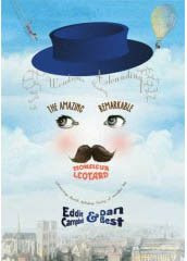
Since I'm running late today and only have time for a short post, here's a piece of news. The book which I am currently working on is now 41 pages to the good, in full painted colour. If the schedule is met, it will be out in mid 2008 from First Second Books. It's title :
The Amazing Remarkable Mr. Leotard.
I'd tell you more about it but I've already gone so far astray from the original pitch that I don't want to worry my editor.

Labels: ,

genre fiction