Saturday 14 July 2007

“It perhaps was not the best way to get on, but I couldn’t help myself.”

Seeing George Melly off last week led to my pal mr j doing some digging to figure out what happened to Flook, the comic strip to which Melly contributed. Wally Fawkes was the artist on it and he would get his more wordy pals in to write it.

Here's an excellent BBC article on Wally Fawkes' retirement from cartooning, from 17 aug 2005. Farewell blues
Flook began life as a children's strip in 1949, but over the years, and with the help of Humphrey Lyttleton, George Melly, Barry Norman, Barry Took and Keith Waterhouse, among others, it became a social and political satire very much for the adults.
Despite its following - which included Baroness Thatcher who said it was "quite the best commentary of the politics of the day" - the Daily Mail decided in 1984 it no longer wanted Flook. The only warning its readers got was a strip in which a blue plaque appeared on the wall: "Flook lived here 1949-1984." Robert Maxwell saved the strip for the Mirror at his wife's behest, but only briefly, and with that, a unique record of post-War Britain ended.
But Trog's political commentary went on for another 20 years.. Now failing eyesight has forced him to put down his pen at the age of 81.


Trog calls it a day from Camden New Journal July 22 2005
Wally has always lived a double life. Being a virtuoso jazz musician as well as a talented artist meant he had two callings. He says: “To cartoonists, I was always the one who played jazz. To musicians, I was always the one who drew cartoons.”
Flook’s adventures with his friend Rufus became an overnight hit. At a reception soon after its launch, Lady Rothermere approached Trog and asked: “How is your lovely little furry thing?”
Trog replied: “Fine thank you. How is yours?”
“I quickly left,” he says. “It perhaps was not the best way to get on, but I couldn’t help myself.”


This Melly obituary at Barista last week gives George's contribution to the strip as a fifteen year run. It also shows a vintage sample.

As for the samples above: I used to pick up the Daily Mail circa 1970 for the Peanuts on the back, and I'd save the other strips too, Flook, Fred Bassett and Tiffany Jones, if memory serves, from the entertainments page inside. Being 14 I never really understood Flook at the time, and I failed to hold onto the cuttings. So to my horror I found that the only tear sheet in my historical files is this one, a page from the Penguin book of comics, split in two here, which I guess is enough of an antique in itself for these to have not been seen by most of my readers. At left is a Punch cover by Fawkes from 1977.
***********

I wonder if it was his sense of humour rather than his eyesight that Wally was losing. Eh? nahhh.
hayley campbell sent this link under her own headline 'Oldies to get humour bypass.'
Grumpy old people 'can't help it'-BBC News- 13 July
People aged over 65 may find it harder to understand jokes. Grumpy old men may not be able to help it, as age could affect their sense of humour, scientists have found. A study by Washington University in St Louis found older people find it harder to understand jokes than students. The authors say the finding should be taken seriously as laughing has been linked to health benefits such as boosting circulation.
Reading the comments on this, lots of grumpy oldies on the defensive. Frankly, i think there could well be something in it. I've observed it over the years. People generally lose their levity as they get one day closer to death. And I don't exclude myself. I bet you remember me when I was a bright and cheerful chappy.

And finally. If, on your relelntless tread toward that last day of mortal irritability, you want to attempt to a note of gaiety, our pal Nathalie sends this link: PUSHING DAISIES, a mortuary novelty shop.
Skull Wedding Toasting Glasses: Love Never Dies
Bride and Groom Skulls celebrate love everlasting. These handpainted champagne flutes feature a skull bride and groom surrounded by a band of bones and flowers. How romantic!
Food To Die For - recipes and more!
The Recipe's To Die For cookbook contains 180 pages of recipes, etiquette, and anecdotes. It is fully indexed and profusely illustrated with black-and-white photographs of the Old City Cemetery. These books are signed by the author.
Coffin Luggage
Now traveling in style is is not a problem with this unbelievable coffin shaped carry on bag. This is the most amazing piece of luggage i'v ever seen! Made from 100% leather...
Hayley! I don't get any of this. Come down here and explain it to me.

Labels:

Friday 13 July 2007

Pour me a bath... and another.

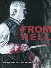
I see it as part of the artist's task in an illustrated work, to catch any practical issues that the writer may have overlooked. When it's sitting in front of you in pictures it can be easier to see the obvious. In From Hell I was always pestering Alan to establish the nature of Netley's possession of a coach and horses. He obviously didn't have the means to own them, certainly not the way I was drawing the poor bastard. Therefore, was he borrowing a carriage at night that he had access to in working hours? Who did he work for? Where were the stables and the garage for the vehicle? etc. Alan's mind was on bigger matters and we never aswered any of that.
Here are two pieces of art that I was particularly pleased with from the Black Diamond Dtective Agency, both based on photo reference. In the script, Hardin (or Hardon as we call him around our house) was running around Chicago for what must have amounted to a week or more. I was starting to consider the hygeine issues. Not having to pass everything back to a scripter this time I just gave him a bath. I found out that the first public bathhouse in Chicago was built and opened in 1894 and would thus have been very new at the time. The photo of the one I used was in fact the third such establishment in the city. I found it online, though I'm damned if I can find it again. I didn't actually show him wet at this stage as later in the book I knew we'd see him in the tub at Ed's appartment, which must make him the most fastidiously clean of old-style American heroes.


Below, I was pleased with this tramcar. The trams were still running around Glasgow when I was a kid. And the trolley buses too.

************
Now, I didn't make this, I just stole it. Or at least, it came in a circulating email. But I think the person who made it will probably judge its success by how far it travels under its own steam. And if you know who, tell us so we can applaud (or apologise for nicking it). Apart from enjoying my blog, How's your interest in today shaping up?

Labels:

Thursday 12 July 2007

Breakfast news.

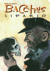
F rom the files. I used to design my own wine label every Christmas. I'd buy a case of unlabelled wine, or 'cleanskins', and glue my own label onto each bottle. This particular year's booty was a red obviously. Under our auspices it became 'Blood of Bacchus'. I'm sure it went down well. I can't remember what year it was, what region it came from, or what grape went into the making of it. Nobody presented me with tasting notes. No anecdotes, no problems, no phone calls, no rescue missions, no involvement of the constabulary, no nothing.
Why can't it always be like that ?

(unlike the next story)
Lee Paul C. in comments yesterday linked to: Drunk horsejacker leaves two injured-By Ben Parsons
A drunk woman caused chaos when she hijacked a horse-drawn wedding carriage and ran down a one-legged man on a mobility scooter. The shire horses were standing outside a pub when the woman and her daughter clambered aboard and whipped them into bolting. They knocked a disabled man off his scooter and ran over one of the horses' owners as the animals headed off down the road.
I must be getting old, as I'm just thinking about all the needless damage.

*******
Noticed by our pal Chris Breach: The indefatigable Everett True is blogging at the Village Voice and is lamenting the passing of PUNK PLANET magazine:
I appreciated the fact it didn't slip into ready cynicism (people confuse criticism with cynicism too often) and its questioning heart, its thirst for knowledge, the way columnists such as Jessica Hopper would write, unencumbered by the desire to impress. I liked the fact it gave over whole issues to the print media, visual artists. It mattered to me: it was an ideal to aspire to. And now it’s gone after 80 issues and 13 years
They've illustrated the piece with my Nick Cave cover for #57.
********
The traffic at Johnny C's blog goes off the graph when he shows all the pictures from this old article:
In 1947 Life Magazine asked some famous comic strip artists to to draw their famous characters while wearing a blindfold.
"Artist Graff even managed to get necktie dots on coat lapel and cigaret in left ear."

(link via Hemlockman)
******
Police seize magic trick from preacher.-Jul 10.-KAMPALA (Reuters)
The Electric Touch device is usually sold in magic shops alongside card tricks, magic coins and disappearing balls.
"People could be duped to think it is a miracle," the New Vision quoted Civil Aviation Authority security chief Herman Owomugisha as saying.

***********

Labels:

Wednesday 11 July 2007

"I don't like drunks in the first place and in the second place I don't like them getting drunk in here..."

Saw it in the bookstore, had to have it (published march 2007). When I went through a period of obsession with the American 'hardboiled' school of crime fiction, thirty years ago, it tended to boil down to three important writers; Dashiell Hammett, Raymond Chandler, Erle Stanley Gardner. In the way of things now, there is a greater sharing of the loot, and all those fellows who were given the bum's rush before, now get invited back in. Fourteen writers are represented by one story each, including all members of the well known triumvirat above. There are 512 pages and the original publication dates range between 1926 (Hammett) and 1942 (Woolrich).
Carroll John Daly was apparently a big name in his time but fell by the wayside. (article: In Defense of Carroll John Daly) Now I get to take the measure of his original reputation. His story in here, retitled from its original 'The Flame and Race Williams' for some unstated reason, is the longest in the book at 140 pages, and was agreeable enough as these things go. It should be said of course, that it is probably necessary to approach most of the stories in this book, if not with a driver of academic enquiry, at least with a back seat passenger of historical curiosity.
Cornell Woolrich had always been hinted at as a possible great. So many of his things made great movies, and Hollywood ain't finshed (e.g.Banderas and Jolie in Original Sin (1947 book)). His story in here is one of the memorable ones, a peculiar manipulation of fate that depends quirkily upon coincidence at exactly the point when the writing manuals tell us to avoid it, and I like it for that very reason, and others of course.
Paul Cain is a writer I had never read before and his short piece in here impressed me. It opens the book:

I'd been in Los Angeles waiting for this Healey to show for nearly a week. According to my steer, he'd taken a railroad company in Quebec for somewhere in the neighborhood of a hundred and fifty grand on a swarm of juggled options or something. That's a nice neighborhood.
My information said further that he was headed west and that he dearly loved to play cards. I do, too.
I'll take three off the top, please.
I missed him by about two hours in Chicago and spent the day going around to all the ticket-offices, getting chummy with agents, finally found out Healy had bought a ticket to LA, so I fanned on out there and cooled.
Pass.


Raymond Chandler is represented by Red Wind. With Chandler you always feel that you're getting more than just prose, and I'm not just referring to his use of language. I often sense of poetic mystery in Chandler. This story is a mystery whose solution I had to strain to grasp, and having been grasped, I found myself explaining it to a friend, finding that my grasp of it was only temporary. Here's a great chandlerism from the second page:

The kid said:' I don't like drunks in the first place and in the second place I don't like them getting drunk in here, and in the third place I don't like them in the first place.

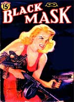
Almost all of the stories appeared originally in the celebrated pulp magazine Black Mask, the scholarship of which has lately acquired a significant online presence.

And of course we lament the fading of the Pulp mags. Nothing lasts forever. They gave way to the modern paperback, which must be understood as more than just a change of format. This article is informative: Raymond Chandler and the Mass Market: The Effects of the Paperback Revolution on Professional Authorship in America.
*********

Regarding my interest in the crime story, the piece I spoke of in my post of 3 feb can be seen in the new Deevee which goes on sale today.

Labels: ,

Tuesday 10 July 2007

"That's what I call a whoppin' big rabbit!"

F or some time we thought we had lost this, but I came across it yesterday while looking for something else. Bill Peet was a an author of twenty-eight Kids' books whom I had never heard of until I had kids of my own. He was Disney's top story man for many years and the Jungle Book (1967) was the last thing he worked on there (greatest Disney movie ever in my humble. They're still discussing it as of yesterday at imdb). Peet is another one of those people who has died since i last went looking for him, in 2002. There's a website dedicated to him and on it you'll find a bunch of interesting things including his drawing of himself as a young chap presenting a storyboard to Disney himself. There are a couple of good photos on that page too.
Huge Harold was first published in 1964. Harold is a rabbit who grows too big to be a rabbit and has to leave home and find his way in the world. Like many of Peet's books it's written in this rhyming couplet thing he had going:

Harold was spotted by Orville B. Croft,
Who heard some loud snoring way up in his loft.
"Well now," he said, "Doggone and dagnabit!
That's what I call a whoppin' big rabbit!"
Then all at once he heard someone shout
And he opened a window and poked his head out.


Peet's style was jaunty and loose. There's a page on the right with Harold hiding in a tree;
Harold ends up pulling buggies in those races they have in the US.

They looked up the rules but they couldn't find one
That said, "It's not fair for a rabbit to run."
So he ran in the race and won going away
And became a champion trotter that day.


Here is a page about the book including Peet's comments and preparatory sketches.

We have a couple of Peet's other books here but our money was always on the rabbit.
**************

I don't think this article tells us anything we can't figure out for ourselves, but it's covering ground I have occasionally trod upon here (see 'new books' in the sidebar):
Young writers with alternative storytelling techniques are quickly becoming today's literary . . . Transformers-By Brandon Griggs -The Salt lake Tribune- 07/09/2007
Such experimentation in content and form is showing up increasingly in recent fiction by authors in their 20s and 30s. This new breed of writers, looking for fresh ways to construct narratives, think nothing of breaking up prose with graphics, maps and comic strips. They vary their font sizes, add extensive footnotes, format their text into strange shapes on the page. Sometimes they even run the text upside down.
(link via Tom Spurgeon)

Labels:

Monday 9 July 2007

About drawing paper. (part 7- final)


A note about the translucent ivory board I mentioned before. Looking in my archive I see that I started using it almost eactly at the time I found myself without a day job. I recall the old chap in the art shop having a word with us (Dave Harood and me) and suggesting that this other card might suit our purposes just as well as the expensive bristol board we were buying. It suited me fine. In contrast to the bristol it's whiter, almost blue white, and I've photographed two for comparison above, being pages from Alec: The King Canute Crowd, from 1981 and 1986. I adjusted the image in curves for the purpose of showing up the contrast. Later when I lived in Brisbane and found a supply of it, I used to order it in big slabs and have it delivered onto my verandah by the manufacturer, and I say this in case I gave the impression that I just steal whatever the kids bring home from school for their projects. I started a fad of sorts and Evans and Mullins used to come around for armfuls of the stuff at intervals. Having an ultra smooth finish it was right for all the penwork I was doing during this period, so long as I didn't gouge, so that From Hell and After the Snooter and all of Bacchus were drawn on it. Either the translucent smooth or on special occasions the textured as illustrated earlier. On the other hand, it's not suited to conventional comic book brush inking with 'feathering', having no tooth or grip, though Pete could ususally pull it off well enough if we needed that kind of effect. I started buying directly from the manufacturer after there was a dip in quality in the stuff I was buying at the art store, with ink lines tending to bleed slightly, and I fretted for weeks over the problem. In fact, I seem to recall it was Mick Evans who found the solution of buying direct for me. Paper quality is not a matter to be taken lightly. I'd get four A3s out of each big sheet. It was one of Anne's jobs to cut it and rule it up to order using the different templates I had cut for each job type, i.e. 9-panel grid, or 'comic book' format or special other (which is why it was no good to me to have stuff printed with blue-lines, though in retrospect, From Hell went on long enough that it might have been a good idea for that template at least.)

Another thing about these old pages, and these are the original and only, is that I once read that I had redrawn almost 60% of the art. There are some touches of white on the page on the left, mostly some fine tuning of jaw and hair lines, but none at all on the page on the right, which is more typical of the whole book. The correction white always showed up bluish on the bristol and yellowish on the ivory.

p.s. Shawn in comments for july 6 queried my view on preservation. I'm certainly not cavalier about the issue, and you can see that the pages above are looking healthy after 25 years. Curiously though, there is a problem with the more expensive card, the bristol, because one of my publishers used a gum to put backing sheets on all the pages (many have abandoned attempts on them which may have confused the printer) which has reacted chemically with the card causing the beginnings of brown stains which caused slight problems when Preney photographed the pages in 2000. The cheaper paper, oddly, was not affected at all. On the page on the left above you can just about see the brown coming through from the back at the outer corners of the inked area. If your work is in any way successful so many people are going handle it over time and You have to allow that you can't control everything. I once got a cover original back that had been accidentally torn in half. The publisher was most apologetic and made good, which i thought was grand as they gave me more than I would have charged for the same original in good condition.
**********
Just received one of those circulating emails, The Kid from Eromanga. This was so well constructed (and very funny) I immediately thought to myself, what's the origin of it? Eric Shackle has already tracked its lineage, but I note this was a couple of years back. I may be the last person in the world to read it. Its variations as it travelled and its origin in Hillbilly Zeb from Texas are intriguing.
**********
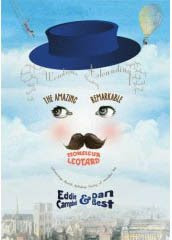
Well, I have now got to the end of The Amazing Remarkable Monsieur Leotard (I think I'll go with the French form). There are a couple of pages spare so I've gone back and inserted some new business between pages ten and eleven. I now have a month to get through it page by page and fix all kinds of problems, including continuity, logic, feeling lazy some days, etc.

Labels: ,

Sunday 8 July 2007

About drawing paper. (part 6)

Addendum to yesterday's post. This is the 'gold' paper I mentioned. I saved it for the page in The Black Diamond Detective Agency showing the flying exit from the the undergorund tunnels into the muted ochre glow of the morning sunlight. I've exaggerated the contrast in this scan of the back of the paper in order to show up that marbled pattern. If you've seen the page in question (124) you can almost imagine the composition forming in the abstract pattern you see here. The gouache white of the cloud of snow above takes on a very blue-cold quality against the warm ground. And once again, the brown gum-tape at the side. I only had one sheet of this, which means I must have spoiled the other (can't reacall). To continue the effect on the page following this one I had to sponge a page of stretched white watercolour paper with an ochre wash.

Labels: ,