Tuesday, 23 October 2007

As we say in our house

Posy Simmonds: the invisible woman -London Telegraph- 21/10/2007

The characters in her stories of middle-class life are known – and loved – by millions. But what of Posy Simmonds herself? Sabine Durrant meets a cartoonist who is never happier than when eavesdropping on the bus
Posy Simmonds, the writer and cartoonist, lives in a quiet Georgian square between King's Cross and Islington in London.
Having male siblings, she says, may well have influenced her sense of humour. 'I think we were all rather lavatorial. My grandmother had a way of changing the subject whenever the talk got a bit salty. She'd say things like, "Oh, there's a squirrel." And this became a family joke. If somebody says anything a little bit… one of us still says, "Oh, there's a squirrel."
The three page article ends with a witty rejoinder to that phrase and I'm reminded of a book on my shelf, As we say in Our house compiled by Nigel Rees, presenter of the BBC4 radio show Quote...unquote. I see he was doing a live presentation of the same kind of thing earlier this month in Warwick.
I've never heard the show, but I enthusiatically picked up the book (published 2001) as it's a theme I've used a great deal in my autobiographical blatherings. Indeed I am always excited by the degree to which the members of close families occasionally share a private lexicon that can be close to being a whole other language. When I first visted the family of the wife of my bosom, I noticed that if one of them was heading out and another asked where they were going, it was customary to say "up on the roof to mow the lawn."
There's one we picked up from the Rees book that has become a favourite. If Anne accidentally overbuys a foodstuff, say marmalade, and we find that we have three identical jars all at once, it is now customary to say: "It's a good thing you went to the store before the hoarders got there."

Labels: ,

Wednesday, 10 October 2007

Articulating pictorial space.

I t's ironic that the most freely available examples of the work of cartoonist Jerry Robinson, who has had a long and illustrious career, are the Batman stories he ghosted under Bob Kane's name. He gets a royalty for them, so I guess he doesn't mind talking them up, as he did in the Comics Journal 2005 interview. It's been written about often enough that he became Kane's assistant in '39 when he was 17 and got the chance to draw stories completely solo from '42 on until '46 when he moved elsewhere. He drew around 23 of these solo outings. The earliest are an approximation of the standard Batman style, while the ones at the end suggest an artist who has arrived at an admirable facility and is coasting. Of the bunch in the middle, the plateau, the third volume of Batman Archives (first released in 1994) (reprinting stories from Detective comics monthly) has three. Beyond that you'd be picking up 230 page volumes for one 12 page story in each, and I'm sure I'm not the only one. Based on these three and a few others I have for some time considered Robinson the most advanced comic book artist of this period. He's only 21 at this time, and I'm envious of what he's doing here.


Here's a full page, a final page, composed almost entirely with half-figures in mid-distance, and just conversation. But it ripples with vitality. And note the observation of the 'feet rule' (I never finished listing my 'rules'), with some background characters shown in full figure in the first panel.


The thing I learned most from looking at these stories, or at least the thing for which I was searching in order to confirm my inclinations, was a way of thinking about the articulation of pictorial space. An artist puts a mark on a sheet of paper, but in his mind's stereoscope he is putting it at an imaginary point theoretically pinpointable by three coordinates. I'm not just talking about creating the illusion of depth, which you'll see if you stick with me, though that is the first step.

By way of showing the contrary, here's an example by Kane (inked and with background probably by Roussos, but that's not really relevant). He has the customary three planes, fore-, middle- and background which, if they are identifiably separated, are secured thus by an imaginary girder, or at least nothing more subtle, across which any communication between the parts must pass. In this case it is mapped by the speed line of the hurled object. Without that line an average four year old would read that Batman is shaking the crane by grabbing its lifting-arm, causing the midget driver to tumble from his seat. The manipulation of pictorial space is really that clumsy. Now, finding half-assed drawings in the funnybooks is a sport for mental loafers, and not me, so I do this to underline that I am not just juggling with abstractions.


The ability missing in the above (and verified by the same artist's drawings everywhere else) is the ability to locate a point in space. And to draw it. Contrast with the splash page below, where Robinson, working completely solo, maps a cascade of spacial points between fore and background with a flutter of banknotes. Robinson would have been sensitive to all the spacial points there without needing to demonstrate it.


(that's from the only Robinson solo in The Dark Knight Archives vol. 5 (the stories from the Batman bi-monthly))

Two points: firstly, the perspective lines of the building are superfluous (they're probably also technically 'incorrect,' but let's not get distracted by that). We're talking about an eye knowing its way through pictorial space. This is comparable to being able to find your way around in musical harmony, such as being able to move away from and back to the tonic during an extended improvised solo (not the same as 'reading music'). Secondly, articulating this space is about the perception of smaller and smaller units. Artists of moderate skill may be limited to the finest point they can locate in a picture by the drawing tip of the finest tool to hand, in other words they may be trapped upon that other important plane, the 'picture plane' (the surface of the paper). Skill may access a finer point than that, the space between two marks made by the finest tool, and that is limited only by the artist's perception. Note that this is not leading us toward the subject of painting miniatures. An artist can put nothing in the space and still make us aware of its existence, if only subliminally.

I'll finish by showing an example of how Robinson used this particular artistic insight and intelligence in a way that flatters the comic book medium. The usual way of making variety would be to juxtapose close, long and medium views, but in the following trio the depth of field is similar in all panels. However, observe that the motif of the outstretched hand moves from middle-ground to background to foreground, in the way that a composer might enliven a piece of musical passagework by passing a phrase, or 'riff' in the jazz parlance, among different instruments.


(there are so many other things going on compositionally in those unassuming three panels, but colouring the foreground figures brown in the third panel looks like the work of one who wasn't following the notes.)

Young Robinson's head must have been in a higher place all the while, which I suppose is understandable for a 21 year old, that he should have been content to do all this anonymously under the name of an artist of astonishingly lesser ability. However at the end of the day it's difficult to imagine that all of Robinson's great syndicated newspaper work, Life (sample a few days back), Still Life (sample here), etc. will ever be significantly reprinted, lost forever to topicality. And the comic book field being what it is, dimwits will continue to argue forever whether Kane or Robinson invented the Joker.

Old Robinson I met once and he didn't seem to be a cranky bastard like me. Maybe it passes.

(more on pictorial space tomorrow)

Labels: ,

Thursday, 4 October 2007

polka dots or not.

O n Tuesday I showed a cd cover that, unbeknownst to me at the time, has been attracting some controversy. See here and here as to how and why the image is racist. I would not presume to interfere with anyone's right to take offence, but while modern caricatures are unusual on classical era music, they are not completely unknown. I showed a cd cover by cartoonist Bill Leak back in June, depicting Mozart seated upon the toilet, and while I didn't think it relevant to say so at the time, I'm not too keen on that one either. Perhaps there is something of a Victorian streak in me. I am more attracted to a cartoonist of the calibre of Jerry Robinson, whom I quoted here yesterday on an unrelated topic:

Robinson often draws in an angular humorous style as in the 1992 cartoon above. Then in this attractive illustration of the young Mozart which I scanned from the Robinson interview in the Comics Journal #271, the artist has taken the trouble, unlike the fellow in the controversial cartoon, to know how a violin is held by its owner, and gives us a nicely observed drawing of a young lad in 18th century period costume. My dislike of the other images mentioned above is due entirely to a problem we find with many cartoonists. They have only one way of doing things.

Labels:

Wednesday, 3 October 2007

SKIPPY

A bhay Khosla writes a Short Historical Piece about the cartoonist Percy Crosby and his creation, Skippy.- Monday, October 01, 2007. he gives links to online samples of Crosby's artwork, and he finishes: You can find out more about Skippy at the Skippy website. You can also read about the never-ending legal battle between Crosby and the owners of Skippy peanut butter at that website; Crosby's daughter has fought it for more than three decades. You might also enjoy the Filboid Studge blog entry on the topic as it includes examples of Crosby's work (which I would say is quite nice). Of course, Don Markstein's Toonopedia is an invaluable resource. And there's a book out there supposedly-- Jerry Robinson's Skippy and Percy Crosby.
I immediately take down from the shelf my copy of the Robinson book, published by Holt, Rhinehart and Winston in 1978, which I found only recently through excellent book trader Stuart Ng, and find this passage that left me stunned when I first read it:

"I was all alone here on Christmas Eve in 1949-- my first Christmas of confinement, and the hideous aspect of it all is too terrible to relate." Crosby wrote in a memoir. His sudden and stunning ruin left him bewildered and almost smothered his spirit. "I began to take myself apart wondering how everything had gone wrong." But within months he was writing Carolyn of plans for the future. He was eager to resume his career, and most of all to finish several novels. He clearly anticipated a complete recovery and an early release. Soon he found to his dismay that a mental institution was much like communism: "It was easy to get into the place, but getting out was similar to running a race through a briared garden maze." This time the maze had no exit.
Percy Crosby was diagnosed "paranoid schizophrenic." A later report described him as being forever litigious and expressing delusional trends involving high government officials. Crosby's litany of persecutors included President Franklin D Roosevelt, the Federal Bureau of Investigation and J Edgar Hoover, The Internal Revenue Service, Al Capone and other racketeers, and Skippy peanut butter, among others. ("The steal of Skippy peanut butter," as Crosby termed it, became one of his most obsessive complaints. For years he had been in litigation with the manufacturer, claiming infringement of the Skippy trademark, registered by Crosby on march 15, 1923.) Such seemingly wild and bizarre postulations, coupled with his suicide attempt, led to the diagnosis.
Tragic questions remain unanswered about Crosby's years at King's Park. There is reason to believe that today Crosby would either not be committed, or at least would not be confined for sixteen years. In retrospect, there is a question about the correctness of his diagnosis. This involves, in part, a judgment as to the extent that his 'delusions' correspond to reality. An investigation would have established that some of his fears-- surveillance by the FBI, the IRS campaign, Skippy peanut butter, had some substance. In the light of what is known in the 1970s about actions taken by J Edgar Hoover and the FBI in the surveillance, ilegal wiretapping, violation of postal laws, and other measures directed toward what they percieved as 'enemies of the state,' it is not unreasonable to speculate that Crosby's "threats" in the Washington papers might have earned such attention from Hoover. certainly, Crosby's fears would not now be so readily described as paranoia as they were then.

Labels: , ,

Monday, 24 September 2007

still cranky

These strips from 1909 to 1913 are very funny and all that. At this time the title changed every day. The first one in 1907 was 'A MUTT STARTS IN TO PLAY THE RACES,' and four consecutive from 1908:
'A. MUTT IS SUMMONED BEFORE THE INSANITY COMMISSION FOR EXAMINATION'
'DIVERS OPINONS AMONG BOOB INSPECTORS! MUTT ASKS POSTPONEMENT TILL TOMORROW'
'THE LOON COMMISSIONERS, AT DEFENDANT'S REQUEST, SEND HIM TO THE BOOBY CAGE.'
'MUTT SPENDS FIRST DAY IN BUGHOUSE AND IS WELCOMED BY ALL THE BUGS'
It's during that sequence, not in the current book, that A.Mutt meets the diminutive Jeff, an inmate of the booby hatch (no sensitivity toward the intellectually impaired in those days), who believes himself to be the world heavyweight champ, Jim Jeffries. Readers picking up the current book will probably be students of the history of humour to a greater or lesser extent. The most interesting thing the book could have told them is when Jeff's name started appearing in the ever changing daily titles of the strips, but some boob has gone to a lot of trouble to remove every single one of them. And the dates too.

Labels: ,

Tuesday, 28 August 2007

"Oh Skin-nay, c'mon over! Smooch is gittin' a hair cut."

Clare Briggs
has for a long been among my favourite cartoonists. I first discovered him in The Time Life book of the century (This Fabulous Century?), where he was one of two cartoonists spotlighted. Feiffer got a couple of pages in the 1950-60 volume, and Briggs in the 1910-20. Later I found a collection from Dover Books, back when Dover still had decent sewn bindings. That book's cover was a wreck however and I dismantled the whole job and kept it in my files as loose pages. At least that way I was able to more or less rearrange them into chronlogical order. That's the annoying problem with reissues of Briggs. You can never just get a run of the stuff and get a sense of his day to day routine of producing for the newpapers. It's always rearranged according to 'themes.' And the present book is no different. It's a facsimile from Drawn and Quarterly of a book that originally appeared in 1913, collecting daily cartoons that appeared under the motto heading In the Days of Real Sport. Briggs had several such headings that he would, I presume, employ at random as the mood took him. Others included When A feller needs a friend, and It happens in the best regulated families, There's at least one in every office, and How to start the Day wrong. This was a standard practice in those years, and you might find other cartoonists using less gentle titles such as Things you see when you're out without a gun, which may well be where the saying originated.
They used to call them 'Panel comics,' and I still do. It was probably Briggs' fellow midwesterner John McCutcheon who started the style. Each one is a panoramic picture with more than one thing happening, and characters and catch phrases recurring. In Real Sport for instance, there is nearly always a kid calling 'Oh Skinnay!' to some other kid outside of the picture, with the running gag that we never get to see this 'Skinnay.' there's another recurring pair in these cartoons, a boy blowing his little brother's nose. I can't even say there are a lot of varations, (Aw shucks another cold! blow now....or just...'HARD!') but I always look for the little pair.

The current volume is useful for getting a look at Briggs' state of play at the year 1913. There are sixty cartoons, arranged approximately Jan-Dec even though they're taken from three years 1911-1913. I would have preferred the facing pages to have more cartoons instead of the verses that were composed for the 1913 book, but what the hell, let's not be picky. Many of the situations are universal, including one that made me laugh out loud because we do the same thing in our house every week. The verse begins: "Don't go to any trouble, ma, pa says each Sunday night./ Don't fix the table- we'll all just pick up a little bite..." In the picture there are a handful of kids lounging around the kitchen eating according to their own inclinations, with crumbs and stuff everywhere, while Ma complains; "My goodness- I might just as well set the table and get a regular meal as go to all this bother."

One odd choice was the one to reconstitute the original extra colour of red, which fills all the flesh areas with pink and was introduced into the original book but was of course absent when the cartoons first appeared in the newspapers. Funny thing is, when I made a joke of the traditional 'extra colour' in The Fate of The Artist by having Honeybee demoted from the front/back four-color pages to the interior two-color pages, quite a number of my readers, as far as I can tell, didn't know what I was talking about.

Most useful is the essay at the end by Jeet Heer, who makes a very good point that never occurred to me before. The first generation of strip cartoonists were big city people east and west coast, New York (Outcault, Opper, Dirks, McManus) or San Francisco (Tad, Goldberg, Fisher, Swinnerton) (even if they didn't technically originate there). But in the '20's and '30s the leading figures were tending to be from the midwest such as Briggs, King, Caniff, and celebrated the locale of their upbringing, making for quite an overall change in style and outlook for the cartoon medium as a whole.

Here's a page from the Dover book (vintage 1924) that doesn't appear in the D& Q. They're all of the same stripe. I have a feeling I may have selected it because it goes all the way back to that Time/Life spread:


And here's one of his 'Movie of a man...' cartoons (vintage 1926). they're always funny:


Links: Briggs' earliest comic strip success was A. Piker Clerk
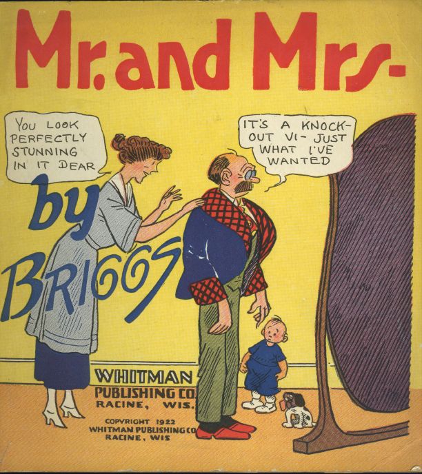
But his most enduring was the colour sunday page of marital blitz, Mr and Mrs

Labels:

Wednesday, 15 August 2007

"We live for a moment and then, like the wind, are gone."

Like the character in a strip described on page 818 of this biography, I have just realised that the title Of Margaret Mitchell's (my mother's names both, coincidentally) famous book, 'Gone with the Wind' is a derived from no. 103 of the Psalms. The line stuck in my head after I finished reading the tome. It's one of those classic, grand biographies that give us the subject from cradle to grave, complete. I have vicariously lived Caniff's 81 years condensed into a short span of time, in this case a couple of weeks, starting on my flight back from San Diego where I picked it up. I had waited too long for this book to not start it right away. Shel Dorf mentions it here, way back in 1998: "I tape recorded many of those conversations with his knowledge and loaned the tapes to R. C. Harvey when he was writing Milt's biography; he's still looking for a publisher." Nine years later we have Bob's book in our mitts. Given that the publisher is Fantagraphics, I presume he got tired of sending it around to all the big houses and gave up hope of a monetary advance commensurate with both the labour and the cultural-historical value of the project. And finishing it yesterday morning, in tears inevitably, I had to write off the rest of the day and go and have lunchtime beers with those pals of mine, none of whom have read a single page of the cartoonist I often cite as the single most important influence on my career.

You may say, 'all right, but we can't see any of that in your work, Campbell.' Fair observation.

I first discovered Caniff in the early 1970s, one of that generation who had taken Marvel comic books very seriously and were then looking for something meatier to sink our teeth into. As Harvey shows in his book, this particular cosmic balance came into effect as Caniff's then current Steve Canyon (1947-1988) daily strip was seriously losing circulation. Compilations of his earlier Terry and the Pirates (1934-1946) were starting to appear in collector's editions, first from Nostalgia Press and then in a long serialisation in ... uh... was it the Menomenee falls Gazette (or one of the other imitations, 'Favourite Funnies' etc?... I confess i chopped them all up into loose sheets the better to transport the distilled essence in my travels, and even at that I no longer have them nearby). The late '80s and early '90s had the Flying Buttress reprints and now we are about to receive the IDW complete edition. I hope it does well and sees completion.

What appealed to me in Caniff was the humanity. take this sample which I found at Duckburg, two people talking about human stuff:

Caniff could have conversations go on for days, sparkling with lively patter. At other times, silent pictures speak eloquently, as in the oft reprinted final page of Terry, a variant of the romantic Bogart-Bergman parting at the end of Casablanca*. Caniff's page will always be a favourite of the comic strip aficionado for all that it evokes without the gloss of verbal description. It is the essence of all that we ever hoped to achieve with the form, when we started thinking of it as a 'form': a pictorial narrative language that is beyond cold theory, demonstrated long before we started looking for it.


It goes without saying of course that a biography of a guy who spent his entire life at his drawing board making some of the greatest comic strips ever including a series that lasted 41 years, written by a fellow enthusiast and obsessive compulsive like myself, would be intrinsically compelling to me. Harvey is good at pinning down once and for all the passage of assorted 'ghosts,' and art assistants through the life of the subject and his work (not as many as one would think in such a long span of time). For instance, one sequence reprinted in the old Steve Canyon mag from Kitchen Sink press, (edited by Dorf, mentioned above) that Caniff thought might have been ghosted by Fred Kida or Alex Kotsky is here given finally to William Overgard (of Mike Nomad fame). Such things are endlessly fascinating to me, but for those not of the same bent, the real interest is in the people of celebrity he knew and who knew him. A line from quite late in the book: Incongruously, one room of the jammed duplex became the resting place for the piano given to the Caniffs by Kurt Weill ; Bunny didn't want it at Vista Chino.

I thought of making a very short but comprehensive list of the serious biographies that we have of the great practitioners of our art, but this one stands on its own and I want to leave it standing like that for now. I'd like to say may Bob Harvey do more like this one, but the moment is too short. We're are lucky to have it at all.

(Update 4.04 pm. to add footnote.) * Not that they are so alike as they are going around in my head in a romantic swirl, much as they did twenty four years ago in the humid evening on the tarmac at Darwin airport (where Jane is headed, above) when I took the notion to propose to Anne, though we were in the terminal by the time I got the words out.

Labels:

Saturday, 14 July 2007

“It perhaps was not the best way to get on, but I couldn’t help myself.”

Seeing George Melly off last week led to my pal mr j doing some digging to figure out what happened to Flook, the comic strip to which Melly contributed. Wally Fawkes was the artist on it and he would get his more wordy pals in to write it.

Here's an excellent BBC article on Wally Fawkes' retirement from cartooning, from 17 aug 2005. Farewell blues
Flook began life as a children's strip in 1949, but over the years, and with the help of Humphrey Lyttleton, George Melly, Barry Norman, Barry Took and Keith Waterhouse, among others, it became a social and political satire very much for the adults.
Despite its following - which included Baroness Thatcher who said it was "quite the best commentary of the politics of the day" - the Daily Mail decided in 1984 it no longer wanted Flook. The only warning its readers got was a strip in which a blue plaque appeared on the wall: "Flook lived here 1949-1984." Robert Maxwell saved the strip for the Mirror at his wife's behest, but only briefly, and with that, a unique record of post-War Britain ended.
But Trog's political commentary went on for another 20 years.. Now failing eyesight has forced him to put down his pen at the age of 81.


Trog calls it a day from Camden New Journal July 22 2005
Wally has always lived a double life. Being a virtuoso jazz musician as well as a talented artist meant he had two callings. He says: “To cartoonists, I was always the one who played jazz. To musicians, I was always the one who drew cartoons.”
Flook’s adventures with his friend Rufus became an overnight hit. At a reception soon after its launch, Lady Rothermere approached Trog and asked: “How is your lovely little furry thing?”
Trog replied: “Fine thank you. How is yours?”
“I quickly left,” he says. “It perhaps was not the best way to get on, but I couldn’t help myself.”


This Melly obituary at Barista last week gives George's contribution to the strip as a fifteen year run. It also shows a vintage sample.

As for the samples above: I used to pick up the Daily Mail circa 1970 for the Peanuts on the back, and I'd save the other strips too, Flook, Fred Bassett and Tiffany Jones, if memory serves, from the entertainments page inside. Being 14 I never really understood Flook at the time, and I failed to hold onto the cuttings. So to my horror I found that the only tear sheet in my historical files is this one, a page from the Penguin book of comics, split in two here, which I guess is enough of an antique in itself for these to have not been seen by most of my readers. At left is a Punch cover by Fawkes from 1977.
***********

I wonder if it was his sense of humour rather than his eyesight that Wally was losing. Eh? nahhh.
hayley campbell sent this link under her own headline 'Oldies to get humour bypass.'
Grumpy old people 'can't help it'-BBC News- 13 July
People aged over 65 may find it harder to understand jokes. Grumpy old men may not be able to help it, as age could affect their sense of humour, scientists have found. A study by Washington University in St Louis found older people find it harder to understand jokes than students. The authors say the finding should be taken seriously as laughing has been linked to health benefits such as boosting circulation.
Reading the comments on this, lots of grumpy oldies on the defensive. Frankly, i think there could well be something in it. I've observed it over the years. People generally lose their levity as they get one day closer to death. And I don't exclude myself. I bet you remember me when I was a bright and cheerful chappy.

And finally. If, on your relelntless tread toward that last day of mortal irritability, you want to attempt to a note of gaiety, our pal Nathalie sends this link: PUSHING DAISIES, a mortuary novelty shop.
Skull Wedding Toasting Glasses: Love Never Dies
Bride and Groom Skulls celebrate love everlasting. These handpainted champagne flutes feature a skull bride and groom surrounded by a band of bones and flowers. How romantic!
Food To Die For - recipes and more!
The Recipe's To Die For cookbook contains 180 pages of recipes, etiquette, and anecdotes. It is fully indexed and profusely illustrated with black-and-white photographs of the Old City Cemetery. These books are signed by the author.
Coffin Luggage
Now traveling in style is is not a problem with this unbelievable coffin shaped carry on bag. This is the most amazing piece of luggage i'v ever seen! Made from 100% leather...
Hayley! I don't get any of this. Come down here and explain it to me.

Labels:

Wednesday, 20 June 2007

The great George Herriman

Bill Blackbeard, the world's preeminent comic strip historian, made a good point in his article, 'The lost years of George Herriman', in Nemo #1 (1984), that the artist's hard work on the fledgling Los Angeles Examiner, launched in Dec '03, should go some considerable way toward explaining newspaper magnate Hearst's loyalty to the artist in later years. Apparently he personally instructed that Krazy Kat be kept on the King Features rostrum even though it was selling to a minimal number of newspaper clients.
Allan Holtz has gained access to a microfilm record of Herriman's work for the paper beginning in August '06, and Allan's blog is now my first habitual blogosphere port of call every saturday. Last week he showed Herriman's before-and-after coverage of the big fight between Joe Gans and Bat Nelson ( it was a big deal at the time and there was a centenary reenactment last year). I was reminded that I have in my files a cartoon by Tad Dorgan, from Hearst's NY Journal, covering the same event:


Like Tad, Herriman used a big close up image, which is so out of character for him that we could posit that he was following Tad's lead. Herriman and Tad often referred to each other in their work, for instance the Herriman section in Walker's The Comics Before 1945 has a caricature of Herriman by Tad at the top of the first column.
According to The Comic Art of George Herriman (McDonnell, Oconnell and Dehavenon) the sports editor of the NY Journal summoned him back east in 1910, apparently to fill Tad's spot while Dorgan went to San Francisco to cover the colossal Johnson-Jeffries fight. Here Herriman played further with some of the comic strip ideas he had been developing in LA and started the Dingbat Family, (or the Family Upstairs as it was first titled.) I have a clipping of the strip from Nov 28 1912, which features an 'Argentinian guacho' (sic) named Tomas Dorgano:


You can enlarge the above, but below there's an extra zoom on that first panel, including an early view of Krazy Kat at the bottom. She had begun appearing there ony a couple of years before, and would in due course become the raison d'etre of Herriman's oeuvre. I see Fantagraphics have already got three volumes in print of the full color sundays;"And now, starting with the sixth volume in Fantagraphics’ acclaimed Krazy Kat reprint series, finally it’s time for... color! After a brief hiatus in the mid-1930s, the heretofore black-and-white Sunday Krazy Kat returned in full spectacular color in June 1935". I shall be bringing myself up to date at San Diego next month.


The gorgeous object above was a gift from Antonio DiDio, physician of Sydney, who pulled it rolled up out of his bag as though it was that day's daily paper, with bits falling off around the edges. I couldn't decide whether to embrace him or thump him. I scanned it recently at a very high resolution. One should never presume that some other person is preserving these things.
The bogus Latin American in his big sombrero leads me to another precious Herriman object, the brochure of a 1997 exhibition of the artist's work in Angouleme. In the inside front cover is this wonderful photo of Herriman, which I have never as far as I can recall seen reproduced anywhere else:


Patrick McDonnell is one of the co-authors of the superb Herriman monograph quoted above. Read his Speech to the 2007 Graduating Class at Center For Cartoon Studies at Tom Spurgeon's blog. Tom also looks at a week of McDonnell's Mutts strip, with thoughtful analysis.
I would say that McDonnell would be the inheritor of the mantel of some of those grand old cartoonists, except I don't think it works that way. I don't think Tad or Herriman would like the modern crowd very much. Tad certainly wouldn't. The only old time cartoonist I know complained to me recently that the young 'uns nowadays just want to sit in front of their computers all day.

my 'classic strips' label below will take you to posts on: Tad Dorgan, Frank King, Walt Kelly, Leonard Starr and Stan Drake. I hope to add many more as the opportunities present themselves.

Labels:

Tuesday, 12 June 2007

Ain't it the Truth!

I see that the great Tad Dorgan has just been inducted into the boxing Hall of Fame. (heads up via Tom Spurgeon). The reporting on it is minimal. There was a time when if you wanted to find examples of Tad's work you'd have to look in the Boxing histories, but he's not even in those any more. The comics historians don't give him a lot of space as Tad's main interest was sports and we know that sports are anathema to most comics collectors. And the arty crowd like Spiegelman would have no interest as Tad was never inclined to play around with formal trickery.


Tad is one of my favourite all time cartoonists. You may recall that he appears in my The Fate of the Artist, where I show one of my two Tad originals, which incidentally was given to me by my pal John Anderson when he saw how I was gushing over the other one. Above is the other one, which I picked up for somewhere over a couple hundred bucks at the end of a San Diego con. The seller wanted more and I would have too, but this was before Campbell made his bundle. It's a big half-page cartoon that appeared under Tad's "CITY LIFE" heading on may 20 1917 , a sunday I think, but I deduce it would not have been in colour, and in the sports section rather than the colour comics supplement of Hearst's New York Journal. The date is scribbled on blue on the back and an order sheet pasted thereon requests the printer to engrave it "12¾ deep". In fact I wish there was more of this order slip remaining. It tells so much about how things were done back then, like the pencilled instruction on the front at lower right which reads, 50% benday.
This original is huge, much too big for my scanner, so I've just used the camera. You can fit a cd in each of the 12 panels. I've put one at the front of the photo for scale. The scenario shows a guy minding his own business in a pool room and then he gets called in to decide a dispute.


He decides the wrong way and gets thumped. We see him next having dinner with a middle-aged married couple, where he is asked to "decide a little matter for us".


He gets it wrong again and on his way home a crowd of baseball-playing boys needs an impromptu umpire. Again he gets it wrong. Lying in a heap on the ground, he is asked by a passing cop if he needs help and he responds "I refuse to decide".
I only ever met one guy who likes Tad as much as I do and that's Bob Callahan. Bob was doing a book about Tad way back when. I don't know if it ever got published. However, on both of the occasions when I've gotten involved in Bob's anthologies (most recently the Smithsonian book of comic books), I never got paid, so I'm not going to send you looking.

Labels:

Monday, 9 April 2007

Motoring

T here's a beautiful collection of Frank King's Gasoline Alley sundays on the subject of Walt Wallet's annual Autumn walk with Skeezix at Roger Clark's art website.
And they are shown at a huge size too, which is something we so rarely see. (via Comics Reporter).
There are 38 beautiful pages celebrating the changing colors of nature and the disappearing American countryside. Here's a panel, left, from November 11 1934.
And if you're looking for more after that there's a much smaller selection at Bugpowder. The panel below is from August 25 1929 and the subject is still nature.


I'm glad to see the selection based on a theme other than the dream pages that are occasionally rounded up as appealing examples of the series. Lovely as those pages are , and they are certainly that, they are often presented, along with Krazy Kat and Polly and her Pals as the last flourish of fading pictorial beauty in the Funnies in the tradition of MaCay's Little Nemo. The real treasure in Gasoline Alley is elsewhere. It is in the sheer length of its attention to ordinary daily life in America in the first half or the twentieth century (it lasted much longer than that of course, but one always feels that its heart was in those years even when the events weren't). One of the best observers of the strip has been Donald Phelps, in an essay that appears in his Reading the Funnies:
"The kind of American epic, in muted tones, which King was to propose can be traced very early on, in affectionate fiddling with perspective; it emerges in King's work as a way , not of questioning the gravity or stance or aspect of the material, but, rather, of refreshing the reader's appreciation of it. Not of "penetrating" the ordinary, but of manipulating it, with a long-time tinkerer's patient adroitness. Ordinaryness is a given of Gasoline Alley's world; something not to be converted, but to be endured as gracefully, stoically, playfully, as circumstances, and one's moods and talents, allow."
(Phelps' writing itself invites the kind of analysis this fellow attempts in a review, at sensesof cinema.com, of the book just quoted)

The true appreciation of this great strip demands a reading of it as a daily event, not just a sunday day-off special. And Drawn and Quarterly are doing us the service of providing it. I have just noticed that I have not yet bought the second volume, and there's a third almost upon us.


One thing I love about the earliest weeks of the strip is that there is always one day in the week, not always the same, when it appears as a single-panel comic, a large panel in which each of the characters would be simultaneously giving his opinion on some aspect of motoring or car maintenance. The syndicates would soon do away with such irregularities in the great homogenisation of the comics format that was still to come, and in our own times the McCloudians would absurdly tell us that King was working in a different medium on those days. The one on the open page is from March 16 1921. If you look closely you'll notice I've pencilled 'weds' beside the date. I guess I might be the only person to whom such trifles matter.

These gorgeously produced books give the work an appreciation appropriate to this era of the 'graphic novel.' The cuttings were mainly provided by Joe Matt who was interviewed about his involvement in the New York Times of January 14 2007:
Comics: See You in the (Restored, Reprinted) Funny Papers
"'A NIGHTMARE,' Joe Matt sighs. 'All those years, all that money, all that work. None of which I’ll ever get back.' Mr. Matt, the graphic novelist best known for his absurdly self-centered autobiographical comic “Peepshow,” is sitting in a prefab booth at Daily Donut in Los Feliz, a neighborhood spot favored by quiet elderly customers and infrequent rushes of teenagers seeking afterschool snacks. He is speaking of his quest for the perfect collection of Frank King “Gasoline Alley” comic strips, from 1921 to 1960. Mr. Matt, who owns no home, car, computer or cellphone, estimates he has spent upward of $15,000 on his mission since 1994.
“I found dealers in comics magazines and ordered the years I wanted,” he says. “A year runs about 312 dailies, of which you can get about 290 or more. Times that by 40, at $50 each. And there’s always missing strips. I’d have to order the same year again and again just to get a few missing days. God help you if you drop them, because you have to sort 300 undated strips by story line. Then I found that different papers ran the strip at different sizes, or with better printing presses. It was maddening.”
His collection forms the bulk of “Walt & Skeezix” (retitled from “Gasoline Alley” for licensing reasons), a decade-long, multivolume reprinting of Mr. King’s complete works published by D&Q (Drawn & Quarterly). (Volume 3 arrives in June.)"


Isn't this a good time to be around?

Labels:

Saturday, 17 March 2007

"'Look,' Browne said, 'St Patrick's day is coming up. You're taking a pill that is turning your urine blue..."

It's St Patrick's, the day of the year when it is customary to needlessly turn everything green, like the Chicago River in this fine photo taken on this day two years ago (courtesy Wikipedia.)
I find myself reminded of the great cartoonist Stan Drake, only because in Comics Between the Panels (by Duin and Richardson, Dark Horse, 1998) which is perhaps my favorite history of comics because it is entirely anecdotal and unpretentious, there is this anecdote:
"In the late 1940s. Stan Drake strained his prostate while digging post holes and putting fences around his house. Worried about a discharge, Drake checked with his doctor, who gave him some pills to take care of the problem. But the good doctor warned Drake that his urine would run blue for the next week.
'Pure blue,' Drake said. 'For about a week I'm pissing blue.'
When wordof this phenomenon got aropund the office at Johnstone and Cushing, Dik Browne dropped by to see Drake with a small brainstorm.
'Look,' Browne said, 'St Patrick's day is coming up. You're taking a pill that is turning your urine blue. But if you don't take it one day, the color will be weakened. And since you normally piss yellow, and Wednesday is St. Patrick's Day...'
Say no more. Drake said. 'So, on Tuesday, I didn't take a pill. And Wednesday morning I let a little squirt come out and, Jesus Christ, it was green. At noon, Dik had gone down the hall and invited everone on the 14th floor of Johnstone and Cushing into the men's room. So, I took it out and peed this brilliant green piss on St. Patrick's Day.'


I'm almost as fond of Drake as I am of Leonard Starr, whom I discussed here a couple of months back. Drake started the Juliet Jones daily strip in 1953, with Eliot caplin writing. It was fast paced, with snappy dialogue. Even though he used polaroid photos for reference for most of the figures, he had a way of exaggerating the histrionics just so, showing the graphic wit of a true cartoonist:

Anther quality I love about his work is his very acute sense of place:

And the way situations could be expressed very succintly in a single panel:


The above samples are from the first year of the strip, taken from the first of the three archive volumes published in the late '80s by Arcadia of Greenfield WI, whom I know nothing about. Enthusiasts chasing further can find up to ten volumes in Spanish, though of fewer pages each which makes it all overlappy.

Drake had a lighter touch in his work of the '60s here's a gallery of original dailies for sale, but you can enlarge and read.

I think this is a site belonging to Drake's son. It has some good photos of the artist.

Prof Mendez wrote a splendid essay on Drake, but it's not up at his site, although his opening page has a gorgeous colour example of Juliet Jones which can be enlarged to screen size.

There's another technique I mentioned in my piece on Starr that is beloved of this school of strip art and that's the 'talking building'. This fell out of vogue a long time ago, presumably because my generation are so po faced serious and found it too cartoony and unreal. I don't understand any of that and I love to look at it. It's a way of changing scene without a bridging caption and it makes more sense than 'meanwhile back at the ranch' which belongs to an older world that moved so much slower. It makes for variety during a conversation, and also adds to that constant sense of place that I referred to above.
It also added a great deal to an overall homogeneity among artists working in the 'photoreal style' (as Prof Mendez has dubbed it), which I like. I've always been more interested in the similarities between artists than in the differences. Thus this little situation appeals to me no end. The first panel is by Drake, from the 1970 sunday page in which Juliet Jones marries Owen Cantrell. It's the opening panel and presumably Drake has used a photo of new York buildings from his clip file of magazine and newspaper cuttings. Coincidentally, Al Williamson, another master of the photoreal style who had to wait until 1967 to get his own daily strip, Secret Agent Corrigan, had already used this same photo for reference in a short story in 1964 in the first issue of Creepy magazine (the story about the cartoonist's assistant, Baldo Smudge).
Anyway, compare the two. Stylistically they are interchangeable.


(In Williamson's own copy I imagine he has long ago filled in the annoying gap between the building and the edge of the balloon at the extreme right. If he's online he's probably even now applying ink to his computer screen.)

Labels:

Sunday, 11 March 2007

The hyphen in Antarctic

Here is a passage from a precious artifact on the Campbell bookshelf, Ten Ever Lovin' Blue eyed Years with Pogo. I believe it's a reprint circa 1970 of the 1959 book. Whenever I take it down for a browse I always want to kick my own arse for letting it get damaged along the page edges while in my suitcase a few years back, but then I start reading and forget all about that. Life is too short.
Walt Kelly telling an anecdote as only Walt Kelly could:
"I recall one time having trouble with the hyphen in “Antarctic.” I was bucking a deadline with a political cartoon that had a lot of snow in it. (It’s easy to draw snow fast as long as it is not falling snow. Always draw snow already fallen and leave it lay there. Don’t mess around with it. Beautiful white space in a drawing is a joy to the eye and saves time.) the drawing needed the word “Antarctic.” Now, “Arctic” and “Antarctic are two target words, so to speak. You remember that there is a “c” after the “r” and you sort of spell around the “c.” It’s like firing at the fence and drawing the target around the bullet hole. Well, on this day I made the “c” all right, but as I worked outward from that point, my thoughts on the drawing, on the deadline, on lunch, I discovered that I was putting a hyphen between the first “t” and the following “a.”
A cartoonist gets preoccupied and loses track. Spelling and drawing all at once are like marriage, like tap dancing while playing the piano, like Dr Johnson’s dog that walked on its hind legs. The job is not done well, but it is a miracle that it is done at all. There might be justification for this hyphen. Off I went to the dictionary- sure enough, no hyphen. Back to the drawing board. Erase the whole thing. Carefully reletter it, by now so upset that I go right past the target “c” like a hot-rod past a red light."

**********

What made me think of the above was a mistake I made a couple of days back in referring to Thomas Hampson as a 'tenor' instead of a 'baritone'. My mind was clearly on the larger issue of coming in at the end of my post with a satisfying punchline. Obviously such a detail would only be of real significance to folk who were looking for a singer to take a part or play a role, and for the rest of us one term or the other suffices to indicate the musical idiom that is being referred to. Hampson thinks a great deal about the subject of the artist and his position in both the world and the continuum of art and culture and I enjoyed this archived 1991 interview.

Labels: ,

Saturday, 20 January 2007

Starr's out tonight.

The second volume of Mary Perkins: On Stage from Classic Comics Press arrived in the mail a couple of days back and I stopped everything to read it all the way through, breaking only for meals and other life-necessities. I really do love the work of Leonard Starr on that strip, which ran from 1957 to 1979. I discovered it quite late in its run, because it never appeared in Britain. I remember following it in the NY Daily News, its home turf, when I was in Brooklyn for a couple of weeks in 1975.


A Few days back I made reference to the different ways old newspaper comic strips are nowadays presented. I suppose you could oversimplify it and say there is the nostalgia camp and then the Comics-are-ART camp, and I’m leaving out the mass market here, that still has a place for Garfield and The Far Side. Both camps long ago decided to kick out the whole soap-opera photorealist genre from the ‘canon.’ Old time comics historian Bill Blackbeard dismissed the whole lot as ‘dismal talking head soaps’ in The Comic Strip Century that Kitchen Sink Press published. He would have liked comics to stay forever the way they were in... the early '40s(?). In the Art camp, John Carlin just ignored the whole subject in the historical survey in Masters of American Comics. I’ve already cut up the first of those books so that it exists in my collection in pieces, and the Masters book is starting to feel like going the same way. Having denigrated it I should give an example of the kind of nonsense in it that annoys me.
“Hogarth’s sequential narratives and later studies such as The Analysis of Beauty consolidated the graphic experiments of earlier prints and established a complex language of graphic devices that artists have borrowed from ever since.
I have a book of Hogarth’s complete prints; I believe i'm a perceptive reader, but I honestly don't know what Carlin is saying. If anything, Hogarth was trying to hold onto a tradition that was fast disappearing, a tradition of picture making and viewing that involved a very complicated reading of symbols. There is no modern pictorial idiom that works that way. Carlin’s writing represents a kind of historiography that is of late considered bogus, this making a continuous narrative out of art so that one thing must be seen to clearly point the way to the next thing. It is considered thus because it tends to lead to false conclusions. The notion that artists stand on the shoulders of a bigger man before them so that they can see further than the bigger man is one of those metanarratives of which postmodernity chooses to be be incredulous.

These Mary Perkins books themselves have the look of having been incubated in the first camp, the nostalgia one. They are glue-bound and delighfully commonplace and unfussy in their appearance and the typesetting in the introductions is utilitarian, all just like this kind of book used to be twenty years ago. The stories, well, if you haven’t encountered the strip before, see Dirk Deppey’s review of Vol 1 from spetember last, or this other chap here who has fallen in love with Mary. The memory and copies of the strip have survived intact due in no small measure to guys like David Apatoff, who wrote a great piece about Starr on his blog. The last time I referred to him in this blog I may have called him a cranky old geezer, or described him as belonging to the 'flat earth school of art scholarship', head in the sand hoping that when he pulls it out modernism will have gone away. And I wrote what I wrote knowing full well that I would probably need to sing his praises a little further down the line..

My purpose here is to point to two or three aspects of the 'Photo-Realist style', as prof Mendez terms it, in his excellent work on the subject, which somebody must publish in book form! He has three pages on the strip under discussion which would make an excellent monograph just by themeselves.1,2,3, as well as pages on all the other major exponents of the style: Raymond, Drake, Kotsky etc. He has a wonderful survey of the advertising art of the period too, and shows how this connects with the style in the strips. Goddamn it, somebody publish it so I can stop trying to find my way around the peculiar design of his site.

Anyway, what I like. Days like this one from Oct 1957 (in volume 1). I was looking for a model for having figures just talking to each other, with body language carefully noted. Starr was a big influence on my thinking in that direction. Note how both characters appear in all three panels. They start facing, and end with their backs to each other.


The 'talking building' has been much scorned by the 'Vertigo generation', replacing it with the more cinematic 'voice over'. Bring it back, I say. Interestingly, there are two talking buildings in this one sunday, from the mid-seventies which can be seen entire on the Mendez site.


I love the way that, while the main characters always have a high degree of idealization in their depiction, there are so many nicely observed individuals among the secondary characters. The artist is obviously photographing his friends for reference.


After discussion with Classic Press publisher Charles Pelto I intend to write an intro for an upcoming volume of the series in which I'll talk about a lovely 1968 colour sunday tearsheet which I had professionally photographed many years ago so that I could keep it pristine forever, back before I realized that forever is bogus.

Labels: ,