Saturday, 9 June 2007

The empty jug.

C hecking out the various blog reviews the other day, I fastened upon this one: Kampung Boy: Not a member of the Legion of Superheroes-June 5- on the blog of one (since I've heard there's more than one) Matt Brady of Chicago Ill.: "The book is more illustrated prose than comics (at least by the Scott McCloud definition), with most pages consisting of text surrounded by pictures..." and it reminded me that I've been making some notes over the last couple of months on this odd tendency, this need to say what a thing is NOT.

Brian Talbot in his new book Alice in Sunderland also invokes McCloud. He resolves a scene in which he is assailed by authorial doubt by having Scott appear like a prophet and deliver the reassuring line, "Comics can be about anything." It's not done without irony, but we come away taking it as a serious declaration, and unlike Lat (Kampung Boy) who is working outside of this subculture, all of Talbot's typographical decisions tell us clearly that he's making 'a comic book', from the carefully cascaded balloon-text units to the compositional relationship of figure to frame; indeed the whole pictorial space is written in comicbook syntax.

Why the need for it to 'be comics'? That's the common denominator in each of the above quotes, even though they appear to be implying opposite positions for McCloud, on one hand that he has placed limits on comics and on the other that he has freed them from limits? An unimpassioned observer might say, why should it matter? If it's 'not comics' it would be ipso facto something else. However, and this may seem strange to the same observer, to say that a thing is 'not comics' is, in the eyes of the folk we are talking about, to ban it to oblivion.

I found a clue to this conundrum recently in an exchange with Stephen Frug on his blog about his contention that a page within The Codex Seraphinianus 'is comics'. He wrote: "I think that the reason I so strongly resist your resisting of the whole idea of definitions in discussing McCloud is that... I experienced it as an attempt to stuff me -- us -- - back in a jail from which we'd escaped."

'Us'? Then let's picture a loose-knit society of fellow travellers, whose members have chosen to express themselves through a genre of art, and to follow the efforts of their confreres in this same genre of art, and furthermore, for their collective benefit, to raise its public respectability. However these ties tend to suggest something stronger than just an 'interest' (or a 'genre', half of my readers are now saying). What is it that unites its members? An allegiance? To what? Not to a political cause or a religious scripture or even a charismatic personality, but to a form. A cold hard formula. McCloud's empty jug.

Though the jug would have it otherwise, it is in the nature of such groups to foster conservatism, and the the first commandment is always the definition. It's not just in 'comics' that I continually run up against definitions. When I wrote about A Humument on 12 march, I read that it was considered to be an 'artist's book', so I figured I ought to read the literature on that just in case I inadvertently 'put my foot in it'. I googled the words and landed in a forum where folk were arguing about the definition of the term 'artist's book'. There's no profit in going back there, so let this stand in for it, from SF Weekly:
In the middle of the tug- of-war over artists' books By Karen Silver October 31, 2001
It's always fun to go to a museum exhibition and step into a pile of steaming controversy. This time the show in question -- "Artists' Books in the Modern Era 1870-2000" at the Legion of Honor -- is a lovely presentation of 180 volumes from the impressive, immense collection of Reva and David Logan, who began amassing works by everyone from Joan Miró to Pablo Picasso to Jasper Johns in the 1950s. At the exhibit's entrance is the first sign of confusion. On the introductory wall panel, the curator attempts to explain the content: "Artists' books (also called livres d'artistes or illustrated books) combine text with art, usually original prints created especially for that volume, to form a unified whole." Under this vague definition, The Stinky Cheese Man might be considered an artists' book.

When I started this blog six months ago, I thought it wise to do some research before throwing myself into the fray. To figure out what a blog is expected to be and do if nothing else:
Just what is a blog, anyway? By Michael Conniff -09-2005
Defining this variable form is not easy in the highly opinionated blogosphere - nor is it simple in the increasing number of newsrooms that are embracing blogging. To blog or not to blog is no longer the question.
The question now: What is a blog?
Capturing the blogging beast is no small matter, not when everybody from the lonely scribe in Paducah to me-too mass media in Manhattan is trying to get arms and minds around the virtual blob now encroaching online. Nor is the act of definition without consequences, as individuals and corporations make plans (and even multimillion dollar acquisitions) based upon the momentum behind something they can no more easily define than a Rorschach splotch.


This commentary piece from the Australian oddly thinks the crucial element in a blog is the comments box:
Blogs still rule, despite the dictatorship of idiotsMarch 28, 2007
Mark Day
Not everyone agrees. As a blogger identified as Jack put it this week: “All weblogs are personal, even the ones of the arrogant journalists bloggers, so called gatekeepers of information, though they treat their audience with contempt. Most journalist blogs are not even blogs, just opinion pieces with a comment section, which the so-called blogger journo peruses once a week and throws a couple of ad hoc replies every now and then to say I’m listening, which they are clearly not.”
Jack says blogs should provoke argument rather than being a convenient response mechanism for readers.
But there are traps in this because blogs are frequently hijacked by people who regularly put forward their own often twisted versions of truth on any subject - call them fixations - and skew the result into what The Sunday Times called “a dictatorship of idiots”. Most times the casual reader wouldn’t have a clue about this because in a blog format the opinions of nutters are given the same kind of space and display as the opinions of the aforementioned erudite ruminators.


The information is no longer arranged in order as in textbooks. It is not locked together; we all receive it in a different order, according to our own 'clickstreams'. There is no hierarchical structure to keep the crap, the 'stinky cheese' and 'the nutters', from contaminating the rest. Did 'we' think of that when we wanted all arts to be considered equal? Definitions are sought to control quality and meaning since there is NO FINAL AUTHORITY. We have overthrown God and the King and there is no bouncer at the door. We are in a mortal panic. Steven King's langoliers are eating the ground we're standing on and we're grasping for something that might take us through a rip in the universe to where everything makes sense.

Labels:

Friday, 8 June 2007

"Even just a little knowledge can make a book into a physically impressive object."

Time is of the essence. A worthy exhibition still has a week to run: Apocalypse Then: Medieval Illuminations from the Morgan
to June 17, 2007. In this exhibition, the Book of Revelations, in all of its complexity, is seen through the eyes of some of the greatest medieval illuminators. Drawn entirely from the Morgan's renowned collections, the show celebrates the completion of a facsimile of the Morgan's Las Huelgas Apocalypse

What drew my attention to this, quite late, is Dirk Deppey's link to a post by blogger, 'Eve': Tuesday, June 5: AGE OF APOCALYPSE: The temporal panel and the infinite page: "I had a really hard time, at first, figuring out how to approach these pages. They seemed flat, static. One of the other patrons felt the same way: I heard him telling a friend that he couldn't really get into these pictures at all. We didn't understand how they worked. But somewhere around the third glass case, I got it. These were comics."

What you really need to look at is the famous Morgan Bible (or 'Crusader's Bible', or 'Maciejowski Bible') from the same collection (Pierpont Morgan Library, New York, Ms M. 638).
It tells the story of the bible entirely in pictures, some 280 of them, with some rudimentary 'captions' for the sake of keeping it comprehensible. In fact, scholars believe the captions are mostly late additions: "The Morgan Bible also evoked text in a more complex sense. The visual conventions described above probably do not draw upon phylogenetically late capabilities of the human brain. Properly trained monkeys probably could sense these visual conventions, while most humans would not consciously notice them without a reason for doing so. However, about the mid-fourteenth century, the owner of the Morgan Bible sensed the need to add text. Latin text was added above and below the pages’ painted areas." That's from a long academic essay on the book by Douglas Gailbi. If you want to know what the monkeys have got to do with it you'll have to go there. My title above is his opening line.

Unlike so many medieval texts, we can look at it without being wealthy. It's all here at medievaltymes.com though the way it's all broken up doesn't excite me. This site gives a more expedient sampling. The battle scenes are magnificent, as in the gory sample above. Taschen's Codices Illustres by Walther /Wolf shows it as a colossal and glorious 'double page spread' to continue in the shrunken spirit of seeing the universe in comic book terms. (There's another battle scene at the Wikipedia article).

The authors note that "scholars believe that the miniaturists (of the Morgan Bible) might have been among the masters who worked on the wall paintings and stained glass of Saint Chapelle in Paris, the palace chapel which was consecrated in 1248." This last named has also been claimed as and by 'comics' in this age of lowbrow cultural colonialism. Try to put that out of your mind when you visit the chapel, as you one day must if you haven't already. It is small as far as gothic architecture goes, but it is the most spiritually exciting place I have have ever stood in, with the sun melting down through all that blue and purple glass. That's it on the cover of Konemann's The Art of Gothic, and here's a beautiful flickr set of pictures.
But apart from that, apparently all tose tiny images in the windows form a complex narrative system. I googled around for a close up. There's one here, five pictures down.
********
I've been chatting to Steve Bissette for a piece he wants to run on his blog, talking mostly about a nineteenth century favourite cartoonist of mine, Richard Doyle. As a teenager he kept an illustrated diary and I've just found a recent post about it with some excerpted pages. Doyle has a lot in common with some of the quiet introverted cartooning of our own alt-comics milieu.
******
A Guardian review, jun 2, of Nick Cave: The Complete Lyrics, published by Penguin
Dark matter Nick Cave's brooding lyrics mark him out not only as a poet of the Australian outback, but as one of the greatest writers on love of our times, argues Will Self
Cave's mise en scène is as particular to his Australian patrimony as the whorls are to his fingers, or his lexicon is to his idiolect. Here, in rural Victoria, the light is harsher, the flies' legs are moister and the blood takes longer to coagulate. A persistent atmosphere of the uncanny pervades the world the songster summons up. While immersed in a Cave lyric, it's easy to believe not only in full temporal simultaneity - the indigenes are hacked to death, even as a football is kicked across the oval - but also that this sepia land marches with ancient Israel itself, both the Pharisees and the Kelly Gang having been clamped by the neck for the time necessary to secure a group portrait.
(link from Michael Evans)
*********
Reviews of the Black Diamond Detective Agency at:
Chris Sims
Geeks of Doom

Labels: ,

Thursday, 7 June 2007

covers- THREE PIECE SUIT

I went about this one in an unusual way. I pecilled a few little groups of figures (1-sample):Alec and the figures of Life and Death from The Dance of Lifey Death (being one of the three books in the collection). On the original cover for Dark Horse Alec was caught up in their mad terpsichorean cavorting; in this version he becomes their fiddler. The initial sketches were loose and then began to get tighter, but curiously smaller and smaller until I was looking at a couple of options each of which was about one-inch square. Out of these tiny groups of figures I enlarged the two that looked most promising. I inked these two and tidied them up before we scanned greyscale at several hundred percent. Then we converted to bitmap. Mick Evans, who was doing all the design work on my books at this time, treated one of these in a cubist manner (2), colourng it in photoshop with flat sharp edged colours and we used that for the solicitation image. When it came to making final decisions I went with the other enlarged drawing (3) and tried a different approach altogether. I modelled it fully and carefully with coloured pencils on an overlay (4). Then we dropped the black line drawing over it (5) for the finished cover, the point being the contrast of different scales, but I'm not sure that works as the drawing tends to hide its tiny origin. If I ever reuse this design, I shall not put the black line on top, but simply pencil some details of face and hands onto the colour layer, which I like for its clean simplicity, and print from that.
Top Shelf have it.
*******
Joe McCulloch reviews The Black Diamond Detective Agency
*****
First second reveals its catalogue for fall 2007
*******
Naked `Tony Blair' at Art Exhibition. Washington Post (Via AP) June 6,
"This is a biblical allegory _ Adam and Eve expelled from paradise _ and this is Blair's legacy," Sandle said, calling the Iraq war "disgraceful."
********
Looted Art Found in Nazi Dealer's Safe Businessweek.com- Jun 6
A number of masterpieces believed to have been looted by the Nazis have been found in a Swiss bank safe, the Zurich prosecutor's office said Tuesday, confirming earlier reports in the German media. The paintings include works by Monet, Renoir and Pissarro, reported the German daily Süddeutsche Zeitung. The safe was rented by Bruno Lohse, an art historian and dealer commissioned by the Nazis to assess works of art looted from Jewish people in territories occupied by the Nazis, especially France, the report said. Lohse died in March aged 95.
*********
Warner offers free music over the internet - London Times- June 7
Lala.com, which received $14 million (£7 million) in funding from Bain Capital and Ignition Partners, the venture capital firms, will pay Warner a royalty each time that a user listens to a track. The streaming service will, in effect, be a loss-leader. Lala.com aims to make money by selling downloads, but has suggested that it could lose as much as $40 million in the next two years. It added that it is in talks with other labels to launch similar tie-ups.
*******
in other news:
CHILDREN"S BOOZE!: AMSTERDAM (Reuters) - Just add water! Dutch students have developed powdered alcohol which they say can be sold legally to minors.

Labels: ,

Wednesday, 6 June 2007

"Kiss my backside." (wrote Mozart.)

The confluffle over cartoonist Bill Leak's appropriation of Tintin in his caricature of Australian politico Kevin Rudd has been resolved.
The Australian, Jun 04, By Peter Wilson in Brussels:
THE Belgian firm that owns the copyright on Tintin has conceded Bill Leak is free to portray Labor leader Kevin Rudd as the cartoon character
in The Australian, but says he cannot "commercialise" the image by selling copies to the public. Leak last night responded to Moulinsart's latest statement saying: "I'm not a lawyer, I'm a cartoonist. I poke fun at people for a living. I'm sure Herge would have approved".

The incident has reminded me of one of my favourite CDs. It's Mozart Unexpurgated, an Australian recording by The Song Company on the Tall Poppies label, 1991, with a cover by the same cartoonist showing Mozart sitting on the dunny with his breeches around his ankles, while scrawling on the wall. The disc gathers together all of Mozart's rude songs, and other songs in no way rude, which he composed for singing among his friends and family. They are translated to English and fit the tone of his letters, which are delightfully peppered with scatalogical nonsense (well served by Spaethling's recent translation).
The disc opens with these lines in gorgeous six-part haromony:
Kiss my backside
Goethe said it in his drama,
second act, you know the scene quite well!
Here's a catchy commentary,
Mozart now is literary!

And the words crap, fuck, fart and shit all put in appearance. It's all beautifully musical of course, and the 12 part harmony of "V'amo di core teneramente" (nothing rude in this one) never fails to reduce me to tears of joy even though it is only 1.12 minutes long.

glossary: The phrase 'tall poppies' is worth a word of explanation: "The tall-poppy syndrome refers to the behavioural trait of Australians to cut down those who are 'superior' to them. It is used to explain why most politicians, some academics, and the occasional millionaire, command a level of community admiration inferior to that of a toilet cleaner."
I and the boon companion of my self publishing years, Pete Mullins, once conceived a chronically self-defeating character whom we named 'the small poppy', and we went so far as to draw a few sketches. But we dropped the idea on the grounds that the greater part of our market, the USa, would probably not 'get' the phrase, and furthermore that from the way we'd drawn it, the person it was based upon would more than likely recognize himself.
'dunny' is self explanatory, but I'm amused to see it has a Wikipedia entry.
*************
Allan Holtz has some grand old Los Angeles political cartoons from 1906 by George Herriman, after finding a microfilm stash at his library. I expect there will be a few who will complain that they don't mean anything if you don't know about the parties being ridiculed, but I always find that those complaints come from folk who also need today's paper explained to them. The art of political cartooning has been using the same kinds of meatphors for centuries. The appeal is seeing the variations, and the additions. Did you need to know who Kevin Rudd is, or who Bill Leak is to enjoy the snippet of the Tintin story above? Politicos are much the same then and now, here and there and if you can get a good batch of stuff from a period, the players become almost like fictional characters whose exploits you can follow from page to page. And if you look long enough and have an enquiring mind, you end up learning something about some obscure corner of history. I've put my name down in in the comments box to encourage him to show as many of these as he can lay his hands on.
*****
Let unexpurgated be our word of the day!
Jack Kerouac: On the Road. It's the fiftieth anniversary of its publication in October!
Penguin Classics: To celebrate this seminal novel, we’re bringing out an exquisite hardback edition of the UNCENSORED MANUSCRIPT, unexpurgated, and that means with all of the sex and drug references that were considered too explicit at the original publication. We’re publishing it as the original 'scroll'.
surely not actually literally?
(link via michael Evans)
******
Leif peng has life story of now-obscure artist Fletcher Martin (1904-79)
*******
Just in. Australian site, Stagenoise: their 30th podcast focusses on the "Graphic novel". A good half hour interview with Campbell. This has come out all right. I explain a few things quite lucidly. In fact, I only half recall doing this interview, perhaps because I didn't say anything stupid, and when the interviewer emailed this morning to say it was up I was taken by surprise. Then Shaun Tan, author of the superb The Arrival, follows me.
********
The Black Diamond Detective Agency should be in Specialist comic book stores TODAY!!
*******
update: mr j in comments below directs you to a
gallery of the offending Bleak cartoons at the Australian.

Labels: , ,

Tuesday, 5 June 2007

"I now need to decide what to do with my life"
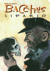
covers-BACCHUS no. 56

Tpair of images above will be familiar to anyone who followed the old Eddiecampbellcomics.com site. It was close to the end of the run and I was habitually showing the preview version of the covers beside the finished print. The latter is in watercolour with a smear of white pastel on the mirror. It's a fairly accurate depiction of me, age 15, from memory.

I recalled this image of my younger self last night after my pal White, who you will remember is a chartered accountant and co-wrote a couple of Batman books with me, directed me to a Millarworld forum where I was supposed to find something, but I forget what it was, and instead found a young guy who is leaving college and is wondering how his life is going to work out. It's that time of year.
"Here's a crazy situation...I'm due to graduate at the end of this year from a Biological Sciences degree and I'm now faced with the scary prospect of entering the real world. The problem is that I now need to decide what to do with my life. One parent thinks I should go into postgraduate work and the other says I should get a science based job. I've got all these options being thrown at me - research work, scientific surveys abroad, the forestry commision (what the heck?), a Phd, a masters - and yet nothing involved my dream to write comics. My Dad even said to my face the other day that "you can't stay at home your entire life and write comics".
Writing is my life. There's nothing else I want to do."


A discussion ensues, and somebody else chirps in with some solid advice:
“There's a chance that none of us will 'make it' and be rich and famous (hell Eddie Campbell, an Aussie writer an artist who worked on batman still earns his daily wage as an accountant), but if we lead rich lives (and are disciplined about our writing) we will both increase our chances of succeeding and not live a half life if we don't succeed.”
I have decided to introduce a new catch phrase here at campbell blogspot. Whenever somebody steps up to offer a word of inspiring and reassuring truth, but then cocks it up, you must say: "Truth is strangler than fiction." (sic) And you can quote me on that.

After many years of hard slog and inspiration, when it all works out for you, you will have a great big studio like these folk photographed by Greg Preston in The Artist Within: Portraits of cartoonists, comic book artists, animators and others. Each one is depicted in his personal working space, and a few examples from the book are shown at the link.
"how do these cartoonists afford such ENORMOUS EXPENSIVE ROOMS?" commented hayley campbell when she sent the link. As it happens, I think this is the book for which my pubisher Chris Staros was trying to get the author to include me in his photographic collection, but my personal working space was much too far away.
hayley campbell envisions his arrival at castle campbell:
you (campbell) would have sat at the end of the table and he would have looked
around corners expectantly.
'so, ah, mr campbell... where exactly is your room?'
'room?'
'er.'
'i work here. and occasionally a few inches over there... depending on
whether it's dinnertime or not.'
'right right.'
'...'
'um, mr campbell, do you know any amateurs in brisbane with big flashy studios?'
'why many! there's wayne, he's got a good'un, and there's always---'
'good good. do you know if they're in? we won't need the room for long..'
'hurrumph.'

Remember: Truth is strangler than fiction.

Speaking of wee Campbell, she has just described an early screening of the Gaiman movie Stradust.
And here is a review of the Black Diamond Detective Agency at Stagenoise
The two parties quoted above obviously need to read my How to be an Artist while anyone interested in more about 'wee Eddie' will find it in After the Snooter

Labels: ,

Monday, 4 June 2007

An exciting incident in suburbia.

The local dog-walking crowd, a beloved loose society of the friends of man’s best friend, arranged one of our occasional get-togethers in the picnic area of the park on Friday evening.

The wife of my bosom was to join us after she got home from work. Actually, we’d switched our venue and she wouldn't be able to see us in the dark, so I waited on the footpath for her, with the loyal Monty beside me. Also, I wanted to intercept her before she wandered along the bike path, what with that 'groper' character still at large.
It darkened very quickly, as it does in these parts, and at this time of year.

It was quiet too. I waited.

A bike came from the same direction where I’m watching for Anne, went past, with his lights on. The roll of rubber on concrete, a snapping of twig, then silence again.

Then, a scream.

A damsel in distress!

“I’m Coming!” I yell, as run toward the noises in the dark, just the other side of the footbridge, only slightly hampered by Monty, using my legs in a slalom.

AS I gallumph across the blur of moonlight on the bridge, there is the wife of my bosom coming toward me from the gloom of trees on the other side. She must have gone the long way around, through the woods. Blind in her terror, she runs past me.

Monty switches his allegiance to her as she disappears into the gloom in the other direction, interpolating himself into her flight.

And shortly behind her, the guy on the bike who had passed me a few minutes earlier, gingerly trying to explain something.

Apparently he rode past her... something bothered him and he'd stopped to turn, and while extracting his ipod from his ears did not stop to think that he was mirroring exactly the modus operandi of the Ashgrove groper, who cycles past his intended victim about ten yards, quietly turns and…

“I thought I’d hit your dog” he offered by way of excuse
"I didn't have a dog!” countered the wife of my bosom, who had by now returned amid the other folk whom our shouts had brought to the scene. The faulty procedure of needlessly giving information to the suspect was neither improved nor negated by the 35 kilo labrador on its hind legs, attempting to partner her in a waltz.

Labels: , ,

Sunday, 3 June 2007

covers- FOX COMICS no.22

When you start out, you fashion little photocopied books in black and white. Maybe you hand colour the covers to make the whole enterprise look a bit more like 'proper' comic magazines (like I did for three or four years in the early eighties.) Somewhere along the line you dare to reach higher, and a bigger print run makes offset litho printing a viable option. Then you try adding one colour to the cover. It probably doesn't work that way now. Computers have altered the equation. It's probably like getting your photos developed in black and white; you need to go somewhere special to do it. But back in the old days, photographically separated colour was beyond dreams to a small potatoes guy like me, and adding the cost of a single printed colour to the cover was a big decision. When I put out the original three Alec books with Escape in '84, '85, and '86, we added an extra colour on the cover of each, but instead of the process primaries, magenta, cyan and yellow, we used one of the secondary colours on each to avoid an obvious cheap look. Thus we used green, orange and purple on the Alec books. It worked; at first sight a secondary colour is read as a mix of two primaries, so it's not obvious there's only one ink (two counting the black of course). I can still look at them now without getting that thought of obvious cheapness. Each has a black and white image set against a flat colour field. A couple of years later I got a chance to do a wraparound cover for Fox comics. They had gone the conventional route of adding a colour, and then two colours, with a complement of
the full four arriving I think in the issue after mine. The one before mine was, if memory serves, by Dylan Horrocks, with three colours, black, yellow and magenta. With three colour printing, the mind's eye immediately realises that something is missing even if it takes a minute or two to work it out, but of course Dylan's design was big and bold enough to make a feature of the limitation. With my outing, I suggested they inquire as to what options we had with regard to colour selection, and I composed a picture in Black, green and brown, the colours of trees, for a bar with the rainforest beginning immediately outside (and I've been in a few like that). Somebody at Fox hand-made the two overlays, and they're all in half-tone too, just to make it trickier, but since my design called for a mad sloppiness, there was no problem about lining things up with an excess of accuracy. I still like my drawing on this, and I usually use it as an endpaper whenever I bring Little Italy out for a new printing ('92 fantagraphics, 2001 my own imprint)

footnote . I reccollect a British comic in the sixties that attempted, in only one issue as far as I know, to save the expense of a fourth colour on the cover (insides were always black only in those days) by cutting out the black. That is, it ventured to put the cover image across with just magenta, cyan and yellow and achieve darkness in places by overlaying all three together, with the logo in red and a headine in blue or purple. Even as an eight year old I knew something extremely unusual was happening and pored over that thing for hours.
*********
ya gotta larf:
I'm up to the page in The Amazing Remarkable Mr Leotard where the Titanic goes down, and I googled for picture reference 'Titanic Sinks'. the first thing up is the brand name of a manufacturer: 'Titanic sinks, taps, appliances and showers'.

Labels: