Saturday 4 July 2009

since I've been missing from my blog here for a number of weeks, I thought i should clear out the drafts folder, where I find this scan of a drawing by the young Hans Holbein, left over form a series of four posts I wrote on the subject of Holbein's marginal additions to The Praise of Folly by Erasmus of Rotterdam (1515)


There's a superb overview of Holbein's most important graphic works, his three treatments of the Dance of Death. But it's much more than that. It traces all the editions and copies, showing complete versions of each. This is a truly remarkable resource which can absorb the historian of graphic art for hours. For example here's an sample woodcut from each of four series out of the seventeen collected in their entirety. I've picked the fighting soldier panel in case some of my younger readers might get bored. Pretend it's a zombie wars flip-book or something:

1.Holbein, 1525:
2. Hollar, 1651:
3. Deuchar, 1788:
4: Bechstein, 1831:
A note to any of those younger readers still hanging about after the pictures finished. We're not looking at cases of artists 'ripping off' another artist. there was a time, long ago, before you were born, when if you wanted a copy of something, you couldn't just scan it. Pictures in books were printed from engraved woodblocks, which would wear out after much use. Thus fifty years later, if a reprint of the book was required, it would be necessary to hire another artist to hand-copy the whole job. And each successive artist copying the same images would be likely to add his own touches. He may also not have had access to the earliest version and have worked from an intermediary copy. It was akin to a shakespearean play, which would have to be restaged and performed anew for each generation. The linked site gives a scholarly assessment of the likely sources of each version. Regarding the panel of the soldier: "Variations: Birckmann has equipped Death with a gigantic arrow instead of a bone; Death doesn't have a shield, but grabs the soldier; Death has placed the hourglass on one of the fallen soldiers. These changes are copied by Valvasor, Hollar and Deuchar. Rubens finishes the drawing of the bone; Death raises his arm, so one can see the face; Death has a nose. These changes are copied by Mechel." The set by Rubens, one of his earliest works, I have never seen before, and in fact it was only discovered in a sketchbook in Amsterdam in the 1970s. These were discovered to be the main source-artwork for the version of the book already known to have been engraved by Mechel.
another note: the process of copying involved pencilling the image onto a woodblock which would then be engraved. In its simplest form, ie not getting into complications by using a mirror, this would leave the image reversed after printing from the block. Thus, one of the images above had to be flipped in photoshop to make it face the same way as the others.

The Holbein section is part of a bigger project of which this is the site map, Lubeck's Dance of Death, dealing with just about all the known information on the subject, of which the Holbein book is but one example. Martin Hagstrøm appears to be the author of the project, which really is colossal, and of inestimable value to anyone curious about the tradition of the Danse macabre.

Watch out for Eddie Campbell's The Dance of Lifey Death, contained in Alec: "The Years have Pants".


And click the 'alec2' label below for many more posts on the subject and excerpts from the big book. When you get to the end of that selection you'll find an 'alec1' label. Click that for more.

*************
Would you pledge your soul as loan collateral?
RIGA (Reuters) – Ready to give your soul for a loan in these difficult economic times? In Latvia, where the crisis has raged more than in the rest of the European Union, you can. Such a deal is being offered by the Kontora loan company, whose public face is Viktor Mirosiichenko, 34. Clients have to sign a contract, with the words "Agreement" in bold letters at the top. The client agrees to the collateral, "that is, my immortal soul." "If they don't give it back, what can you do? They won't have a soul, that's all," he told Reuters in a basement office, with one desk, a computer and three chairs.

***********

Labels: ,

Friday 3 July 2009

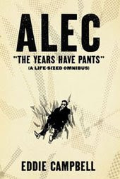
if you are intrigued by the zipatone style I wrote about yesterday, then I should mention that I pulled out the sheets of the stuff for the new book, "The Years Have Pants", the 35 page addition which brings Alec up to date (and gives its name to the whole collection). Here's a panel from it:


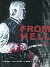
I read somewhere on the net yesterday that“Top Shelf has wisely kept From Hell in print as a nice affordable softcover. At 576 pages, it's longer than either the Bacchus book or the Alec book would be.” Note that the Alec book is in fact 64 pages longer than From Hell, with a total of 640 printed pages, and goes for the same price, 35 bucks soft and 50 bucks hard.
*********
Housewife first up for 100-day "live sculpture"
"One & Other" is a work devised by sculptor Antony Gormley for Trafalgar square's empty plinth, now a platform for temporary works of art. The first of 2,400 people to feature in Gormley's work is Rachel Wardell, a 35-year-old housewife and mother-of-two. "I wanted to be able to represent normal, everyday stay-at-home mums who aren't normally a feature of major artworks -- to show my kids now, and when they're older, that you can do, and be part of anything, no matter how ordinary you are or feel," Wardell said. She will appear on the plinth at 9 a.m. on Monday, July 6, and will be followed at 10 a.m. by Jason Clark, a 41-year-old nurse from Brighton.
**********
WELLINGTON (Reuters) – Air New Zealand has hit on a novel way to make sure even the most jaded flyers keep their eyes glued on its flight safety briefing. The national carrier's safety video for domestic services on its Boeing Co 737 planes show pilot and cabin crew dressed only in body paint.

Labels:

Thursday 2 July 2009

a couple of weeks back, Alex Holden, an artist worthy of our attention, wrote on his blog about the elusive Zipatone:
Zip A Tone has been on my mind because I recently received "Two Eyes Of The Beautiful" from Ryan Cecil Smith, who is currently living in Japan. Some equivalent of Zip A Tone (in virtually unlimited variety) is still widely available in Japan, despite the advent of the computer. "Two Eyes of the Beautiful" is all about Zip A Tone, from simple dot patterns, to trees and foliage......even buildings.
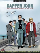
I recalled this because in the course of scanning my Ace Rock'n'Roll Club pages as part of the routine digitalization of my whole back catalogue, I came across a particular story where I set myself the challenge of making all the pictures as much out of tone as possible, with supporting ink-work kept to a minimum, even excluding panel borders. This is a panel from that story, drawn in Feb 1979, thirty years ago.

(click for a close-up)
I was able to get some tonal gradation using superimposition and overlap, creating a sense of light and atmosphere, but this approach proved too expensive and time-consuming. I carried a much simpler version of it over into the Alec Book. The white lines in the picture are a result of shrinkage of the material, which happens over time. I'd probably want to mend those if i ever reprint the story.
For more on the subject, click the label.

******
I'm told that the event I discussed here last thursday went well, and Amos's latest posters sport nifty slogans such as:
"YOU'RE GOING TO HELL AND THE DEVIL IS MY BITCH" and "I KNEW GOD WAS A WOMAN, BUT I DIDN'T KNOW SHE WAS BLACK!"

Labels: ,

Wednesday 1 July 2009

once kick the world, and the world and you will live together at a reasonably good understanding."-Jonathan Swift.

I see Mr Bent of Bent Books in Brisbane still hasn't put our 2008 set of bookmarks up with the others, so here's a first showing of this one. I expect he has had more important things to think about, what with the recession. Follow the label below for some more.

Labels:

Tuesday 30 June 2009

i was in town today to visit the dentist, due to the mishap mentioned here on Saturday. I popped into Folio Books, where my pal mr j works. he showed me all sorts of wonderful things. I bought a book which I'll write about later, but right now I'll give a quick mention to the one I didn't buy as it is a recent release and relevant to yesterday's celebration of James Kochalka. James is one of the fifty "artists, illustrators, designers," featured in


An Illustrated Life: Drawing Inspiration from the Private Sketchbooks of Artists, Illustrators and Designers (Paperback) There are six pages devoted to Kochalka's sketchbook diaries, including some close up photos of the objects, which invite us to see them in quite a different way from his online digitally-colored scans.

It was released in December 2008 and Amazon included it in their best books of that month.

And since I haven't mentioned my pal mr j here in quite some time, you can see what he's been up to on his blog, ON THE MAT, which is all about his wrestling cartoons, of which this is a sample:


Meanwhile, there is abeautiful big white whale that we love to watch for along our coast here.
Migaloo, a 14-meter, 35-ton pure white humpback whale, has been spotted off the New South Wales mid-north coast and could soon be in Queensland waters, where hefty new fines apply to anyone who gets too close.
"Migaloo has been declared a special-interest whale, granting him more space to swim up the Queensland coast," Ms Jones said.
The first reported sighting of Migaloo was in 1991 off Byron Bay, when he was three to five years old.
His unusual colouring makes him easy to track.
In winter humpbacks migrate north to warm tropical waters, where females give birth. 2005 PHOTO AT THE LINK

Labels: , , ,

How it lo0gs

I expect most people who read this are just swiftly taking in the information and don't give much of a thought to how the page looks. As somebody for whom making a living depends on attracting the eye of potential readers, I naturally give a great deal of thought to how this page looks. But trying to design a blog page for the internet in the old-fashioned print sense is folly. In the past i have relied on readers to tell me when something hasn't worked well on one of the variant browsers, so today when the wife of my bosom mentioned that my blog has become unreadable (on her monitor at work), it behooved me to do something about it. "Do you mean I'm using too many big words?" "No, I mean you're putting them all on top of each other."

This is how it looks to me on safari. Maybe you're familiar with it and maybe you're seeing it like this for the very first time. I'm particulary fond of the cunning motif of having the opening 'capital' overlap the header.


Firefox isn't too bad. It loses the neat drop shadow under the title lettering, but otherwise is faithful:


Opera picks up the drop shadow but does this odd thing with the sidebar, amputating it and shoving it as far east as it can go.


Explorer centers everything, loses the title altogether and puts the sidebar at the bottom:


That sound of a pencil hitting the floor, a stamping out of the room and a slamming of the door. That's me giving up and going to the pub.

Labels:

Monday 29 June 2009

that Colman G. has made me laugh again in comments by introducing me to my new favourite site, 'There, I fixed it.'
Observe the 'replacement bumper' on the Toyota:


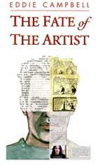
He says it reminds him of some of the stuff in The Fate of the Artist. He will be pleased to know there is a whole lot more of it in The Years Have Pants .

Labels:

____ochalka, yet again

k


I've been reading the most recent of the American Elf books published by Topshelf and it occurred to me that the sketchbook diaries, as he's been calling his daily strip, recently marked its tenth year. This was the very first cartoon:
And here's the most recent as I write this:


The whole archive is available at his site, linked above, but you should do like I did and go out and buy it.

Actually, It was more complicated than that. I was on my way to get one last week after my pal White reminded me of it, but then he phoned me to say, 'Oi, you haven't gone and bought that yet, have you, no? because I accidentally bought two." He was going to write it off as stupidity tax, but i was there to take it off his hands, so all's well that ends. While we were having lunch, Whitey reminded me that he was one of the first, if not THE first, to publish a selection from the Kochalka dailies, way back in DeeVee around ten years ago. Who would have thought then that we were looking at the first step in such a significant piece of work? At the same time he was serializing my How to be an Artist. Who would have thought there was all that happening in a quiet little book like Deevee? It goes to show you never can tell. You need to pay attention

speaking of Michael Jackson:
Michael Jackson's death sparks bus brawl
MIAMI (Reuters) – A fight broke out on a Florida bus when news of Michael Jackson's death sparked debate over whether he should be remembered as a great musical talent. The bus was moving through the city of North Lauderdale on Thursday when passenger James Kiernan received a text message about Jackson's death on his cell phone, and he read it aloud on the bus. The unidentified bus driver opined that "Michael Jackson should have been in jail long ago," prompting Kiernan, 60, to retort that "the world just lost a great musical talent." The last remark enraged another passenger, Henry Wideman, who started a swearing match with Kiernan, then pulled out a knife... .

my previous Kochalka post

Labels: ,

Sunday 28 June 2009

in the early 1980s I was part of a lively scene in London based around a small-press outlet called Fast Fiction, which was really an agglomeration of like minds. The early chapters of my book How to be an Artist are my account of that milieu and you can find that in the big Alec book I previewed yesterday. I'm always pleased when see one of my confreres from those days doing well, as I did a couple of months back in Creative Characters (the faces behind the fonts) issue #21 April 2009. I'm speaking of the excellent interview with Rian Hughes.


Typefaces. Are you a Space Cadet or an English Grotesque?
I’m a Slack Casual. With contextual ligatures.

Most of your typefaces capture a certain style or atmosphere without copying a specific model. Do you feel you’re a “character actor”, in some way? Which of your typefaces come closest to being “you”?
Ministry is the only straight revival I’ve done, though I’m working on a new, unrelated, American revival. Rather than pastiche, I’d say “essence” is what I’m after. Paralucent and Blackcurrant are very “me”. The rough wood types are less “me”, but have been hugely popular. Give the public what it craves!
That's Blackcurrant above left. If you think you don't know Rian's work, I'm sure you've seen it without realizing:


********
Distraction of the day: those amusing Japanese
*******

Labels: ,