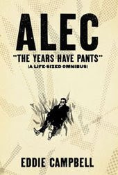
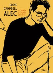
in the early 1980s I was part of a lively scene in London based around a small-press outlet called Fast Fiction, which was really an agglomeration of like minds. The early chapters of my book How to be an Artist are my account of that milieu and you can find that in the big Alec book I previewed yesterday. I'm always pleased when see one of my confreres from those days doing well, as I did a couple of months back in Creative Characters (the faces behind the fonts) issue #21 April 2009. I'm speaking of the excellent interview with Rian Hughes.


********
Distraction of the day: those amusing Japanese
*******

Typefaces. Are you a Space Cadet or an English Grotesque?That's Blackcurrant above left. If you think you don't know Rian's work, I'm sure you've seen it without realizing:
I’m a Slack Casual. With contextual ligatures.
Most of your typefaces capture a certain style or atmosphere without copying a specific model. Do you feel you’re a “character actor”, in some way? Which of your typefaces come closest to being “you”?
Ministry is the only straight revival I’ve done, though I’m working on a new, unrelated, American revival. Rather than pastiche, I’d say “essence” is what I’m after. Paralucent and Blackcurrant are very “me”. The rough wood types are less “me”, but have been hugely popular. Give the public what it craves!

********
Distraction of the day: those amusing Japanese
*******
Labels: logos, typography


3 Comments:
Thanks for the distraction which resulted in my boy commandeering the computer for 10 minutes and laughing maniacally.
I would have lost the house betting on Blackcurrant being Woodrow Phoenix.
arf. I could quote that. You should have signed it.
But how about that. Two first class typographers came out of fast Fiction.
Post a Comment
Subscribe to Post Comments [Atom]
<< Home