Sunday, 28 June 2009

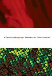
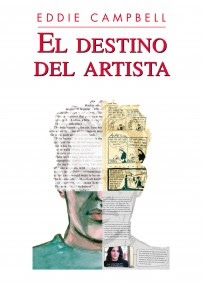
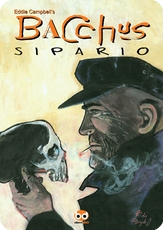
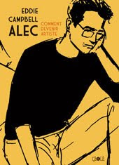
in the early 1980s I was part of a lively scene in London based around a small-press outlet called Fast Fiction, which was really an agglomeration of like minds. The early chapters of my book How to be an Artist are my account of that milieu and you can find that in the big Alec book I previewed yesterday. I'm always pleased when see one of my confreres from those days doing well, as I did a couple of months back in Creative Characters (the faces behind the fonts) issue #21 April 2009. I'm speaking of the excellent interview with Rian Hughes.


Typefaces. Are you a Space Cadet or an English Grotesque?
I’m a Slack Casual. With contextual ligatures.

Most of your typefaces capture a certain style or atmosphere without copying a specific model. Do you feel you’re a “character actor”, in some way? Which of your typefaces come closest to being “you”?
Ministry is the only straight revival I’ve done, though I’m working on a new, unrelated, American revival. Rather than pastiche, I’d say “essence” is what I’m after. Paralucent and Blackcurrant are very “me”. The rough wood types are less “me”, but have been hugely popular. Give the public what it craves!
That's Blackcurrant above left. If you think you don't know Rian's work, I'm sure you've seen it without realizing:


********
Distraction of the day: those amusing Japanese
*******

Labels: ,

Thursday, 24 April 2008

design goof.
OGC unveils new logo to red faces - Telegraph UK- 24/04/2008

"It cost £14,000 to create, but clearly no-one at the smart London design outfit that came up with the new logo for HM Treasury thought to turn it on its side:"
"The logo, for the Office of Government Commerce, was intended to signify a bold commitment to the body’s aim of “improving value for money by driving up standards and capability in procurement”.
(link via Ben Smith)

update several days later. oh dear, somebody has animated it.

Labels: ,

Sunday, 19 August 2007

ANOTHER LOGO
This one was fun
Mick Evans' idea was to make a neatly designed logotype and then damage it by hand. Actually, I think he said it was to be 'distressed.' He made up a bunch of xeroxes on ordinary bond paper and invited me to attack them with a scalpel. Then we selected the best. On this close-up of the L you can feel the paper and toner suffering under my scraping. After a few efforts we decided on a disturbance coming from off-field and after a few more fixed upon the lower right as the source of the violence. Mick scaneed and saved at 800 dpi. When it's done in red and superimposed on the cover painting its origins are less obvious than you see here in black and white.

Labels: ,

Saturday, 18 August 2007

IF YOU've

BEEN

following

my look at logos

over the past few days
you'll have heard me complain that I know very little about the subject. The ailment is contagious; many designers around the place think that Campbell's presence on the cover means that the usual rules are out the window. Here's one from last year:
The designer on this was Adam Grano, no relation to cum grano salis (as far as I know). I made the letters in the balloon out of wet watercolor so that the density of saturation varied with the unloading of the brush. He decided to replace the magazine's illustrious logo for this issue with these campbellian fumbles. He took my letters from inside the balloon, blew them up and constructed the logo from them. There was an earlier change that I sent in which meant he had all the letters except the 'j' which he made by lenghtening an 'i'. Now I personally would never have had the arrogance to send that in for a logo. I would have been sweating and weeping all night with a ruler and a t-square only to see my effort summarily rejected. These design guys, eh? What makes them think they can get away with it, that's what I want to know :)
(I don't think i've ever mentioned it before, but the gag on that cover was my pal Daren White's idea. In fact, that's him under the word balloon.)

Labels:

Thursday, 16 August 2007

MY FIRST LOGO

I EveR FELT HAPPY ABOUT

was this jobby from

good lord, 19 years ago.

I got around my complete lack of confidence by cutting a couple of letters out of a magazine and sticking another incongrous one in between. The whole cover was quite simple and tasteful. Phill Elliott did the hand separated colours. I never attempted that, and thank goodness I probably won't ever have to now. Much later I tried the cut-out thing again and this time coupled it with the blobby technique (see yesterday) for the Bacchus logo. Actually, the original was a baroque horror, with a pictorial element and a Kleenex smear all thrown into the mix. By the time Evans hacked it down to size and spread it out a bit it was much sweeter. That single cut out letter gives the thing an unearned air of authority.

************

Labels: ,

Tuesday, 14 August 2007

HERE'S ANOTHER

REALLY ODD

Thing I drew with


The dropper measuring thingy that comes in some ink bottles:
I'm sure it has a name, like every other thingy in the world. You press the top and hold it, dip it in the ink, unpress it and let the ink get sucked in. Then draw with it, occasionally pressing to release blobs of black for emphasis. This technique was used for one of my favourite logos, The Dance of Lifey Death, a book of mine first publshed by Dark Horse in 1993 (full cover), and to finish the effect I wanted to cut little feet out of one of those old style ballroom dance manuals, but instead I borrowed a rubber stamp of a barefootprint from my daughter, hayley campbell, who had borrowed it from a classmate at school. When he got it back it never worked properly again because I'd soaked it in india ink and it went hard. Sometimes I just hate myself.

Labels: ,

Monday, 13 August 2007

THE ODDEST

THING

i ever drew with

is a rolled up kitchen tissue. I'd tear off the end and plunge it into the ink, like this:
I used it to do the panel borders in the flashbacks in a couple of Bacchus short stories, enjoying that big hairy multiplied line:


The technique even came in useful for a logo once:


That was with fantagrpahics in 1991. Their design person used it in bright red with a blue-grey drop-shadow, which you can see if you click to enlarge. A good logo should be able to withstand all kinds of variations.
But what would I know about logos? These are the experts:
Todd Klein gives a potted history of comic book logos
his hand drawn logos
made on the computer.
logos by Richard Starkings and Comicraft
The more modernist logos of Ryan Hughes

Funny thing is though, there seems to be an opinion rolling around out there that my own logos are well suited to my own books, so over the years I've had the chance to make a few. Not having a trained grasp of letterforms, I tend to make a feature of the unlikely daftness of an unusual technique, and then cross my fingers and hope i get away with it

Labels: ,