IF YOU've
BEEN
following
my look at logos
over the past few days
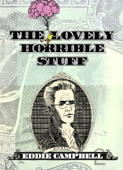
you'll have heard me complain that I know very little about the subject. The ailment is contagious; many designers around the place think that Campbell's presence on the cover means that the usual rules are out the window. Here's one from last year:
 The designer on this was Adam Grano, no relation to cum grano salis (as far as I know). I made the letters in the balloon out of wet watercolor so that the density of saturation varied with the unloading of the brush. He decided to replace the magazine's illustrious logo for this issue with these campbellian fumbles. He took my letters from inside the balloon, blew them up and constructed the logo from them. There was an earlier change that I sent in which meant he had all the letters except the 'j' which he made by lenghtening an 'i'. Now I personally would never have had the arrogance to send that in for a logo. I would have been sweating and weeping all night with a ruler and a t-square only to see my effort summarily rejected. These design guys, eh? What makes them think they can get away with it, that's what I want to know :)
(I don't think i've ever mentioned it before, but the gag on that cover was my pal Daren White's idea. In fact, that's him under the word balloon.)
Labels: logos







10 Comments:
That's a bloody lovely cover. A shame I missed it.
It amuses me.
And on days like this I need such diversions.
(sigh sigh groan whine etc.)
I loved that cover and the interview. It's actually one of the two Journal issues I own.
I always wondered if the joke was in any way related The Smith's lyric "Oh, I can smile about it now but at the time it was terrible." I meant to ask you that earlier but I had forgotten about it until I saw Cal wearing the Meat is Murder shirt.
And the logo totally fits the cover so I can see why he did it... but yeah... it woulda' been hard to just send that in and be like, "here's the logo, lads." :)
It was.
Dear Maestro,
Think of the money you'd make from your friends -- and enemies -- if you'd made a print of the TCJ cover to sell at conventions. If you ever get around to it, I'm in for at least a half-dozen...
W
the cover would ve been more realistic if Dan was checking Campbell's pockets for loose change or un-eaten chips.
I need to subscribe to the Journal, since I don't go into comic shops (and most comic shops don't sell it anyway). I've never seen that issue, but that's a very funny cover.
This comment has been removed by the author.
well, whad'ya know... :)
Logo smogo. They either look great or they don't. Logos are so subjective. How can a person say that a logo sucks if other people like it.
Am I taking this too seriously?
Post a Comment
Subscribe to Post Comments [Atom]
<< Home