MY FIRST LOGO
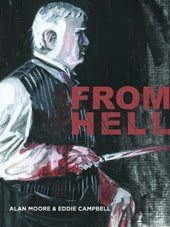
I EveR FELT HAPPY ABOUT was this jobby fromgood lord, 19 years ago.
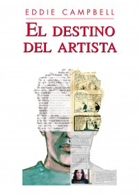
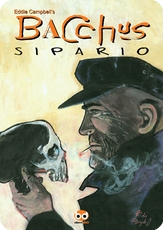
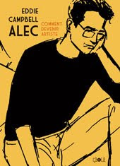
 I got around my complete lack of confidence by cutting a couple of letters out of a magazine and sticking another incongrous one in between. The whole cover was quite simple and tasteful. Phill Elliott did the hand separated colours. I never attempted that, and thank goodness I probably won't ever have to now. Much later I tried the cut-out thing again and this time coupled it with the blobby technique (see yesterday) for the Bacchus logo. Actually, the original was a baroque horror, with a pictorial element and a Kleenex smear all thrown into the mix. By the time Evans hacked it down to size and spread it out a bit it was much sweeter. That single cut out letter gives the thing an unearned air of authority.
************



5 Comments:
That mixed-typeface approach was very popular in the 1980s, post-Neville Brody and The Face magazine, so you caught the zeitgeist, as it were.
You may have seen this but re: Caniff and co (and Gasoline Alley), Stripper's Guide has an interesting discussion about the (literally) shrinking importance of the newspaper comic strip in America:
http://strippersguide.blogspot.com/2007/08/strippers-guide-dictionary-part-1.html
Funny that. I think that's one of the most eye catching covers I've ever seen.
Hey, you have a great blog here! You really are very talented and deserve an honest compliment, congradulations! I'm definitely going to bookmark you!
Jerome Poitevin
John,
I recall Looking at the logo Ryan Hughes designed for Knockabout (circa 1985) and trying to figure out what was going on, in that the drop shadow didn't match the letter forms. Woodrow Phoenix had to point out to me that the drop-shadow was in a completely different typeface.
interesting times, as you say.
Christopher, Jerome, thanks.
Post a Comment
Subscribe to Post Comments [Atom]
<< Home