ANOTHER LOGO
This one was fun
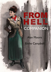
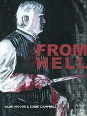
 Mick Evans' idea was to make a neatly designed logotype and then damage it by hand. Actually, I think he said it was to be 'distressed.' He made up a bunch of xeroxes on ordinary bond paper and invited me to attack them with a scalpel. Then we selected the best. On this close-up of the L you can feel the paper and toner suffering under my scraping. After a few efforts we decided on a disturbance coming from off-field and after a few more fixed upon the lower right as the source of the violence. Mick scaneed and saved at 800 dpi. When it's done in red and superimposed on the cover painting its origins are less obvious than you see here in black and white.



4 Comments:
ouch. the effect looks like the sound of a dead chalk on a blackboard.
That's a great L. You could have used just that, and call the book From L and it would have fit.
It works perfectly on the front cover. Nicely done!
From 'L is the Cockney version (with a glottal stop). 'Bout this geezer, Jack the Lipper.
Post a Comment
Subscribe to Post Comments [Atom]
<< Home