THE ODDEST
THING
i ever drew with
is a rolled up kitchen tissue. I'd tear off the end and plunge it into the ink, like this: 
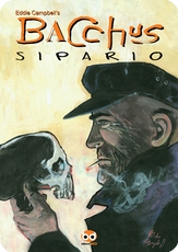
I used it to do the panel borders in the flashbacks in a couple of Bacchus short stories, enjoying that big hairy multiplied line:
The technique even came in useful for a logo once:
That was with fantagrpahics in 1991. Their design person used it in bright red with a blue-grey drop-shadow, which you can see if you click to enlarge. A good logo should be able to withstand all kinds of variations.
But what would I know about logos? These are the experts:
Todd Klein gives a potted history of comic book logos
his hand drawn logos
made on the computer.
logos by Richard Starkings and Comicraft
The more modernist logos of Ryan Hughes
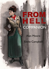
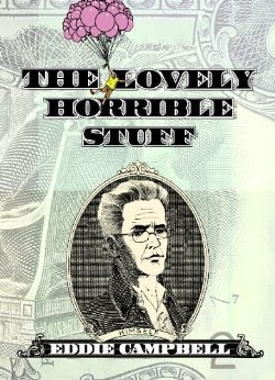
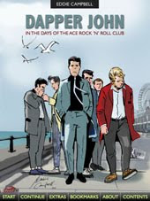
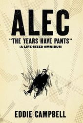
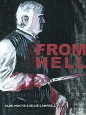
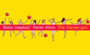
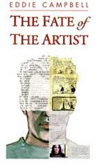
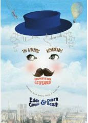
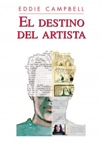
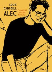
Funny thing is though, there seems to be an opinion rolling around out there that my own logos are well suited to my own books, so over the years I've had the chance to make a few. Not having a trained grasp of letterforms, I tend to make a feature of the unlikely daftness of an unusual technique, and then cross my fingers and hope i get away with it
Labels: logos, markmaking



4 Comments:
I love Ryan Hughes' logos. He's a great font designer as well, a discipline I've rarely had the patience for (although I did convert an alphabet design of Alan Moore's into a font once). You have to do all the characters then all the kerning pairs (letter spaces). Then you print out an example and realise it looks crap... I'm designing a record label logo at the moment which is more fun.
Oddest things I regularly used for drawing were my trusty toothbrushes: one coarse-bristled one for doing black ink spatter and a finer one for white (or other colour) paint spatter.
Hi, Mr Campbell!
It's a really interesting choice of drawing material. Thanks for sharing (and inspiring). :D
I once used some random plants leaves to draw and their forms and textures presented some unique results.
Recently, a lady from the life drawing classes I attend gave me a bamboo stick that she uses. It works kinda like a pen nib but if you use one with branches it feels like a crazy brush. In either case, you don't have much control but, that's the fun in it.
If you want to, you can check out a few examples here and also here.
Of course for really old-school logos, you have to look at Ira Schnapp. Here's a page on his design of the original Superman logo.
http://www.dialbforblog.com/archives/374/
Hm. That was one of my favorite Bacchus sequences.
Funny to see how you use all manner of stuff with which to illustrate. I once looked upon about ten years worth of an artists output (this guy doesn't sell his originals) all stacked up about his studio. I suspect it was all done on the same paper and all illustrated with the same model pencils and brush and uniform black ink.
The uniformity of the stacks would seem to bear that out.
Post a Comment
Subscribe to Post Comments [Atom]
<< Home