Saturday, 1 August 2009

a little knowlidg is a good thnig

i've been reading Spiegelman's excellent new edition of Breakdowns: Portrait of the Artist as a Young %@&*!, which was released last October. The 28 huge new pages in this alone are worth the entry price. Artie dedicates it in part to the memory of Woody Gelman, who at one point, in 1977, was to be the original publisher of Breakdowns, which reminds me of a theory I entertained for a while. That is, the significance of Gelman's contribution to the modern 'idea' of comics. Before making my point however, I would have you know that this is no longer an idea that I have faith in. It's an idea that had its day in the world and has given way to a smaller, shrunken situation in which it is difficult to locate any idea. Alan Moore was addressing this state of affairs when he wrote: "I did once feel I was part of a movement that wanted to change comics into something valuable to culture, but I don't really feel that kinship in the way I used to." I do admit that Spiegelman's book almost revives the old enthusiasm, but occasions the thought that this may be a generational thing.
My perception was that it was Gelman who first envisioned comics for the bookshelf and, whether he invented the notion himself, he certainly inspired us with the thought of it. With his Nostalgia Press editions of Flash Gordon in two pleasing clothbound volumes, and particularly the lavish large format Little Nemo (all between 1967 and 1975 approximately), he put in our heads the idea that one of us might one day do something worthy of such a serious presentation. I'd bet that Alan Moore had such a thought when he held them. And I know he could not have failed to have bought them, probably in the same place as I did, Bookends in Camden Town, the only shop I know that imported all this obscure stuff in the early 1970s. This was just one aspect of the multi-faceted concept of what later they were calling the 'graphic novel,' long before we had stalwarts like the following chap to explain it to the world on our behalf:

'Comics 101: What is a Graphic Novel?' by one Adam Relayson- Examiner.com - July 20,
One of the most common mistakes made in our medium is the confusion of Comic Books with Graphic Novels. This is sort of like referring to a Magazine as a Newspaper; while they may contain similar information, they are entirely different formats.
The main source of misinformation in this case is the film industry and celebrities. Part of it is simple ignorance, while much of it is the desire to disassociate multi-million dollar film projects with the stigma of comics on which they are based. For instance, Zach Snyder's recent film adaptation of Watchmen contained a tag line in the trailers referring to it as "the most celebrated graphic novel of all time." Yet Watchmen is not a graphic novel. It was 12-issue mini series published from 1986 to 1987. Later Watchmen was collected into a format known as a Trade Paperback.

Trade paperbacks or 'trades' can easily be confused as graphic novels because they both present a seemingly self-contained story in a similar format. The difference being that a trade is the collected version of a story previously published in an ongoing, maxi- or mini-series comic. Whereas graphic novels present an original story.
At the end of the day, they are all comics in some format. Still, a little knowledge is always a good thing.
All of the labels that he explains so cleerly and knowledgously, all this misinformation that he sends out into the world, are the end-results of several years of misinterpretation and misunderstanding, every bit of it originating within the comic book collecting community and not outside. A person of any education, while accepting that these labels exist as such within this tiny enclave, would be embarrassed to be asked to promote them to a larger public, where a 'novel' is not a format and 'trade paperback' just means a larger-than-conventional paperback whose name resulted from old-time practices within the book 'trade.' That's what it meant when I was ordering printing only seven years ago and the printer didn't care what you called the stuff inside it, because content and format are completely separate things. It could be recipes or song lyrics or a novel, or a 'graphic novel' even. And in the larger world, since a novel is not a format but a literary form, which I realize may be too abstract for some comic book minds (think: it can be taken out of one format and lodged in another without altering its internal formal connections), serializing a novel in a newspaper or magazine, prior to its book publication, never disqualified it from being a novel. Will Eisner likewise serialized some of his earlier unquestioned 'graphic novels' (Message from Space, A Life Force), so labelling them as he did so. Marvel comics devised a format into which to put their their 'graphic novels,' that became standard for a while, being 48 or 64 pages- in large size-perfect bound-card covers, and called it their 'graphic novel format.' Comic book fans interpreted that to mean that 'graphic novel' IS a format.

Examiner.com is hardly a site of any authority (in fact I had to go to wikipedia to find out what the hell it is), but the bunch of opinions expressed by this particular citizen journalist are held by a large number of his fellow fans. There was a time when such blather would only be found in xeroxed fanzines and nobody would pay it any attention, but his page turned up for me via a Google news search, not a blog search, while I was investigating Watchmen's DVD reception two days ago. A sensible person arriving at it as I did must wonder how such a load of baloney could ever have come to be. It dents longstanding general knowledge in at least four places, and offends the preposition in two, all of this just within the 'pull-quote.' And it does it while declaring others to be 'ignorant.' Said sensible person might find himself momentarily questioning his or her previously held suppositions about the lately trumpeted value of the so-called 'graphic novel,' or worse, reverting to the earlier held supposition that comics are read by people who are not very bright.

I suppose all pop-culture communities are bound to have their own jargon, but it's very cringeworthy to find fans arguing that the larger society has got it wrong when they themselves have mangled it out of shape in just three or four cultural generations. My inclination is to feel as Alan felt when I quoted him above, and to say: they're not with me; I came in alone.

Labels: , , , ,

Friday, 31 July 2009

in comments yesterday Jody macGregor drew my attention to this:
Jokes are funny. Picking them apart isn't. Witness my clown autopsy- Charlie Brooker -The Guardian- Monday 27 July 2009
In each case, brevity is key. I assume these gags stemmed from the (stand-up) comic in question making a passing observation (eg "I suppose you could argue that walls are intrinsically better than people at tennis"), remembering and noting it as funny, then trying to cram said observation into the shortest space possible. As demonstrations of condensed poetic skill go, they're as impressive – to me at any rate – as the works of, say, Raymond Carver, Cormac McCarthy or Kurt Vonnegut.
Not that they should be given equal recognition. No comic should, ever. It spoils the fun, somehow. That's why most articles on "how comedy works", including the one you're reading now, feel so antiseptically mirthless: they're like clown autopsies, but less amusing. (more at the link)
He's obviously another student of the great Professor Bean:


In other news:
Police give chase after seven-year-old speeds off in dad's car to avoid going to church

Labels: ,

Thursday, 30 July 2009

who watches the Watchmen? Eddie Campbell finally gets around to it.

'Watchmen' dominates video charts
The action hit "Watchmen," from Warner Home Video, shot to the top of the national home video sales and rental charts its first week in stores, with 36% of its total unit sales coming from the high-definition edition.
Firstly, the hullaballoo about Mahnhattan's willy was completely unnecessary, and the product of small minds. It's no big deal and I wish I hadn't commented on the comments of the fanboy forums, where far too much was made of it. There are annoying things in the movie and that isn't one of them. And there are more annoying problems with the reviews of the movie, for instance this new one:

Watchmen is too faithful to Alan Moore's book, writes Paul Owen on the Guardian Film Blog
Zack Snyder told the Guardian earlier this week that his version of Alan Moore's comic novel was 'not really a movie, in the traditional sense'. I wish it had been
At times this labour of love seemed like a shot-for-shot adaptation of the comic, with as little as possible squeezed out during its lengthy running time. Does it work as a movie? Does it work independently of its source material?... my feeling is that it does not. Anyone putting Watchmen into the DVD player unfamiliar with the comic and what it was trying to do might well be left baffled by the plot and alienated by some of its imagery and themes. Enjoyable as it is to see Rorschach snarl at his fellow prisoners "You're locked in here with me", for example, this whole jail sequence could have safely been deleted without interfering with the plot.
Most importantly, some things that don't necessarily seem ridiculous in comics – superheroes' physiques, their costumes, capes, secret identities and underground lairs – seem much more silly on screen, when brought to life by real human beings. The leap of imagination or suspension of disbelief is much more difficult to make in films than in comics. And Watchmen does not do enough to make these aspects of the film credible to the general viewer.
Separating the points, firstly: It's a very smalltown reviewer who only concerns himself with what the commonplace viewer is likely to accept. A bigger person would lead the way and casually attempt to influence taste. I would certainly have expected more from a writer in the Guardian, whether online or off.
Secondly, there is a great deal of the book that can arguably be left to one side for the purpose of a movie; Rorschach in jail is not part of that. 'Springing' Rorschach is the hinge upon which the drama turns. His refusal to give in must be pushed to its very limit, even in the face of brutal murder in jail, before decisive action is taken by others to influence the course of events.
Third, the business about the exaggerations of the comic books not taking well to the screen is palpably untrue. All action movies now are comic book movies, even those that didn't originate in the funny books, such as Die Hard and James Bond. Even the Bourne movies might as well have strip cartoon origins for all that they respect the rules of physics. The comedies even moreso. Jim Carrey is a walking cartoon; so is Eddie Murphy. The fact is that movies, insofar as they are all about spectacle, are more likely to have their antecedents in the circus and street parades than in books. Costumes and tricks of the eye are the very essence of movies, or at least one strain of them, from Georges Méliès to George Lucas. Speaking purely theoretically, a comic book is as likely to provide the stuff of a successful movie as any other source material.

Now, as to the problems. In spite of all I've heard, if the movie is weak, it is categorically NOT because of its faithfulness to the original. I found myself continually wondering if the adapters had completely understood the original. For example they retain the line "(Blake) saw the true face of the twentieth century and he chose to become a reflection, a parody, of it. No one else saw the joke" but they do not, as does the book, combine those words with the image of the Vietnamese woman bottling his face. They do show that in its proper place in Manhattan's memory, and the result is a gash in Blake's cheek. But the whole point of the act of violence was that it transformed the permanent expression on his face into a cruel sneer. Blake does not have this in the movie. Small things like this say a great deal symbolically. Blake has changed from the arrogant jocular chancer of his youth in the gaudy yellow clown suit, to the vicious cynic of a politically more complicated time. A similar amount of thought went into Rorschach's mask in the book: "Viscous fluids between two layers latex heat and pressure sensitive. Customer young girl, never collected order, said dress looked ugly. Wrong. Not ugly at all. Black and white, moving, changing shape. But not mixing. No gray." Then it turned out the woman who ordered the special dress was real life Kitty Genovese. I'll admit this is perhaps much too complicated for a film, but the business about 'black and white, no grey' says a huge amount in a very small space, and they didn't really get into Rorschach's world view in other ways. It would have made the mask a potent symbol and carried more weight than adding in the completely new action of him putting a cleaver in the child murderer's head four or five times, which is no more or less meaningful than all the other acts of violence.
Then there is Rorschach's diary. In the book the diary has the first and last words. Perhaps a crucial scene has been eliminated, to be reinstated in the director's cut, in which we see him actually writing in the diary, or perhaps I just closed my eye and missed it. Otherwise his words exist only as a voice-over, so that when an actual book-diary turns up at the end, I was a little surprised. I had presumed from its absence that it was going to be one of things they were cutting out.
Then there's all the violent stuff that has been added in, as I referred to above. In the movie version of the fight with Laurie and Dan in the alley with five thugs, we now see ten thugs and they are all brutally dealt with. One has his arm snapped in two by Dan, another gets stabbed in the throat by Laurie. I must say I was shocked. In other places, Dan is horrified at the violent acts of Rorschach breaking a thug's fingers to get info and The Comedian's violent dispersion of protesters; it makes no sense. And why do the thugs attack one at a time, apart from the cinematic need for each act of violence to be clearly outlined? In the book the point of the scene was to create an oddly humorous sexual frisson, as they lean back against the wall and the first thing she thinks of is to light a cigarette. You'd need to be a nut job to be up for humour after seeing the guy with the knife in his throat. More added violence in the attempt on Veidt's life. Not only his assistant as in the book, but now three politicos also, as Veitd ducks behind them in what looks like a cowardly maoneuvre. In the movies, meaning will always be secondary to spectacle, and the favourite spectacle of our miserable age is the spectacle of hurt.

And this movie is very spectacular, in many places, especially the sequence on Mars, and the owlship in flight and it is also, I would say, the best adaptation of Alan Moore to the big screen. But all through it I felt ill-at-ease. You know that feeling, when you have a visitor in your house and he's going around manhandling all your things.

Labels: , ,

Wednesday, 29 July 2009

the previous was apparently my 700th post on this here blog, all in a period of two years and eight months. When I've sat down to post I've always challenged myself to try to find something wise and or funny to say and I like to think it worked more often than not. Everything is archived if you have the time to delve. To make browsing easy, all my subjects are listed a mere click away.
everything human is pathetic. The secret source of humor itself is not joy but sorrow. There is no humor in heaven." - Mark Twain

(Author portrait from the first set of Bent Books bookmarks, 2004)


You don't need to click on this link unless you're in a browsing mood. It's just a random thing that happens to suit my agenda for today. A doctor here uses his memory of reading the Inside Woody Allen comic strip to unlock metaphysics. I think the problem at hand is to do with dieting: "It’s not that they are not dealing with metaphysical problems. The problem is that they are looking for metaphysical solutions. For example, you have heard the phrase, “Laughter is the best medicine.” It isn’t “Humor is the best medicine.” Humor is a metaphysical concept, laughter is an active physical behavior, and that’s where solutions lie."


He must have studied under the great Professor Bean.


In other news (since we are now looking forwrd to going to Italy, as of yesterday):
ROME (Reuters) – Two Swedes expecting the golden beaches of the Italian island of Capri got a shock when tourist officials told them they were 650 km (400 miles) off course in the northern town of Carpi, after mistyping the name in their GPS.

Labels: , ,

Tuesday, 28 July 2009

looks like I'm doing some traveling this year after all. I'll be in Lucca, Italy, for the festival in the last week of October. And I'll follow that with a brief appearance in London.
Nestled in its stout ring of Renaissance walls now converted into an elegant promenade, the relaxed, gentle town of Lucca in Tuscany has little to betray its status as Italy's capital city of comics. That is, unless you happen to pass by the Museo Nazionale del Fumetto e dell'Immagine (National Museum of Comics) on Piazza San Romano, launched in 2001 to celebrate the best Italian comic characters and authors. Yet it's in the Fall, with the annual Lucca Comics & Games fair and convention, that the city's penchant for comics really bursts to life.
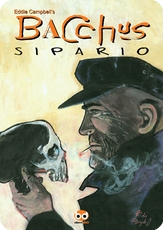
I'll be a guest of EdizioniBD, and it times nicely with the arrival of the eighth and final volume Of Bacchus translated to Italian. They've been bringing them out at the rate of one per year since 2002. It's 'curtains' for Bacchus in this one. I had an idea the title 'Banged Up' (locked up, or jailed) wouldn't travel well. The phrase doesn't even read clearly in America.


Curiously, the same publisher released A Disease of Language a few months back and I've only just discovered it. It's been attracting some great reviews. Well, they sound okay to me. Panorama.it: Un disturbo del linguaggio. Il genio visionario di Campbell e Moore. Mick Evans, who did all the design on it, thinks 'Disturbing Luggage' should have been the title from the get-go.


Then there's the one I spoke about two weeks ago here. ORPHANS! MAYHEM! TERROR!. Designer Charlie Orr put that along the top just to demonstrate a typographical approach. It cracked us up and we insisted it stay there.


To those three books newly printed in Italy, add a fourth, the old perennial, published, like the above, by Magic Press. No translation needed


A few years back Magic Press also published a book (now out of print) that never had an English language counterpart, my neglected Hellblazer run between shiny covers. It was a glossy tradepaperback using the cover of Hellblazer #90, June 1995, and the contents included all four of my parts of 'Warped notions', plus the issue Jamie Delano wrote to fill the gap while my thing was still gearing up, and the two issues following that were written by Paul Jenkins after my run concluded earlier than expected and somebody thought there were loose ends lying around. It was all a bit hectic and distressing I can tell ya. Vertigo thought my best idea was the one where I said, 'how about I just get off the book altogether'. You see, I never really 'got' Constantine. I mean he was good in the first place when Moore wrote him, and in the second place when Neil Gaiman put him in The Books of Magic ('how about you, John, have you ever travelled through time? Yeah, but only one minute after another, like everybody else.') (I'm pulling that out of my memory so it may not be exact). In those manifestations the character was a London wide-boy wandering about the occult end of the DC universe. By the time I arrived he was a London wide-boy wandering around... London. it seemed to have become a sixteen-year-old's idea of how a cool forty-year-old might behave. I didn't get it then and I still don't get it. Anyway, the book was a great cover-to-cover showcase of first rate early Sean Phillips art, and why it remains uncollected in English, when other baloney is published every month of the year, will have to remain a mystery. And 'I don't like myskeries on account of I cannot understan' 'em.' So there you go; Distorted Noses.


I'll note the London appearances when they're pinned down.

Labels:

Monday, 27 July 2009

steve Holland's obit for John Ryan quotes the man himself:
"I'm a lucky man, because I've managed to earn a living by doing what I love: drawing and painting every day! And I've been supported by my wonderful wife, children and grandchildren, who've helped keep Pugwash afloat, sailing the high seas for 57 years! No matter how many other characters I create, I always seem to come back to the Captain. Pugwash has two qualities which I believe are present in all of us to some degree: Cowardice and Greed. It is the conflict between these opposing emotions which make the stories work. It may be that the Captain is popular because we all have something in common with him. What would YOU do if you saw a delicious toffee on the nose of a crocodile"
Steve Bissette cracks me up:
As a lad, I couldn’t get past the ‘tamping rod through the skull’ trauma, and for years carried the manufactured image of one Phineas Gage having to live out his life with said rod still fixed in his face and brainpan. I reckoned (as youthful men do) that it must have been carefully, tenderly sawed off top and bottom, leaving only the unremoveable portion of the bar buried cheek-to-upper-forehead forever in his head, and pondered many a night how heavy such a head would lie upon a pillow, or how easily he might have broken his neck thereafter merely by sneezing, or crueller still, by nodding off in church, as young men must and do from time to time."

Leonard Pierce at the AV Club reccommends From Hell as a first read comic or graphic novel

I'm waiting for mine in the mail

Labels:

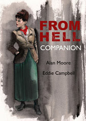
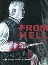
i was shown the 2-volume cover designs for the upcoming Japanese edition of From Hell last week. They were hoping I still had the originals of some incidental drawings they wanted to use within the designs. I don't, and I'm not sure how that will affect the overall plan. Not too much I hope as the designs were striking and definitely the most daring version of the From Hell covers so far. Hopefully the problem will be solved and I can show them here soon. meanwhile it got me thinking back over the assortment of covers adorning the big book since it was launched in Dec 1999 on the eve of the new millennium, just short of ten years ago. The earlier eleven painted covers of the Kitchen Sink Press parts are visible on one page here (1991-98.) My original cover was an update, but darker and with a new ominous feeling, of the first KSP cover, a still life in oils depicting a velvet covered top hat with grapes, which had come to be emblematic of the whole story.


The foreign editions of the book sported this cover design, with technical variations, for instance the French edition had matt varnish and 'French flaps,' and elsewhere I've told the story of Mick Evans and the bantam cock on the spine of the Australian Random House edition (which was printed in India from the second set of negatives which we had made specially for the limited signed Graphitti Designs edition... none of this was straightforward). The exception was our Spanish publisher, Planeta, who made the first of the foreign editions and boldly went its own way, using the old Todd Klein logo from the KSP run and combing it with a photo of the actual William Gull superimposed on the infamous From Hell letter. I've always liked to imagine that our William Gull is a fiction who just happens to share a name with a real one who existed once, so this discomforts me a little, attractive though it is as a cover. It certainly serves the same purpose as the still-life in making the book look very unlike a comic. (On a side note, I'd be interested in hearing Todd's observations on designing that From Hell logo because he was brought in after the first book was already out and it was impossible to put the new logo on the reprints of it. The story involves Tundra and could only include accounts of hair-pulling exasperation.)


To coincide with the release of the movie it was necessary, as demanded by the bookstore chains, that we tie the cover design to the movie poster. This was what was available, an interestingly simple motif which was subsequently compounded with photos of Depp and Graham closer to the release of the movie. Half of our third print-run had this cover.


If we'd had the full version (above, of which my son Callum has a huge six-foot version, on that shiny plastic canvas material, obtained from a cinema by hayley campbell and inherited by him along with the bedroom wall on which it is hanging after she shifted to London), I'm sure it would only have confused many readers who tried to match the characters on the cover to any of the characters inside. We were glad when the movie came and went and we could get back to our regular cover. But once that sparkling red streak was in our system, by which I mean on our 'core resources' disc, it turned up on some of the later foreign editions to come on board, such as the Danish one. Or at least, I think it's Danish, as this image I found on the net is my first sight of it.


Here you see it combined with our own logo (Incidentally, I wrote about the logo here):


After five printings I handed the whole business over to Top Shelf and gave them a new cover with which to get started. Curiously they were very wary of it at first, and reused the old cover with this as a black and white endpaper on their first printing (sixth in total). Something to do with the blood and the bookstore chains. Anyway, it's been on the front where it belongs from the seventh printing and the book is up to it's ninth or tenth. I stopped counting after a while.


Top Shelf used the same image on their hardcover, but without the logo, which appears only on the spine. Knockabout in England took advantage of the new digitalized files (relevant post, November 2006) to organize their own printing (theirs was previously ganged up with the US edition printed in Canada) and redesigned the look of the hardcover. The splash motif, in red, comes from the title page, where it has always been printed in black.


The above cover is a variation on that of a very odd edition I published myself back in 2002. It consisted of nineteen copies bound in plush kangaroo leather. As a publisher it was my only adventure in extravagance. photo by Chris Mclaren of his copy.


Last Monday I linked to an old article I wrote titled 'The Technical history of From Hell', which I guess is what suggested today's post, which goes some way toward updating the essay, though I would probably need around 5,000 words to do it properly.

Labels:

Sunday, 26 July 2009

while digging out the old 1995 Bissette interview friday I came across something I haven't seen in fourteen years. When I was launching myself as a self-publisher, my mentor Dave Sim, for whom I retain enormous admiration, gave me eight pages at the back of each of two consecutive issues of Cerebus to show a preview. It was done very quickly as I was already throwing myself into the disciplined routine of getting it done and moving on quickly to the next job. I chose some neat upcoming pages from Bacchus and put a couple of myselves in there too, darting around pointing things out, and the wole thing finished with me coming face to face with Gull. (click to enlarge)

Labels: