Saturday, 7 July 2007

About drawing paper. (part 5)

This is a paper I used quite a lot though The Black Diamond Detective Agency. I thinks it's supposed to be a mounting board. It comes in bright grey, bright gold and dull green, and perhaps others. I used those three. It has distinctive arbitrary-seeming marks through it which remind you of the patterns in stone marble. I liked the notion that Fate had already put marks on the page before I got there, and thaat thses marks, random as they may be, could not help but have an influence on all the decisions that I would make. The page at left is one where I left a great deal of the original paper showing, to give the reader a clue as to what might be afoot, to let them in on the game if they wanted to try and follow the moves. I was surprised how sweetly this card took the watercolour paint. Absorbtion was slow and it was a very pleasing surface to work on. The example below shows the bare paper next to the applied colour. And below that Is a scan I made of the back of the same page, showing the scope of this marbled pattern across the whole surface. That's the 'green' selection.


************
Condom testers wanted."To apply, simply explain why you think you're right for the position (missionary is acceptable)..."
************

Today's post may be up later than usual as we are off to a wedding. And If I forget to put it up altogether, apologies. I'm either three sheets to the wind or testing condoms.

Labels: ,

Friday, 6 July 2007

About drawing paper. (part 4)

Pages 16 and 17 of The Black Diamond Detective Agency were painted on a most unusual choice of paper. I didn't so much choose it as find it lying about. I have no idea where it came from. It was probably a backing card for some household object. It was standing against the wall outside the back door on its way to the garbage can when I spotted it. That'll be the very fellow for me, I thought to myself. It's a coarse brown sheet of paper with a horrible texture. Exactly what I needed to help express the anguish and horror of the aftermath of the train sabotage at Lebanon Missouri that fateful day. It was big enough for me to cut two pages from it. You can see it exerting its hot acrid influence at left on the whole page. Using a base like this means you don't need to do a lot of overpainting, letting the peculiar texture be seen to advantage. I put a swathe of blue smoke in the final panel just to be contrary, just to let the paper know it wasn't the master. In this scan from the original art you can see the raw paper at top left outside my pencilled page border which hopefully doesn't show in the printed book.


I scanned a small area of the back of the original art at 400% enlargement and curved it in photoshop to give enough contrast so that you can see the texture. So it looks a little brighter and more yellow than the original, but you can see all the pulpy natural crap embedded in the paper.


It's an adventure this art game.
*********
Dammit, George Melly died.
Loud check zoot suits, jaunty fedoras and ties that almost glowed in the dark of smokey jazz clubs were all the brash trademarks of Good Time George. He hankered after a bygone age of gangsters’ molls, speakeasies and bootleg liquor in a camp, infectiously entertaining way that endeared him to audiences for 40 years.

Away from showbusiness and writing, his main recreation was fly fishing and he owned a mile stretch of the River Usk in Wales beside his picturesque holiday home at Scethrog, Brecon, Gwent. He paid £47,000 for it in 1985 but had to sell three of his surrealist masterpieces – a Magritte, a Klee and an Ernst – as auction bidding mounted.

**********
and in other news:
HONG KONG (Reuters) - A Hong Kong woman who blinded her boyfriend in one eye in a fight six years ago has been jailed for jabbing a chopstick into his other eye, a newspaper reported on Wednesday.

Labels: ,

Thursday, 5 July 2007

Go out and get your bawbaw.

Happy Seventeenth Birthday to Erin Campbell!
you may remember her from such comicals as "This is your lunch'
(enlarge each tier separately)
(From The Dance of Lifey death in Three Piece Suit.)
************
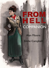
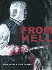
Meanwhile, "It's a pain in the gary," said the other one, wee hayley campbell (who took the photograph above), at the beginning of a conversation that had me phoning our local chirpy cockney, mr White, and ended with me finding the cover of this week's London Time Out magazine. Soon as I set me minces on this I said, 'very From 'ell, dontcher fink?'
************
In other news:
Drunk takes a free bike ride on car roof-
Jul 3, "The driver and his wife, when stopped by the police, said they heard a noise while waiting at a traffic light, but did not realize they were taking on an extra passenger."

Labels: , ,

Wednesday, 4 July 2007

About drawing paper. (part 3)

H

aving introduced red coloured paper into the process of making The Black Diamond Detective Agency (see yesterday) I thought, 'Why stop there?'. Next it was black and grey coloured papers for the night scenes. The dark paper exerts its influence over everything that goes onto it, maintaining a somber tone over the whole page.

I always use fairly lightweight paper, a habit derived from a need to reduce the expense of mailing heavy packages overseas, so I always stretch my paper to avoid buckling if I'm going to paint on it (I didn't always do this, if you happen to have a Batman page that isn't sitting perfectly flat and you're wondering what I'm talking about). The stretching keeps the paper flat, a necessity for aligning the lettering on a tracing paper overlay. I always leave plenty of space in the word balloons because with the humidity where I live, the page and its overlays can end up having quite different measurements. In fact, it's a rule of mine that I never put anything on an overlay that requires ultra-accurate placement. That's why I stopped putting a black line around word balloons, though once I started doing for practical purposes I came to prefer it aesthetically. That strip of brown on the right is the tape that held the paper to the wooden drawing board. I don't know what it's called. After all these years I still ask for 'the tape you use to stretch watercolour paper'.


The stretching process is explained here: "The easiest way is using your bathtub. Make sure it's clean and fill it about 6" deep with lukewarm water..." I would never go to that much trouble in the soaking; I'd hardly run that much water to give myself a bath. And in a busy house like mine there's always somebody at the door shouting "Dad, Is that you in there washing your paper again?" I've selected these from the original art scans so you can see evidence of the unpainted paper at the edges, and I've zoomed close enough that you can see something of the fibres in the paper. above is page 24 bottom right and below is page 117 bottom left, showing the snow outside the tunnel entrance.


All this stuff about paper is meant to show that, whlle it is undeniable that certain application techniques are best served by specific receptive surfaces, a spirit of adventurousness may well be rewarded. And in the end, it's everybody to his own. What serves my purpose may not serve yours. John Coulthart in comments, monday, made me laugh:
"Bryan Talbot used to enthuse about very expensive CS10 paper which has a smooth surface that can be scratched away if necessary. I never liked that, it felt like drawing on the side of a fridge."

More intriguing paper secrets next time, and do tell us about your own discoveries..

****************
Yahoo news: (via mick Evans, who loathes the word 'blog' and reminds me of his detestation every time I bring up the subject.)
"Blog", "netiquette", "cookie" and "wiki" have been voted among the most irritating words spawned by the Internet, according to the results of a poll published Thursday. Topping the list of words most likely to make web users "wince, shudder or want to bang your head on the keyboard" was folksonomy, a term for a web classification system. "Blogosphere", the collective name for blogs or online journals, was second..."
***********
A couple of days back a commenter was asking what I'm currently working on. This question is answered at some length in the second part of my Publishers Weekly Interview, online today: Since that interview I have arrived at the end of the book, The Amazing, Remarkable Monsieur Leotard, and now I must spend a month revsing and fine tuning. By the end of a book I've always had second thoughts about what a character is supposed to look like, so I have to go back and make everything consistent. Also around this time I go through a phase of wanting to toss the whole lot in a fire, change my name and go into hiding. I believe this is normal.

Labels: ,

Tuesday, 3 July 2007

About drawing paper. (part 2)

M

ore on the eternal mystery of what paper to use for drawing comic books. Campbell's theories on this important subject are guaranteed to baffle you. For the big double page (8/9) explosion in The Black Diamond Detective Agency I had this notion I could save time, since I wanted the finished thing to be very red, by painting it on red paper. The problem was that when I needed to fix mistakes I had to try to mix a red to match the colour of the paper. So, in the end, the red paper didn't save me much time. You can see other tints showing up in this detail:


The effect I wanted however was pure black on pure red and nothing in-between, so Danica at First Second tweaked the spread in photoshop.


The effect i was after, and nobody appears to have noticed this yet, was exactly that obtained by Wally Wood in the Kurtzman story Atom Bomb in Two-Fisted Tales #33 of May 1953. And to get this effect it would have been much easier to have done the art in black 'line' and add the red later at the production stage;


However, that effect of the black on red may have only happened on the back cover of a Comics Journal, a 1981 issue whose featured interview was either with Kurtzman or Wood, as the Russ Cochran EC reprint shows a completely different coloring:


Question: was I influenced by a Comics Journal re-colouring job when all these years I thought it was in the original?
***************

Bernard Black responds to a rejection letter
"Thank you for returning my manuscript, and your enclosed niminy piminy little note. I am afraid YOUR letter is unsuitable for ME as I have just spent the entire weekend wriing the novel that you have smmarily rejected. I can only assume that it is company policy to reject all manuscripts not submitted in ten foot high braille. And yes, I am aware that it is bad form to respond to any kind of criticism or rejection, but in this as with all else I am an innovator, therefore I may freely address you as… pissmidget. Still, there’s time for you to change your views and I think you will when we meet and meet we most assuredly will, when I suck out your eyes and use them as stoppers for my ears to muffle the screams that you make as I head-butt you into a fine paste. I do hope you will not be disheartened by your sudden, violent death.
Yours faithfully,
Bernard Black."

Labels: , ,

Monday, 2 July 2007

About drawing paper. (part 1)

S

ince this is the kind of question a beginner always wants to ask, I thought a few posts about drawing paper, or 'art board' might be fun. In fact, I think it's best to stop thinking of it as 'art board' right from the outset; just think of it as the paper you draw on, as opposed to the paper it will be printed on. I drew the entire 48 pages of my masterpiece, Graffiti Kitchen, on ordinary typing paper because I wanted to remove all thoughts that I was wasting expensive paper while I merrily inked on it without pencilling and shredded it and threw away three times as much as I kept. In fact it doesn't even need to be paper. You could draw on your bum and photograph it if you thought that would make your work any funnier.

A young guy phoned me out of the blue once for the purpose of finding out what kind of board he needed to use to draw comics. When I told him what I myself use, he went away very disappointed. Either that or he thought I was pulling his leg, or even protecting trade secrets from being purloined by outsiders. I believe he wanted me to tell him the secret of obtaining that paper with all the guidelines already printed on it in blue, as it seemed to be his belief that his drawings could never be considered real comic book art without it. I've used the official Marvel and DC boards at least once each in my life, as evidenced by the image at left, part of my very first panel of the two issue Captain America job I drew in 2004. It's usually a good idea however to use DC boards for Marvel, and Marvel boards for DC. I used to think it would screw with their minds, but since everybody does it, they never even noticed. My assistant on the Cap job is one of those dedicated comic book aspirants who gets his own blue line boards made up, with StewART in bold across the top in proud cyan, so when we I ran out of both Marvel and DC boards (we were spoiling a lot of them in our desperation) I just used some of StewART's.

The type of paper discussed above is called bristol board, and if you are a young artist with no job and no money you will be alarmed at how expensive it is, even without the samples with a publisher's bluelines on them that you may have stockpiled by pretending that you spoiled a lot of them. For my own work however I very early, for reasons of economy, got into a habit using what is called ivory board. I don't think it was ever meant to be an art paper and I deduce it's used for making printed cartons or other design purposes. Note that I'm not recommending it to you by any means; my purpose is to show that there is no single answer to the question, 'what board?'. But it was always cheaper than bristol board and its glassy surface made it good for the kind of fast pen work I had turned into a speciallty. The board also comes in a couple of other styles made by embossing a texture onto it in the manufacture, such as a linen effect which I used for two whole chapters of From Hell (#2 and #10). Here's an example from the Bacchus story Afterdeath. I would use a crayon across the surface so that where it touched the raised parts it was black and where it didn't, in the depressions, it remained white, making a halftone effect. I've scanned this from the art, but it usually printed more or less accurately, tending to be darker, but since I usually used this board on stories where I wanted a bit of murk, that was fine. The nice thing about it was that this toothy surface never arrested the nib, so I could use fine lines on it also. ( a certain yellowness you can see on this scan is caused by a layer of sticky-backed transparency I'd lay over the crayon areas to avoid smudging. Theoretically that should be a bad idea, not unlike all my other ideas, but it has served me well).

More silly art-papers next time.
******
Back on 13 May I mentioned Sarnath Banerjee’s The Barn Owl’s Wondrous Capers, and a fellow just linked me to his article on The Plight of the Indian Graphic Novel
You may enjoy it if you like delightfully impenetrable references without any links to pictures so we could get a grasp on things:
"We are talking about the Baboo Bankim Chandra of the Indian graphic novel..."
"And even when you have plentiful instances of intellectual foppery and postcolonial spin offs, our graphic novelist writes 'Nuncoomar' like a pucca sahib"

But the poor chap thinks it's necessary to erase all yer pencil marks. he obviously isn't familiar with Campbell's works:
"The Indian press is all praise for Sarnath, whose illustrations, simply put, are horrible! In some frames, you'll see that the artist in his hurry to fame has simply forgotten to erase his pencil-marks from the paper... a criminal offense I never found repeated in the comics and graphic novels he tries to emulate!."
*******
in other news:
In Yangon, Burma, thieves are taking advantage of outages often lasting for more than 20 hours a day to steal the copper power cables, police said on Friday. "The thieves are risking their lives as it is impossible to know exactly when the power is going to be restored."

Labels: ,

Sunday, 1 July 2007

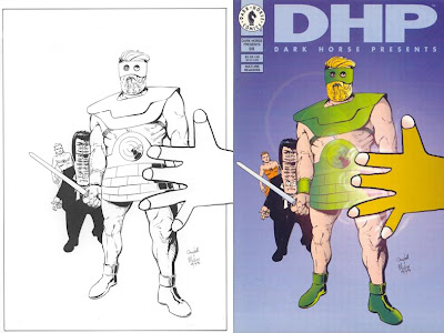
covers- DHP no. 98

Sometimes the black and white drawing looks like it didn't involve very much work, but once it's been colored you couldn't add or subtract a line without ruining it. This is another where the colorist completely understood the desired effect, and I don't know who did it (When I visited Dark Horse in '93 they had a colouring department with three or four people working industriously at their monitors) and I don't think we sent a colour guide as I would have made Joe's hair white instead of blond. The drawing illustrates the part of the story where Joe Theseus meets God, and God turns out to look exactly like a child's crayon drawing. Pete and I both tried to draw God in a child's style but it just wasn't working. It was coming out too cute, too knowing. Another thing about a child drawing a comic strip is that the character would never look the same twice. You would never even get the same proportions reccurring. Thus for authenticity I got wee hayley campbell to draw God. She'd have been eight at the time the story was drawn and just a couple of months older at the time of this cover, dated 28/10/94. I honestly didn't think I'd get away with having her draw the 'hand of God' in the foreground of the actual cover, but I decided to brazen it out. Nobody said anything to the contrary and it remains a favourite of mine. Pete had more of a sense of big heroic figures, so he worked over and inked Joe Theseus, but the Eyeball Kid looks like mine. And the girl at the back is Pete's.
***********
hayley campbell, no longer eight, reviews Beirut's London gig at audioscribbler.
She has also been looking up Grose's 1811 dictionary of the Vulgar tongue. This is probably what Neil Gaiman was looking up when Alan Moore wrote (in the appendix for From hell Chapter 3 page 3):
"The expression , in this instance, was passed on to me by Mr Neil Gaiman, who has a dirty mouth in at least seven centuries."
************
Find out the rating of your blog (thanks to John C.)

Online Dating

This rating was determined based on the presence of the following words:
hell (19x) death (5x) crap (2x) shit (1x)
It's that hayley campbell's fault.

Labels: , , , , ,