Tuesday, 9 September 2008

my old pal Pete Mullins called yesterday and surprised me by mentioning as an afterthought that he has started a blog. He's using it to showcase his work both old and new and make passing comments as he goes along. It was great to see some of the stuff he's been up to of late. Long time readers here will recall that Pete and I worked closely together for a few years in the 1990s. You can see his work in Bacchus volumes 7-10 and From Hell. You'll probably have trouble separating his from mine back then, as we often do ourselves, and as Lambiek does, surprising given that he does work as flash as these character designs for an animated series where the characters are all constructed from old socks.


This is a a clear example of Pete's style on Bacchus. Only the lettering here is mine:


He would always go to town if I asked for something crazy. Everything this side of Bacchus is Pete's work:


And finally, a panel from one of the oddest things we pulled off. A little humorous five pager titled The Devil's Footprints (co-scripted with Marcus Moore) for a Heavy Metal special number that Kevin Eastman published back in 1997. In this panel I see my own lettering and I guess that hand in the forground; the rest is Pete's:

Labels:

Sunday, 1 July 2007

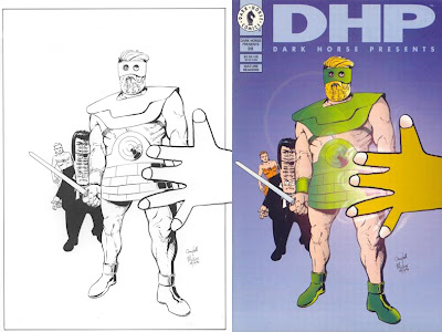
covers- DHP no. 98

Sometimes the black and white drawing looks like it didn't involve very much work, but once it's been colored you couldn't add or subtract a line without ruining it. This is another where the colorist completely understood the desired effect, and I don't know who did it (When I visited Dark Horse in '93 they had a colouring department with three or four people working industriously at their monitors) and I don't think we sent a colour guide as I would have made Joe's hair white instead of blond. The drawing illustrates the part of the story where Joe Theseus meets God, and God turns out to look exactly like a child's crayon drawing. Pete and I both tried to draw God in a child's style but it just wasn't working. It was coming out too cute, too knowing. Another thing about a child drawing a comic strip is that the character would never look the same twice. You would never even get the same proportions reccurring. Thus for authenticity I got wee hayley campbell to draw God. She'd have been eight at the time the story was drawn and just a couple of months older at the time of this cover, dated 28/10/94. I honestly didn't think I'd get away with having her draw the 'hand of God' in the foreground of the actual cover, but I decided to brazen it out. Nobody said anything to the contrary and it remains a favourite of mine. Pete had more of a sense of big heroic figures, so he worked over and inked Joe Theseus, but the Eyeball Kid looks like mine. And the girl at the back is Pete's.
***********
hayley campbell, no longer eight, reviews Beirut's London gig at audioscribbler.
She has also been looking up Grose's 1811 dictionary of the Vulgar tongue. This is probably what Neil Gaiman was looking up when Alan Moore wrote (in the appendix for From hell Chapter 3 page 3):
"The expression , in this instance, was passed on to me by Mr Neil Gaiman, who has a dirty mouth in at least seven centuries."
************
Find out the rating of your blog (thanks to John C.)

Online Dating

This rating was determined based on the presence of the following words:
hell (19x) death (5x) crap (2x) shit (1x)
It's that hayley campbell's fault.

Labels: , , , , ,

Saturday, 30 June 2007

covers- DHP no. 94

A Dark Horse Presents cover from the period when they dispensed with the sidebar (starting #91) and the covers were open and spacious, well except I've crowded in a bunch of skulls where the sidebar used to be. The signature is dated the month after the ones I showed yesterday. The cover goes with the first part of a serial of six ten-page chapters that ran monthly in DHP, Feb-July 1995, immediately following the miniseries I showed yesterday (Dec-Feb) and overlapping the The Bacchus color special (Apr) and launch of my own imprint (May). My entry into self publishing, or Campbell's world takeover as it was referred to around our house, was nothing if not impeccably planned. Hellblazer was in there too, Jan-Apr, and volumes seven and eight of From Hell in Nov and April. There were a couple of other things too, so that roughly speaking we had three outings per month over a seven month period, from four different publishers. It's no wonder I thought I needed help. Nevertheless, the main figures on this one look like my own pencilling and inking. I must have run out of patience and asked Pete Mullins to finish off the skull headed villains. I could never take that kind of thing seriously, even if this outing was more mock than heroic, though always played straight-faced.
I'd forgotten there was a pencil rough for this one until yesterday. There must have been a colour guide too, though I can find no record of it, as the Eyeball Kid is wearing the hat worn by my son age 2, and they wouldn't have otherwise known it was supposed to be white.
************
hayley campbell linked me to CBS News: Dangerous Bomb Deactivated.
As for Londoners, the chances of something like this sending London into a panic are about zero. In 2005, Slate's David Plotz happened to be in London on 7/7 and noted, within a couple of hours of the attacks, "When I walked by the Queen's Larder Pub, not half a mile from the Tavistock Square wreckage, at 11 a.m., a half-dozen men were sitting together at a sidewalk table, hoisting their morning pints of ale. Civilization must go on, after all."
Hearty bunch, those Brits.

Labels: , , , , ,

Friday, 29 June 2007

covers- HERMES Vs. THE EYEBALL K!D
(3-part miniseries)

L ooking at these two covers (inked 1,2) (colour roughs 3,4) I noticed they both have the same date, 13 July 1994, and I recalled the industrious enthusiasm with which I and Pete would throw ourselves into the thing away back when I started 'Campbell Industries' (as Pete called it) in 1994. Whoever did the computer colouring at Dark Horse (April Johnson, who is listed as designer?) did a very nice job of interpreting our intentions (5,6), I like the way a potential tonal muddle has been avoided in the lower left corner of the second cover, enabling the foreshortening to thrust forward. Also, there is a sensible scaling up and redrawing of the logo from the small one Pete designed for the chapter box headings.


It's tricky now to say who did what on these, but relevant to recent debates around this blog, I decided to try for some Colletta lines on that first one, though they look like Pete's execution, on the Hermes at least. That's his more fluid line all over the second cover
Not only did we do the two covers in one day, but for the third I included in the package this cover I drew for Dark Horse Presents when the serial originally appeared there but which had not been used at the time.


I sent some extra spirograph patterns which I'd blown up from that product's demonstration booklet when I found that making them by hand was turning out to be much too difficult (another of wee hayley campbell's toys commandeered for professional usage), and invited the colorist to have fun.


All in a day's work.
Here's a recent review of the first issue.
And if this has made you curious about the story, It's all collected in here.

Labels: , , ,

Thursday, 21 June 2007

covers- BACCHUS no.20

A nother cover from our run of good ones around 1997, this one being for Bacchus # 20, Dec 1996. I was tickled by the situation with the tobacco industry, being legally obliged to spend one third of its product surface and advertising space telling people not to buy the product recommended in the other two thirds, and the way the industry gamely presses on under those and other constrictions. For a moment I thought we were MAD magazine, with Bacchus standing in for Alfred E. Newman. For the first sketch I stretched out an actual cigarette packet and glued a drawing of Bacchus plus a logo onto it. I always used to put a thick line around the sketch with a caligraphy marker when I used it as the solicitation image (1), to make it stand out in the crowded Diamond catalogue. For the finished cover I was thinking of the typographical arrangement of the slick magazine ads for cigarettes. I gave it to Pete Mullins to turn into a painting (2) and Mick Evans did the finished cover design (3), taking a notion to dull the image and put it slightly out of focus for an effect of queasiness. The cover was odd enough to stand out quite nicely on the shelf.
********
Our regular commenter Ben Smith noticed this because they used the photo of the gigantic condoms again, last linked to here when it tickled wee hayley campbell: India rattled by vibrating condom -By Jyotsna Singh -BBC News, Delhi-20 June
A vibrating condom has sparked a fierce debate in India, over whether it is a sex toy - which are banned - or a means of birth control. Hindu hardliners have held protests asking the government to ban its sale, though most people on the streets of the state refused to be drawn on the matter.
********
meanwhile the lass herself is off to see Grinderman. Honeybee, we'll have to make do with youtube.
********

Labels: , ,

Tuesday, 19 June 2007

covers- BACCHUS no.22

This has the same cover date, Feb '97, as the neat DeeVee cover by Pete Mullins I showed on Saturday. It was a year of good covers. It's one of those where I honestly can no longer tell who did what on it. I even think I see both Pete's and my own hand in the colouring. There is a slight change in the judge's facial expression, becoming a little more malevolent, between (1) and (2). I remmeber selling the original to a lady lawyer who was tickled by it and wanted to hang it in her private office. One thing I do recall is that I knew Pete was driving by the courthouse and asked him to do a quick reference sketch of the statue of Lady Justice in the fourcourt from his parked car. I subsequently received the following by fax, and like all faxes received from the inestimable Mr Mullins, I made a xerox for long term filing. He would usually find a humorous way of including himself.
************

The music of science
Horace Dorlan by Andrzej Klimowski is a weird, witty and oddly humane graphic novel- reviewed by Michael Moorcock-Guardian-Saturday June 16,
(link thanks to regular commenter Ben Smith)

Labels: , ,

Sunday, 17 June 2007

covers- BACCHUS no.25/27

After that gorgeous cover Pete Mullins made for DeeVee #1 of feb '97 (see yesterday's post) I commissioned one for Bacchus in the same manner. So he put together the image of the Anchovy, a character in the storyline being reprinted in the second half of the book, in his own studio, and brought it in and it appeared on my #27 August 1997 issue. This was one of only two or three occasions when a Bacchus cover was coloured on the computer. That approach would never have been cost or time effective in the Campbellian set-up. It was much more expedient to just get out the markers and paints and work over a good quality xerox of the image. Pete could always get a good crisp result that way as in the cover of Bacchus #25 of May '97, the gathering of the Elvises, which is also all his work. In pulling out pictures to scan here I was again struck by how clean and bright the pre-press proofs in my files are (used here for both of the above) compared to the printed results.

p.s. Some time later we put together a whole 8-page Spirit story for Eisner and Kitchen Sink Press that we coloured in-house on computer. It had its own technical problems. I'll talk about that some other time.
********
hayley campbell sends this link: Doherty, the scruffy urchin with the million pound record contract and supermodel girlfriend, will join drinking pal Shane Macgowan and Meltdown festival curator Jarvis Cocker to pay tribute to classic Disney songs as part of the South Bank's annual music jamboree. Nick Cave, Baaba Maal, Ralph Steadman and Bryan Ferry will also perform. The event is June 17. you may have missed it already.
*******
In other news:
China censors "Pirates" for "vilifying Chinese"

Labels: , ,

Saturday, 2 June 2007

covers- DOING THE ISLANDS WITH BACCHUS

D oing the Islands with Bacchus - Like the 'Immortality' cover I showed on may 21, this is another that I lived with through several variations over a ten year period. In the top two I was stuck at two extremes; one puts the protagonist so far back among the beach girls that we hardly notice him, while the second brings him so far forward that the girls could be in another picture. The lower composition tries to resolve the problem by having a large girl in the foreground and the small group further off , but not too far. I like that I kept the rough painted edge in that second one in my xerox copy. You never see that again after the picture is printed as a cover. I remember visiting Matt Wagner in Portland Oregon around the time I painted the second picture and we discussed the aesthetic of painting up to a straight edge by using masking tape. Collectors apparently like to have a clean edge. Damn them I say; let's see all the workings. The foreground girl in the lower pair is based on a figure from a ladies' underwear catalogue; I was very taken with the arrangement of a strong reflective light thrown up from the hot sand
(1) is an ink drawing intended for the cover of a third issue of the Harrier Bacchus in 1988 if the series hadn't been discontinued (#2 saw Bacchus arrive among the Greek islands to begin his adventures there). I saw a chance to successfully submit it to the Amazing Heroes annual swimsuit special (Fantagraphics) 1991-(third girl back looks out of proportion, and the band of distant figures was added to fill the space that would originally have been taken up by a logo)
(2) Doing the Islands with Bacchus, Dark Horse mini-series 1991, 1 of 3- a xerox of my cover in oils, untrimmed, without logo and title type.
(3) coloured ink drawing, solicitation image for my own 176 page collected Doing the isands With Bacchus 1997, all the girls in this one, (colouring too), by Pete Mullins from photo refs.
(4) chemical proof of my finished cover in oils, 1997, without logo and title type. Note the seated girl in the middle-distance, from a photo, who appears in all three of the colour versions and may even still be sun-baking in my cumbersome file of old reference cuttings, third drawer down in the old metal cabinet..

******************
coincidentally from comments:
"This next story caught my eye after re-reading 'Doing the Islands with Bacchus' the other night."-Ben Smith
An 89-year-old (british) woman took a £2,000 taxi trip to Greece - because she can't stand waiting in airports.-BBC NEWS-30 May
Taxi driver Mr Delefortrie said: "I like driving and it seemed a good idea. The drive through Austria was spectacular.
*********
John Coulthart alerts me to a new exhibition opening June 1:
DALí & FILM - A GROUNDBREAKING SHOW AT TATE MODERN. This is from the 24 Hour Museum site:
The dream recounted by Gregory Peck for analysis by Ingrid Bergman (in the Hitchcock movie Spellbound, the dream sequence of which was designed by Dali)– with its distorted perceptions, eerie landscapes and faceless tormentor – remains one of the most powerful depictions of the subconscious ever seen in the medium of film. The image of the eye returns here, again being slashed by a man with a pair of scissors; other disembodied eyes watch the chaotic action from their position on top of plant stalks.
*******
in other news:
Man falls off balcony in spitting contest

Labels: , ,

Friday, 1 June 2007

covers- BACCHUS no.17

T he Yellow Bustard. I was going to inscribe that on the cover of this sly dig at Sin City, but I thought, oh everybody will get it. I suppose they did, but nobody ever said anything. Picture on left from Frank Miller's The Yellow Bastard, picture on right by me except for the rubber chicken, which Pete Mullins contributed and logo and color were added by Mick Evans at the design stage. We had conquered that problem some time before, as explained in an earlier post. Apart from my suspicion that everybody missed the joke, we had no problems whatsoever with this one, and the solicitation image was the same drawing as the finished cover. Why can't life always be like that?
***********

After enjoying the Beirut video the other day I’ve been doing some digging. Hayley Campbell sends me this Guardian article from November 24 last, the day before I started blogging, in which Zach Condon and Eugene Hutz are cussing at each other. Ah, not since the heady days when trad and modern jazz locked horns have such passions been raised.
'There is no such thing as Gypsy music'
From Basement Jaxx to Beirut to Gogol Bordello, bands are looking to the Balkans for inspiration. But, asks Dorian Lynskey, is this a genuine new musical hybrid or just cultural tourism?
***************

I've been enjoying Leif Peng's look, over the last couple of weeks, at the work of great American illustrator Al Parker
There are yards of beautiful pictures.
**************

wha? there have been 50,000 views of this pilot of the Furry Freak Brothers movie and I've only just heard about it? Gilbert never mentioned the possiblity of a movie when we had dinner with him, Hunt Emerson and the Knockabout crowd in Angouleme in France two years ago.
(via mr j, drjon and just about everybody else who heard about it before me)
***********

I'm interviewed at Suicide Girls. These long distance telephone conversations are always tricky, but I don't seem to have embarrassed myself too much here.
There's another interview at Comic Book resources. This was by email, so there was less chance of me making an ass of myself, but you be the judge.
*********

Website of writer Miranda July is the most original and funny thing I've seen online in a long time. (link via Neil Gaiman's blog)

Labels: , , ,

Wednesday, 30 May 2007

covers- BACCHUS no.29

T his issue had the story that was bumped along from #28, whose cover I showed yesterday. I must have realized it was getting too difficult to predict where I'd be when the time came three months later to draw the promised story, for I've drawn a standard sort of pin-up cover in the solicitation image (1), showing a grouping of the characters as they were appearing in the supporting (reprint) story. The coloring on the printed solicitation (2) looks like Pete's work. Very nice too. I can imagine I bought the catalogue just to cut that out for my files. The printed size of these could vary; this one is two and a half inches high, yesterday's was two inches. With the finished painting (3), which Pete has painted so thoroughly I can't recall how much I was involved, a boot is tromping on the flag of civilisation. In retrospect, the idea is too complicated since it's not an object that anybody could possibly recognize. What I really wanted to do was have Bacchus wiping his bottom with it (4), as he does in the story, and was promised in the solicitation for the previous issue, and I've mocked up here just for a laugh, but I didn't think the distributors and the shops would stand for it.
********

Book without words wins literary prize The Australian, may 29.
The graphic novel, The Arrival, by Shaun Tan, won the Community Relations Commission (CRC) Literary Award for 2007.
The $15,000 award was one of 11 announced tonight at the annual New South Wales Premier's Literary Awards dinner in Sydney.
(thanks to Michael Evans)
I wrote about the book on dec 11
*********
Alan & Mel's Wedding Reception Flickr set. (thanks, drjon)
*********
Marjane Satrapi shares the Jury Prize at Cannes. I missed this profile in the Herald Tribune from last week.-may 22
Marjane Satrapi at Cannes: An Iranian graphic novelist's coming of age

(via First Second blog)
*********
here's another great sound. French band Dionysos, and my First Second stablemate Johan Sfar appears to have designed the cartoon video. (link via mr j.)
*****************
If you liked that Nick Cave cover I drew for Punk Planet, David Carroll has posted a big full size version. My monitor is showing a lot of yellow on the face that shouldn't be there, it should be a flat flesh tone all over, but there's some nervous pencil detail that's picked up nicely. Mick Evans cobbled all my bits and pieces together in photoshop for this job by the way. the main portrait sketch is on a piece of tracing paper (used to trace the best parts of an earlier sketch) which when last seen hayley campbell was using as a bookmark in her copy of From Hell. In an artist's house, such things are taken for granted.

update: she says "'it's no there noo, it's shifted.' Now it's a bookmark in How to Beat an Artist."
**************
in other news:
Man wrestles leopard in his bedroom--Tue May 29,
JERUSALEM (Reuters) - An Israeli man wrestled a leopard to the ground after it entered his bedroom in a desert college and tried to make a meal of his pet cat.
"He jumped on the leopard and pinned him to the floor, then his wife called us so we could take it away," Amram Zabari, a local park ranger who rushed to the scene, said on Tuesday.

Labels: , ,

Sunday, 27 May 2007

covers- BACCHUS no.18/19

Y esterday I was writing about those little advance cover images that I'd send for the previews catalogues. Once I acknowledged the unlikelihood of the first idea being the one that would make the eventual finished cover, it seemed inexpedient to go to the trouble of drawing it up in a 'finished' way. Also, since my covers were more often than not painted, an inked line version was surplus to requirements. Thus I decided to cut a corner. Instead of drawing a full size cover at this stage, I'd make a very small drawing that would look good at the repro size of two or three inches high. In other words, since the distributors were agreeably showing a picture in their jam packed catalogues, I'd make the most dynamic use of the available space by composing to best suit the scale, and think of my picture as a 'placeholder' for a better one that would come along later. There was a lady at one of the distributors who phoned to point out that I had delivered a cover different from the one advertised in the catalogue, which was against the rules. I responded by pointing out that the rule was a sound one designed to stop publishers from offering , say a brilliant cover by Dave Stevens and then delivering a dumb one by Eddie Campbell, thus causing discontent with the readers who would naturally feel gypped. Since I had promised a cover by Campbell, and then delivered a more detailed cover by Campbell, I wasn't playing against the purpose of the the rule. I presume the matter was referred to somebody who knew who Eddie Campbell was, and no more was heard about it at this end for the rest of my duration as a publisher.
Anyway, after that first year of self publishing, most of those solicitation images were quite different from the covers as later published. Above are a couple of good examples. You can see how in the small versions the bold and simple black and white miniatures command their space more authoritatively, while if you click through to the bigger version, the colour image comes into its own. The Issue #18 (oct. '96) preview has a profile of Bacchus that is almost bigfoot cartooning. I tend to prefer it to the finished picture. The Subject of #19 (nov.'96) was so suited to Pete Mullins' skills that I handed it over to him and kept out of the way, so that one's 100% Mullins. The small girl's head sufficed until I or Anne found a photo ref for the finished image. With that issue Mick Evans finally got to redesign the logo after complaining about it for a year. 'Colo' was of course our version of the popular British mint, 'polo'. The story in this episode was one that Marcus Moore wrote for me, about the invention of a mint for inserting in your posterior, or the 'arse-mint.' Forever after, in the pages of Bacchus, Marcus was referred to as 'Minty Moore'.

(That's after 'Dinty' Moore, who was the chef in the great Bringing Up Father daily comic strip. There's a great site devoted to it, courtesy of Mark J. Holloway, including Dinty Moore way down the page.)
*************


Short Is Good: The concise joys of condensed books -- and the virtues of brevity

Wall Street Journal-May 12-By TERRY TEACHOUT
NEW YORK -- "Orion Books, one of England's top publishing houses, has just brought out the first six titles in a series of abridged versions of such classic novels as "Anna Karenina," "Moby-Dick" and "Vanity Fair." The covers of these paperbacks, which have been shortened by as much as 40%, bill their contents as "Compact Editions."
Of course great art deserves to be experienced on its own uncompromising terms, flaws and all. But the older I get, the more I appreciate those artists who say what they have to say, then shut up. Is there a more powerfully moving novel than F. Scott Fitzgerald's 56,000-word "The Great Gatsby"? Or a funnier film than Buster Keaton's 44-minute "Sherlock Jr."? Or a more profound meditation on the brevity of human life than "Anakreons Grab," Hugo Wolf's setting of Goethe's 12-line poem about the grave of an ancient Greek poet? "The happy poet rejoiced/In spring, summer and fall/Now at last this mound of earth/Protects him from winter." I'd trade any number of operas for that exquisitely wrought three-minute song."


*********
European men are flocking to Bulgaria to buy 'breast-boosting beer' after EU accession led to customs duties on the drink being abolished
Constantin Barbu crossed the Danube from Romania to buy Boza in the Bulgarian border town of Ruse.He said: "I've bought a case for my wife to try out. I really hope I see an improvement."

Labels: , , ,

Thursday, 19 April 2007

"There oughta be a law!"
"There already is, m'lud."

T his post relates to both the courtroom sketching I've been showing over the past ten days and my post of feb 25 about why on a comic book page the lettering should be done first. There are five stages in this sequence. I can't recall now why I would have gone to the trouble of making copies as I was going along. There must have been a presentation at the college coming up, but I don't rememeber ever using these for such a purpose. Stage one is the lettering, with just enough of a sketch to get the composition clear in my head. Click on each for a legible view.


There's a stage missing, as I have relettered the page to get a better descending rhythm to the balloons, and also altered the angle of approach slightly to make a deeper pictorial space (though you probably can't tell that from the scribble above). This was to be the first page of the final volume of Bacchus, so I was prepared to spend more time than normal to make sure it worked well. The main figures also look like they've been placed by me. I'm still happy with the composition here. Pete Mullins has gone in over my rough, added all the foreground figures and thoroughly worked out the perspective.


Next, I've pencilled and inked Bacchus and the other principal figures. There was to be a standing figure in the far corner, but I've decided to eliminate him.


Pete inked everything else


Then the page went to Anne for cleaning up, which in my studio was usually a lot of work and included such things as whiting the point on the balloon outline where the tail joins it. Since the balloons were drawn first it was usually wise to leave the tails until we knew exactly where the figure was going to be. You can follow that process above.


This appeared in Bacchus #16, which was (without checking) august 1996, before I got into the court sketching work. Perhaps Pete was already doing it and I thought it a good idea to take advantage of his experience. That would have been the reason I gave him so much to do on this page.

******
p.s. at the time of posting this, Blogger is having problems with pictures. I see that my photo in the sidebar has disappeared for instance, and the system won't let me upload any new pics. This one is already in the can and the pictures are working at my end. Any problems let me know. This will be a pretty pointless sort of post if the images have all gone AWOL.

Labels: , , ,

Wednesday, 21 March 2007

Calendar Girl

Showing those old LP covers a couple of weeks back made me remember a treasure I once owned and now It's 'melancholy March, meet melancholy me' (to quote a line from the precious artefact) because I let it go (can't even remember when... undoubtedly during one of those periods I was strapped for cash.) I found it in a junk shop way back in '78, one evening when I was walking home from work at the factory. I didn't know anything about Julie London at the time, but this object was just too beautiful to not take a chance on. Calendar Girl, an Lp with twelve songs, six on each side, one for each month of the year (there's another version of this lp with an extra song thrown in... I think the British edition must have logically thrown that one back out... or something) and on the cover Julie London herself poses in idiomatic costume twelve times, one for each month.


Maybe it was her famous Cry me a River turning up on the V for Vendetta soundtrack that brought her recently back to mind. That was a track from her first Lp, which had a pristine and perfect pared down accompanimant of only guitar (the first rate jazz guitarist Barney Kessel) and base, and was a big success against the odds in the year that rock'n'roll arrived in the public consciousness, 1955. It was produced, as were her first handful of albums, by her husband Bobby Troup, himself famous as writer of the song Route 66. Her second album, Lonely Girl was even more sparse, with just a soft guitar. Calendar Girl was her third, and an orchestra was brought in this time. Half of the numbers were standards and the rest were written specially including two by Troup himself and two by the guy who wrote Cry me a River.
While googling around i found a chap named Godfrey King mulling over one of these,
'FEBRUARY BRINGS THE RAIN' (Troup)
breaks the Winter's icy chain,
that's a song I heard so long ago"
I think he must have been recalling Sara Coleridge's (1802 - 1852) poem known as 'The Months'...the second line goes
"February brings the rain, Thaws the frozen lake again". It is at least an adaption from it and, as her father ST Coleridge
is my favourite poet , the song becomes a shared memory beautifully sung by Julie.

the album affects people like that.
I recently was able to retrieve it to some extent when it appeared on a cd, but it was paired with her 1959 album which had an orchestra arranged and conducted by a young Andre Previn in a godawful syrupy style. After Calendar Girl they started mucking about trying to find a winning approach, and there was an occasional return to form, but the 1955-57 albums are the best. My favourite Chet Baker session went for the same kind of simplicty. Dated 1957 it was probably carefully taking note of London's first outing. That's on Embraceable You. The record company apparently decided that wasn't saleable and put it in the vault for thirty eight years.

I scanned the above piccies from the cd booklet, but there's a site here with a far superior scan of the original lp sleeve, and lots of information on Julie London and her recordings.

My brain turned to Calendar Girl in 1997 when I needed a story for the Bacchus serial Banged Up. The set-up was that Bacchus was in jail and each of the various characters he meets there has his own story. Thus the book becomes a little set of short crime stories, including the man who killed santa Claus, the punk who pissed on the grave of Elvis, etc. This story was titled The Snatching of Miss July. An old inmate finds that his favourite pin up has been stolen out of a calendar that he has kept for years. The other pinups comment on the stituation:
Miss June: "I was looking the other way at the time."


Miss August: "It happened right under my nose but I aint saying nothin. More than my life's worth."
Miss December: "you ask me, she got what she deserved. She was so up herself, all that flag wavin' an' bugle blowin'."
It turns out in the end that Miss July was the old geezer's wife of twenty-odd years ago, and he's still doing time for her murder.


The attraction of the story was that I was able to draw on one of Pete Mullins' strengths, the depiction of that kind of period style cheesecake, and have him do a great deal of the art on that chapter. We had a lot of fun with it. You can just see my drawings of Bacchus and his cockeyed mayhem behind the pin-up of Miss January, which appears to have been left lying over the artwork. It wasn't unlike the kind of tricks Eisner used to pull in the great days of the Spirit.


Labels: , , ,

Thursday, 1 March 2007

A Pinch and a Punch.

A pinch and a punch for the first of the month (and all its variations and attachments). Where does that come from? I googled around to find the origin of that old saying and found a lot of people asking the same question.
Back in '96 when we were doing the last volume of Bacchus I had come up with a couple of characters named Transom and Mullion. There had been a tradesman in the house fixing windows and he had used the technical terms for the upright and horizontal in a window or door construction, at which point my mind left the matter at hand and my eyes probably glazed over. When you're galloping at high speed, writing a monthly book, you tend to sweep up everything before you and absorb it into your story. So I thought, Transom and Mullion, two characters who are always at cross purposes. Later I noticed the Hood's henchpeople in the Thunderbirds movie had those names (more wordplay since hood in Britain can mean the roof of a garage etc.), and they may have been in the original '60s series too, and if the names weren't used long before that I'd be surprised.


Once on paper, characters start to write themselves and these acquired a sado-masochistic relationship, and so, galloping at high speed from one month to the next I had them act out the first day of the month ritual in all of its violent potential. Pete Mullins, who worked with me in that period, always drew these two, and you can see his line is much cleaner than mine. (click for a larger reading version)

From Bacchus vol 10: Banged Up

Labels: ,

Tuesday, 19 December 2006

Let me Outta here!


These guys fell off the shelf while I was looking for something else and reminded me that Christmas is less than a week away. The fashioning of these little chaps owes something to the same impulse that guided Michelangelo. It is said that when he carved the Dying Slaves for the tomb of Julius II it was 'a process of highy symbolic direct carving which consists in freeing from the dead stone, the raw inert material, the beauty it imprisons'. As the great artist himself said in a sonnet "The marble not yet carved can hold the form/ Of every thought the greatest artist has..." Well, it was exactly like that when, at the end of one of our Christmas parties here at Castle Campbell, I was gazing at the champagne cork after the delicious liquids had all been consumed, and I was certain I saw my pal Evans in there, asking to be let out. "let me outta here!" I heard him yell. So I immediately took to the cork with my acrylics and my scalpel and in short order there was Evans on the table. Well, a miniature version of him I mean. And then this became a tradition here at our house. Neil Gaiman recently said that you can make anything into a tradition. Just do it and name it a tradition, but make sure you remember to do it again next year. And remember we did. Every year at the end of our Christmas bash, and after other mid-year parties, the cork would be retrieved from the floor and one of those present, or even not present but dear to our funny bone, would request to be let out of it. There were a dozen of them at one stage. I know this because our lad Callum used to get them off the shelf and put them in a 12-size egg carton, standing room only, and, pretending it was a bus, drive them all over the floor of the house. He even took them to school for show-and-tell once, introducing them as 'the cork people'. Looking at them now, the sheen has gone off them and their paint is chipped, and only four of them remain. It should also be mentioned that they once had necks, but champagne corks find their way back to a cylindrical shape if you don't tie string around them. In the foreground above is my pal Mullins, my right hand nib thorugh From Hell and Bacchus, and on the left my father himself, giving me a stern look. I don't think he knows about this tradition.

Labels: ,