The last word in Speech Balloons. (rule #3)
 About these 'RULES' of mine. I originally collected and numbered them for a talk I gave, which I titled 'Towards a rhetoric of comics'. In other words, a bunch of principles codified for assisting a cartoonist to put his thoughts across in the clearest and most persuasive way.
Jessica Abel drew a two page comic strip explaining how a comic strip works, and I have a problem with it. I don't think it's Jessica's fault. She has tried to explain something which under closer scrutiny proves to be faulty, but she's too sweet to say so. Now, me, I'd say: "this system is shambolic, I'm proposing a new one whether you like it or not."
The problem lies in the placing of word balloons. Convention (or Jessica) says that comics are a 'nested system'. You read a panel from left to right and from top to bottom and, when you've read everything in that panel you move left-right and top-bottom and read everything in the next one until you've completed the page.
 However, in all of my watching and noting over many years, the reader, even the experienced one, after reading the contents of a balloon, will be inclined to read the next nearest balloon irrespective of whether the rest of the balloons in the current panel have already been taken in. If the next nearest balloon is in the next panel, or even the panel underneath, then the cartoonist risks losing control of his/her narration. Therefore the very first thing the artist must do upon a approaching a page is pin down the balloons. In fact I go so far as to do all of the lettering first, because in addition to the above, lettering will take much less reduction in size than a picture, therefore it is essential to give the lettering priority. When I am certain that the lettering follows reading-logic, only then do I start drawing. Each balloon should follow clearly from the one before it no matter where the panel borders are placed.
example a: a page from Bacchus vol 1, Immortality isn't Forever (right above). The first panel is the tall one at the left of the page. My system dictates that the lettering in this panel go at the very top and there only, even though it might function better nearer to the heads of the speakers, otherwise the reader would be required to break a basic reading rule and move up the page to the next panel and its balloons, instead of following the conventional law of top-bottom.

example b: page at pencil stage from my cockeyed version of the Minotaur's story in Bacchus vol 3, Doing the Islands with Bacchus. lest you think that my system is inevitably going to require that all the balloons float at the tops of the panels, here's a variation. In this case the position of the balloons in the second panel have determined that those in the last panel must be placed very low, in fact at the foot of the page. The course of the balloons follows a downward sinuous line. They can only be read one way. This sample is also useful in that you can see I have ink-lettered the balloons while the pictures are only sketched roughly. In fact if you have the book you'll know that these pictures were replaced by others at the inking stage. I wouldn't normally do this much sketching (any) before lettering except that this was an odd layout that required special attention.
To summarize:
CAMPBELL"S RULE #3: In spite of what you may read, comics are not a nested system; a reader will read a balloon and then read the next nearest balloon even if they haven't already read all the ones in the current panel.
Other relevant thoughts on the general subject of balloons: Eisner has stated that giving a character more than one balloon in a panel gives the lie to the panel being a moment in time, with characters frozen in a pose relevant to what they are saying (therefore they can only be saying a limited amount). We all have our rules to make our specific way of doing things into a coherent system, but I don't worry too much about that one (you take your pick). I distrust the idea of comics being tied to 'time'. it's too close to the movie model for my liking. And there are bigger lies to worry about, like who said they didn't steal the tarts, or said they didn't kill Cock Robin.
Alex Toth wrote something about lettering that stuck in my head. It may have been here but I can't find it again. That site has Toth doing commentaries on a bunch of his old short stories. The 50s romance stories are the ones most worth checking out. He said that he liked a lot of 'padding' in the balloons, in other words, a comfortable amount of white space around the block of text. I have taken that one on board completely.
At the top of this post is a brace of word balloons from a detail of a panel in The Black Diamond Detective Agency that express my present aesthetic ideal. The balloon should be a thoughtfully designed shape that relates to the things around it in its pictorial context. I absolutely DETEST and ABHOR those goddam elipses they use nowadays in the comic books. I LOATHE them and will NOT TOLERATE them. I also don't care for them. I've heard all the economic arguments, so don't send them to me. Within the balloon the block of lettering should also form a designed shape, which need not echo the shape of the balloon around it, but the two should be aware of the existence of each other. It need not be said that I also have no time for computer fonts. But thirdly and don't forget this one, the space between the block of lettering and the balloon is a yet another element that needs to be carefully considered and shaped, the 'padding ' that Toth speaks of. Half close your eyes and you'll see it as a white stream flowing around the block of text.
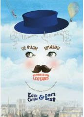
In my last couple of jobs I have taken to painting the balloons onto the page of art (before the picture, and then tidy them up later) in a pale yellow. I want the balloon to be a painted presence on the page instead of a hole through it to another dimension. I arrived at this by an evolutionary process after I started doing the painted books (in Batman: Order of Beasts I used a font, with irregular balloon shapes but with a holding line around them. The holding lines proved to be a technical pain in the ass, so in the 13 page Escapist story I did I tried losing those and lettered onto a tracing paper overlay by hand, which is very simple to align with the time honoured manner without extra computer work. This proved satisfactory so I carried the approach over to Diamond and I'm also using it on my new one, The Amazing Remarkable mr. Leotard.
My pal Dave Gibbons felt compelled to throw in his two cents on my last 'rule' . Since he does his own lettering and it is always faultless, I'll be very interested indeed to hear his thoughts on this one .
Finally, if you click the 'balloons' label below you'll find an earlier post on the subject.



14 Comments:
You are lettering king.
Love it. I never would've thought one would do the lettering first! But then I'm not a comics writer/artist am I? You actually do the fingering before the bowing on the cello.
Kidding.
I don't suppose there's, like, original artwork for the above stuff going? Or are you over that now?
Misplaced balloons can be so annoying. I had an example yesterday when reading the "Hello Cthulhu" on-line strips, the order was just not right: I had to stop, go and pick up a manga and read it in order to reset my reading mechanism, so I could go back on the site and really enjoy the strips.
I remember that a common critic to Druillet's books was that people had no clue in what order they had to look at the frames or how they were supposed to read the text (and the ornate lettering did not always help). His more recent works seem to have done away with the more Piranesian approach to frames he had back in the 70's.
Breach sent me this but I'm going to post it first because he hasn't done it yet and is thus, rubbish.
Jon Morris' plea for hand lettering!
Part 1 http://comixpedia.com/node/10366
Part 2 http://comixpedia.com/my_plea_for_hand_lettering_part_2
The whole point of language is to be able to import information. The point of "rules" within the language are there to remove confusion and help impart that information in the most clear way possible, keeping within the originator's intents.
Unfortunately, there's plenty of examples in comics when the narrative becomes confusing, even when you've got a revered letterer like Todd Klein. Alan Moore's fantastic Promethea often gets hard to follow as boundaries are pushed later in the series, which just, unfortunately, reduces the power of the original words.
It's clear that, even hearing the complaints of artists who've found their detailed work obscured by word balloons (I'm thinking of Gene Ha), and from the times that I've become lost in a narrative, that letters and artists (if they are to be separate) should liaise more with each other on their intentions.
Perhaps an artist could do their layouts, send them to the letterer, and then redraw their artwork accordingly.
It might take longer, but it might also make for a more satisfying read!
I know from conversations with Bryan Talbot that he also works out the positioning of the balloons first, making sure there's a logical flow from one to the next. He makes detailed guides for his letterers so it's not impossible to do this without doing the lettering yourself.
Seems like that would be a good way to do it, but I imagine it must take longer. It's weird that more artists don't work more closely with their letterers, but I guess that these days everyone is in a different city/state/country, which can't make things any easier.
I get this rule. I'm also intrigued by the Black Diamond panel. It appears to have the ability to be read in any order, the comments make sense with either coming first. the overlap, something that I'd assume is deliberate, seems to be to place the higher balloon as the first one, but I could be out. I do remember old British comics, The Beano or 2000AD, used to sometimes guide you through panels if the speech bubbles perhaps led you in a different order.
That Bullshit page, I mean, aside from positioning that way to grab the readers attention, they simply frame the images and the page wonderfully, although I'd guess that's because of the way the eye works across a page. I can't really speak on all this from any position of learning, but the placement of the images, like the glass in the second panel leaning into the balloons, and then the eye in the third panel appearing to focus on them somewhat distantly... it feels to me like there's a plan at work. Certainly agree that hand lettered stuff works better.
I once heard B.Talbot talk about how he used lettering to lead the reader through the art. Any thoughts on that?
Peter!
coincidence.
Anne was just asking what Fourplay were up to these days and then you suddenly commented on the other page a couple days back. great to hear from you. hope you're well. say hi to the band!
(you had me for a minute about the cello)
eddie and Anne
nathalie
i met Druillet once, back in '84...
John
yes, Bryan is always logical about the balloons.
Steve
i meant to say hi to your big long one on the other page, but i'm finally finding it hard to keep up here. Great to hear from you ... don't be a stranger again...
everybody else
AAAARGGHH
gotta take monty to the vet
before i go
steve
I flicked back a couple of pages and responded better than this
thanks for taking the time.
eddie
I got my break in comics doing balloon lettering on other people's work. In those days in UK comics, it was done on sticky back paper that was put onto the already inked artwork. I got to work over such wonderful artists as Solano Lopez, Joe Colquhon, Ken Reid and Leo Baxendale.
It was quite an education, not only because it allowed me to study original art up close, but also because the artists had a great feel for where the lettering should be placed and left "holes" in the artwork where they wanted it to go.
When I graduated to drawing strips rather than just lettering them I did my own lettering where I could, for two very pragmatic reasons and one aesthetic one. Pragmatically, it meant that I didn't have to waste time drawing stuff that was going to be covered up anyway and also that I got an extra payment for filling up the space. The aesthetic reason was that I hated handing in pages of art that looked incomplete and unbalanced because they lacked lettering. In those days my art needed every bit of aesthetic help it could get...
My feeling is that the drawing should be arranged around the lettering rather than the reverse and I always indicate it from the very crudest first thumbnail I do for a page. Like Eddie, I'll then rough pencil the lettering and the art together and only when I have ensured that there is room for the lettering will I tighten up the drawing.
in the case of Watchmen, where space was very formally and tightly arranged, I'd ink the lettering and balloons before doing much drawing at all.
Nowadays, I do use a computer font, which I had made by the experts at Comicraft but still set the balloons before I complete the pencilling. I'll sometimes print them out in light blue on the artboard and draw around them. I'm aware of the arguments against computer lettering but I'm very happy with the results I get, since the spacing and placing is still clearly mine.
The considerations of "breathing space" and text block shape inside the balloon remain critical, whether inking digitally or manually and are what gives it its graphic identity, possibly more so than the actual letterforms. Lettering digitally allows more time to be spent on these considerations and for tweaking balloon shapes away from the vanilla ellipse, which I share Eddie's loathing of.
I also tend to subscribe to Campbell's Latest Rule (#3). Looking forward to discussing the Next...
I was just about to write an impassioned screed in defense of the ellipsis, which I use liberally in Machiavelli to denote a pause in speech, casting about for the proper word, etc. Then I realized that Eddie will not tolerate the elipse (by which I'm assuming you mean computer-generated word balloons?) and realize I'm in agreement. Very well then.
I do, however, use a computer font, Operina Pro, for Machiavelli. It makes a lot more sense to use a typeface that complements the period.
I used to tell some of my more scholarly writer pals that there were things you could do in comics that you cannot do in any other type of story telling. Not with short stories or novels or in film.
The next time one of these folk ask for details, I shall send them straight to this blog.
I recall years ago being impressed with the graphic novel, GREENBERG THE VAMPIRE. Not because the story itself was particularly good (it was decent enough), and not because the artwork was spectacular (it was okay, too). But because both the author and the artist really played with the form in some interesting ways. (I have to admit that it's been a very long time since I've read that graphic novel, so my memory of it is rusty.)
However, I do recall thinking that the creative team on it had explored a few new ideas on how to tell a story with words and balloons and sequential art.
Having had dinner with J.M DeMatteis (the author of Greenberg)last night for the first time in many years. As we start to plan a web comic in Flash, thanks for noticing. It's nice to be remembered for things you try and my second gig in the biz.
Mark Badger
(artist of Greenberg the Vampire)
Post a Comment
Subscribe to Post Comments [Atom]
<< Home