covers- HERMES Vs. THE EYEBALL K!D
(3-part miniseries)


L ooking at these two covers (inked 1,2) (colour roughs 3,4) I noticed they both have the same date, 13 July 1994, and I recalled the industrious enthusiasm with which I and Pete would throw ourselves into the thing away back when I started 'Campbell Industries' (as Pete called it) in 1994. Whoever did the computer colouring at Dark Horse (April Johnson, who is listed as designer?) did a very nice job of interpreting our intentions (5,6), I like the way a potential tonal muddle has been avoided in the lower left corner of the second cover, enabling the foreshortening to thrust forward. Also, there is a sensible scaling up and redrawing of the logo from the small one Pete designed for the chapter box headings. 
It's tricky now to say who did what on these, but relevant to recent debates around this blog, I decided to try for some Colletta lines on that first one, though they look like Pete's execution, on the Hermes at least. That's his more fluid line all over the second cover
Not only did we do the two covers in one day, but for the third I included in the package this cover I drew for Dark Horse Presents when the serial originally appeared there but which had not been used at the time.
I sent some extra spirograph patterns which I'd blown up from that product's demonstration booklet when I found that making them by hand was turning out to be much too difficult (another of wee hayley campbell's toys commandeered for professional usage), and invited the colorist to have fun.
All in a day's work.
Here's a recent review of the first issue.
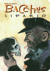
And if this has made you curious about the story, It's all collected in here.
Labels: Bacchus 2, covers-2, Eyeball Kid, Pete Mullins





3 Comments:
Ah, Spirograph... There's probably a (very short) study to be written about the use of Spirograph patterns in comics and other works.
When I was doing the Haunter of the Dark I wanted some shapes like that for the moments of cosmic realisation, preferably like the designs Saul Bass used for the Vertigo title sequence. I managed to get a secondhand Spirograph from somewhere then photocopied the patterns onto clear sheets and overlaid them on the drawing.
I was later given some of those other shapes--whose name I forget entirely--made by attaching a pen to a pendulum and suspending it over paper. Bass's shapes are those designs--the ones that aren't animation anyway. It should be noted that your use of the humble Spirograph is far superior to my efforts which ended up small and rather muddy.
Oddly enough I was wondering recently if there's an Illustrator plug-in to make those kinds of patterns. Never know when they might be required again.
Oh, and seeing as everyone will be desperate to know...those Vertigo shapes are Lissajous spirals. By coincidence the movie ones were animated by John Whitney who I just happened to be writing about yesterday.
enjoyed your youtube links John.
Got me thinking about the choice of the sitar pieces as an aural equivalent of the animated geometry.
Post a Comment
Subscribe to Post Comments [Atom]
<< Home