Tuesday, 14 July 2009

the Italian edition of The Black Diamond Detective Agency, published by Magic Press, who also did From Hell, just arrived in the mail. I open it to see how my favourite pages are looking, and i start to notice all my mistakes and oversights, the things inevitably missed when one is concentrating on the total effect. But at the same time I'd forgotten how hard I worked on this thing. This is another book, like From Hell, for which I used a large amount of photo-reference. the trick with that is to do it without being obvious. An image should not draw attention to itself as having been based on a photo because that tends to give the lie to all the stuff around it. Rather than being the text of the work, the detail becomes a reference to something existing outside the text, and the whole thing starts to unravel. And there just isn't time, if you're making a living out of it, to check every detail against a model. I lavished so much care on the big bottom that I didn't notice that the arm was implausible (I had no photo to get me anywhere close to what was needed for this one). I've fixed it digitally for showing here (click for an even bigger bottom):


(ignoring the digital tampering, the above is what the original art looks like, with the brown stretching tape still visible)

Crime writer Peter Doyle, author of City of Shadows, a stunning book of and about old police crime scene photos in Sydney Australia (circa 1920s) recognized some of his dead crims doing service as extras in The Black Diamond, even though I skewed them considerably, like this poor chap here, getting his just desserts no doubt.


Black Diamond Still available in English from First Second Books. Here's a recent review.

postscript. The wife of my bosom seriously wants it to be known that she did NOT pose for the big bottom.

Labels:

Saturday, 28 July 2007

saturday morning

L ast night had dinner and many laughs with Bill Horberg, film producer and Charlie Mitchell, writer of The Black Diamond Detective Agency screenplay. At left is a rare item you may never see. Bill gave me a copy, of which there are five hundred I think, last year. Without any pretense of being a graphic artist he fondly constructed, using collage and comic strip, an honest and engaging account of his meeting with Mickey Spillane and his attempt to develop a project with him. Artist Elsa Mora painted the cover for it in an approximation of the 1950s paperback style.
Charlie told me he's started writing another Black Diamond story.
Wee Cal is buying heaps of stuff. I'm curious to see how the lad thinks we're getting it all in the suitcases. I'm reminded of the time at con clean-up I scored a life-size cardboard stand up figure of Poison Ivy for my daughter Erin. For free. But then I had to pay a hundred bucks to get it on the plane. Having pictured her delight at having Uma Thurman standing around in her bedroom I wasn't about to back out.

Labels: ,

Thursday, 19 July 2007

"One bang and the cemetery population doubles"

T he Black Diamond Detective Agency. The colour on Sadie's face needed to be pristine, so I didn't want a lot of sketching on the actual art paper and tended think about her in the roughs more than I would all the other details. I was also worried about crowding in these panels. While I haven't solved the problems in the sketch, I've established what those problems would be and made the top panels a little taller to accommodate all the parts.


In the sketch you can see where I worked out the dialogue in the margin. Having boiled it down to its shortest possible length I'd then shift it into the spaces where it needed to go. As I said in an earlier post, the lettering would always be done first and the pictures made to fit around it.

Labels:

Wednesday, 18 July 2007

"She's not coming back."

T he Black Diamond Detective Agency. Another finished page and its preparatory rough. This one involved business that had to be clearly readable just from the visuals, so I needed to know where everything was going. The sketch was adequate to my purposes.


************
I just discovered this. Engrish.com, humorous mistakes made in Japan in the use of the English language. Some very amusing photographs. God only knows it works vice versa-- in fact, here's the very place: Hanzi Smatter :- dedicatd to the misuse of Chinese characters in western culture. I've linked to the first page of his blog in 2004, where he gives an introduction. I found the first site by accident and the second via the first.
********
John C. draws our attention to "A 180ft image of Homer Simpson waving a doughnut aloft has appeared adjacent to the ancient Cerne Abbas giant, the 17th Century chalk fertility symbol in Dorset." (wiki), a current publicity stunt, and advises Americans to avert their gaze in case they catch a glimpse of the giant's willy.
But wait a minute. They can't have that both ways. Is it an ancient fertility symbol or a 17th century hoax?

Labels:

Tuesday, 17 July 2007

Another Campbellian motif

S an Diego Convention coming up. One week from today I shall be on my way. Look for me there. I should be standing in the usual place in the Top Shelf set-up. Pick up a copy of The Black Diamond Detective Agency or have a look at some of the original art, or just come around and say hello and get me started on some yarn or whinge. If there's a tall handsome kid standiing where I should be, that'll be my son.
Meanwhile, I found three pages of of Black Diamond pencil roughs that survived my working methods, so here are some more notes on working methods and on mucking about with the script.
Normally I made a rough layout in pencil same size as the finished page was to be drawn. The purpose was to pencil the lettering which I would then trace onto an overlay. Occasionally, but not normally, it would be necessary to deal with some aspects of the drawing at this stage. These layouts were very rough and I would then go on to use the page for colour testing and for leaning the heel of my hand on. They didn't usually survive even until I'd finished the art for the page. Occasionally there would be one or two where the layout almost amounted to a sketch that could be interpreted by somebody other than myself. I'd throw those aside for keeping, but there really were only a handful of them. Here's a finished page and its preparatory rough. I wanted to keep that white background clean, so I worked this one out more thoroughly than usual, though many looking at it would not, I'm sure, regard that as a finished pencil drawing.


I've just noticed the lettering in the rough is in upper case. That's odd. While this is the first page in the book, I drew it in the middle of the whole job, not at the beginning. I went back and inserted this page (in fact the opening three page sequence) to try to solve some psychological difficulties in the script. I had plunged into te thing just presuming he was wearing glasses because his sight was not 100%. After meeting with the Hollywood guys I realized this was wrong and in fact this was a whole logical issue not addressed anywhere in the text. For narrative reasons he needed to be wearing tinted glasses later in order to pass himself off in disguise, so I had to construct a whole psychological reason for it. Hopefully I turned their character into a neurotic in the process; when he clobbers the detective on page 24 in order to escape, he steals the poor guy's glasses, which also wasn't in the original. And of course, the stolen pair of glasses is just one more thing that doesn't work, and he has to chuck them away. Just another nutty Campbellian motif. It will be interesting to see how that works out in the movie.
**************
Couple of links from Nathalie in comments yesterday:
US Publisher Turns away from Cartoon Nudity. Children's book author Rotraut Susanne Berner refuses to remove the willy, so book will not now be published in the USA. --America! The world is laughing at you!
Internet connects reclusive Nobel laureate to readers — and the world. International herald trib. on Elfriede Jelinek.
Jelinek, 60, has been posting chapters of the new book, "Neid" (German for "Envy"), as she writes them. The first two chapters of the work she describes as a "mixture of blog and prose"

A couple of Harry Potter links via comicmix:
Harry Potter and the man who conjured up Rowling's millions. her agent Christopher Little, profiled in The Guardian.
Potter Publisher Predicted Literary Magic- profile of US editor Arthur A. Levine of Scholastic.

old link (2005) rediscovered (via Dylan Meconis)-Terry Gilliam bitter about Potter:
"I was the perfect guy to do Harry Potter. I remember leaving the meeting, getting in my car, and driving for about two hours along Mulholland Drive just so angry. I mean, Chris Columbus' versions are terrible. Just dull. Pedestrian." On his contemporaries in film directing, Gilliam also said, "I saw 'War of the Worlds' and I thought, Steven Spielberg is a man who makes brilliant scenes but can't make a movie anymore."


The Apu travesty Guardian- 16 july-
A promotion for The Simpsons movie exploits a crude racist stereotype that insults South Asians living in the United States. (thanks to mick Evans)

Labels:

Friday, 13 July 2007

Pour me a bath... and another.

I see it as part of the artist's task in an illustrated work, to catch any practical issues that the writer may have overlooked. When it's sitting in front of you in pictures it can be easier to see the obvious. In From Hell I was always pestering Alan to establish the nature of Netley's possession of a coach and horses. He obviously didn't have the means to own them, certainly not the way I was drawing the poor bastard. Therefore, was he borrowing a carriage at night that he had access to in working hours? Who did he work for? Where were the stables and the garage for the vehicle? etc. Alan's mind was on bigger matters and we never aswered any of that.
Here are two pieces of art that I was particularly pleased with from the Black Diamond Dtective Agency, both based on photo reference. In the script, Hardin (or Hardon as we call him around our house) was running around Chicago for what must have amounted to a week or more. I was starting to consider the hygeine issues. Not having to pass everything back to a scripter this time I just gave him a bath. I found out that the first public bathhouse in Chicago was built and opened in 1894 and would thus have been very new at the time. The photo of the one I used was in fact the third such establishment in the city. I found it online, though I'm damned if I can find it again. I didn't actually show him wet at this stage as later in the book I knew we'd see him in the tub at Ed's appartment, which must make him the most fastidiously clean of old-style American heroes.


Below, I was pleased with this tramcar. The trams were still running around Glasgow when I was a kid. And the trolley buses too.

************
Now, I didn't make this, I just stole it. Or at least, it came in a circulating email. But I think the person who made it will probably judge its success by how far it travels under its own steam. And if you know who, tell us so we can applaud (or apologise for nicking it). Apart from enjoying my blog, How's your interest in today shaping up?

Labels:

Sunday, 8 July 2007

About drawing paper. (part 6)

Addendum to yesterday's post. This is the 'gold' paper I mentioned. I saved it for the page in The Black Diamond Detective Agency showing the flying exit from the the undergorund tunnels into the muted ochre glow of the morning sunlight. I've exaggerated the contrast in this scan of the back of the paper in order to show up that marbled pattern. If you've seen the page in question (124) you can almost imagine the composition forming in the abstract pattern you see here. The gouache white of the cloud of snow above takes on a very blue-cold quality against the warm ground. And once again, the brown gum-tape at the side. I only had one sheet of this, which means I must have spoiled the other (can't reacall). To continue the effect on the page following this one I had to sponge a page of stretched white watercolour paper with an ochre wash.

Labels: ,

Saturday, 7 July 2007

About drawing paper. (part 5)

This is a paper I used quite a lot though The Black Diamond Detective Agency. I thinks it's supposed to be a mounting board. It comes in bright grey, bright gold and dull green, and perhaps others. I used those three. It has distinctive arbitrary-seeming marks through it which remind you of the patterns in stone marble. I liked the notion that Fate had already put marks on the page before I got there, and thaat thses marks, random as they may be, could not help but have an influence on all the decisions that I would make. The page at left is one where I left a great deal of the original paper showing, to give the reader a clue as to what might be afoot, to let them in on the game if they wanted to try and follow the moves. I was surprised how sweetly this card took the watercolour paint. Absorbtion was slow and it was a very pleasing surface to work on. The example below shows the bare paper next to the applied colour. And below that Is a scan I made of the back of the same page, showing the scope of this marbled pattern across the whole surface. That's the 'green' selection.


************
Condom testers wanted."To apply, simply explain why you think you're right for the position (missionary is acceptable)..."
************

Today's post may be up later than usual as we are off to a wedding. And If I forget to put it up altogether, apologies. I'm either three sheets to the wind or testing condoms.

Labels: ,

Friday, 6 July 2007

About drawing paper. (part 4)

Pages 16 and 17 of The Black Diamond Detective Agency were painted on a most unusual choice of paper. I didn't so much choose it as find it lying about. I have no idea where it came from. It was probably a backing card for some household object. It was standing against the wall outside the back door on its way to the garbage can when I spotted it. That'll be the very fellow for me, I thought to myself. It's a coarse brown sheet of paper with a horrible texture. Exactly what I needed to help express the anguish and horror of the aftermath of the train sabotage at Lebanon Missouri that fateful day. It was big enough for me to cut two pages from it. You can see it exerting its hot acrid influence at left on the whole page. Using a base like this means you don't need to do a lot of overpainting, letting the peculiar texture be seen to advantage. I put a swathe of blue smoke in the final panel just to be contrary, just to let the paper know it wasn't the master. In this scan from the original art you can see the raw paper at top left outside my pencilled page border which hopefully doesn't show in the printed book.


I scanned a small area of the back of the original art at 400% enlargement and curved it in photoshop to give enough contrast so that you can see the texture. So it looks a little brighter and more yellow than the original, but you can see all the pulpy natural crap embedded in the paper.


It's an adventure this art game.
*********
Dammit, George Melly died.
Loud check zoot suits, jaunty fedoras and ties that almost glowed in the dark of smokey jazz clubs were all the brash trademarks of Good Time George. He hankered after a bygone age of gangsters’ molls, speakeasies and bootleg liquor in a camp, infectiously entertaining way that endeared him to audiences for 40 years.

Away from showbusiness and writing, his main recreation was fly fishing and he owned a mile stretch of the River Usk in Wales beside his picturesque holiday home at Scethrog, Brecon, Gwent. He paid £47,000 for it in 1985 but had to sell three of his surrealist masterpieces – a Magritte, a Klee and an Ernst – as auction bidding mounted.

**********
and in other news:
HONG KONG (Reuters) - A Hong Kong woman who blinded her boyfriend in one eye in a fight six years ago has been jailed for jabbing a chopstick into his other eye, a newspaper reported on Wednesday.

Labels: ,

Wednesday, 4 July 2007

About drawing paper. (part 3)

H

aving introduced red coloured paper into the process of making The Black Diamond Detective Agency (see yesterday) I thought, 'Why stop there?'. Next it was black and grey coloured papers for the night scenes. The dark paper exerts its influence over everything that goes onto it, maintaining a somber tone over the whole page.

I always use fairly lightweight paper, a habit derived from a need to reduce the expense of mailing heavy packages overseas, so I always stretch my paper to avoid buckling if I'm going to paint on it (I didn't always do this, if you happen to have a Batman page that isn't sitting perfectly flat and you're wondering what I'm talking about). The stretching keeps the paper flat, a necessity for aligning the lettering on a tracing paper overlay. I always leave plenty of space in the word balloons because with the humidity where I live, the page and its overlays can end up having quite different measurements. In fact, it's a rule of mine that I never put anything on an overlay that requires ultra-accurate placement. That's why I stopped putting a black line around word balloons, though once I started doing for practical purposes I came to prefer it aesthetically. That strip of brown on the right is the tape that held the paper to the wooden drawing board. I don't know what it's called. After all these years I still ask for 'the tape you use to stretch watercolour paper'.


The stretching process is explained here: "The easiest way is using your bathtub. Make sure it's clean and fill it about 6" deep with lukewarm water..." I would never go to that much trouble in the soaking; I'd hardly run that much water to give myself a bath. And in a busy house like mine there's always somebody at the door shouting "Dad, Is that you in there washing your paper again?" I've selected these from the original art scans so you can see evidence of the unpainted paper at the edges, and I've zoomed close enough that you can see something of the fibres in the paper. above is page 24 bottom right and below is page 117 bottom left, showing the snow outside the tunnel entrance.


All this stuff about paper is meant to show that, whlle it is undeniable that certain application techniques are best served by specific receptive surfaces, a spirit of adventurousness may well be rewarded. And in the end, it's everybody to his own. What serves my purpose may not serve yours. John Coulthart in comments, monday, made me laugh:
"Bryan Talbot used to enthuse about very expensive CS10 paper which has a smooth surface that can be scratched away if necessary. I never liked that, it felt like drawing on the side of a fridge."

More intriguing paper secrets next time, and do tell us about your own discoveries..

****************
Yahoo news: (via mick Evans, who loathes the word 'blog' and reminds me of his detestation every time I bring up the subject.)
"Blog", "netiquette", "cookie" and "wiki" have been voted among the most irritating words spawned by the Internet, according to the results of a poll published Thursday. Topping the list of words most likely to make web users "wince, shudder or want to bang your head on the keyboard" was folksonomy, a term for a web classification system. "Blogosphere", the collective name for blogs or online journals, was second..."
***********
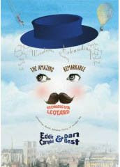
A couple of days back a commenter was asking what I'm currently working on. This question is answered at some length in the second part of my Publishers Weekly Interview, online today: Since that interview I have arrived at the end of the book, The Amazing, Remarkable Monsieur Leotard, and now I must spend a month revsing and fine tuning. By the end of a book I've always had second thoughts about what a character is supposed to look like, so I have to go back and make everything consistent. Also around this time I go through a phase of wanting to toss the whole lot in a fire, change my name and go into hiding. I believe this is normal.

Labels: ,

Tuesday, 3 July 2007

About drawing paper. (part 2)

M

ore on the eternal mystery of what paper to use for drawing comic books. Campbell's theories on this important subject are guaranteed to baffle you. For the big double page (8/9) explosion in The Black Diamond Detective Agency I had this notion I could save time, since I wanted the finished thing to be very red, by painting it on red paper. The problem was that when I needed to fix mistakes I had to try to mix a red to match the colour of the paper. So, in the end, the red paper didn't save me much time. You can see other tints showing up in this detail:


The effect I wanted however was pure black on pure red and nothing in-between, so Danica at First Second tweaked the spread in photoshop.


The effect i was after, and nobody appears to have noticed this yet, was exactly that obtained by Wally Wood in the Kurtzman story Atom Bomb in Two-Fisted Tales #33 of May 1953. And to get this effect it would have been much easier to have done the art in black 'line' and add the red later at the production stage;


However, that effect of the black on red may have only happened on the back cover of a Comics Journal, a 1981 issue whose featured interview was either with Kurtzman or Wood, as the Russ Cochran EC reprint shows a completely different coloring:


Question: was I influenced by a Comics Journal re-colouring job when all these years I thought it was in the original?
***************

Bernard Black responds to a rejection letter
"Thank you for returning my manuscript, and your enclosed niminy piminy little note. I am afraid YOUR letter is unsuitable for ME as I have just spent the entire weekend wriing the novel that you have smmarily rejected. I can only assume that it is company policy to reject all manuscripts not submitted in ten foot high braille. And yes, I am aware that it is bad form to respond to any kind of criticism or rejection, but in this as with all else I am an innovator, therefore I may freely address you as… pissmidget. Still, there’s time for you to change your views and I think you will when we meet and meet we most assuredly will, when I suck out your eyes and use them as stoppers for my ears to muffle the screams that you make as I head-butt you into a fine paste. I do hope you will not be disheartened by your sudden, violent death.
Yours faithfully,
Bernard Black."

Labels: , ,

Monday, 2 April 2007

Me new book.

W ell I've got my copy. The rest of you will have to wait till June.
It's funny seeing it after all these months. It's like the kid came home from college, and he's got all these piercings and stuff. I hardly recognise him. All the time he was living here, I don't recall him having that mad gleam in his eye. it comes with a red 'belly band', but like I did, you can take that off and chuck it away and see Charlie Orr's great cover design in all its wit and brilliance.

Labels:

Wednesday, 14 March 2007

"Pulp writing at its worst was never as bad..."

Ah, one of those blessed days when those of us who have inflicted upon ourselves the duty of daily blogging realize we can get by with a few links to elsewhere. But what to use for a title? All the puns on 'link' must be used already. This is Heidi's latest: Linkie winkins from all over

One of the things she links to is the The Daily Cross Hatch interview with Jeff Smith. His experience with self publishing started much like my own:
"Part of the plan was that I was going to reprint the collection in books, to always keep the story available. I always wanted to do the big one volume edition, too. One of the things that I wanted to do was change the model of comics and make them restockable. You needed the early parts of the story to always be there, so when number one sold out, put 5,000 more out on the market. The next stage was to go into the trades, and keep those in stock. It was very necessary for people in the middle of the story to be able to very cheaply and very easily go back and get those."
I have for some time argued that an explanation of what a 'graphic novel' is should start with this kind of rationale. The market for comic books developed an appetite for longer and more complex and intelligent narratives and the delivery process adapted incrementally to satisfy that appetite (from different kinds of serialization models through to conceiving, completing and releasing a long comic strip in one book, along with the concomitant economic reonfigurations). To just decide that a 'graphic novel' must be a certain size and then go back through the history of the world with a measuring tape, as some are inclined to do, is, I suppose, the kind of simplemindedness you'd expect in the comic book environment.

Speaking of the 'graphic novel' (always to be spelled with the apostrophes), I hate to think that I have become by default the muggins whose job it is to explain the object to the world. In this capacity you will find me in the new issue of World Literature Today which is dedicated to the subject and is available online as well as in print. I wrote a 400 word sidebar for it (page 13) explaining why the term is hopeless. It's the easiest hundred bucks I ever made; it took me longer to write the invoice than the article. (seriously)

Yesterday I was quoting Walter James talking about No Orchids for Miss Blandish, a novel by James Hadley Chase and a series of connections wafted through my head later in the day. It occured to me that I didn't know anything about Chase, apart from, as it happens, having once read the book in question. So I checked Wikipedia (from where I nicked the image at left).

He was "British... at different times... a children's encyclopedia salesman and book wholesaler before capping it all with a writing career that produced more than 80 mystery books.
...after reading James M. Cain's novel The Postman Always Rings Twice (1934), he decided to try his own hand as a mystery writer... with the help of maps and a slang dictionary, he composed in six weeks No Orchids for Miss Blandish (1939). The book achieved remarkable popularity and became one of the best-sold books of the decade.
...Most of his books were based on events occurring in the United States, even though, he never really lived there. In 1943 ... Raymond Chandler successfully claimed that Chase had lifted whole sections of his works in "Blonde's Requiem". Chase's London publisher Hamish Hamilton forced Chase to publish an apology in The Bookseller."

PLAGIARISM! rears its ugly mug yet again.

When I read Miss Blandish I had a nagging feeling that there was something more than a little bogus about it. It didn't quite belong among the other great hardboiled crime stuff I was reading. And so I never picked up any of his other books. They were all over the place earlier in the '60s, but they never looked like they were for me. the covers always sported characters who could only be interested in crap like sex and money when there was obviously more important stuff to be thinking about like whether the universe was going to come in on schedule or whether we'd all be et by Galactus.
However, his book Just Another Sucker was filmed in 1998 as Palmetto 'a very underrated neo-noir' starring Woody Harrelson and Elizabeth Shue, but I haven't seen it..

Coincidentally, the article on Spillane in the World Lit mag linked above shows Chandler at odds with him too. "Pulp writing at its worst was never as bad as this stuff." (source given) I was finally reminded of a moment in Ian Fleming's Live and let Die where James Bond arrives in New York to find all the hoodlums trying to act like characters out of Mickey Spillane. Now an English author was leading the field. And on his own, very English terms.

*********
An email from movie producer Bill Horberg, who happens to be a big fan of Mickey Spillane, five minutes ago:
eddie
i'm sitting here with a copy of The Black Diamond Detective Agency in my hand.
it's pretty damn cool.
I think the size is actually great having fretted about it from the beginning.
And the colors came out nice although you'll be the judge of that with your artist's eye.
It's a magnificent thing and so satisfying to arrive at this moment of completion after such a long journey.
Now I've got to keep up my end of the bargain and try to get a goddamn film made!

Labels: , ,

Saturday, 24 February 2007

Something to Say.

I'm quite serious about the idea of rules. They have their uses. Here's one: never jump out of a plane without a parachute. The thing about rules is that they can become shortcuts to getting things done efficiently. If the parachute was invented once, we can use it over and over until we think of a better idea, like when we invent anti-gravity powders. I always liked to invent rules. Even at the beginning, because there's nobody likes teaching other people more than those who have just learned themselves. So I was something of a sloganeer right at the start. In June '83 in one of my multifarious hand lettered essays that appeared in various small press newsletters (blogging hadn't been thought of yet) I declared that 'It's not enough to just want to draw comics, you must have something to say'. the following month the Man at the Crossroads wrote in an Escape editorial, 'Cartoonists don't start by being able to draw, they start by having something to say.' Rephrased like that it suited Paul's post-punk philosophy of putting the art in the hands of the energetic novice. A month later again, the phrase turned up in a cartoon Hunt Emerson drew for the Radio Times (the BBC's official 'what's on' guide and one of the country's top selling weeklies. Well it was back then; I considered it high irony that the best selling magazines in Britain were the two television guides). Called upon to draw a cartoon announcing the show That's Life which this week boasted a talking dog among its assorted novelties, Hunt had a poodle being interviewed and saying: 'Most of us can talk, we just don't have anything to say.' (Scanned and shown above right, copyright Hunt Emerson) Hunt said he never read my piece or took much notice of Paul's either, so it's just a coincidence. But I've never been one to let the facts spoil an anecdote.

***********
Here we go again: Dirk at Journalista wrote: "Your lazy funnybook plagiarist for the week: Mike Choi, the artist behind this Witchblade: First Born cover, who shamelessly ripped off Annie Leibovitz’ cover to the August, 1991 issue of Vanity Fair magazine." I beg to differ. That's a good piece. If your purpose is to quote a the original but introduce an adjustment (like the assorted variations on American Gothic)), then you should quote it exactly, and this original was famous enough that it "spawned parodies and imitators.". Choi's quotation gets the Campbell thumbs up, and I refer Dirk to my own long quotation from RG Collingwood.

*********
We should all be following the Gordon Lee case. (via Neil Gaiman). Of tangential interest is another piece by the artist Nick Bertozzi, the extract from whose upcoming book The Salon started the row. he mentions it briefly in this interview, but not by name: "James Sturm and I were working on a proposal for a Hollywood producer; we did a 10-pager together, and it just wasn't going to work out schedule-wise for us to do the book, but we really had a good time working together..." He is in fact referring to an early attempt at making a graphic novel of the Black Diamond Detective Agency for 'Hollywood producer' Bill Horberg. Sturm and Bertozzi took an entirely different approach from the one I went with. I guess they produced the ten pages as a sample to use to sell he project with the intention of finishing it when a deal was made. By that time both had taken on other obligations, Sturm with his newly set up Center for Cartoon Studies, and Bertozzi with The Salon. It would interesting to talk to them about their version of Diamond and show a panel or two (since I guess it will only be seen in the context of interviews and such, as one of the interesting unfinished projects of our times). But I'm saving that for later after the book has found its place in the world and we have time for alternate world contemplations.

Labels: , ,

Thursday, 22 February 2007

labels

I did some house cleaning and filing in the middle of the night on account of I got up to relieve a cramp in my foot and all the jumping up and down thoroughly woke me up. So should you wish to do some backtracking and find out, say, where the hell 'thanks for roning' comes from, here at Campbell blogspot we now have LABELS, including but not limited to these:

Labels: , , , , , , , , ,

Thursday, 1 February 2007

Diamonds on the soles of my shoes.

For those of you who want to see some more of Black Diamond, my publisher has put up a handful of consecutive pages for you to look at. Also, the Kirkus review, which I'll show here too. There's also a cinema style trailer for the book, which I'm kind of queasy about, but what the hell, go have a look and laugh at my expense. My pals up the pub have already done their best. I did mention it on this blog already, but with my hand half over my gob. There's also a special 32 page release for Free Comic Book day on may 5, so watch out for that. Or just wait till June and get the whole thing in one piece. Speaking of which, I still haven't seen a copy of the book. Are you holding out on me there at First Second?
(while trying to find a copy of the image on the right I googled "The train was bang on time" and it gave me back: "Did you mean: "The train was being on time?')

First Second also have previews of the other five books that will appear in the spring 2007 line-up. All from the same page linked above. The Professor's Daughter looks especially appealing.

REVIEW IN KIRKUS
The Black Diamond Detective Agency
First Second Books
ISBN: 1-59643-142-3
$16.95
Eddie Campbell
A visually stunning graphic narrative with all sorts of complicated plot twists.
The latest from visual artist Campbell (The Fate of The Artist, 2006, etc) represents something of a show-business reversal. Where it has been commonplace for Hollywood to adapt graphic novels and comic book series into movies, this collaboration finds Campbell working from (or "inspired by") a screenplay by C. Gaby Mitchell. The result is a turn-of-the-century (19th to 20th) pulp thriller concerning a railroad attack, domestic desertion, a series of double (or even triple) crosses by gangs and a conspiracy that ultimately reaches so high that the Black Diamond Detective Agency has no idea what it's really investigating. The complications have implications that reverberate a century later, but even those who have trouble following the plot will marvel at Campbell's visual detail, use of color (particularly an explosive red) and extensive stretches of wordless panels.
The veteran artist rises to a new challenge.


* * * *

My pal Christopher Moonlight has posted a nice scan of a color original of mine, which I know you won't have seen before as it was published in black and white (plate signed by me and Alan in collector's special edition of Disease of Language). I think it became a colour job by accident when my mind wandered. He must have scanned it at very high res.
A few days earlier he told his version of the night he and his wife took me to dinner. As anecdoted in comments here a few days back, he neglected to tell me he'd booked the restaurant under his nom de plume instead of his regular everyday name. So we were sitting in different parts of the joint for 45 minutes. Bloody artists! :)

* * * *

Anita Virgil is the widow of Andy Virgil (1925-80), one of those great stylish illustrators of the 50s/60s. She has written an excellent little memoir of Andy, which Leif Peng is serializing on his blog, Today's Inspiration. It has wonderful observations and details of how commercial illustration studios ran back in those days, and the whole thing is brimming with affection. And of course you can always depend on Leif to have a splendid selection of images. I've simplified it into parts for you. intro, 1, 2, 3. and it will be continuing...

* * * *

If you can get through this reflection upon cartoonist and childrens book author, the late Harry Horse, and his wife, without bursting into tears, you're a better man than I am, Hayley Campbell.
(via Journalista)

Labels:

Monday, 8 January 2007

...but for me and thee.

Final on the Black Diamond Detective Agency for a while, but we will be back. In case the facetiousness here at campbell-blogspot should give a false impression of levity in the overall tone of the book, here is a page with a glimpse of the tragic. It's also the first appearance of a Black Diamond Detective. And I'm rather pleased with my colour scheme, if I may say so.


(click for larger)

* * * *
Joining in the spirit of proposed spousal address here at campbell-blogspot, Brad Weber sent me an email beginning 'The wife took me to the art institute in Chicago..." and apropos of my 'cork people', he attached a photo of some little figures made by Lyonel Feininger which are on display at the museum, of which this is an enlarged detail.


Feininger was one of the great early comic strip makers, and later a noted painter in the cubist manner.

For a look at his comic strip work, Andy at Bugpowder is a good place to start. Here's a reduced detail from one of the pleasing full-scale pages on show there, including some examples I'm unfamiliar with, presumably work published in Germany rather than the two famous series he made for the Chicago Tribune. The little figures above look like the Kinder Kids from that paper, which is where the panel below comes from.


My old publisher, Kitchen Sink put out a full collection of the pages back in 1994, but you ain't getting my copy.

* * * *
My pal White, chartered accountant with a legal firm, as you may or may not recall, sends the following:
"The defence lawyer of a Wisconsin man charged with having sex with a dead deer is claiming he's innocent of any wrongdoing - because a "crimes against sexual morality" statute prohibits sex with animals, but fails to mention carcasses, The Duluth News Tribune reports..."

* * * *
How to hide a comic book.
* * * *

Labels: , , ,

Sunday, 7 January 2007

“When I was a kid, if a guy got killed in a western movie I always wondered who got his horse.”

The Black Diamond Detective Agency (that's my next book, see previous two posts.) It's 144 pages , in full painted colour, which I wrapped up in july '06, to be released June '07. That's a whole year of waiting. The year I spent drawing it I was also waiting for my Fate of the Artist to come out. There was a comfort in knowing that if Fate was too pretentious and complicated for everybody, I had this more straightforward action-adventure waiting in the wings to redeem my reputation.


It's based on an original movie script by Charles Gaby Mitchell, who has a co-writer credit, I see, on the new movie, Blood Diamond. Everything he touches turns to diamonds.

Film Producer Bill Horberg has been working the BLACK Diamond property for some time. I'm presuming it was his idea to get a 'graphic novel' published, based on the script and preceding the possibility of a film. It appeared to be understood from our earliest discussions that a 'graphic novel' was necessarily a completely different thing from a movie, and that not everything that works in one can be expected to work in the other. So I was able to approach the work quite at liberty to imagine it as an Eddie Campbell book. The first thing I liked about the script was that it was about the arrival of the twentieth century, of the optimistic and shiny modern world. Except that it arrives with a huge bang,


and in the ensuing confusion everything is out of whack.

Nothing works.

The opening line of my Fate of the Artist is : "One day the artist wakes up with the disquieting feeling that it has all gone wrong." Black Diamond is an action adventure, but at the same time I've been able to carry my own theme over into it. In fact my version begins:
"The day it all went wrong
started out fine..."


* * * *
The quotation at the top of today's post is from George Carlin. I found it while looking for something else. It reminded me of a bit of business in Black Diamond. In the movie script he cuts his hoss loose before jumping a train for the city, which might be interpreted as a big symbolic gesture, but later when he's grubbing about in Chicago I was trying to figure out the finer points of where he could get some ready cash, to buy meals and stuff and the obvious occurred to me. He should have traded in the hoofs. Now, I don't know what the animal would have been worth back then, with there being so many of them around, but I figured you could live on the proceeds for a couple of weeks or more, so I went back and inserted a scene where he sells it.
I don't know from horses. they're so long ago.
Well, I don't know from cars either, and they're only last week . First car I ever bought was for 35 quid, which is a bout 60 bucks, a piddling amount in '80 as now. We poured two pints of water into the tank and watched it all come out of the exhaust pipe.

Ah! Nothing works.

Labels: ,

Saturday, 6 January 2007

"Oh, they're tough, mighty tough, in the west"

I used to read westerns, well maybe for a year or so I read 'em, and in the Campbellian way, read every possible author on the market and analyzed the history of the whole thing. But I got the impression I was supposed to be reading science fiction. The whole 'comics fandom' thing was understood by everybody in it to be a sub category of sci-fi. Then in the seventies it became fantasy. I remember one fanzine defining its content as 'all the stuff we're interested in', and I thought: how would you know what I'm interested in? There was a sense of one thing connecting inevitably to another. I never got that. In fact, I've never got the idea of 'genre fiction' either. I mean, as a thing to which you pledge some kind of allegiance. Anyway, for a year, Westerns were for me. I spent an hour this morning trying to google up the cover of a book I owned way back when I was fifteen.


It wasn't easy because I couldn't even remember the author's name. All I could recall is that it was painted by Gino d'Achille. It was in '69, a few years before he came to the attention of American collectors with his painted covers for the Edgar Rice Burroughs books. Looking at those now, I care for none of them. But I did find my cover in the end and I still love it as much as when I once owned that little paperback written by Matt Chisholm. A British writer of westerns (real name peter Christopher Watts), with a painted cover by an Italian; indeed, isn't that cover just saturated with the stylings of the spaghetti western.

The Comic book was my customary means of expression, so I took Chisholm's Apache rogue, Gato, and drew a couple of 13 page stories around him, in full colour. This was in 1971. Don't expect more than juvenlia here, and by the end of the second story it's starting to look too much like Buscema's Conan (perhaps I had shifted my genre-allegiance by then.) Also, and alas, I had a habit then of drawing the action scenes as though I was taking part in them. It was many years before I'd learn to take pains over all aspects of the work. Still, one or two pages show a little promise.


I only located the links for Chisholm (whose name I had forgotten) due to the fact that I named one of the characters in this story after him.

The Black Diamond Detective Agency (my upcoming book from First Second Books- see yesterday's post) is not really a western, but it starts quite westerly, in Missouri in 1899, and then shifts to Chicago and becomes a gangster story (if you need to understand fiction in these terms). It's really more about the arrival of the train than the fate of the horse, but I find it interesting that I seem to have subconsciously remembered that horse from the cover above when i drew this silent sequence in Diamond. If I'd been more conscious of it, I'd have made more of the horse no doubt, perhaps going so far as to swipe that perfectly observed leg in the air in the d'Achille painting. But then I'd have been too ashamed to show the original here.


The title of this post comes from a 1937 hit sung by British jazzman Nat Gonella
"Oh, they're tough, mighty tough, in the west,
and their beards are thicker than an eagle's nest.
Their dentists have bad manners
and they pull out teeth with spanners..."

I have for a long time been of the opinion that this song was the inspiration for the British comic strip character Desperate Dan, which started in december of the same year.

Labels: ,

Friday, 5 January 2007

" 'Ja think I'm a cowboy?"

The time has come to reveal the cover of my new book, due on sale in June 2007, or five months from now, from First Second Books in New York. Design work is by Charlie Orr , who also did the designs on my Fate of the Artist. Charlie's idea of a theatrical, or showground, facade on the front/back of that cover has been called, by at least one reviewer, the funniest gag in the whole book.


(click to enlarge)

On the back cover I am pretending to be the protagonist of the book, in a photo taken under our house by wee Callum under my direction:


It's the first time I have been photgraphed as a cowboy since, well since this one I suppose:


The title of today's post is of course the very first line uttered by Popeye, on Jan 17 1929. Castor Oyl is walking along the harbour trying to buy a boat to get to Dice Island. He says to Ham Gravy, "You'll find the scum of the earth right here in this port. So we've got to be careful in picking our crew". In panel 2 he calls to someone off-panel, "Hey there, are you a sailor?" and then in panel 3 we see him, the character who will become one of the greatest ever: Popeye.
"''ja think I'm a cowboy?"
"O.K. You're hired."

Labels: ,