Thursday, 2 July 2009

a couple of weeks back, Alex Holden, an artist worthy of our attention, wrote on his blog about the elusive Zipatone:
Zip A Tone has been on my mind because I recently received "Two Eyes Of The Beautiful" from Ryan Cecil Smith, who is currently living in Japan. Some equivalent of Zip A Tone (in virtually unlimited variety) is still widely available in Japan, despite the advent of the computer. "Two Eyes of the Beautiful" is all about Zip A Tone, from simple dot patterns, to trees and foliage......even buildings.
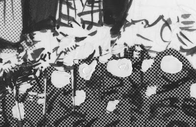
I recalled this because in the course of scanning my Ace Rock'n'Roll Club pages as part of the routine digitalization of my whole back catalogue, I came across a particular story where I set myself the challenge of making all the pictures as much out of tone as possible, with supporting ink-work kept to a minimum, even excluding panel borders. This is a panel from that story, drawn in Feb 1979, thirty years ago.

(click for a close-up)
I was able to get some tonal gradation using superimposition and overlap, creating a sense of light and atmosphere, but this approach proved too expensive and time-consuming. I carried a much simpler version of it over into the Alec Book. The white lines in the picture are a result of shrinkage of the material, which happens over time. I'd probably want to mend those if i ever reprint the story.
For more on the subject, click the label.

******
I'm told that the event I discussed here last thursday went well, and Amos's latest posters sport nifty slogans such as:
"YOU'RE GOING TO HELL AND THE DEVIL IS MY BITCH" and "I KNEW GOD WAS A WOMAN, BUT I DIDN'T KNOW SHE WAS BLACK!"

Labels: ,

Wednesday, 17 September 2008

just found: Splash Page-MTV has a great Steve Lieber drawing on their opening page (and a nice photo of the artist too), but you only see it briefly before a bunch of text boxes cover up most of it, unless you freeze the screen like I did. Do that and get a look at it full size. Steve and i have long shared an interest in the atmospheric effects that can be achieved by mixing up the various techniques of black line art, including dot tones and white paint.

Labels: ,

Saturday, 8 September 2007

5 : Another class of tone worth mentioning is what we might call pseudo-tone, such as when you get one of those blank adhesive-backed transparent sheets and photocopy your own one-off pattern onto it. I can't remember exactly but this one looks like I superimposed two square areas of wavy line tone, then enlarged them enormously and photocopied onto an adhesive transparency, laid it over the figures , carefully cut around their outlines and discarded the bits from within the figures (Though knowing me I probably saved those bits for use elsewhere) (Bacchus Vol 8):


That was Joe Theseus and Big Ginny, Queen of the Amazons, cast adrift in The patterns of Fate, drawn in 1994. On another occasion I saw this sheet of printed cellophane that came into the house wrapped around a bunch of flowers. I knew it was something I could find a use for and filed it away with my zipatones.


Sure enough, a page of From Hell script arrived that called for a zoom towards and into a bedroom window (chapter 5 page 1). The flower pattern was just right for representing a lace curtain, with the addition of a few verticals of white tone to suggest the undulations.


I discussed that page of art and script in an earlier post, though interestingly the effect hasn't come out well in the xerox I scanned for that. A quick check with the current Top Shelf edition of From Hell shows that it looks okay there.
********
there are two posts today; scroll down.

Labels:

Friday, 7 September 2007

A s I mentioned yesterday, there's a television Arts program doing a piece on 'the graphic novel.' I've got to fly down to Melbourne on Monday for advance shooting, having been all the way down there only last week. While I abhor the idea of having to explain what I regard as a hijacked and demeaned concept, I figured the alternative is too much to contemplate, that some other boob would be asked to do it and I would be reduced to being embarrassed in front of the tv. My mission, and I've chosen to accept it, will be to create in the minds of the viewers the notion of an ideal art so attractive and appealing and shiny and brilliant that they will not notice, when they seek it in the bookstores, that it is buried under a pile of manure (see yesterday's post). Furthermore, I will attempt to do it without saying 'comics' or 'graphic novel', or inventing any new term for that matter. Let's see how far I get.
********
Nicki Greenberg will also be on the program, as will Shaun Tan. Nicki's Great Gatsby has just been launched into the world at Readings bookshop in Melbourne (see photos), with a spoken intro from Shaun, whose book The Arrival is released this week Stateside from Scholastic (correct me if I'm wrong on that)
********
meanwhile...

4 : The white zipatone was the most sumptious of all. Screens of white dots to lay over a black drawing. I used to drop them in everywhere for painterly subtleties.


In at least one place in the following there are three layers of white (10%?) over a 50% grey:

Labels:

Wednesday, 5 September 2007

3: The zipatones always made for subtler possibilities in drawing. I was already trying to use the finest possible ink lines, but with tones you can cut for example, a line that is no more than the edge of a juxtaposition of white and 10% grey. There's nothing so white as a white shape without an outline.


I'd also draw with white on top of grey tones. Scraping the dots off the surface of the screen was an option too, though going all the way through to the paper underneath wasn't something I did often:


**************

London underground's on strike again. here's a song for the occasion. link via hayley campbell, so it's obscene. keep the sound low if you're in the office.
**************
Tom Spurgeon's obit. for the late Arnold Wagner led me to Arnold's blog, where I found a link to this spoof of Thomas Kinkaide
JONAS KASKADE, Painter of trite.
“Built in 1947, Loon Point Light was constructed to warn off incoming migratory birds. Prior to its installation, hundreds of geese, swans and loons smacked into the rocks as they approached the high mountain lake every year. After the light was activated, the deaths declined dramatically.
Standard Fine Art Print: $600
Deluxe Fine Art Print with little actual paint daubs added: $1500

************

(pictures above from Alec: The King Canute Crowd again though i confess to moving a couple of small unconfident marks off the white dress)

Labels:

Tuesday, 4 September 2007

ARTWORK: ORIGINALS FOR SALE
As promised, the original pages from The Black Diamond Detective Agency are now on sale at The Beguiling. Note that all pages have been signed by me in pencil since those scans were made. I'll put a permanent link in the sidebar in case you take a notion later. Meanwhile...

2: More on zipatones. Here's Dave Sim making an in-joke on the cover of Cerebus #207 about the way I tended to use the stuff.


I wanted to create a painterly style, as opposed to a drawn one constructed with lines. Normal comicbook drawing has always looked dead on the page to my eyes. I needed a style that could suggest light and air. I'd dab in black ink marks, lay down tonal slabs not necessarily contained by lines, and then dab white paint on top of that. If you click to zoom you can see the textures.


The above is a window box of flowers in a foreground, if you're the sort of viewer to whom such things matter. Below is a panel I was always happy with. The only significant drawn line in it is made by the diagonal cut edge of tone in the left foreground.


The above are from images I scanned in enlargements from Alec: The King Canute Crowd (circa 1985-86) and offered to Ca et La to use as chapter headings and endpapers in their edition last year, but they preferred to go with a different approach.
In my last few books I've used actual paint in full colour and no longer need to find ways to simulate 'painterly' effects. I miss the old dots though... maybe time to get back to them for a spell.

Labels:

Monday, 3 September 2007

1: All about zipatones, in my continuing survey of the technical aspects of cartooning. My pal Patrick Alexander, last seen on this blog on 10 jan '07, recently sent me a few sheets of the stuff from Japan:


I'm talking about those screens of dot-pattern that used to be a staple of my black and white art. I guess they're well and truly out of fashion now, since it's easier to make a screen on the computer and besides patterns of dots in artwork are likely to cause scanning problems. The sheet has a sticky back, and comes on a slick sheet which is semi-transparent, just enough to see the art underneath so you can cut to fit with a scalpel. They come graded in percentage greys, from 10, 20 etc. up to 90, though 90% was likely to fill in black if there was to be any reduction in size. I always found that 70% was a comfortable high. They also come in line-per inch. I was using 50-lpi last I thought about it. Finer than that was asking for trouble if there was to be a 70% reduction in size. On a light print job 10% grey might just look like the merest gossamer smear on the page, but I was all for that kind of subtlety. I liked to hack the stuff up a great deal, so after some use my pages would look like this:


But I always could use the bits no matter how small they got.
**************

Joe McCulloch writes 2,801 words on the history of Steve Bissette's TABOO anthology. I have never understood the attraction of horror, so I wasn't really paying attention at the time, Thus it has completely slipped my mind what a pain in the arse it was for Steve to get that second issue out, the one in which From Hell made its debut, and FH wasn't even the component that was giving offence:
A typesetting house refused the project, as did two copy shops. As did a color separation outfit. A different separation outfit, approached to handle the back and inside covers, had to be assured that certain symbols on display were not Satanic. Upon approaching a bindery, the book was refused because the people there believed incorrectly that John Totleben had drawn a vagina somewhere in his front cover art. Nine binderies refused the book in sum. Finally, the damned thing was released in the Autumn of 1989, all 10,000 copies. Some of which were then seized and destroyed in customs busts in Canada and the UK. At the end of 1989, Bissette was refused a business loan by his bank, which had handled the prior issue's money, for the purposes of reprinting the volume.That is infamy.
********
Competitors in the World Beard and Moustache Championships paraded through Brighton on Saturday morning.-BBC news- 1st Sept- ten photos.

Labels: