Tuesday, 11 March 2008

T his is a book I bought a year ago. As to its contents, it is a study of the English satrical print between 1780 and 1830. I'll leave the rest to someone who gets paid to be a reviewer. It was out in paperback as recently as September 2007 and here is the Amazon page. All I will put up here by way of recommendation is to note that the sixth chapter is titled 'Bums, farts and other transgressions'

As a lover of everything to do with the eighteenth century, this is a book I would have picked up anyway (as I did unseen by mail order), but two things about it pleased me greatly. The first was to find it addressing an idea that I dabbled with myself in my aborted book, The History Of Humour (of which three chapters appeared in serial form). The idea that there is a history of any given subject is not one that should be taken for granted. In fact the idea of history itself had to be invented, as explained in The gift of the Jews ('How a tribe of desert nomads changed the way everyone thinks and feels') by Thomas Cahill.
Here is a paragraph from Gatrell's introduction:

"By focusing on casts of mind that were satirical, sardonic or ironic, as well as on some more genial forms of humorous expression, the book offers a history of humour and laughter. Attention to so large and loose a subject must break new and difficult ground, for there isn't much previous research to build on. It is lucky for laughter that most historians prefer to write histories of misery, pain and woe, since nothing so kills laughter as analysing it. Yet humour is as plausibly a historian's subject as any other, and it allows us to say new and important things. As the Aristotelian formula put it, man is the only animal that laughs (and weeps and blushes) because man alone can see the difference between how things are and how they ought to be. In other words, the reflex of laughter is controlled by mental processes; and mental proceses have histories. The subjects that people think it appropriate to laugh at; what kinds of people laugh; how cruelly, mockingly, or sardonically they laugh (or how sympathetically and generously); and how far they permit others to laugh- all vary with time, sex, class, place, and culture. And since these questions have always been regulated by moralists, laughter has always been central to the processes by which Western manners have been disciplined over the centuries. For all these reasons, studying laughter can take us to the heart of a generation's shifting attitudes, sensibilities and anxieties just as surely as the study of misery, politics, faith or art can. Indeed, the art forms which shape this book, whose purpose was to provoke amusement at others' expense, are perfectly contrived to lead us to past mentalities along routes as yet hardly explored."
The other thing is that the cover shows, not a detail from one of the satirical prints that the book is all about, but a reproduction of a paintng by John Hamilton Mortimer (1740-1779). He was an artist in the neoclassical idiom, and of portraits and 'conversation pieces'. But he also made a couple of large scale caricature groups, and did this kind of thing so well that presumably he must have made a lot more of it than I have seen. But then all the accomplished portraitists of the time dabbled in the new fashion of 'caricatura.' William Hogarth was a traditionalist and he resisted and protested against this Italian import,
"caracatura is...divested of every stroke that hath a tendency to good drawing...for the early scrawlings of a Child which do but barely hint at an idea of an human face will always be found to be like some person or other... etc"
which is one of the reasons I have a problem with the precise way Hogarth's importance is measured by the 'comics' intelligentsia. "Hogarth... consolidated the graphic experiments of earlier prints and established a complex language of graphic devices that artists have borrowed from ever since," it says in a footnote in Masters of American Comics. This is bogus history writing. It suggests a template that had to be filled, and Hogarth was the square peg that the writer wanted in the round hole (in order to create the fiction of a long and noble continuous art of drawing in sequences). Much as the artworld now elevates him high over his contemporaries, historiographically Hogarth is a point of discontinuity. The interests of art at that time (of Hogarth's late years) went off in another direction entirely, and Mortimer in his serious art was very much of his time. But there is something about the immediacy and spontaneity of inspired humour that can allow it to stand outside of the fashions and constrictions of time. It could be said that Mortimer's caricatures appear very twentieth century (sic). The first of the enlarged details below could almost be a humorous sketch of Rowan Atkinson for the tv guide.


Labels: ,

Monday, 25 February 2008

Note to self. Look into the life and works of Elizabeth Vigee Le Brun (1755-1842), portrait painter to Marie Antoinette who was depicted briefy in one scene in the movie, making a full-easel painting of the family group out-of doors (which I think unlikely if you will permit the picking of a nit), and who is seen in the beautiful self-portait at left at age 27.

There is an online site dedicated to the artist with an extraordinarily comprehensive gallery of her pictures. At a rough count there are over five hundred pieces contained there. There is also a sprightly biography taken complete from a 1922 monograph by Haldane MacFall. She made a bad start by marrying a ne'er-do-well. But then after making her exit from Revolutionary Paris well ahead of the year of Terror during which fourteen hundred heads were lopped off, the lady travelled all over Europe and was famous for her portraits everywhere she went. She lived to the grand old age of 87
************
Steve Whitaker just died. In 1990 he made the excellent colouring job on the book I mentioned yesterday, The New Adventures of Hitler. The interior views were full of floating wallpaper patterns. I always wondered whether that was Whitaker's contribution or whether artist Steve Yeowell planned it that way (The work was first drawn in black and white for Cut magazine). He also coloured V for Vendetta and that was first rate too. I seem to have been in proximity to Steve at a number of points in my career (e.g.) but we only ever exchanged a few words here and there. He was only 52, considered young these days, at least by me.

(I mentioned to Alan Moore a while back that we now find ourselves in that time when we are starting to lose our contemporaries. He replied. "We are in mortality country now, Eddie, and the guides and bearers have turned and fled.")

addendum: I picked the above page as one of the most subtle and interesting in the set, but after posting it i noticed a colouring mistake. I'm sure it must have bugged the hell out of Steve for the last 18 years. I fixed it, mate. Rather than replace it with another page I mended it in photoshop and reposted.

Labels: ,

Friday, 6 April 2007

My scanner, my microscope.

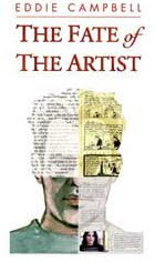
O ne of the enduring objects of my enthusiasm is eighteenth century music. I wrote about this in The Fate of the Artist where I also made this pastiche of a cd cover in the style of the Naxos series of classical music releases. I love the simplicity of that design template.
Not a month goes by without my finding the work of a composer of that era with whose work I was not previously familiar. Recent discoveries have included Thomas Erskine the Earl of Kellie, and George Vogler, whose Requiem I went to some trouble to track down. Latest is the one picked up this week. Five symphonies Karl von Ordonez of Vienna. I was hoping Naxos would get around to him sooner or later. I'm on the lookout now for his contemporary Leopold Gassman. But anyway, to my purpose. By the above means, which is to say indirectly, I have been developing a fondness for the topographical prints of Karl Schutz (1745-1800), which are likely to be selected to adorn the covers of cd's of music or composers originating in Vienna in the 18th c. I depicted him at work in the Fate of the Artist at the link above, even though I don't know what he looks like. In fact, this is when I got the idea of having actors play all these people, so that I could then still believe myself to be holding to a kind of authenticity. And sychronistically I happened to notice that Schutz seems to employ a little troupe of actors to people his prints. It's true of course that an artist does not have an unlimited supply of 'people' to trot out upon his paper and we are likely to see the same types used over and over. But it pleased me to think of Schutz' people as being in some way more real than the stiff mannequins in the prints of other artists.
These prints are essentially topographical. Their purpose is to record the look of buildings in and around Vienna. But what topographical artist ever took such pains to show us:
a guy indoors reading, framed in a window. Is it his own room? Is he stealing a look at that letter?

and are these three guys on the right talking about the guy in the blue coat behind his back?

what is the relationship of this overdressed woman to the young laddie? is he leading her somewhere, and how much will he receive for his trouble?

and there is always a lusty gallant, tipping his bonnet to a lady. Here he is greeting the woman taking a rest in her shop doorway.

and once again we must curse the cd booklet for being too damn small.
(edit: most pressing question of all, how did I get those piccies to wander into the sidebar?)

If I had as much dough as you think I have, I'd go and buy me one of these:
Sotheby's - New York - 2000
Lot 130 : Waldstein, Franz de Paula Adam, Graf von, and Paul Kitaibel. Descriptiones et icones plantarum rariorum Hungariae. Vienna: A.M. Schmidt, [1799]-1802-1812
first edition, 3 volumes, folio (650 x 300mm.), sepia aquatint view by Hirscher, 280 hand-coloured engraved plates by Karl Schutz after his father Johann, contemporary half calf, volume 1 preliminaries detached, some plates c... [Please sign in or subscribe to Artfact Professional to view more]

Labels: , ,

Friday, 26 January 2007

Typography.

I've been following my own chain of connections on the subject of typography. It started with The Lunar Men (2003) by Jenny Uglow. With regard to subject matter, here's an excellent review.
It's the 18th century, my favourite time in the history of the world, an age 'when great men were as common as gooseberries'. A couple of hundred pages into it I found myself riveted by a thought.
"The journeys of men who profoundly dissent do not end with death... After the house is sold in 1788, the small conical museum is removed, and so, the owner thinks, is the body..." (Uglow narrates, at some length, the peculiar story of the movements of the remains of John Baskerville, the great 18th century type designer.) "Finally, in 1898, he moves to Warstone Lane in the middle of Birmingham's jewellery quarter. He is still there now. I think. And his beautiful type lives on, and you are reading a version of it in this book."

The text of this paperback book is 'aware' of the type in which it is set!

Conventionally, the text of a book is completely unaware of its typographical environment. That kind of thing is decided after the author has handed the work in, it's been proofread, and she/he's too busy working on her/his next one to be available for consultation on such matters.
Later, a similar event.:
"The following summer, in front of a crowd of a hundred and fifty thousand, he (Captain Vincenzo Lunardi) arranged to take the famous beauty and actress Mrs Sage, and their friend George Biggins -amateur chemist and invetor of the coffee percolator- into 'the blue Paradisial skies', as shown on the cover of this book."
I hadn't read Uglow's work before (to my shame) and checked to see how she could have pulled such marvellous tricks. Thus I note that she works as an editorial director at a big publishing house, which I guess would give her the inside track on getting a book done exactly as she wanted it.

Mark Danielewski didn't have that advantage when putting together his House of Leaves (2000). (interview)
"We were heading for a train wreck, and (Pantheon) wanted to do it a completely different way — or didn't want to do it. So I actually, on my own dime, flew to New York and set up shop. They found a freelance computer on one of the floors... and I worked on it. It took me three-and-a-half weeks."

The interviewer is naturally incredulous that it could have been achieved in that time:
"The labyrinth section (the most complex section of the book) took, like, nine-and-a-half months to storyboard," Danielewski says. "So it was almost like a shooting schedule."
Leaves is a baroque extravaganza of typographical liberties. I like the way he composes endless lists of architects names or examples of architectural styles or technical terms, which seem pointless from a reader's point of view, until you realize that he has used the sheer physical density of the type to create walls and passageways or, by having a square of text mirror-reversed on the flipside of a page, blind windows.

For anone who needs an idea of what House of Leaves is 'about', I guess it's a psychological horror story about a house that goes wrong. Here's the first chapter transcribed out of its typographical environment, which is how most prose expects to get around in the world.

Labels: ,

Wednesday, 24 January 2007

A Reader's Progress.

Sketch of the Snooter, whom you may remember from such books as After the Snooter, doing what he does best. Being an annoying bastard.


This is just pulled from my sketch folio.The Snooter's hand appearing to extend Campbell's nose is entirely accidental and means nothing. I think. First to ask for it in comments can have the drawing in the mail.
* * * *

Excellent gallery of the works of William Hogarth


I was talking about William Hogarth the other day and it carried over into the comments to the extent that I felt I owed a few more words on the subject. I was critical of the notion that "Hogarth’s sequential narratives... consolidated the graphic experiments of earlier prints and established a complex language of graphic devices that artists have borrowed from ever since". This has become accepted as fact among too many comics scholars.

My argument essentially is that it can't be so as I have never met a comics person who would know how to read Hogarth properly (myself included) let alone be influenced by his work. In support of my statement I quote this article by Martin Heusser reviewing
Reading Iconotexts:From Swift to the French Revolution. Peter Wagner. London: Reaktion Books, 1995.
"Reading Iconotexts is a study of 18th-century prints and their inscriptions, which Wagner prefers to call iconotexts in order to emphasize the high degree of mutual interdependence and interpenetration between word and image which they exhibit. In fact, Wagner claims that they form a specific genre, because in them, neither text nor image is free from the other."
"Reading Hogarth "right" is difficult for two reasons, one intrinsic and one extrinsic. On the one hand, these illustrations are in and of themselves heterogeneous; they represent both a critique and an enactment of 18th-century commercialization of culture and taste. On the other, modern interpretation suffers from a severely distorted view, because, over the generations, the immensely broad range of 18th-century cultural phenomena has been pared down to a very narrow body of samples.
Taking Hogarth's well-known first plate of
A Harlot's Progress as an example (shown above), Wagner convincingly shows what he means. To "understand" this picture - that is, to get the maximum information out of it and to grasp it - we have to be capable of decoding a wealth of sign systems running criss-cross through its visual appearance. On a pictorial level, we find both the re-enactment and the subversion of traditional subjects as diverse as the Penitent Harlot, the Choice of Hercules and the Visitation. Similarly complex but more difficult to trace and recognize are those references to what must have been first-rate contemporary tabloid material offered by the three central human figures: the rapist Colonel Charteris, the notorious prostitute Kate Hackabout, or the debauched Mother Needham. Then, there are the numerous emblems and puns present in the guise of seemingly accidental elements such as the dead goose and the bell, which may both well refer to the fate of the silly goose who may soon be a dead belle. By the same token, the horse whose excessive appetite causes it to knock over a pile of utensils demonstrates ad oculos how the consequences of gluttony affect the careless without delay.
The quasi infinite number of allusions generated by the quite finite space of Hogarth's engraving proves Kristeva's point that references do indeed evoke a "universe" of significances... "


Here's an extended argument over the details of the same image by two experts: READING HOGARTH By Ronald Paulson, Reply by Richard Dorment. They're making as much progress as you and I.

Labels: , ,