Typography.
I've been following my own chain of connections on the subject of typography. It started with The Lunar Men (2003) by Jenny Uglow. With regard to subject matter, here's an excellent review.
It's the 18th century, my favourite time in the history of the world, an age 'when great men were as common as gooseberries'. A couple of hundred pages into it I found myself riveted by a thought.
"The journeys of men who profoundly dissent do not end with death... After the house is sold in 1788, the small conical museum is removed, and so, the owner thinks, is the body..." (Uglow narrates, at some length, the peculiar story of the movements of the remains of John Baskerville, the great 18th century type designer.) "Finally, in 1898, he moves to Warstone Lane in the middle of Birmingham's jewellery quarter. He is still there now. I think. And his beautiful type lives on, and you are reading a version of it in this book."
The text of this paperback book is 'aware' of the type in which it is set!
 Conventionally, the text of a book is completely unaware of its typographical environment. That kind of thing is decided after the author has handed the work in, it's been proofread, and she/he's too busy working on her/his next one to be available for consultation on such matters.
Later, a similar event.:
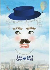
"The following summer, in front of a crowd of a hundred and fifty thousand, he (Captain Vincenzo Lunardi) arranged to take the famous beauty and actress Mrs Sage, and their friend George Biggins -amateur chemist and invetor of the coffee percolator- into 'the blue Paradisial skies', as shown on the cover of this book."
I hadn't read Uglow's work before (to my shame) and checked to see how she could have pulled such marvellous tricks. Thus I note that she works as an editorial director at a big publishing house, which I guess would give her the inside track on getting a book done exactly as she wanted it.
Mark Danielewski didn't have that advantage when putting together his House of Leaves (2000). (interview)
"We were heading for a train wreck, and (Pantheon) wanted to do it a completely different way — or didn't want to do it. So I actually, on my own dime, flew to New York and set up shop. They found a freelance computer on one of the floors... and I worked on it. It took me three-and-a-half weeks."
The interviewer is naturally incredulous that it could have been achieved in that time:
"The labyrinth section (the most complex section of the book) took, like, nine-and-a-half months to storyboard," Danielewski says. "So it was almost like a shooting schedule."
Leaves is a baroque extravaganza of typographical liberties. I like the way he composes endless lists of architects names or examples of architectural styles or technical terms, which seem pointless from a reader's point of view, until you realize that he has used the sheer physical density of the type to create walls and passageways or, by having a square of text mirror-reversed on the flipside of a page, blind windows.
For anone who needs an idea of what House of Leaves is 'about', I guess it's a psychological horror story about a house that goes wrong. Here's the first chapter transcribed out of its typographical environment, which is how most prose expects to get around in the world.
It's the 18th century, my favourite time in the history of the world, an age 'when great men were as common as gooseberries'. A couple of hundred pages into it I found myself riveted by a thought.
"The journeys of men who profoundly dissent do not end with death... After the house is sold in 1788, the small conical museum is removed, and so, the owner thinks, is the body..." (Uglow narrates, at some length, the peculiar story of the movements of the remains of John Baskerville, the great 18th century type designer.) "Finally, in 1898, he moves to Warstone Lane in the middle of Birmingham's jewellery quarter. He is still there now. I think. And his beautiful type lives on, and you are reading a version of it in this book."
The text of this paperback book is 'aware' of the type in which it is set!
 Conventionally, the text of a book is completely unaware of its typographical environment. That kind of thing is decided after the author has handed the work in, it's been proofread, and she/he's too busy working on her/his next one to be available for consultation on such matters.
Later, a similar event.:
"The following summer, in front of a crowd of a hundred and fifty thousand, he (Captain Vincenzo Lunardi) arranged to take the famous beauty and actress Mrs Sage, and their friend George Biggins -amateur chemist and invetor of the coffee percolator- into 'the blue Paradisial skies', as shown on the cover of this book."
I hadn't read Uglow's work before (to my shame) and checked to see how she could have pulled such marvellous tricks. Thus I note that she works as an editorial director at a big publishing house, which I guess would give her the inside track on getting a book done exactly as she wanted it.
Mark Danielewski didn't have that advantage when putting together his House of Leaves (2000). (interview)

"We were heading for a train wreck, and (Pantheon) wanted to do it a completely different way — or didn't want to do it. So I actually, on my own dime, flew to New York and set up shop. They found a freelance computer on one of the floors... and I worked on it. It took me three-and-a-half weeks."
The interviewer is naturally incredulous that it could have been achieved in that time:
"The labyrinth section (the most complex section of the book) took, like, nine-and-a-half months to storyboard," Danielewski says. "So it was almost like a shooting schedule."
Leaves is a baroque extravaganza of typographical liberties. I like the way he composes endless lists of architects names or examples of architectural styles or technical terms, which seem pointless from a reader's point of view, until you realize that he has used the sheer physical density of the type to create walls and passageways or, by having a square of text mirror-reversed on the flipside of a page, blind windows.
For anone who needs an idea of what House of Leaves is 'about', I guess it's a psychological horror story about a house that goes wrong. Here's the first chapter transcribed out of its typographical environment, which is how most prose expects to get around in the world.
Labels: 18th century, new books (1)


13 Comments:
I was actually peeved about House of Leaves, because the first I heard about it was that it was this incredible work that I had just missed reading on-line, but which had been removed and now I'd have to wait for it to be published.
And I've never seen the damned thing since. Really peeved I missed out on downloading the PDF.
I don't like reading stuff online, nor on my computer (which I may end up having to do because of failing eyesight--blind in one eye and failing in the other). Much prefer old-fashioned books.
Eddie Campbell has now made me have to buy two books I'd never read (and which aren't his).
Eddie, it's worth taking a look at Danielewski's follow-up "Only Revolutions", too. For my money it's not as accessible as House of Leaves, but the experiment in typography is much more in a Modernist tradition than some of the (admittedly beautifully executed) Postmodern excesses in HoL.
House of Leaves still sits in my "too be read" pile. The person that gave me it thought its reputation was undeserved by my friend Jeff VanderMeer is a big admirer of Danielewski's books. One day I'll have to find out for myself.
Speaking as a jobbing typesetter (among other things...), three and a half weeks is actually a long time to typeset a book, even a complicated one like HoL. An average novel could be roughed out in a day or two before fine-tuning things. Garamond is my favourite font for body text. And since John Baskerville was mentioned, it's his 301st birthday on Sunday.
Some authors do try and control the way their books are presented. I read once that Patricia Highsmith always wanted her books set in Ehrhardt although I can't find any mention of this online. If true, I tend to wonder why since Ehrhardt isn't a very attractive design:
http://www.identifont.com/find?font=Ehrhardt&q=Go
i hear danielewski's new book is a bit more sedate, but still typography-happy.
house of leaves! i thought the story about it being first available online was a hoax.
i've read it quite a few times, even deciphered one of the whalestone letters. pretty good reading, i thought.
Adam: Well, I can't verify the hoax story either way, sadly. First I'd heard of the possibility.
This fan page mentions the online distribution thing, and there's a reference on the wiki entry... but the wiki entry's discussion page also casts doubt on the story.
But it would explain why I wan't able to find a copy at all, though (I am--or rather, was--a Cybrarian, and I usually find what I'm after online pretty quickly).
Thanks to all for the comments,
and John for the pro view on typesetting.
Leaves is well worth your time. Especially since I know you like your Lovecraft. This is the first horror book i've enjoyed in many years. (I really have no time for the genre otherwise).
Drjon. 'Cybrarian'? you just coin that? I'll be using it.
Eddie
Nyet, it's in common currency amongst Library Professionals.
It's been a while. These days you need a University Qual to be a Cybrarian. I should get me one of those, one of these days, I guess.
Cheers!
The pulp-style horror writer David Wellington publishes his stuff online before his books are made available in print. Additionally, his books remain online after traditional publication.
I've always thought that amazingly weird and counter-productive, but he seems to be making quite a good living from sales of his paperback books (in one interview he stated that his royalties from 2006 would amount to over $75K).
You'd think no one would buy his books in hard copy if they remain free to read online. But he apparently believes the opposite is true. And this seems to be the case.
Adam
forgot to mention that I have Danielewski's Only Revolutions. will read soon. Gorgeous looking book.
James,
I can't figure out the relationsip between online and hardcopy. Some people told me they were downloading From hell during the year it was out of print. That didn't stop it from selling like crazy when we got it back on the market.
Eddie
Online v. print, big subject but... Try taking an e-book up a mountain. Or reading it on the beach. Or while eating. Or curled up in a chair. Or in the bath. Or in a place with no electricity. Drop a laptop and a book out of a window and see which still does the job it's supposed to. And so on.
As Neil Gaiman said once, books are solar powered.
John: i have read in three separate interviews (ok, one is a list provided by alan)that House of Leaves is one of Alan Moores favourite books.
eddie
I am half way through Only Revolutions. and things just got a little more complex in there, beautifully so, this is a book that RELIES on the typographical "tricks". its like reading a kaleidoscope. in a good way.
thewalker
thanks for your comment. I thought it would get overlooked back here so i cut and pasted it under 15 feb.
Eddie
Post a Comment
Subscribe to Post Comments [Atom]
<< Home