my pal Mick Evans had a copy the new restoration of the old Lee-Kirby Tales of Asgard with him when we had lunch last week. There's a preview of some of the pages at Newsarama, from which I've clipped these panels.

It looks very airless and lightless and unappealing. The very thing that attracted me to this stuff in the first place has been rejected, that is, the riotous colour of those early 1960s Marvels. It was so riotous they could never keep it between the lines, as i'll show below.
Frank Santoro posted an article last week in which Neal Adams talked about how the old comics were limited to effectively 64 colours. Now that there are thousand to choose from, we have to wonder why our present day colourists have trouble getting past GREY (or gray as they write it in the USA). Once or twice when I've drawn these sorts of things I threw in some rough colour guides, taking care to let the colourist know the light sources and times of day, two crucial natural determinants in the appearance of a colour to the human eye. Of course I came to realize that comic book colourists, with one or two exceptions, don't know about and are not interested in such high-flown painterly matters. They have their formulas for modeling shapes and have not much looked up from their computers in the learning of them.
Nevertheless it's good to see some of the Colletta-inked stories in print again. There are even a couple that I don't recall ever seeing before (my Thor collection is impressive but incomplete though I can get an uninterrupted read-through from The Trial of the Gods to Ulik the Troll).
Discussing the work of Vince Colletta is one of those things that guarantees me a lot of visitors, and I bring the subject up yet again, knowing that all these visitors cannot look at the page without glimpsing the ad in the sidebar for my next book. But I do not lie when I say that he was my favourite 'inker' of the 1960s. Last week Sam Henderson posted a short romance story Colletta illustrated in 1960 (more). Since discussions of the artist very rarely get down to specific graphic points, note that I am particularly fond of panel 4 below, in which the bold sweep of the brush lines of the tree trunk is contrasted with the noodling of the flexible pen in the clouds.

I don't know what Sam scanned from, whether original or reprint; it looks fine, too fine to be a 1960 printing. However, in the past I have always been dismayed to see how Colletta's work has suffered in reprints. Following are two pairs of samples. All four of these are from different books; the problem was widespread. The first of each pair is the original printing from the mid-1960s and the second is the reprinting from the 1970s. You have to ignore the differences in the colouring. The older panels both have registration problems, and also there seems to have been a custom of underlaying a deeper yellow in the flesh hues (see the Santoro article linked above which discusses this very point). Colletta's style of inking Jack Kirby's work on Thor favoured a lot of textural fine lines. There is always a feeling of roughness and ruggedness in the inkwork that complements the sense of a pre-technological age. But notice in the reprint images how much of this fine work has disappeared. In the first pair, notice the lines that have disappeared off the yellow of the hair and work around from there. I've zoomed on very small details to make my point, but as I say, on first arriving at the reprinted versions, I'm always filled with a dismay at feeling that overall there is a great deal missing. Even moreso at the thought that these weak photostats(?) are all marvel has kept for the future. In the second pair, notice how the modelling lines on Thor's right arm have filled in, leaving ragged black shapes.


I have wrestled with the very same problems myself, though I am willing to admit that I create many problems with my ultra-fine linework. When Pete Mullins started working with me, one of the first things I observed was that he had worked out an indestructable inking style, quite in contrast to my cobwebbiness .
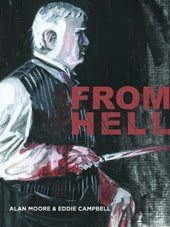
Here is an example from From Hell. The first version is from the current printing. The second is from the first Tundra/Kitchen volume 1, which went into three printings. The third is an even more degenerate version I just found on the internet. I wrote a 3,500 word account in 2001 of the technical history of From Hell which is quite dense with information that would only be of interest to a limited few people. It's available there via wayback, and should be copied and filed by anyone who can imagine ever wanting such a thing at a remote future date. The example below was particularly annoying to me because the very point of the moment is that a huge solid volume has suddenly placed itself in front of the running Sickert. In the faulty reproductions there is an opening on the side of the vehicle through to a white distant sky, undermining the intended effect.


It looks very airless and lightless and unappealing. The very thing that attracted me to this stuff in the first place has been rejected, that is, the riotous colour of those early 1960s Marvels. It was so riotous they could never keep it between the lines, as i'll show below.
Frank Santoro posted an article last week in which Neal Adams talked about how the old comics were limited to effectively 64 colours. Now that there are thousand to choose from, we have to wonder why our present day colourists have trouble getting past GREY (or gray as they write it in the USA). Once or twice when I've drawn these sorts of things I threw in some rough colour guides, taking care to let the colourist know the light sources and times of day, two crucial natural determinants in the appearance of a colour to the human eye. Of course I came to realize that comic book colourists, with one or two exceptions, don't know about and are not interested in such high-flown painterly matters. They have their formulas for modeling shapes and have not much looked up from their computers in the learning of them.
Nevertheless it's good to see some of the Colletta-inked stories in print again. There are even a couple that I don't recall ever seeing before (my Thor collection is impressive but incomplete though I can get an uninterrupted read-through from The Trial of the Gods to Ulik the Troll).
Discussing the work of Vince Colletta is one of those things that guarantees me a lot of visitors, and I bring the subject up yet again, knowing that all these visitors cannot look at the page without glimpsing the ad in the sidebar for my next book. But I do not lie when I say that he was my favourite 'inker' of the 1960s. Last week Sam Henderson posted a short romance story Colletta illustrated in 1960 (more). Since discussions of the artist very rarely get down to specific graphic points, note that I am particularly fond of panel 4 below, in which the bold sweep of the brush lines of the tree trunk is contrasted with the noodling of the flexible pen in the clouds.

I don't know what Sam scanned from, whether original or reprint; it looks fine, too fine to be a 1960 printing. However, in the past I have always been dismayed to see how Colletta's work has suffered in reprints. Following are two pairs of samples. All four of these are from different books; the problem was widespread. The first of each pair is the original printing from the mid-1960s and the second is the reprinting from the 1970s. You have to ignore the differences in the colouring. The older panels both have registration problems, and also there seems to have been a custom of underlaying a deeper yellow in the flesh hues (see the Santoro article linked above which discusses this very point). Colletta's style of inking Jack Kirby's work on Thor favoured a lot of textural fine lines. There is always a feeling of roughness and ruggedness in the inkwork that complements the sense of a pre-technological age. But notice in the reprint images how much of this fine work has disappeared. In the first pair, notice the lines that have disappeared off the yellow of the hair and work around from there. I've zoomed on very small details to make my point, but as I say, on first arriving at the reprinted versions, I'm always filled with a dismay at feeling that overall there is a great deal missing. Even moreso at the thought that these weak photostats(?) are all marvel has kept for the future. In the second pair, notice how the modelling lines on Thor's right arm have filled in, leaving ragged black shapes.


I have wrestled with the very same problems myself, though I am willing to admit that I create many problems with my ultra-fine linework. When Pete Mullins started working with me, one of the first things I observed was that he had worked out an indestructable inking style, quite in contrast to my cobwebbiness .
Here is an example from From Hell. The first version is from the current printing. The second is from the first Tundra/Kitchen volume 1, which went into three printings. The third is an even more degenerate version I just found on the internet. I wrote a 3,500 word account in 2001 of the technical history of From Hell which is quite dense with information that would only be of interest to a limited few people. It's available there via wayback, and should be copied and filed by anyone who can imagine ever wanting such a thing at a remote future date. The example below was particularly annoying to me because the very point of the moment is that a huge solid volume has suddenly placed itself in front of the running Sickert. In the faulty reproductions there is an opening on the side of the vehicle through to a white distant sky, undermining the intended effect.


Labels: "Make room for me vinnie", coloring, comic books 2





13 Comments:
A lot of details are indeed lost and that must be infuriating.
Do you find that the quality has improved with the modern printing/scanning techniques?
Hmmm well I guess those recoloured Tales Of Asgard still look great(it is Kirby after all) but I have to agree. I guess Marvel wanted to change it so people could justify buying it a second time. Or maybe no one likes bold colours anymore, it seems that way from the newsarama comments.
It's funny though, I often gravitate to the greyish colours for my own drawings even though strong colours look better with my rather flat cartoony doodles.
Dear Mr. Campbell,
From Hell is a genius masterpiece.
Brilliant as well is The Black Diamond Detective Agency.
I have collected all of Bacchus and am enjoying reading it straight through this summer.
I am thrilled each morning to read your blog.
I mean only to thank you for your wonderful work.
I also hope you will visit me in my hometown of Chico California.
You see I live within smelling distance of the Sierra Nevada Brewery. The aroma is wonderful. I promise to treat you to some of the beers they craft that are only consumed locally!
Thank you very much for all of the fun!
Best wishes,
your fan,
Gordon Smith
aka "go"
Well sir, it seems that you and Dan McFan are the two chief Colletta admirers in the world. I daresay that without your input Vinnie would be suffering a far worse reputation than he does. In comic book forums, when a member dares to post a positive comment about Colletta he is practically made a leper. There may be more fans out there who just don't want to put up with the barbs so we never hear from them. Kudos to you for bravery as well as good taste.
its educational!!
Natalie,
The artist has more control over things now because he can do all the photographing/scanning himself, at least on this simple black and white stuff. I do it all on a little machine the size of a briefcase. In the old days the machinery would fill a small room.
from 1969:
http://www.theage.com.au/ftimages/2004/03/18/1079199351275.html
thanks to everybody else for commenting
I love that you wrote that you actually liked rejection! The voice of a true artist. One reason I love you books is the wonderful details in each frame. There is also a realistic truth in you drawing, I pass a comic boook stand everyday and often I'm so disappointed on the black dark colors and how they draw the faces of women and men. The look like cookie cutter people not actual people like one of my favorite artist Goya. It was because of him I embrace my Latina looks, I grew up where only blond, long limb women were the ideal, it was only when I started studying my mom's college art book I saw women with skin tones and features like mine! When I see you people I feel I'm looking at a mini portrait not just an drawing of a fantasy. Especially where women are concerned. So many comic (graphic novel) women have tiny features, huge breast and a tiny waist, where so these women come from? Sorry this is so long Love; just your blog set me on fire! By the way , check out the film "Goya's Ghost" a great film on a great artist! Namaste-Geri
Met to write your but typing on a new PC.
Ooh, a PMT camera (that's photo-mechanical transfer to you, not the other kind...). I had a job working one of those once in a crappy advertising graphics place. Didn't stick it for very long but it was fun for a while messing with developers and screening things. Before I left I wasted a lot of expensive photo paper making copies of some of my rather poor ink drawings. Still have a couple, one of which has gained a nice metallic sheen due to some chemical reaction.
I'm enjoying my Tales of Asgard but only because I can mentally turn off the horrible coloring that Marvel has inflicted on great artwork.
I want to post one mild defense of the recoloring. What we've typically seen in Marvel reprinting the original pages with attempts at recapturing the original coloring ... on FHINY FLOURESCENT PAPER. The result was even worse; since Kirby's art had been designed for poor repro on yellow/grey paper, the old reprints played up every flaw.
If Marvel will refuse to reprint material on the original sort of paper for which the artwork was designed, I would rather have subtle recolorings than the opposite.
I always thought the only good Thor issues were those with Colletta inking. Roussos and Heck did a good job before Colletta started, but once he was on the series it really came to life. Any Thor issue he didn't ink always seemed to me to be second rate.
Check out a closeup of the work he put into those pages:
http://picasaweb.google.co.uk/comicartist
Thanks for the close-up, George. Yes, details were lost even before the first printings. Until recently everything went off to the printer and you just hoped for the best.
Post a Comment
Subscribe to Post Comments [Atom]
<< Home