Sunday, 4 October 2009

Tom Spurgeon contemplates an article from a couple of months back: On The Subject Of Return Reading
"The author and music writer David Gates penned an article this summer for Newsweek -- where I think he's a staffer -- on the pleasures of re-reading. Gates seems to view re-reading as way to spend time in the company of memorable characters that have touched him in his lifelong give-and-take with literature."
..and selects his favourite handful of books for reading again. Coincidentally, today I just finished reading The Amazing Adventures of Kavalier and Clay for the second time. I picked it up to momentarily derail my brain from an irritating subject and then wrote off most of the weekend in its company.

"In the immemorial style of young men under pressure, they decided to lie down for a while and waste time."

"Dinner was a fur muff, a dozen clothespins, and some old dish towels boiled up with carrots. The fact that the meal was served with a bottle of prepared horseradish enabled Sammy to conclude that it was intended to pass for braised short ribs of beef. Many of Ethel's specialties arrived thus encoded by condiments."

"The pyjamas were patterned with red pinstripes and tiny blue escutcheons. Sammy was wearing a pair that had red escutcheons with blue pinstripes. That was Rosa's idea of fostering a sense of connection between father and son. As any two people who have ever dressed in matching pyjamas will attest, it was surprisingly effective."

It's a wonderful book, and I thought Chabon spoiled things a little by allowing Dark Horse to adapt the Escapist, the comic book character invented by the two young men, into an actual comic book series. I wasn't dismayed enough however to turn down the opportunity to do my own version of the character. This was in 2005, and in the same issue as the last thing drawn by the late Will Eisner. Dan Best wrote the story, which was set at the 1940 Empire City World's Fair, an approximation of the famous NY one. The Escapist has to get himself out of the time-capsule. The New York one was just a couple of feet high, but this one was big enough to imprison a person inside along with the other stuff that was being salted away for future rediscovery a thousand years later. Actually, we didn't know the NY one was so small until we had already committed ourselves. I found a load of old pictures of the NY Fair, which fascinated me for their oddly tinted colours, which I presume are a result of the aging of printing inks, or the yellowing of paper, or the imperfections of early colour photographic reproduction processes, or all of the above. I tried to capture the odd harmonies that I saw in the old photos:


It was twelve pager, but Michael suggested a sharper ending (showing the opening of the time capsule a thousand years later and the odd thing that was found there) that required us to add a thirteenth page. I was glad to see him tinkering with the stories, like I'd hoped Eisner would have done with the New Adventures of the Spirit, though I'm sure his Pulitzer prize-winning time would have been better spent working on his next novel.

Related: I just noticed that there's an excellent portrait of Michael Chabon by Tom Yeates currently at the top of Steve Gettis' Hey Oscar Wilde page
Previous posts on Chabon, including the last that was heard of a possible movie adaptation of Kavalier and Clay.

Labels: ,

Wednesday, 12 August 2009

two more images from The Playwright, the most colourful, sexiest thing likely to ever come from my hand. And if that sentence sounds like one of the Playwright's own double entendres, so let it remain.


Labels: ,

Monday, 20 July 2009

my pal Mick Evans had a copy the new restoration of the old Lee-Kirby Tales of Asgard with him when we had lunch last week. There's a preview of some of the pages at Newsarama, from which I've clipped these panels.


It looks very airless and lightless and unappealing. The very thing that attracted me to this stuff in the first place has been rejected, that is, the riotous colour of those early 1960s Marvels. It was so riotous they could never keep it between the lines, as i'll show below.
Frank Santoro posted an article last week in which Neal Adams talked about how the old comics were limited to effectively 64 colours. Now that there are thousand to choose from, we have to wonder why our present day colourists have trouble getting past GREY (or gray as they write it in the USA). Once or twice when I've drawn these sorts of things I threw in some rough colour guides, taking care to let the colourist know the light sources and times of day, two crucial natural determinants in the appearance of a colour to the human eye. Of course I came to realize that comic book colourists, with one or two exceptions, don't know about and are not interested in such high-flown painterly matters. They have their formulas for modeling shapes and have not much looked up from their computers in the learning of them.
Nevertheless it's good to see some of the Colletta-inked stories in print again. There are even a couple that I don't recall ever seeing before (my Thor collection is impressive but incomplete though I can get an uninterrupted read-through from The Trial of the Gods to Ulik the Troll).

Discussing the work of Vince Colletta is one of those things that guarantees me a lot of visitors, and I bring the subject up yet again, knowing that all these visitors cannot look at the page without glimpsing the ad in the sidebar for my next book. But I do not lie when I say that he was my favourite 'inker' of the 1960s. Last week Sam Henderson posted a short romance story Colletta illustrated in 1960 (more). Since discussions of the artist very rarely get down to specific graphic points, note that I am particularly fond of panel 4 below, in which the bold sweep of the brush lines of the tree trunk is contrasted with the noodling of the flexible pen in the clouds.


I don't know what Sam scanned from, whether original or reprint; it looks fine, too fine to be a 1960 printing. However, in the past I have always been dismayed to see how Colletta's work has suffered in reprints. Following are two pairs of samples. All four of these are from different books; the problem was widespread. The first of each pair is the original printing from the mid-1960s and the second is the reprinting from the 1970s. You have to ignore the differences in the colouring. The older panels both have registration problems, and also there seems to have been a custom of underlaying a deeper yellow in the flesh hues (see the Santoro article linked above which discusses this very point). Colletta's style of inking Jack Kirby's work on Thor favoured a lot of textural fine lines. There is always a feeling of roughness and ruggedness in the inkwork that complements the sense of a pre-technological age. But notice in the reprint images how much of this fine work has disappeared. In the first pair, notice the lines that have disappeared off the yellow of the hair and work around from there. I've zoomed on very small details to make my point, but as I say, on first arriving at the reprinted versions, I'm always filled with a dismay at feeling that overall there is a great deal missing. Even moreso at the thought that these weak photostats(?) are all marvel has kept for the future. In the second pair, notice how the modelling lines on Thor's right arm have filled in, leaving ragged black shapes.


I have wrestled with the very same problems myself, though I am willing to admit that I create many problems with my ultra-fine linework. When Pete Mullins started working with me, one of the first things I observed was that he had worked out an indestructable inking style, quite in contrast to my cobwebbiness .
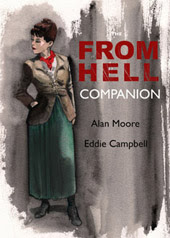
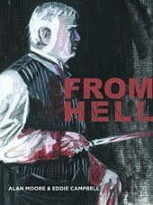
Here is an example from From Hell. The first version is from the current printing. The second is from the first Tundra/Kitchen volume 1, which went into three printings. The third is an even more degenerate version I just found on the internet. I wrote a 3,500 word account in 2001 of the technical history of From Hell which is quite dense with information that would only be of interest to a limited few people. It's available there via wayback, and should be copied and filed by anyone who can imagine ever wanting such a thing at a remote future date. The example below was particularly annoying to me because the very point of the moment is that a huge solid volume has suddenly placed itself in front of the running Sickert. In the faulty reproductions there is an opening on the side of the vehicle through to a white distant sky, undermining the intended effect.


Labels: , ,

Wednesday, 30 April 2008

since I'm meeting up with Neil Gaiman in Melbourne this week, here's a glimpse of the Spirit story we put together ten years ago. Someone has posted six and a half of the ten pages online. Steve Oliff did a sweet job on the colours.


Next, the above page as it looked when I'd done my part. Since I normally start with the lettering, working this way just felt all wrong to me, and to this day when I look at the printed version all I can think about is that the lettering (can't recall the name of the letterer) was put on after the art (although on page 1 you can see that I was planning it very carefully).


The story had a swarthy thug named Squith because Neil wanted to name one of the characters after Mark Asquith for some reason.

The 'New Adventures of the Spirit' set of stories (including three interrelated by Moore-Gibbons) remains out of print in spite of at least two different publishers intending to do it over the years. I did a second story in the last of the eight issues, by which time I had a better handle on the look of the thing except it was our first attempt at computer colouring in-house here at Campbell Industries and The Spirit camme out looking more like the Green Hornet.

Labels: , ,

Wednesday, 21 November 2007

Three more images from The Playwright:


Labels: ,

Tuesday, 20 November 2007

the playwright

I'm busy completing The Playwright in a colour edition perhaps for release in 2009. That's the story written by Daren White of which four chapters have already appeared in DeeVee. It will finish at double that length. I'm reformatting it into a small narrow book of single tier strips. I'm enjoying making something special of the colours, since I can apply all my attention to them as all matters of formal construction have already been dealt with. Here are a couple of details:


***********
Joe McCulloch reviews Betsy and Me- This can be a sad, sad book, if you want it to be.
This was a beautiful happy little strip from 1958 whose author, the great Jack Cole, shot himself two months into it.

************
The Guardian- Interview -
Crime of passion
- Sunday November 18- As Britain's bestselling crime writer lays Inspector Rebus to rest after 20 years, the Scottish grocer's son talks about sex, death and binge-drinking, and tells how his son's condition spurred him on to literary stardom. (The last sentence below amused me.):

Anyway, he is not planning to write any more crime fiction for a couple of years because he has other things to do - first, the publicity tour for Exit Music. He is currently doing Australia and New Zealand, followed by Austria and Germany in December. Then he is writing a libretto for Scottish Opera - 'It starts with a bloodbath and ends with a bloodbath, very traditional' - and also a graphic novel, for DC Comics in America. After that, he has promised to expand a serial he wrote for the New York Times about an art heist into a full-length novel, which he reckons will take him well into next year.
He does drink, then? I was worried that maybe, like the smoking, it was exclusive to Rebus. 'Oh, I like a drink! You can see from here,' he says, pointing to a bookshelf entirely given over to bottles of malt whisky, including one his agent gave him dating from the year of his birth. Does he drink every day? 'No. I probably do what is now called binge drinking, which used to be called drinking.

************
Moore, Clowes, Spiegelmaus on Simpsons. Catch it before they remove it. thanks, mr j.


"Maus is in the House!!"

Labels: ,

Wednesday, 26 September 2007

colour me purply black

Here's a detail from another one of my comic book outings. This is from a story Neil Gaiman wrote for DC titled The Flame is Green. I think it may have been the first thing he wrote for them but it was shelved for twelve years until 2000. I drew the three page prologue, pencil and ink, which had a haunting romantic quality about it. A character who is not identified but is obviously intended to be Blackhawk steps down into the wreckage of a bunker in Berlin. A serious battle took place here. Among the deathly remains we see a skeletal Sandman (the original with the fedora and gasmask) and battered wings that could only be the remains of a Hawkman who did not survive his golden age. Blackhawk is obviously a little tipsy, and wants to get back to his barstool. I'm not sure how Neil swung that, as I was once catogorically told that DC heroes never touch the stuff.


I forgot to check the colorist when I made the scan, but I believe it was Matt Hollingsworth, one of the few colorists I've encountered who knew exactly what he was doing. The lettering looks good too.

Labels: , , ,

Thursday, 20 September 2007

colour me purply brown again.

M ore panels of campbellian X-men. Here's the panel I already showed in the gentleman's club:


And here it is in clubby smoky purples and browns.


Here's a panel which is all Pete Mullins' work.


And here it is in steampunky purples and browns:


I kind of like this little panel. Minotaur by campbell, cute girl by mullins:


Not sure how that blue got in there.
Those pages were the last time Pete and I worked on a job together ( 2001).

Labels: , ,

Wednesday, 19 September 2007

color me purply brown.

Iwrote yesterday's post after uncovering a pile of old artwork while looking for something unrelated. I looked over the pages of art I drew for the X-men thinking to myself: this isn't as bad as I remember it. It was during that phase when Marvel's colorists were doing everything in purple and brown, for reasons one cannot hope to guess. Here's my rendition of Wolverine:


An here he is in muscular purples and browns:


Here's a shaman character coming form the wilds, whom I modeled on Alan Moore. For those following my recent notes on markmaking, I smeared the ink into a thick gel medium and laid it on with a one-inch broad bristle brush for the effects of the tree bark (click to enlarge for closer detail.)


And here it is in foresty purples and browns:


More shimmering hues tomorrow. Watch for them.
***********

Mother sues doctor over twin birth

Graphic novel a brilliant way to tell a disturbing story- The Ottawa Citizen- Monday, September 17.- Yann Martel, the Booker Prize-winning author of Life of Pi, is sending a book and letter every two weeks to Prime Minister Stephen Harper.: "Maus by Art Spiegelman. Don't be fooled by the format. This comic book is real literature..."

Mini-comic vending machine.

Labels: , , ,