Wednesday, 22 July 2009

there are only two things. Truth and lies. Truth is indivisible, hence it cannot recognize itself; anyone who wants to recognize it has to be a lie."- Franz Kafka

from the third set of Bent Books bookmarks, 2006

***********
in other news:
I just had lunch with my pal Daren White who mentioned that, after the whole rigmarole of starting school and explaining the days of the week and weekends and all that to his two wee'uns, he now has to explain why Wednesday Comics doesn't come out till Thursday. It's not even about shipping and distances any more, it's just that it's Thursday here when it's still Wednesday there. This is the first major comics confusion since the lads announced that the three leading members of the Justice League are Superman, Batman and Womany-man. Ever after, in our circle, Wonder Woman has been known as 'womanyman'.

Labels: , ,

Monday, 20 July 2009

my pal Mick Evans had a copy the new restoration of the old Lee-Kirby Tales of Asgard with him when we had lunch last week. There's a preview of some of the pages at Newsarama, from which I've clipped these panels.


It looks very airless and lightless and unappealing. The very thing that attracted me to this stuff in the first place has been rejected, that is, the riotous colour of those early 1960s Marvels. It was so riotous they could never keep it between the lines, as i'll show below.
Frank Santoro posted an article last week in which Neal Adams talked about how the old comics were limited to effectively 64 colours. Now that there are thousand to choose from, we have to wonder why our present day colourists have trouble getting past GREY (or gray as they write it in the USA). Once or twice when I've drawn these sorts of things I threw in some rough colour guides, taking care to let the colourist know the light sources and times of day, two crucial natural determinants in the appearance of a colour to the human eye. Of course I came to realize that comic book colourists, with one or two exceptions, don't know about and are not interested in such high-flown painterly matters. They have their formulas for modeling shapes and have not much looked up from their computers in the learning of them.
Nevertheless it's good to see some of the Colletta-inked stories in print again. There are even a couple that I don't recall ever seeing before (my Thor collection is impressive but incomplete though I can get an uninterrupted read-through from The Trial of the Gods to Ulik the Troll).

Discussing the work of Vince Colletta is one of those things that guarantees me a lot of visitors, and I bring the subject up yet again, knowing that all these visitors cannot look at the page without glimpsing the ad in the sidebar for my next book. But I do not lie when I say that he was my favourite 'inker' of the 1960s. Last week Sam Henderson posted a short romance story Colletta illustrated in 1960 (more). Since discussions of the artist very rarely get down to specific graphic points, note that I am particularly fond of panel 4 below, in which the bold sweep of the brush lines of the tree trunk is contrasted with the noodling of the flexible pen in the clouds.


I don't know what Sam scanned from, whether original or reprint; it looks fine, too fine to be a 1960 printing. However, in the past I have always been dismayed to see how Colletta's work has suffered in reprints. Following are two pairs of samples. All four of these are from different books; the problem was widespread. The first of each pair is the original printing from the mid-1960s and the second is the reprinting from the 1970s. You have to ignore the differences in the colouring. The older panels both have registration problems, and also there seems to have been a custom of underlaying a deeper yellow in the flesh hues (see the Santoro article linked above which discusses this very point). Colletta's style of inking Jack Kirby's work on Thor favoured a lot of textural fine lines. There is always a feeling of roughness and ruggedness in the inkwork that complements the sense of a pre-technological age. But notice in the reprint images how much of this fine work has disappeared. In the first pair, notice the lines that have disappeared off the yellow of the hair and work around from there. I've zoomed on very small details to make my point, but as I say, on first arriving at the reprinted versions, I'm always filled with a dismay at feeling that overall there is a great deal missing. Even moreso at the thought that these weak photostats(?) are all marvel has kept for the future. In the second pair, notice how the modelling lines on Thor's right arm have filled in, leaving ragged black shapes.


I have wrestled with the very same problems myself, though I am willing to admit that I create many problems with my ultra-fine linework. When Pete Mullins started working with me, one of the first things I observed was that he had worked out an indestructable inking style, quite in contrast to my cobwebbiness .
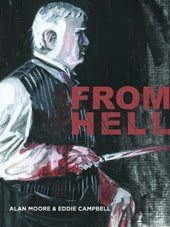
Here is an example from From Hell. The first version is from the current printing. The second is from the first Tundra/Kitchen volume 1, which went into three printings. The third is an even more degenerate version I just found on the internet. I wrote a 3,500 word account in 2001 of the technical history of From Hell which is quite dense with information that would only be of interest to a limited few people. It's available there via wayback, and should be copied and filed by anyone who can imagine ever wanting such a thing at a remote future date. The example below was particularly annoying to me because the very point of the moment is that a huge solid volume has suddenly placed itself in front of the running Sickert. In the faulty reproductions there is an opening on the side of the vehicle through to a white distant sky, undermining the intended effect.


Labels: , ,

Friday, 5 December 2008

i've been enjoying the old reruns of Maverick on Foxtel, and I seem to have gotten in early enough to catch some of season 1 from 1957. I was two when these things first aired. I loved the cowboy shows as a kid, but managed to miss this one except in an occasional repeat. It would have been my favourite, though probably would have a bit over my head for a few years. Anyway, Callum is passing through the room, catches a glimpse of James Garner as Bret Maverick and says "Hey! Wouldn't he make a good Spirit!". (Cal is currently working his way through Will Eisner's complete run of the Spirit.) Coincidentally, Eisner himself thought Garner would have been perfect in the role. He originally, in the '40s, had Cary Grant in mind, but by the '60s Grant would have been too old, so the 30 year old Garner he saw as perfect.
Of course it's all academic now as Garner is himself too old, but discussing the issue would at least leave an impression of just what the character should be like on screen, relevant as Farnk Miller's version will be coming to our screens very soon. Thus In 2002 at the Will Eisner symposium on the graphic novel in Florida, at which I was a guest, I was having breakfast with Will himself and he confirmed his liking for Garner as a theoretical Spirit. In 2006 I was having a beer with Frank Miller in San Diego and I brought the subject up. I may be wrong but I got the impression that Frank was dismissive of the choice.
Garner has great presence and has to be watched on screen, but here are a couple of stills of him as Bret Maverick


Here is Eisner's Spirit:


And here's the second Maverick photo with a mask drawn on the face:


This remark on the wikipedia page linked above,
"Garner as Bret usually wore a black cowboy hat, often changing its placement on his head from one scene to the next,"
reminds me of the expressive ways that Eisner would use the Spirit's hat, changing it from sombre to resilient to comedic to jaunty, etc. etc. from panel to panel.

update as i just realised the release of the movie is closer than I thought:
Spirit stars at abandoned warehouse (13 hours ago)
The stars of comic book film adaptation The Spirit have appeared at an abandoned warehouse. Rather than a Leicester Square premiere, Samuel L Jackson, Eva Mendes and Scarlett Johannson graced the red carpet at the Old Post Office in central London, ahead of the film's world premiere in New York next week.

**************
Andre Rieu earlier in Melbourne:

Saccharine touches make Rieu mildly nauseating

Alongside "light" classical and popular 19th century Viennese dance music, a Rieu performance typically features staging, costumes and coiffures based on romanticised stereotypes of 19th century Vienna, with saccharine Disney studio touches and kilometres of taffeta thrown in for good effect. Add in sing-along, clap-along, whistle-along audience participation, pantomime jokes, sensory overload (large screens, ice skaters, dancers, horses) and the production values of variety television, and you have The Wiggles for grown-ups.
(thanks to Louise for the link)

Labels: , , ,

Friday, 21 November 2008

it's 2004; the two comic book artists are fighting in the street.

It's two weeks ago; I'm writing this blog entry and forgetting to post it.

It's 1974; I'm being introduced to Dave Gibbons.

It's 2008; Dave Gibbons is publicizing his book, Watching the Watchmen.

There are all the thumbnail sketches, abandoned alternative character designs, colour guides for the characters and other paraphernalia, script addenda and memos, three dimensional scale location constructions and all the other stuff by which perfectionists such as Dave Gibbons and Alan Moore intricately work out their ideas and communicate their vision to each other and the people who work with them.
The Guardian is showing a bunch of sample pages.

It's two days ago. Mick Evans is telling me to check it out.

The torn photograph is on my desktop.

(I pinched it from here, but don't tell.) That's me , Dave and Bob Chapman from Bob's Dead Dog party, always the last Sunday of the San Diego con, invite only. Bob, Dennis Kitchen and I usually close it and walk through the empty San Diego streets in the wee hours. This year I had to leave early as our publicist had me on a six a.m. flight to Chicago. This meant that at least I didn't wake up on the Black Freighter again.

It's today. Dave's on Foxnews video

It's 2004; the Dead Dog party. The two comic book artists are fighting in the street. They're really trying to hurt each other. At the bar I ask Dave what could two cartoonists possibly be fighting over?
Dave says in an American accent, "But you never GAVE ME (BIFF!!) any colour guides! (WALLOP!)"

Labels:

Monday, 27 October 2008

after writing about the British small press comics scene of the early '80s in my previous post, a few thoughts have been lingering in my noodle. Firstly the Wikipedia page titled 'British small press comics' is full of problems (duh!), for one: "A "small press comic" is essentially a zine predominantly comprised of comic strips. The origin of the term is uncertain but probably emerged in the late 1970s and serves to distinguish them from zines about comics." (bold mine). Origin uncertain? I have on more than one occasion written that I told the Fast Fiction guys to stop calling all that stuff 'fanzines' if they wanted to make headway outside of comic book circles. I then suggested 'small press' as I had been to the Cambridge poetry festival in 1981 and found myself interested in the 'small press' tables with the photocopied books of poetry, more interested in the idea of it than the things themselves. I thought, when I later saw it, that it It looked just like wee Paul Gravett and his Fast Fiction table. My suggestion was taken up and survives.

Further down the Wiki page it says: "A number of people and creators have been associated with the small press comics scene over the years. Alan Moore, Eddie Campbell and Dave Gibbons were regular attendees at the Westminster Comic Mart in London originally organised by Paul Gravett in 1981." Apparently these events are too lost in the past to be accurately reconstructed. Paul never organised the marts. They were a bi-monthly mini-convention, lasting one Saturday's daytime trading hours, at which he quietly and inconspicuously just happened to hire one of the many tables. The rest of the mart was about the usual comic book and collectibles baloney and it regularly attracted large crowds. I hated that part then and I still hate it. The people named are just three of those who happened to have mentioned a transaction or two that took place there. Those marts attracted anybody and everybody who was interested in comics and the gathering together of writers and artists in the pub next door encouraged a tight-knit community and made a fertile ground for the cultivation of ideas and styles. If you asked me who was there, it would take the rest of the day to draw up a list.

A thing about the small press scene that is not usually mentioned is that there was something of a split around 1987. A few of us, I, Phil Elliott and Glenn Dakin mainly, didn't like the way Escape magazine was going. We felt that Escape was trying to be too slick and cosmopolitan and had lost sight of its founding goals. We didn't appear in any of the issues after #11 (it ran to #19 and while it was always smartly designed, it looked particularly flash at the end) and had already set up a separate operation within Martin Lock's Harrier Comics, who had otherwise been running since May '84 doing an old fashioned sci-fi type of US-format comic book in black and white. There, in assorted combinations of ourselves and others, we turned out 37 comic books under the rubric 'Harrier New Wave,' with our own separate banner on the covers, though we had been cuckoos in Mr Lock's nest for a few months before we thus declared our 'difference.' However, our own efforts were in the main no closer to anybody's founding goals either, since we were compromising a great deal to attract the attention of the American market. The last couple of issues of !GAG! (edited by Phil Elliott) did succeed to some extent in keeping that spirit alive, and a couple of the later issues of Australia's Fox were in the running too, with me, Elliott, Dakin and New Zealander Dylan Horrocks showing new work (Dylan talks about those years in an interview at Comics Reporter- word-search to the section beginning 'The English Small Press'). Fox serialized my material that was later collected as Little Italy. They even managed to front me a little bit of money for it, and asked me to not tell anybody. I guess it's all right after twenty years.

Our Harrier operation ground to a halt at the beginning of '89 and Escape, attached now to UK distributor Titan making inroads into publishing, made it to the autumn (fall). They also had planned a number of American-format comic books, which may have gotten as far as mock-up stage. Fox attached themselves to US publisher Fantagraphics and made it all the way through the following year, 1990. I believe Fast Fiction the table, trading in dozens of new photocopied comic productions as well as screen prints, postcards and other novelties, every two months, and the comic, presenting the cream of the artists that were around, also every two months, in a booklet format of twenty or more pages, may have dribbled into 1990 too, but I wasn't watching.

Some piccies from my files. This was my back cover of !GAG! #5, but think about it for a minute:


I drew it in black for one of Ed Hillyer's failed productions. I think Ed found it in his files late in the day and Phil Elliott coloured it. Here are a few covers of books that had been planned but never appeared:


With some additional details the above drawing appeared in that jokey annual event, the Amazing Heroes swimsuit special. Nothing ever went to waste. You can see that version here


Lucifer did appear two years later in 1990 from Trident, a UK publisher following on the heels of Harrier during the boom for black and white US-format comic-books. It was a three issue mini-series but without the cover above (note how the photocopy has been roughly folded for cramming into an envelope). Everybody was happy with Paul Grist's drawing on it, but he drew a lovely new one with a big close-up. There was also a book collecting the three at the end of that year, which is very hard to find as the publisher ran into money problems and Canadian printer Preney held the book to ransom. The publisher folded and the printer tried to sell the stock themselves, by representing themselves as the publisher, through Diamond Distributors, but this plan ran aground when I faxed them an irate letter after seeing the solicitation in the Previews catalogue. Dave Sim (Preney was the printer he used, and later me too) later told me I was an idiot and I could have worked something out with them, which is what I would tell some hotheaded artist if they came to me with the same story. I can no longer remember how I obtained my one copy; Paul once told me he'd never ever seen one.


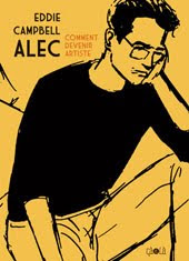
The above drawing fails to capture all the charm of the photo on which it was based. It had earlier appeared as a cover on an issue of Speakeasy but I relished the thought of a colour version. The Speakeasy guys, Acme Press, were another regular in the London small press scene. Speakeasy was a news and interviews mag and didn't show much in the way of new cartoons at first except when Phil Elliott and I gave them our strip samples that we had failed to sell to regular magazines, but Acme were the ones who published my big Alec book in 1990 in collaboration with US publisher Eclipse just after Escape (who had already published three of the four parts) faded out and just before Eclipse went bust too. Acme pulled a few other neat tricks out of the hat in the late '80s, like publishing all of Alan Moore's Maxwell the Magic Cat newspaper strips in four neat volumes ('86-'87), and getting the rights to adapt a James Bond film in time for the movie's appearance ('89). Richard Ashford wasn't allowed to take away a copy of the shooting script but was left in a locked room with it for an afternoon and adapted it on the spot in longhand. There's no Wiki entry for Acme so I'm not sure when they went kaput, but it was perhaps around '95, as I see their imprint that late, as co-publisher on the extended series of James Bond books put out with US publisher Dark Horse. Hey, surviving in this business is a real art.

Labels: ,

Tuesday, 21 October 2008

You kids keep offa my lawn!

due to the overwhelming thumbs up in response to my post telling you kids how to dress properly, I am now offering 'Comicbook morality in one easy lesson.' What you gotta do, right, is if you have a character and you want to send the reader a signal that we are not to take this person's actions as morally positive, you first must show him eating badly. Here is Rorschach with a can of cold beans:


Later when you want to show him ruthlessly breaking a criminal's fingers one by one in what would normally be unacceptable torture, don't worry because you will already have covered it by showing what a sloppy eater he is:


Now let us take a more recent example. It helps if the foodstuff is something that you kids don't like very much, like seafood. Pizza or burger is no good for this technique. Here is the Joker with some scampi:


And now we can show him blowing a guy away with impunity. You can take a low angle like you would with a hero blowing a villain away. It's all right because we already covered it with the yukky seafood:


This old fuddy duddy will no doubt have more useful advice for navigating those difficult parts of the comicbooks on another day. Keep watching, kids.

Labels: ,

Thursday, 16 October 2008

i only looked at this because wee Cal took a notion to dress up as the Ledger Joker for a party and I'm trying to tell the wife of my bosom that the purple tailed suit is not worn by this incarnation of the character. It's a four page preview of a one-off book by Azarello and Bermejo. It looks all very overdrawn and hideous; the wine is made from the same substance as the shrimps and there's a nauseous quality to it all which I suspect is not so much intentional as the artist's normal view of the world. Note that the Joker's coat folds right over left in the universal manner of women's coats instead of that of menswear, left over right. I apologise for picking on this artist, but I see the same problem all over the place. It can happen because the artist is looking in a mirror, but the overwhelming reason in the last twenty years is that comic book artists generally speaking, though there are a few fashion plates to give exception to the rule, are the worst dressed people in the world who mostly get around in t-shirts and draw people in leotards. Editors too, otherwise somebody would have picked up the mistake. The only other explanation is that it's intentional, in which case I'm full of baloney*. But if I arrived at the pub with a coat like that, somebody would have ridiculed me, probably Evans. Everybody else in the room has their coat open, and if I had done it intentionally I'd have made sure the reader knew it by showing all the others folding the opposite way.

The earliest example of the mistake that I own is contained in a double album of Duke Ellington's 1944 Carnegie Hall concert, released in 1977. Some hippy guy in the design department thought sports coats are symmetrical and flipped the image, putting the Duke's breast pocket on the right side. We can only imagine that the great man, who has strutted the world's stages in top hat and tails, was mortified, and I say guy because I have not yet met a woman who is unfamiliar with the niceties of dress differentiation, and have met at least one who wanted to make a political issue of it:


*after all, the Ledger Joker did look sweet in the nurse's uniform, an option I somewhat mischievously suggested to Callum.

Labels: ,

Sunday, 20 July 2008

Unsung hero...

at the Stafford City 2.10 showing of The Dark Knight. The geezer who rushed out after a few minutes to get them to fix the screen ratio. Hey, that was Eddie Campbell. I missed what happened for a few minutes onscreen. Next time I'll just yell (it's a very polite crowd you get on a Sunday. Nobody said a word before or after.)
Great movie anyway. I wonder if they looked at our (Campbell and White, writers, Bart Sears artist) version of Gotham General, a 44 page yarn in which the Joker planted a bomb in said hospital and succeeded in blowing up part of it. But for all I know maybe he tries it on once a year. You'll find it reprinted in a Batman/Joker collection titled Going Sane, on sale at the end of this month.

Labels: ,

Wednesday, 16 July 2008

my pal Lee Slattery has just finished putting his Everyone Loves the Lizard man online. This used to run as a serial in Deevee at the same time as my How to be an Artist. Also, he has coloured the whole thing. It's brilliant.

(in the scroll that opens for the five chapters watch out for the numbering, as I don't think they appear in correct order)

Labels:

Monday, 19 May 2008

cal came home from the movies the other night and announced that Iron man is cool. I said 'You know I drew Iron Man once' 'You never did' 'yes, he was a guest star in an issue of Captan America.' 'YOU drew Captain America?"
The thing about kids is that they weren't listening to anything you told them between the ages of ten and sixteen, so you get to tell them all over again. I fished out the issue in question and he read it. Here are a few panels. The heroes get to hang out and call each other by their first names. I always liked that kind of thing when I was a wee'un. You could imagine you were hanging out with them yourself. Tony, Steve and wee Eddie.
The colouring was very dark, and I've had to lighten it so we can see what's going on. StewART McKenny helped me out with the backgrounds and mechanical objects in these panels. The thing I like most is that it almost doesn't look like my work.


update: I forgot to mention that the book was writen by Bob Morales who is always sending me links for my blog.

Labels:

Friday, 4 April 2008

my thoughts have turned to an old pal I first met exactly twenty years ago. I'm having trouble verifying details on this and I'm sure somebody will help as apparently he has no online presence (except for a reproduction at Tabula Rasa, David Carroll's Australian comic book covers gallery). I gather that he was found at the foot of a cliff six or seven years back, presumed suicide.
I first saw the work of Nigel Gurney on this striking cover in 1988. Tusk Comics was his own self-published book. The first issue appeared the previous year and was titled 'Hap Hazzard,' and this was the second. Brigid Bolt was a character that made her first appearance in the first issue and in between landed a weekly spot in local Sydney newspaper the Sun-Herald.


Brigid Bolt was an original and memorable cartoon character and I like the way Gurney and his scripting collaborator figured out the cadences of the sunday comic format and married that to their own subversive purposes.
sept. 6 1987

The above appeared in the book, while the next were loose xeroxes Nigel sent me. jan 10 and 17 1988


Nigel was a few years younger than me, which I always presumed because he seemed to think I was further along the road to recognition than he was. In 1988 I was appearing in a number of places but not making a lot of money out of it. I used one of his stories in The Dead Muse, a book I edited that was published by Fantagraphics in 1990.
I'm looking at a dozen or so letters from Nigel over the course of two years, thinking how fine it was when we all wrote to each other, properly thought out two page handwritten letters.
(9 june ) "Hope things pick up for you- can understand that feeling of 'the doors closing on another phase'. Brisbane is a tough place to entertain such thoughts. I always get depressed there... maybe it's because it's where I spent my early years."
(26 july) "Got your letter and 'Honk' (long defunct Fantagraphics humour mag whose last couple of issues were edited by Joe Sacco) in the box on my return- many thanks. 'The Wonders of Science' was certainly a gallant effort of lunacy, way beyond what we were allowed to do in the Sun-Herald. I found out the other day that our last story caused a storm of editorial controversy and nearly wasn't published because a) it showed a hand being chopped off, and b) it was about two lesbians. it's probably a good thing we quit."
Nigel was a granson of famous Australian cartoonist Alex Gurney of Bluey and Curley fame (Lambiek site biog):
(8 nov) "I'm going to photocopy a batch of Bluey and Curley strips for you, so you can see what Alex Gurney was doing. Rereading them I think they hold up incredibly well and I still get a real laugh out of quite a few of them."

Brigid Bolt made some later appearances I think in a gay interest magazine, but mostly I think Nigel experienced only frustration trying to get somehwere with his art. I have two photos in my files. One is a smiling portrait and the other is a tiny photo-booth mug-shot which nevertheless captures something of the desperation of the young artist perpetually thwarted.

Labels:

Tuesday, 25 March 2008

in my book, After The Snooter, I drew this scene in which I discovered my first American comic book.


A fine chap named Tim Stark wrote his thesis on my stuff and pointed out something I never noticed while drawing the piece (though it looks so obvious I feel stupid saying so), namely that wee Eddie, probably eight years old, is having an artistic epiphany while in hospital wearing a bandage on his head after being hit by a car, and the big moment of his enlightenment is focused upon a comic book whose title is: OPERATION BRAIN BLAST. This wasn't literally the first American comic book I fastened my eyes upon, but out of the bunch of contenders this one had the right resonance, so presumably my brain was still making important decisions at some subconscious level, blasted or not. In the anecdote I had been given a kiddie's comic while the guy in the next bed was given this wondrously exotic and adult looking object (I've even managed to catch a snippet of the back cover ad, something about boys vis-a-vis men and physical fitness.)


So in the middle of the night I sneaked over to the other kid's bedside table and secretly read his comic. For a moment I thought of stealing it, but then in that special logic of childhood I figured that anything as wondrous as the drawings of Jack Kirby would be missed and the hospital would send somebody out after me to get them back.

Shortly after this I started collecting the black and white British reprints of the Marvel material. I used to colour them with wax crayons because I knew the originals were in colour as I'd seen one that day in the hospital, and I wouldn't stand for anything incomplete in my collection. Virtually all of the Marvel line was represented across five weekly titles. I recently came across a couple of loose pages I picked out of the pile as mementos before I threw it all in the trash.


These are dated '68. I'd have been 11/12 years old.


I coloured ALL of the stuff, all the Hulks and Avengers, the whole lot, but the thing you should notice about the pages I chose to keep is that they are examples of THOR that were inked by Vince Colletta. The British publisher was in the habit of removing the credits, but that never fooled wee Campbell; it just made him look harder. A while back I wrote a post here about how Colletta was my favourite comic book inker of the 1960s. For some unfathomable reason beyond all absurdity, it was and continues to be the most visited post I've written. I almost said popular there, but that would be the wrong word, for I was vilified in many places for uttering such an opinion. Even people you would think could not possibly give a hoot, I found them stopping me in the street, in San Diego during the convention, the only place everybody knows my name, sadly, and even somebody such as Gary Groth had to get his two cents in and call me an idiot. People generally can't stand by and allow you to have an opinion they don't share.

My old pal Lew Stringer writes about those old British reprints
and again
And never one to miss a detail, he shows here how the English publisher sometimes changed stuff

Wikipedia on the subject

Labels: ,

Friday, 1 February 2008

No matter how famous we think a book or film has become, there will always be a brick wall of human brains that will remain impervious to any knowledge of it:

LONDON (Reuters) - Woolworths has withdrawn the sale of the Lolita Midsleeper Combi, a whitewashed wooden bed with pull-out desk and cupboard intended for girls aged about six after a concerned mother raised the alarm on a parenting Web site.
"What seems to have happened is the staff who run the Web site had never heard of Lolita, and to be honest no one else here had either," a spokesman told newspapers. "We had to look it up on Wikipedia."
(link via wee hayley campbell)
***********

This made me laff. One of my comic books from twenty years ago ended up in a museum.

The Museum of Riverina, city of Wagga Wagga, NSW, Australia:
This new acquisition has a link to the Wagga region, simply by virtue of its title: by the time i get to WAGGA WAGGA. The cover illustration depicts a rough map of the Wagga region, with a 'Where's Wally' type character falling towards it from a plane.
This comic is a good example of the work done by graphic novelist and illustrator Eddie Campbell. It is one of a number of quirky items which use the name Wagga Wagga in their title, but seem to have little to do with the place itself.
Campbell's quirky comic exemplifies the number of books or plays which use the town of Wagga Wagga as a setting - for example the books Mud Crab Boogie and Men are From Wagga and Women Wish They Weren't.


(a link to this has been in my 'gallery of amusements' sidebar for some time, but you may have overlooked it there. anybody curious as to what was in the comic book see here.)
************

Coincidentally, somebody has just posted a cartoon page I drew twenty years ago on how to collect comic books. I'd steal it back and show it here except I think my mum is still sore about me using my school lunch money for such nefarious purposes.

Labels:

Monday, 5 November 2007

Old photos

I came across this old photo the other day. It's of me and Pete Mullins and was taken by Randy Stradley at a Sydney convention fourteen years ago in 1993, around the the time Pete started working with me regularly.


Pete had been picking up a few art jobs around the place including drawing a few books for Revolutionary comics such as this one:


The Revolutionary story is more interesting than any of their actual books, and you can find the short version here and here. Even shorter, Publisher Todd Loren put out unofficial biographies of famous individuals and rock bands and got sued every which way by the likes of Bon Jovi and Motley Crue.
I remember quite well the day Pete came round and said he thought he was going to have trouble getting paid for a certain job, perhaps the one above. And I said, give me the details and we'll see what we can do, as I liked to pass myself off as somebody who knew a thing or two. He said 'my publisher just got murdered.'
I had no answer.
Even the FBI had no answers: In June 1992, at the age of 32, Loren was found stabbed to death in his San Diego condo. The case remains unsolved, although some people suspect spree killer Andrew Cunanan. The FBI later investigated and ruled out Cunanan's involvement.
Here's another cover by Pete. This one is dated Sept 1993.


Lots more by me and Pete under the label Bacchus.

Labels: ,

Wednesday, 26 September 2007

colour me purply black

Here's a detail from another one of my comic book outings. This is from a story Neil Gaiman wrote for DC titled The Flame is Green. I think it may have been the first thing he wrote for them but it was shelved for twelve years until 2000. I drew the three page prologue, pencil and ink, which had a haunting romantic quality about it. A character who is not identified but is obviously intended to be Blackhawk steps down into the wreckage of a bunker in Berlin. A serious battle took place here. Among the deathly remains we see a skeletal Sandman (the original with the fedora and gasmask) and battered wings that could only be the remains of a Hawkman who did not survive his golden age. Blackhawk is obviously a little tipsy, and wants to get back to his barstool. I'm not sure how Neil swung that, as I was once catogorically told that DC heroes never touch the stuff.


I forgot to check the colorist when I made the scan, but I believe it was Matt Hollingsworth, one of the few colorists I've encountered who knew exactly what he was doing. The lettering looks good too.

Labels: , , ,