"It is in the nature of cinema that an actor who made her last film appearance more than seven decades ago, and who retreated from public view in the late 1940s, refusing photographs and interviews ever since, can still be appreciated on screen as young, as lovely and as fresh as ever. Barbara Kent, who has died aged 103, was one of the last surviving stars of the silent era. She appeared in the last great silent American film, Lonesome (1928), Paul Fejos's masterpiece of urban poetry. Kent played Mary, a switchboard operator, who meets Jim (Glenn Tryon), a factory worker, in Coney Island. They spend the day together, fall in love, and then lose each other in the crowd. The simple tale of "little people" is raised by the sincerity of the performances and by the director's expressive use of location, camera movement and montage."more, the Guradian
Saturday 22 October 2011
Obituary of Barbara Kent.
Friday 21 October 2011
CLowes' Mister Wonderful is a great read. A whole book describing the events of a single blind date. It took me a long time to warm to Clowes work as I never liked the gallery of grotesques in his early books like A velvet Glove cast in Iron. But from Ghost World on he has been a world class 'graphic novelist'. What bugs me now is that I didn't have the courage to make The Playwright a long horizontal book. I mean look at this; he's got two inches on me:
You see, I was so wishy-washy about the horizontalness of the art that I put padding at the top and bottom of the pages so I could try to slink around the walls of the ballroom without attracting too much attention.
Mister Wonderful is a gathering up of the serial that Clowes made for the New York Times when the venerable old lady was running a 'Funny Pages' section
The section has been criticized for being unfunny, sometimes nonsensical, and excessively highbrow; in a 2006 poll conducted by Gawker.com asking, "Do you now find — or have you ever found — The Funny Pages funny?", 92% of 1824 voters answered "No."Mister Wonderful was published a couple of months back by Pantheon. this month Drawn and Quarterly have gathered up his Death Ray (originally published as Eightball #23). he's talking about it at the AV Club:
The Funny Pages are no longer published in the magazine.
AVC: How much research do you do to get a time period or a place right? Like in The Death-Ray, there’s a panel in which a character is holding a little photo-cube, which is such a perfect little ’70s décor detail.
DC: Often I’ll do research just to get a time period correct, but I didn’t have to for the ’70s. [Laughs.] That was sort of the height of my powers of observation, those years. I feel like I can close my eyes and still see it so clearly. And that was something I always wanted to do, to capture that later half of the ’70s. It’s like the early half of the ’70s is still the ’60s, in that there’s still kind of a playfulness and inventiveness in terms of design and the things that were going on in the culture. The second half, it got much more commodified. It’s possibly the ugliest era of architecture and clothes and design in the entire 20th century, from 1975 to ’81 or ’82. So I really wanted to capture that, because those were my formative years, and I feel like a lot of my aesthetic was in response to feeling the awfulness and cheapness of that. One of my weekend hobbies is to go look at old houses when there are open houses around here. Just to go look at the architecture. And you can see how many houses were built around 1977, the year where everyone said, “Let’s put in these aluminum windows instead of beautiful hand-made wood ones.”
Labels: new books (3)
Thursday 20 October 2011
it's just comics- part 3
I was looking forward to this new book a/ because it's Alex Toth and b/ because it reprints 60 stories, Toth's entire contribution to the catalogue of a long defunct publisher whose material we rarely see reprinted. And c/ because I was guessing at least half of these stories would be in the ROMANCE genre. The rest are HORROR, CRIME and WAR, but how rare it is to get a big set of Romance things in one package. (video preview)
The Wikipedia entry for Standard Comics just talks about the publisher's superhero characters of the early 1940s, none of whom are of any interest to me. The company got into the Romance line on the bandwagon (more on that in a future post) in 1949, and Toth arrived there in 1952. I saw a couple of these stories reprinted by Eclipse Comics about twenty years ago and I thought they were lovely. They suggested ways in which comics could be made closer to real experience. Toth himself favoured the genre.
Popular Romance #22, jan 1953
Intimate Love #26- Feb 1954
The influence of of Noel Sickles on Toth has been analysed, but this work shows a multitude of influences rubbing shoulders as though at a party, the first party of summer where you can be absorbed enough just circulating and looking at what everybody is wearing:
Thrilling Romances #24- Jan 1954
Intimate Love #26- Feb 1954
The other name making these pages sizzle is that of Mike Peppe. Toth's work is invariably at its best when he does the whole job himslef, but to get the most out him, the editors assigned him mainly to pencilling. Assorted inkers were tried until Peppe filled the bill. that's his inking in most of the samples above. That effect of lushness that we don't expect to find in Toth is no doubt partly his doing.
The Publisher, Standard Comics, went out of business in 1955 or 56 at the same time as so many others in the field, just after the introduction of the Comics Code censorship body. Somebody bought up all the artwork or something and it occasionally turns up around the place. The book under discussion is from Fantagraphics, with the original printed pages restored in all their colours by Greg Sadowski, who put the whole package together with extensive notes from which I quoted the above snippets. The Eclipse sampling from twenty years ago was presumably from original art and had sharper linework (Sadowski shows us about a dozen original art pages for revealing comparisons) but the up-to-date colouring they applied tends to distract. so it's six of one and half a dozen of the other.
One other thought. Sadowski's book opens by reprinting an excellent old interview with Toth that I've had in my files for years. It first appeared in Graphic Story magazine, and took place in 1968. The issues of this magazine are where the 'graphic novel' came into being as a thoretical idea. They ask Toth:
addendum. Tom Spurgeon on Setting the Standard, three weeks ago
more soppy romance next time.
The Wikipedia entry for Standard Comics just talks about the publisher's superhero characters of the early 1940s, none of whom are of any interest to me. The company got into the Romance line on the bandwagon (more on that in a future post) in 1949, and Toth arrived there in 1952. I saw a couple of these stories reprinted by Eclipse Comics about twenty years ago and I thought they were lovely. They suggested ways in which comics could be made closer to real experience. Toth himself favoured the genre.
"Romance was very special. It dealt with emotions in a different way than the slam-bang adventure stuff. There are a lot of things under the surface...a line of dialogue could say 'this', but the expression of the person would say 'that'... there were all these little nuances of line readings, acting, reacting, interpretation, layers of character personality, integrity... that was very grown-up."Of course, all of that went out of fashion in the comics:
Intimate Love #21- feb 1953
In his later years, among the things that distressed Toth about modern comics was a lack of everyday natural emotion. he once wrote to an aspiring cartoonist: "How do comic book friends and colleagues and lovers, and parents with their kids, express good and loving feelings? Think about it-- so rare an event in comic book fare-- positive emotions-- why so? Do your characters relate to each other? Touch? In ways other than the usual punching and pounding superjock jazz wipeouts? Is that the limit? Little things mean a lot-- friendly hugs and shoulder pats and evident body English when two or more characters relate in a scene or throughout a story-- as we do in our own lives. or didn't you know? Or never connect the dots? Or never give a damn?"Toth's work has long been admired for its distilled simplicity of black and white design, but these early pages fizz and bubble with life.
Popular Romance #22, jan 1953
Intimate Love #26- Feb 1954
The influence of of Noel Sickles on Toth has been analysed, but this work shows a multitude of influences rubbing shoulders as though at a party, the first party of summer where you can be absorbed enough just circulating and looking at what everybody is wearing:
Thrilling Romances #24- Jan 1954
"I enjoyed doing the stylish thing, well-dressed men and women. Inspired by Parker and Whitcomb, plus fashion magazines to bone up on the latest thing, to smartly dress men and women. It was fun."I speak above of these stories as the product of a publisher. One publisher is only different or superior to another in respect of the creative people that it attracts into its orbit. Some of the stories in the book are fairly routine fare, but the best of the romance stories were written by Kim Aamodt, and have a level of insight and craft not often found in comics, never mind romance comics, the worst of which of course are as bad as anything you can think of. One of the best stories in the book can be read online. Lonesome for kisses (you'll just have to get used to these titles) is a ten pager that appears to have been reprinted in something called Buried Treasure #2 in 1986, in black and white, probably from photostats with zipatones added. There's nothing in it that could not have really happened.
Intimate Love #26- Feb 1954
The other name making these pages sizzle is that of Mike Peppe. Toth's work is invariably at its best when he does the whole job himslef, but to get the most out him, the editors assigned him mainly to pencilling. Assorted inkers were tried until Peppe filled the bill. that's his inking in most of the samples above. That effect of lushness that we don't expect to find in Toth is no doubt partly his doing.
The Publisher, Standard Comics, went out of business in 1955 or 56 at the same time as so many others in the field, just after the introduction of the Comics Code censorship body. Somebody bought up all the artwork or something and it occasionally turns up around the place. The book under discussion is from Fantagraphics, with the original printed pages restored in all their colours by Greg Sadowski, who put the whole package together with extensive notes from which I quoted the above snippets. The Eclipse sampling from twenty years ago was presumably from original art and had sharper linework (Sadowski shows us about a dozen original art pages for revealing comparisons) but the up-to-date colouring they applied tends to distract. so it's six of one and half a dozen of the other.
One other thought. Sadowski's book opens by reprinting an excellent old interview with Toth that I've had in my files for years. It first appeared in Graphic Story magazine, and took place in 1968. The issues of this magazine are where the 'graphic novel' came into being as a thoretical idea. They ask Toth:
Someday graphic novels will take up where comic books are leaving off, but what about the artst who has to sit down and draw them? If someone came to you with a 200 page pictorial novel to illustrate, and if the money was okay, do you think you'd be interested?Note that both the interviewers and Toth see the business of comics as one where an artist goes to the publisher (or the publisher comes to him) for an assignment. Time has shown us that with the 'graphic novel', things work quite differently. An artist conceives the thing and pushes it uphill. At some stage they may tap into some money in order to get the thing made, but we're talking about self-motivation and a constant reinvention of the whole idea. The artist doesn't just do one and then line up for his next one. He has to resell the whole idea of a graphic novel each time around. 'This is nothing like your last one.' That's because it's THIS one.' And so on. Interesting to look back at when it was still just an abstraction.
I'd probably blow my brains out... etc.
addendum. Tom Spurgeon on Setting the Standard, three weeks ago
more soppy romance next time.
Labels: Alex Toth, It's just comics 1
Wednesday 19 October 2011
Matt Seneca writes passionately about the latest volume of the reprinted Prince Valiant (1943-44). Damn right he is I say!
Of course, critical judgments of a comic stop mattering once you read it. A few pages into the fourth of Fantagraphics’ beautifully reprinted new editions of Hal Foster’s masterpiece and it’s difficult indeed to remember that this isn’t the greatest comic ever.Prince Valiant does not tend to shape up to contemporary laboratory theories about what 'comics' is supposed to be, which is a shame. Here's part of a favourite sequence of mine. These three panels are actually taken each from a separate Sunday page over three weeks in early 1956, not from the book Matt is reviewing but from a 1979 Pacific Comics Club reprinting. Those guys paid no attention to the original colouring, but never mind that for now. Vikings are ransacking the fort, where Aleta is. Val and his party are returning from somewhere and they hasten to the rescue. The impatient Val decides to go down the mountain more or less vertically.
Labels: classic strips(3)
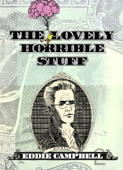
Since my upcoming book will be about money, The Lovely Horrible Stuff, I have been uncommonly interested in the stuff of late. Leif peng has been doing a bloody wonderful series of posts specifically about the business of making money from Illustration, going way back to 1924, then coming forward the 1960s. Fully illustrated as always.
post of October 11
post of October 11
Five thousand dollars! Using any one of a number of online currency converters, we can quickly recalculate Albert Dorne's income as being nearly one million dollars per year when adjusted for 60 years of inflation. His $5,000 ad art fee comes to $46,436.23 in 2011 dollarspost of October 13
Its not surprising then that, at a time when the average annual family income was just over a thousand dollars, Rockwell describes being able to put ten times that amount into savings in a matter of months.post of October 17
Liberty magazine's publisher may have failed to sway Norman Rockwell's loyalty to George Lorimer and the Saturday Evening Post... but the demon of temptation proved too powerful for another illustrator - Rockwell's friend, Leslie Thrasher.
"Some months later Thrasher came to my studio asking advice about an offer Liberty magazine had made to him. It was a five-year contract calling for Thrasher to do fifty covers a year at one thousand dollars a piece. "I can live on ten thousand dollars a year," said Thrasher, "so I can save forty thousand. At the end of five years I'll have two hundred thousand dollars. I'll be well off and secure for the rest of my life."
"After eight or nine months his house burned and he was so run-down and tired from overwork that he caught pneumonia and died."
The 1960's would prove to be a challenging decade for Marvin Friedman and virtually every other illustrator trying to pursue a career in magazine illustration. As television stole away advertising revenue, page counts went down and magazine editors increasingly turned to photography in place of illustration. Only the truly determined artist could hope to snap up some of the fewer and fewer assignments. "I had to brown-nose," says Marvin, "I had to send liquor out at Christmastime - it was like any other business - you had to do what you had to do to get the work."
Labels: Illustration
Tuesday 18 October 2011
It's just comics- part 2
After dismissing the big Nostalgia EC HORROR book in my previous part, I remembered there was another story worth mentioning. It was crime story that evoked the style of what would later be called 'film noir.' It was one of a group of stories by a writer named Carl Wessler, made after Gaines and Feldstein started out-sourcing some of the scripting in 1953. This is from Shock Suspenstories in the last year of EC's colour comic books. It has those huge blocks of text that make EC problematic for the comics theory purists, but they've never bothered me unless they're tediously written, which was more often than not. This one does the tough first person voice-over appropriate to type. The narrator has been hired for 500 bucks to bump a guy off: 'a five-c-note for a couple'a hours work.'
Shock Suspenstories #17- Oct 1954 Wessler/Evans
Typical of an EC story, you don't need to read the whole thing to get the point, though I would be happy enough on any day to look at six pages of George Evans drawings with no story attached at all. Going straight to the end, the assassin chases his prey all over the place, finally down a stairway and into an unlit room. Suddenly the lights go on and he finds himself fatefully onstage in a small theatre. "It turns out I've walked in on the opening scene of a play about President McKinley and the guy what shot him. It's called "The Assassin". There's a twist, huh? Whose picture do you suppose is on a five-c-bill? Yeah..."
The EC CRIME comics as a whole were actually a cut above other publishers' attempts, due entirely to Johnny Craig being the editor/writer of Crime Suspenstories. He also drew one of the four stories in each issue. Here's an example of a daring splash page by Craig. There's something about the colour doubled under the black lines on the figures that creates a very unusual 3D effect, visible even in this scan. It would be easy to characterize this as a happy accident, but I can think of many messes that have been made by colourists mistakenly thinking that any colour combined with black will be invisible. (this is a reprint and may not reflect the original presentation).
Crime Suspensetories #2- Dec 1951- by Johnny Craig
The story is about a criminal who realises he looks just like a certain millionaire who is ailing in a rest home. He kills the guy, takes his place, and makes a swift recovery. Taking over the guy's life, he now realizes the rich guy got rich by devious financial practices and is not well liked. A trio of brothers whose father has just committed suicide on account of the rich bloke, come visiting and haul the 'rich guy' out into a very secluded spot, with the obvious intention of doing him in. The guy spills his guts about how he's not the rich guy but just a chancer who bumped him off and took his place. He's a ringer in other words. The trio are not sure whether to believe him and shoot him anyway, finishing with the punchline, "Now he's a DEAD ringer." And so you see the EC practice of building an entire story around a pun.
I haven't seen any crime comics that were half as good as Craig's, but for further reading, Santiago Garcia, recently transplanted to the USA and findiing himself at the Baltimore Comic Convention, picked up a handful of issues of Crime Does Not Pay, published by Lev Gleason, edited by Charles Biro, the first of the CRIME comics (1942-54) and wrote three long appraisals of them (read from the bottom up). I can't look at those Biro books without wondering how he thought all that garish colouring was a good idea. Marie Severin coloured the EC books in a more thoughtful way, though if she did every one of them I can't imagine there was much time for thinking.
But hey, It's just comics. They were churned out like a factory product. The things that make them still work, if they do, are almost accidental, the choice of an artist, or a story that is good in spite of itself, or somebody cared more than they needed to.
(I'm still adrift from my original destination... more to come)
Labels: It's just comics 1, Johnny Craig
Monday 17 October 2011
There is a theory being proposed that Van Gogh didn't die by shooting himself, but got caught in a crossfire between a couple of school age cowboys in the cornfield that day.
Or something like that. It's all in Googledutch.
*****
Just out. 1001 comics you must die before you read. I wonder if I'm in it.
Or something like that. It's all in Googledutch.
This hypothesis will present the Pulitzer Prize-winning American author, Steven Naifeh and Gregory White Smith, now in their biography of Van Gogh, Van Gogh: The Life. That would be the gunshot wound in the belly of the painter and explain that the weapon, but his painting stuff, never recovered.(brought to my attention by h.n. in comments)
*****
Just out. 1001 comics you must die before you read. I wonder if I'm in it.
Sunday 16 October 2011
It's just comics- part 1
In which I try to put the early 1950s in perspective (it started as a simple plug for a book and grew into a monster- the book will be in part 2).
In my post of April 22 2008 I quoted a passage from Eisner/Miller, published by Dark Horse in 2005, in which Miller referred to a fact that EC was the best comics publisher of the 1950s and disregarded the older man's challenge of his assumption. It's one of those things that comics fans have always taken to be a truth even though for most of them (including Miller) (and me) it all happened before they were born. I'm not saying it wasn't so, but I've always thought it was a claim in need of questioning. The claim no doubt arose due to that syndrome in which history is written by the survivors. While many comics publishers disappeared in the mid-1950s, EC survived via Mad and the later leasing by Gaines of the entire catalogue of stories for publication in deluxe albums for collectors, by Russ Cochran, and then subsequently as regular comic books all over again.
The first celebration of EC that I observed (outside of fanzines, which were invisible to me in my youth) was the big Nostalgia Press Collection of 1971. It was a sampling specifically of the HORROR genre, and the cover sported a corpse getting out of a coffin, drawn by Al Feldstein.
I would have been prepared to accept that this was a selection of the best of EC comics across the board except that in the very same year, in Comix: A History of Comic Books by Les Daniels (described here) there was a complete reprinting of the 7-page Harvey Kurtzman war story Big If (in black and white), which was superior in every way to anything in the horror collection, not counting the classic Master Race (which didn't originally appear in one of the 'horror' comics so titled). (here is the first page of Big If as a reminder. You can find the entire story here, scroll down past the gallery of Kurtzman covers)
Fontline Combat #5 May 1952- by Harvey Kurtzman.
The mystery prevailed: why show all that horror stuff when there is presumably a wealth of better comics to make a collection out of? To be fair, there were good items in it, such as Pipe Dream, drawn by Krigstein, Squeeze Play by Frazetta, the above mentioned Master Race and others, but the accent on horror meant that Williamson was badly represented with a vampire thing and in general some awful nonsense was included. I realize I am probably in the minority in regarding horror, at least as it has appeared in comics, as a very low kind of storytelling; a kind of ugly joke in which the material turns in upon itself at the climax and you realize you have invested your attention in a narrative that wasn't worth your time. Most of the better artists had a low opinion of it too, such as Williamson, and Kurtzman and Krigstein (If this were a formal essay I'd find the references). It was designed to appeal to 14 year old boys, who had not yet discovered girls, and was perpetuated by adults who had not entirely gotten over being 14 year old boys.
That in itself is not an original observation, and not wishing to leave this on a cliche, I have often wished that there were more archival projects that preserved the best of the ROMANCE genre.
(more tomorrow)
Labels: It's just comics 1, Kurtzman