Thursday, 7 December 2006

Them idyots at Top Shelf

Tita asked:
”I have the three Alec series from TopShelf and am still wondering if they publish them in different sizes on purpose.”
I don’t know what I’m going to do with those boys.
Actually, I have to confess it’s all my fault. I think I had some idea about a 'book' comic being such a different model from the old style floppy comic-book that I should go to lengths to undermine the idea of it being a series. That is, no volume numbers (I’d already done that with the Bacchus books) because with volume numbers you can’t get a customer to take the third one if he doesn’t have the first two, and stuff like that. So I went to lengths to make sure the message got across, by making each one a slightly different size, and gave each one a different price, completely ignoring the convention of ‘price points’. I carefully calculated each according to page count, which tended to vary. What I never considered was all the time that would be wasted having to check the goddamn prices all the time, and then packing them in boxes, all the repacking and stuffing that would be needed to make sure the corners of those sticking out wouldn’t get ‘dinged’ (that may be a top shelf word, we don’t know it around these parts).
Ah, the practicalities of publishing. My pal Staros always says he can explain the Bacchus backstory in five minutes but it takes him half an hour to explain why Campbell published volume 9 in between volumes 3 and 4, and why although there are ten in the series there are only nine books because Campbell collapsed volumes 7 and 8 into one book

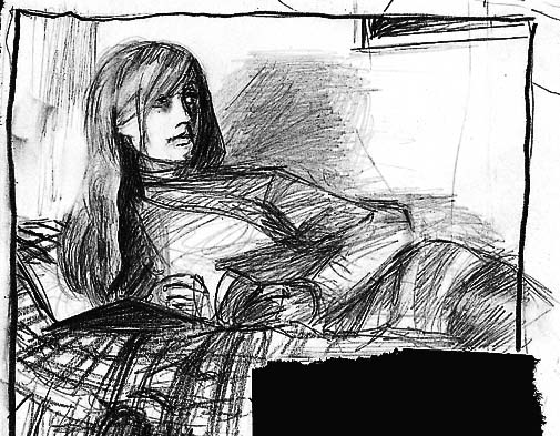
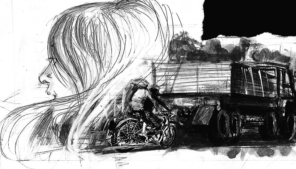
Same drill as before. The small original above: first to put their hand up in the comments can have it in the mail. Give me an email contact so I can get your address.

Mikel Midnight wrote:
" One strip I've been waiting for years to see? The final 'Ace Rock & Roll Club' which was apparently done in watercolours. I keep hoping for a Campbell color special which might squeeze that in.”
I pulled it out and had a look. It’s the story I redid into black and white and it was included in the 1993 Fantagraphics collection in that form. It was of course drawn some 27 years ago in 1979 and the the color work leaves much to be desired, alas. There are maybe a handful of panels I’m not unimpressed with. Here are a couple.

I find these days that virtually all of my work is in painted color. There was this year’s Fate of the Artist, and there will be next year’s Black Diamond Detective Agency (more on that very soon as I hope to have a copy in my hand by end december though it won't be officially released till next june) and a new one that I am 30 pages into and have not mentioned once in public until now. There was also Batman: The Order of Beasts, a 48 page special in 2004. My pal Evans suggested the witty title. Then the 13 page Escapist story of 2005, A Fair to remember, a play on an old movie title , suggested by my co-writer on that, my pal Best. It’s a good job I’m surrounded by geniuses, as I’m really dumb myself. With all this stuff I have to steal, my nom de plume should be Alexander Dumbass. Actually, I just pinched that one from Stephen Fry. It’s a good job nobody is fussed about plagiarism in these modern ti-
Wait a minute, the phone
“uh…what?... they are? Since when?... shit no.
okay, thanks for roning.”

Labels: , ,

Wednesday, 6 December 2006

Shirley it is a graphic novel.

A thing is what it is. When persons argue about what to call it, what they are really talking about is their relationship to it. For instance, Person A: is he a friend or an enemy? Obviously there is no absolute answer; it depends on where you’re standing.

And you’re standing on a shifting funhouse floor. At least where matters of artistic culture are concerned.

Take Illustration.

To the present day art world, anything figurative is likely to be regarded as illustration, anything in fact that refers to something outside of itself. Thus a painting that refers to actual things in the world outside of the materials of the painting, its pigments and canvas surface, may be said to be illustrative.

Illustration was once the most important thing in art. In the mid-Victorian era, knowing the classics and being able to quote and recite poetry was the mark of an educated person. The visual arts did this too, pictorially. That kind of art still has its adherents of course. The Art Renewal site has done a marvellous job of rescuing the art that fell through the cracks after modernism arrived: “Nothing has been more restricting and debilitating than the theories of modernism…” This site has a huge display (and is adding all the time) of forty works by Jules Lefebvre, an artist I wrote at length about in my Egomania magazine (issue #1) and a copy of whose painting Chloe is hanging over our dinner table.
But after immersing myself in it, I usually start to feel that in spite of all the beauty and intelligence, there is also a kind of flat-earth mentality at work. David Apatoff is a crankier example of this kind of thinking: “Art sits back, licking its chops and waiting for the next fool who believes art can be explained rationally. I've never been that kind of fool.” I admire his proclamation that he is going to uphold the faded reputations of all those artists the world now files under ‘hack’. But then he takes pains to explain why Chris Ware is no good, and why Norman Rockwell is a better painter of light than Claude Monet. Only a philistine and a crank would think it was necessary to rubbish Monet in order to make Rockwell look good. (this guy's links may not work. It's http://www.illustrationart.blogspot.com/ ( jan 28 '06, jan 16, '06)
Narrative illustration found that it and 'the art world' long ago went separate ways, but its principles lived all through the modernist era in magazines. Leif Peng is a cheerful and engaging enthusiast who wants to preserve as much of it as he can. Get on his mailing list if you like to enjoy this kind of work without having some cranky geezer railing at you while you’re doing so.

From the comics point of view, illustration is apparently a bad thing. It represents redundancy.

I gleefully drew a page in my Fate of the Artist as a kick up the arse to all those who say that writing a sentence, and then putting the same information in a picture beside it, is automatically a bad thing. There has been too much pontificating about what should and shouldn’t be done in comics. In June this year I wrote a piece about Audrey Niffenegger’s List Of Illustrated Books to read at Amazon.com. There are two ‘graphic novels’ in her list and what I liked about it was that Audrey chose to regard the graphic novel as just another kind of illustrated book. Here’s Audrey’s latest, The Adventuress. It has a peel-off label describing it as ‘A novel in pictures.” I’ve seen it filed in the graphic novel shelves at Border’s. Hayley Campbell, more of a friend to the literary famous than I’ll ever be, asked her on my behalf what she thought of that. Audrey said she didn’t call it a ‘graphic novel’ because she didn’t want to stand on anyone’s toes, imagining, I guess, that there is some kind of graphic novel community with a clear consensus on what a graphic novel is supposed to be. (in an earlier post I hinted that I have enumerated four clear concepts of the ‘graphic novel’ currently in usage and here it is in brief: a) it’s a synonym for comics, any comics. You can have a two page graphic novel, and anything that doesn't look like comics isn't in it (,Percy). b) it’s a format, i.e. comics in a book with a spine, no floppies. The floppies get rounded up and turned into a graphic novel. c) it’s a comics equivalent of the prose novel, which is to say that it’s fiction and non-fiction isn’t in it. d) It’s a new art form altogether which has its origins in the comic book, and for practical purposes let’s say that means it’s grander in ambition as well as longer in form, so the old fashioned comic book isn't in it. Thus you can see that 'a' is mutually exclusive of 'd' etc. Now, don’t get in an argument. I’m just calling it as I see it. If you favor one or other of these, keep it to yourself. Personally. I’m having nothing more to do with it, which you’ll see if you stick with my blatherings long enough.)

That was a long bloody parenthesis. We need a picture. Here’s one of Audrey taken at the famous Highgate cemetery, by Hayley Campbell. Audrey , when she's in London, likes to take the official role of a guest tour-guide in the cemetery, which contains among many other noteworthy graves, that of the other famous red-haired beauty, Lizzie Siddall, called ‘a Pre-Raphaelite supermodel’ in a recent biography, who was last exhumed in Snakes and Ladders, in itself my 48 page illustration of a spoken performance by Alan Moore. (I needed to shoehorn at least one more of my own books in here to justify this colossal writing exercise.) (and I prefer illustration to adaptation in order to steer clear of those clots who say 'adaptations don't work'. Illustrating has an undeniably long history.)


From the working illustrator's point of view, illustration is no more than the next paying job. I get the impression that Illustrators would have no interest in any of this contemplation unless it might show a way of gaining an edge on the competition.

Recently, at the British Association of Illustrators (AOI) site, I came across a description of an illustration course at Falmouth University in the UK., in connection with which someone has apparently coined the term ‘authorial illustration'.
"It is a revealing observation that an illustrator’s best work is often self-originated, or the result of deep involvement in origination and development, as opposed to fulfilling the requirements of a prescriptive brief to a pre-determined concept. With the present merging and blurring of boundaries within visual arts practice, it could well be the case that practitioners from neighbouring worlds such as Fine Art, Photography or Graphic Design will be (are?) moving into spaces traditionally the preserve of the illustrator. We feel that Illustration needs to respond to this development.”
Note the ‘blurring of boundaries'. I want to write more about that later.
As examples of ‘authorial illustration', these: “…recent work by Graham Rawle, David Shrigley, Andrzej Klimowski and Sara Fanelli, among others. Perhaps the most significant achievement has been Chris Ware’s, in winning the Guardian First Book Award with his graphic novel "Jimmy Corrigan, the Smartest Kid on Earth.”
Note that, as in Audrey’s list, the graphic novel (Ware) is positioned as simply an illustrated book among other illustrated books..

Steve Braund is the man behind all of this , and also the man behind Atlantic Press, publisher of The Funeral by Barnaby Richards, (see right, copyright Richards) described in the publisher’s catalogue as a “Comic Book, 20 page softback, staple bound… edition of 1000 copies”. I wrote and asked him where this idea came from.
“…the term 'authorial illustration'... began to appear in the UK about 10 or 12 years ago and really struck a chord with me. I'd done a small book, 'Something Amiss on the Moor' which seemed to me to be a piece of 'authorial illustration' after many years of commercially prescriptive work.There were a few articles back then by Veronique Vienne, Ric Poynor (Eye) and Robert Mason which used this term.”
I haven’t read any of the above names, but I note that Vienne wrote the recent monograph on Chip Kidd
Braund guest-edited an issue of the AOI Journal which is very revealing if you want to pursue this line of enquiry further. Graham Rawle talks about his work (as will I further down the track) and there is a review of Kochalka. Plus Franciszka Themerson, Martin Tom Dieck, Illustrators and comics people, all mixed up together.

And what is my point? it is that I have become very interested in the blurred areas between one thing and another, and I have a lot more to say on the subject.

But for all those who canna take it, tomorrow I shall go back to being a smartarse.

Labels:

Tuesday, 5 December 2006

Bookmark This!

The latest set of bookmarks have just gone online at Bent Books of Brisbane Australia, of which the proprietor is my pal Sean Mackinnon. I do a set of six of these towards the end of each year. Actually it used to be the beginning, but well... attrition. Here is Colette from the 2006 selection.

And here's Pam Noles' favorite from last year, H P Lovecraft.
When I drew the first of these I was determined to avoid the 'big head' formula, so well known from old cigarette cards and the like, But there's something about the logistics of that narrow vertical frame that demands an old fashioned enlarged bonce, and if you can figure out a better appraoch, you're a better man than I am, Hayley Campbell. There are eighteen altogether. See how many you can recognize. Sean gives them to customers buying books, but if you're one of them folks from the other side of the world that can't just look at them on your screen but needs to possess them, like Pam Noles, you'll have to email my pal Mackinnon and do a deal I suppose.
* * *
Looks like we've finalized the cover of the first volume of the french Alec series, being The King Canute Crowd. That's the book where I get locked up by the gendarmes on a daytrip to the French coast. Not sure how that will go down. Bloody drunken British fool, or whatever that is in French. Things that happen when you're young and stupid.
If you haven't read them in English, Top Shelf has the whole series.

Labels: ,

Monday, 4 December 2006

Pass the baton, dear.

Mark Siegel at First Second is the first to link to Sunday's NY Times article by David Hadju, reviewing the Ivan Brunetti edited Graphic Fiction. Hadju wants to boost comics to some level of cultural import. So far so good. That's all very routine to our way of thinking.
But I'm much more interested in this aspect of the situation. Hadju quotes Time book critic Lev Grossman's article of July 10, 'Who's the voice of this generation?." Grossman describes a century of literary baton-passing (as this theory of artistic historiography has been described elsewhere), from Fitzgerald to Hemingway to Salinger to Kerouac to Heller to Vonnegut to McInerney to Ellis, but laments that the baton seems to have got dropped and lost around sixteen years ago. Hadju says he's looking for it in the wrong place. But this model of artistic development, this passing of some kind of legacy, is regarded with suspicion in our postmodern environment, and for that matter I think the notion of looking for it in any one place is also to be seriously questioned.
The interest for me lies in certain similarities to an article by Barry Gewen in the NY Times of dec 11 2005: The State of Art, in which he examines six books of Art criticism which all appear to have arrived at the conclusion that art is in a serious crisis: "One critic stands at the center of this "worldwide crisis." Clement Greenberg sensed there was an anything-goes problem long before it had reached the stage of decapitated chickens..."
What I love about it all is the spectacle of intelligent critics in a state of terminal bewilderment. Somebody has palmed the baton! It makes me Laff.
* * *
Andrew wrote in yesterday's comments: "One set of panels I would love you to post? I read somewhere once that there was a page in the script of From Hell which had Gull and Netley driving over London Bridge, which hadn't been built at the time, so you sketched the page anyway essentially with Gull stopping mid-sentence to scream as his carriage hurtled into the Thames. I think I read that somewhere. Does that exist?"
That would have been Tower Bridge. It was built in late Victorian times, but styled to chime with the medieval architecture of the Tower of London itself. Thus many sightseers don't realise it is in fact just over one century old. But of course they didn't have the means to make a big mechanical rising bridge like that away back in the middle ages, so obviously it must be relatively recent. What happened: I didn't draw the script as written but sent Gull down to the next bridge and just stretched the dialogue over more panels than Alan intended. In the meantime I scribbled a gag on a photocopy of a 19th century photo of the bridge under construction and sent it to Alan, so I no longer have it. However, for an article in the final issue of Bacchus (#60) I made a new version of the same thing, more or less identical. I no longer have that either, but here it is scanned from the article: (click to enlarge) I haven't looked at the big bulging box of photo reference for From Hell in a long time, but I'm sure there are many more treasures contained therein, including Alan standing in front of some of the London monuments for which he sent pictures. If enough people ask I could go root around in there and see what I find. Would make interesting posting on slow news days.
* * *
mr j thinks I made him look 'obsessive compulsive' (yesterday's comments) so I'll remind you that he's also brilliant. Here's a recent strip.(click to enlarge) Readers of Angry Cook in The Fate of the Artist are anticipating the possiblity that one day Hayley Campbell may notice that the other great beauties of history inspired poetry, while she has tended to inspire comic strips.

HA! just in my inbox:
Dave Gibbons has left a new comment on your post Old block off the chip: "Met Hayley in the pub on Saturday. Much was spoken of. Forgot to mention the dishwashing rota, though..."

Labels: , ,

Sunday, 3 December 2006

Two hats

I won't show the panels to which this anecdote refers. I'll let you take your copy of the book off the shelf and pretend that you've just discovered the mistake for yourself.
Today I got an email from Serge Ewenczyk of Ca et la, He tells me they've noticed a mistake in book 2 page 42 panel 2 of Alec: The King Canute Crowd. Danny Grey gives his hat to Louise, who puts it on in the next panel, except in the next panel they're both wearing it.
two hats.
It was published like this in 1985, 1990, 1997 and 2000. and Serge is the first person to mention it. These guys have been paying a lot of attention to the details, which is a good sign. but then so have I. A font has been specially made from samples I hand lettered. I have scanned all of the pages from the original art and I had to consult more than one expert before I worked out a dependable system. The big serious problem with it is how to get all those zip-tones to reproduce via the digital process without introducing moire patterns in the greys (look at the awful repro in my two pages in the recent Smithsonian book of comics for a bad example). I mean, over and above the ones that were intentional, put there for deliberate pattern effects in clothing materials for instance. I recently heard that Serge and his team went to some trouble to try to fix those too but gave it up as hopeless.
LOL, as you young 'uns would type.

* * *
oh bloody hell, this post was up and now it's down again. there's a voice mail from my pal, mr j: "It's there, and then its gone again...of course, in the meantime i've gone and checked the page in question in my copy of the king canute crowd... think the page numbers were different in the old books ( which were closer to hand, so i couldn't find it... )... in fact, i have now...and in alec... love and beer glasses, danny grey isn't wearing the hat in the 2nd panel... is this some sort of a conspiracy...

and another voicemail, again from mr j: "ok... alec-love and beer glasses pg 28 ( this is the escape edition we're talking about )... no hat...so at what point exactly was it drawn back in??? and by whom??? is this like a comic book x-file??

what's this? another message from my pal mr j: "seriously, do i get a no-prize for this?"

Damn. if i had anotther post for tonight i'd scrap the whole thing, but we just had drinks with my pal Huge Andrew. Okay, consider the no prize yours, mr j.

and thanks for roning.

another call from mr j.... "you've spelt another with two t's."

ladies and gentlemen, this is live blogging.

Labels: ,

Saturday, 2 December 2006

Avril

Springboarding from some recent comments: very pleased that Marcus Gipps, author of the review I linked to, didn't take offence at my proposed 'It's not a graphic novel, Percy' campaign. On the contrary, he regretted missing the opportunity to nab the original sketch. Tobey Cook got that (any sketches I do for the blog I'll be mailing off to the first person who puts their hand up, so you have to look in regularly). Hayley Campbell (we always give her the full two names. Not sure how that came about. Funny thing is that most people who meet her and don't know this is a long tradition going back to her birth , find themselves doing it too) has demanded to be the first to sport the slogan on a t-shirt. Hey, you know, I'm not copyrighting this thing. If somebody beats her to it, i'll put the photo up here. I'm not even promoting anything, except chaos of course.
* * *
Aaron White's comment to yesterday's post reminded me of something that fell out of a library book I once borrowed: several photos, I think four or five, of a young girl in various poses, obviously enjoying just being herself. Maybe I should have tried to trace her (or whoever was cherishing her photos) through the library but this was in a period when i was up to my neck in problems and wasn't thinking clearly. Or at least, not about other people's problems. Considering it later, the photos looked like they were taken in the 1960s, twenty years earlier, and they came to haunt me. When I needed a model for the doomed Avril Allard in Alan Moore's The Birth Caul, I remembered these images and, using them, I was able to recreate an authentic-seeming girl from their various angles and viewpoints. Perhaps my sympathetic sadness for somebody's loss of these lovely photos helped me to create the required tragic note.
"His sister Avril, 5 years older, wears black tights and a perfume called Midnight Passion. Smugly notices but does not acknowledge the mute worship of her brother's friends.

"is sat astride her boyfriend's motorcyle, when it hits the rear end of a lorry, 'doing the ton' along the Weedon Road."

"playground Mythology, our only truth, maintains that she is cut in two on impact, torso there to one side of the road, her perfect legs upon the other.""And still conscious, but gone to a beatific place beyond the pain. And smiling. An immaculate teen angel, dying there upon the glittering macadam when we loved her."

The Birth Caul was collected earlier this year along with Snakes and Ladders and My long interview with Alan Moore in The Disease of Language published in a neat hardcover from Knockabout, with design work by my pal Evans, who just about fell out with me over the whole thing. My pals, whatcha gonna do with them?

Labels:

Friday, 1 December 2006

Look at all the lovely people

Can this handsome man with his beautiful lady wife in front of Times Square possibly be a 'graphic novelist'? Gene and Teresa Yang after the National Book Awards. Gene had the honor of being nominated for his American Born Chinese, in the young readers category. I'd be a runner up in anything if I could be either of the people in that photo (by Mark Siegel, with more of them at First Second Books)
* * *
For all those whose appetite has been whetted by my words and links re. mr j, I give you his latest. Out of context of the series as a whole, it may not be clear that the titular Hayley Campbell doesn't appear in this example. On seeing it she said; "How come the Mammy gets a nose and I don't?" (click for larger)Well, you see, that's one of our tricks of the trade, those subtle techniques we cartoonists use to differentiate characters.

A whole bunch of these strips can be found in the upcoming DeeVee.

The colourful cover above came about when my pal White (who is by day a chartered accountant, you will remember me saying yesterday) said to my pal Evans, the designer, "We're forking out for full color on the cover, so I don't want any of your minimalistic crap." The issue will also contain the next chapter of The Playwright by White and me. We've managed to get out one of these per annum for the last four or five annums. At this rate, by the time we gather it into a book White will be retired and living off his perfectly planned superannuation.
* * *
Here's an odd item. 'Una curiosidad sobre el From Hell.' On Little Nemo's Kat, a Spanish blog; the writer reports on the finding of an annotated copy of From Hell in his local public library. By annotated I mean thoroughly glossed in blue ballpoint pen in the margins, with cross refs to the notes at the back. He has scanned and reproduced a couple of pages. If anyone can ventilate the Spanish better than Google, send me an update and I'll report further (unless it turns out to be dumb of course). (since I jotted this draft I see the writer has responded to the note I left on his blog, in the comments section of my From Hell post.)
* * *
Still on From Hell, Mark Clapham commented...
"Gull Catchers part two? Very tempting. I'm probably not alone in thinking its one of my favourite parts of the book.
The most startling Ripper revelation in recent years was on a recent documentary on the UK's Channel Five, in which a contemporary criminal psychologist was asked to look at the evidence. Her conclusion was that a man who butchered his fellow human beings in such a way probably 'lacked empathy'. "
Revelatory indeed. thank god we have experts. I haven't seen the show but i did read about it. Like Alan said, we've got enough for another 24 pages of hilarious ripperology. It was the favourite part of the book for me and my pal Mullins, where we were permitted to unleash our madcap antics that had been kept very much under wraps till then.

Labels: