
posted by Eddie Campbell at
12:23
0 Comments
![]()
![]()
Wednesday, 30 October 2024
Monday, 11 December 2023

Thursday, 3 August 2023
My new book is OUT!!
 Amazon
Top Shelf
Amazon
Top Shelf

"During an endless Covid lockdown in which everybody wears a mask and needs a haircut,Eddie’s wife is certain that he has been supplanted by an imposter. She hires a detective, the square-jawed Royler Boom, to solve the mystery. What follows — interspersed with Campbell’s trademark wry anecdotes, dreams, parodic pastiches, and pandemic peccadilloes — is a thrilling investigation that builds to a car chase and a violent conclusion. The author cunningly passes this off as another piece of autobiography."
posted by Eddie Campbell at
14:29
2 Comments
![]()
![]()
Monday, 19 February 2018
Saturday, 3 March 2012
I'm sad to hear that Sheldon Moldoff has died, at the age of 91. I was just talking about him a few days ago.


posted by Eddie Campbell at
22:44
12 Comments
![]()
![]()
Wednesday, 22 February 2012
Here's What Rochester Looks Like (as a Police Composite Sketch)


In terms of image-construction itself, Davis used the forensic software program Faces ID, which gives users (creepily, incredibly) about 10,000 individual facial features to choose among. He then used the authors' descriptions of their characters as guidelines in his selections, selecting the most true-to-text facial features, Identikit-style. For the inevitable gaps in the characters' descriptions (noses and ears, Davis discovered, were often ignored by authors), he did some educated guesswork, considering factors like the era the author was writing in and other elements of the story that might inform its characters' appearance.Also, Madame Bovary, Humbert Humbert... and more at The Composites, including Daisy Buchanan and Sam Spade. (The Atlantic, feb 10... link thanks to Bob Morales)
"So," Davis says, "it's a combination of literary criticism -- which I know well -- and forensics -- of which I'm an utter amateur."
posted by Eddie Campbell at
23:26
2 Comments
![]()
![]()
Tuesday, 21 February 2012
I'm reading the appeal brief in the case of Marvel vs Kirby. It's hard slogging to get through all this legal terminology.

When, I ask you, did the word 'knockoff' become acceptable English usage???
"Did the District Court err in denying Defendants' motion to dismiss for lack of personal jurisdiction over indispensible parties, and assuming personal jurisdiction over lontime California residents Lisa Kirby and Neal Kirby, whose sole contact with New York was merely mailing statutory notices of termination as required by 17 U. S. C. 304(c)(4)? The standard review is de novo.Then we come to this bit:

When, I ask you, did the word 'knockoff' become acceptable English usage???
posted by Eddie Campbell at
17:44
2 Comments
![]()
![]()
I'm reading Comics Press's excellent trio of collections of The Heart of Juliet Jones daily strip By Elliot Caplin and Stan Drake, when suddenly I've solved a little mystery that has bugged me for years.
Sheldon Moldoff, working anonymously, took over pencilling Bob Kane's share of the Batman comic book stories circa Jan. 1954. But I always had trouble pinning down the exact moment, due to some anomalies in the images, namely that some panels were too well drawn to have been done by Moldoff. For a long time I thought there was another ghost in the mix and that one day we'd be able to put a name to this mysterious artist. Then it dawned on me that it was just a case of Moldoff copying figures from the work of assorted artists from all over the place. For example, here's a panel of Catwoman from Detective #203, Jan 1954:

which is clearly modeled on this Matt Baker Phantom lady splash page from June 1948:

This figure from Batman #92 of June 1955 is the one that has mystified me the longest, as it is clearly not a Moldoff figure in the middle of a job otherwise unquestionably by Moldoff:

Now I find that the source is this figure of Eve Jones in a Stan Drake panel from April 1954:

After a year this kind of pilfering disappeared from Moldoff's work and for the rest of his career he turned out pictures that were invariably stiff but which had a simple, if not quite naive, charm about them.
You learn something every day. Now if only I could learn something useful.
posted by Eddie Campbell at
01:53
6 Comments
![]()
![]()
Monday, 20 February 2012
From the New York Review of books. Feb 15
E-books Can’t Burn
Tim Parks
E-books Can’t Burn
Tim Parks
Only the sequence of the words must remain inviolate. We can change everything about a text but the words themselves and the order they appear in. The literary experience does not lie in any one moment of perception, or any physical contact with a material object (even less in the “possession” of handsome masterpieces lined up on our bookshelves), but in the movement of the mind through a sequence of words from beginning to end. More than any other art form it is pure mental material, as close as one can get to thought itself. Memorized, a poem is as surely a piece of literature in our minds as it is on the page. If we say the words in sequence, even silently without opening our mouths, then we have had a literary experience—perhaps even a more intense one than a reading from the page. It’s true that our owning the object—War and Peace or Moby Dick—and organizing these and other classics according to chronology and nation of origin will give us an illusion of control: as if we had now “acquired” and “digested” and “placed” a piece of culture. Perhaps that is what people are attached to. But in fact we all know that once the sequence of words is over and the book closed what actually remains in our possession is very difficult, wonderfully difficult to pin down, a richness (or sometimes irritation) that has nothing to do with the heavy block of paper on our shelves.
more at link
posted by Eddie Campbell at
04:19
2 Comments
![]()
![]()
Friday, 17 February 2012
Huge 2000 word article at the Columbia Journalism Review has loads of facts and figures and speaks to the major players:
Cartooning for a Sustainable Future
Will editorial cartoonists find their (paid) place on the web?
By Alysia Santo
Cartooning for a Sustainable Future
Will editorial cartoonists find their (paid) place on the web?
By Alysia Santo
The proprietors of YubaNet, a two-person news operation covering California’s Sierra region, count a subscription to Cagle Post as one of their most important investments. Pascale Fusshoeller, the site’s editor, says that the cartoon section draws consistently high traffic numbers “every single day.” “If the cartoons aren’t up by 7 am, I get e-mails or calls like, ‘Hey, there is no cartoon today,’” says Fusshoeller. “Some people are very attached. They start their day with these cartoons.”
Other cartoonists choose to self-syndicate rather than sign with a third party. Mark Fiore, who won a Pulitzer in 2010 for his animated political cartoons, says he was syndicated with Universal Uclick for a few years, but felt “they’re no better at it than I am.” Instead, he chose to “pound the pavement” to sell his own work. Now, he collects advertising revenue from his website and his YouTube channel. “In a way, YouTube is a syndicate for me; they are selling the ads, and getting my work out there.” There’s no way to undercut syndicates, says Fiore, “unless your selling it for pennies,” so cartoonists have to find a way to offer something unique from what the syndicates offer. “The syndicates are cartooning’s best friends and worst enemy,” says Fiore, but to break free from that, “You’ve got to figure out the hustle.”
posted by Eddie Campbell at
15:23
0 Comments
![]()
![]()
Wednesday, 15 February 2012
The Daily Mail on a great exhibition of photos:.
Rabbis, rags and rainy Whitechapel: Stunning photos from the 1950s celebrate Jewish life in post-war East End
This one takes me back to some of the references I was using to draw From Hell:

Rabbis, rags and rainy Whitechapel: Stunning photos from the 1950s celebrate Jewish life in post-war East End
This one takes me back to some of the references I was using to draw From Hell:

posted by Eddie Campbell at
00:35
1 Comments
![]()
![]()
Tuesday, 14 February 2012
Iwas in transit when this news came down:
DC Plans Prequels to Watchmen Series
DC Plans Prequels to Watchmen Series
Brian Azzarello, a comics author who is writing the mini-series for the Watchmen characters Rorschach and the Comedian, said he expected an initial wave of resistance because “a lot of comic readers don’t like new things.”Some people have no shame.
But Mr. Moore was unconvinced, saying that the endeavor only weakened the argument that comics were an authentic form of literature."Everything goes from grand to paltry."- Bacchus
posted by Eddie Campbell at
13:32
9 Comments
![]()
![]()
Monday, 13 February 2012
A rather astonishing news item from over here.
Secret documents lift lid on WWII mutiny by US troops in north Queensland
Secret documents lift lid on WWII mutiny by US troops in north Queensland
An Australian historian has uncovered hidden documents which reveal that African American troops used machine guns to attack their white officers in a siege on a US base in north Queensland in 1942.
Information about the Townsville mutiny has never been released to the public.
But the story began to come to light when James Cook University's Ray Holyoak first began researching why US congressman Lyndon B Johnson visited Townsville for three days back in 1942.
What he discovered was evidence detailing one of the biggest uprisings within the US military.
"For 70 years there's been a rumour in Townsville that there was a mutiny among African-American servicemen. In the last year and a half I've found the primary documentation evidence that that did occur in 1942," Mr Holyoak told AM.
During World War II, Townsville was a crucial base for campaigns into the Pacific, including the Battle of the Coral Sea. ...(more)
posted by Eddie Campbell at
19:00
2 Comments
![]()
![]()
Sunday, 12 February 2012
 Those of my readers following my series of posts about the old ROMANCE comics may be interested to read my review of Young Romance: The Best of Simon & Kirby’s Romance Comics at the Comic Journal. This forms a useful addendum to Part 4 of my series.
posted by Eddie Campbell at
16:55
0 Comments
![]()
![]()
Thursday, 26 January 2012
I'll be at the Ca et La booth in Angouleme at the Espace Le Nouveau Monde marquee afternoons, Fri Sat Sun. Then in Paris at Super Heros, 175 rue St. Martin on Jan 31 at 16.00 o, clock. Friday 3 feb at Gosh but that,s all booked up. See you there. Typed on my iPad in Angouleme. Now i'm off to dinner.
posted by Eddie Campbell at
12:53
3 Comments
![]()
![]()
Monday, 23 January 2012
Where have all the book illustrators gone?
"I think a) it's (out of) fashion", he says trenchantly. "And b) there aren't that many great illustrators. It's rare you can come across someone who can draw. Even when you're looking for someone to do book jackets, it's hard to find someone who can draw the human figure – it seems to be unfashionable now."-Book editor Dan Franklin quoted in the UK Independent. He must be looking in the wrong place.
posted by Eddie Campbell at
14:11
8 Comments
![]()
![]()
Thursday, 12 January 2012
I missed this on Hallowe'en. Cal's Girl friend Chloe Turner dressed up as a Lichtenstein painting, complete with speech balloon attached to her hat. Brilliant!

One cannot say Lichtenstein any more without hearing shouts about plagiarism My mind turns to a couple of recent lawsuits that I didn't follow to their conclusions. Firstly, Richard Prince daubed paint on Patrick Cariou's Photographs and called them his own. The judgement of March 2011 went against Prince, but he's appealing:
NY Times December 28, 2011
It is also noted: "In many ways the art world is a latecomer to the kinds of copyright tensions that have already played out in fields like music and movies, where extensive systems of policing, permission and licensing have evolved." Two years ago Australian pop band Men at Work were sued for stealing five or six bars of the tune titled 'Kookaburra sits in the old gum tree'. they lost that but the appeal came up in October last:
The Australian October 07, 2011
It remains arguable where the line should be drawn but for now, Larrikin are 'greedy opportunists' in the words of Hay, and Prince is a wanker. That was my word.
Still on the subject, I was re-reading an interview with Comic book artist John Romita made by a couple of old small press pals of mine, Ridout and Ashford, and published as a hardcover book by Marvel in 1996:
The New Criterion, December 1991

One cannot say Lichtenstein any more without hearing shouts about plagiarism My mind turns to a couple of recent lawsuits that I didn't follow to their conclusions. Firstly, Richard Prince daubed paint on Patrick Cariou's Photographs and called them his own. The judgement of March 2011 went against Prince, but he's appealing:
NY Times December 28, 2011
In March a federal district court judge in Manhattan ruled that Mr. Prince — whose career was built on appropriating imagery created by others — broke the law by taking photographs from a book about Rastafarians and using them without permission to create the collages and a series of paintings based on them, which quickly sold for serious money even by today’s gilded art-world standards: almost $2.5 million for one of the works.
What were Mr. Prince’s intentions in re-using the Rastafarian pictures taken by the French photographer Patrick Cariou and why did he choose them? For the sake of parody? For criticism? Or did he just pick something that inspired him, for reasons as difficult to plumb as any those of many postmodern artists?...
Mr. Prince replied, “The message is to make great art that makes people feel good.”
He also made it clear that he was not making art that commented on Mr. Cariou’s work itself. (Judge Batts ruled that for a work to be transformative it must “in some way comment on, relate to the historical context of, or critically refer back to the original works” it borrows from, a test she said Mr. Prince’s work failed.)
In an interview Daniel Brooks, Mr. Cariou’s lawyer, said that if such a subjective principle for borrowing as Mr. Prince’s were to become the legal standard — and in parts of the art world it is already much more subjective in practice — there would be no way to protect copyright.
“It can’t just be random, that he ‘liked it,’ because there’s no practical boundary to that,” he said.
It is also noted: "In many ways the art world is a latecomer to the kinds of copyright tensions that have already played out in fields like music and movies, where extensive systems of policing, permission and licensing have evolved." Two years ago Australian pop band Men at Work were sued for stealing five or six bars of the tune titled 'Kookaburra sits in the old gum tree'. they lost that but the appeal came up in October last:
The Australian October 07, 2011
The High Court denied the band's bid to appeal a federal court judge's earlier ruling that the group had copied the signature flute melody of Down Under from the children's classic Kookaburra Sits in the Old Gum Tree.
Kookaburra was written more than 70 years ago by Australian teacher Marion Sinclair for a Girl Guides competition. The song went on to become a favorite around campfires from New Zealand to Canada. The wildly popular Down Under remains an unofficial Australian anthem.
Ms Sinclair died in 1988, but publishing company Larrikin Music - which now holds the copyright for Kookaburra - filed a copyright lawsuit in 2009.
Last year, Federal Court Justice Peter Jacobson ruled that the Down Under flute riff replicated a substantial part of Ms Sinclair's song.
The judge later ordered Men at Work's recording company, EMI Songs Australia, and Down Under songwriters Colin Hay and Ron Strykert to pay fove per cent of royalties earned from the song since 2002 and from its future earnings.
The court didn't specify what the five per cent penalty translates to in dollars. Larrikin wasn't able to seek royalties earned before 2002 because of a statute of limitations.
It remains arguable where the line should be drawn but for now, Larrikin are 'greedy opportunists' in the words of Hay, and Prince is a wanker. That was my word.
Still on the subject, I was re-reading an interview with Comic book artist John Romita made by a couple of old small press pals of mine, Ridout and Ashford, and published as a hardcover book by Marvel in 1996:
Romance was quite dull stuff. We called it the popcorn genre. A lot of guys had gotten into the habit of doing the tears in the shape of popcorn. then we were getting ripped off by guys like Lichtenstein, blowing up our panels and representing them as their own art, and we were pissed off. We almost had a class action suit. Not only that, I heard there was whole school of German artists blowing up the panels like Lichtenstein and cashing in in Europe. I saw some of my panels line for line.I found Moma's fact sheet for the event. And this review by Hilton Kramer, critic with a modernist bias who, it should be noted, is the same generation as Romita:
I wiil say one thing, Lichtenstein actually didn't stick religiously to it. In fact, he was almost critical. he picked out some things and made fun of them in his panels. he not only blew up the dots, but he made ragged lines where there weren't ragged lines; he made them look bad, almost when he's blow them up the lines would get ragged and blotchy. He was sort of saying that this is trash and i will now turn it into quality art. that was his philosophy and I respected that in a way., but from what I could see of the german artists, they were taking panels and blowing up religiously, following every line and making them clean. I remember one. The girl's hair was blowing in the wind and I had this pathetic expression on her face. Well, this guy did that panel. Every single shape including the placement of the balloons, everything was exactly as I did it. he blew it up and did it in the same color, only with the dark more visible. I saw a picture of my panel and the painting together in the museum of Modern Art.
So we went through that period, and a lot of guys- Bernie Sachs and a few others- wanted to get together and file a class action sit against Lichtenstein and some of the other artists. I was not too interested. I said first of all, i don't want to contribute money to lawyers. I didn't want to get involved in it. I even foolishly told them that I was somehow flattered by the fact that they would consider these panels so good that they felt it was worthy of a painting. And, of course, the thought I was crazy. "Flattered?! they're ripping you off!" I never felt ripped off. I felt like it was a different art form. I wished they would say 'from a drawing by...', but they never did.
About four or five years ago (1990) the Museum of Modern Art had an exhibit for the express purpose of showing the connection and the similarities and the derivation. We spent hours being interviewed: they got all sorts of copies of my panels and the dates and the paintings. They said they were going to have an exhibit finally showing who inspired all these paintings. I thought, well, thirty years after the fact, we were going to get some kind of credit and tribute. The exhibit ended up being clalled 'High and LOw'. Another slap in the face.
They got all their facts wrong. They attributed artwork to the wrong artists, they got the dates wrong, everything was wrong. The fact that they called comic art 'low' drove me crazy!. And then if you'd gone to the show, the bulk of the comic book part of the exhibit was down in the basement, which was on the lower level. So we were really given another slap.
I went there. they gave me an invitation. I got a tux and everything. It was a wonderful dinner. I shook hands with Garry Trudeau. He thought it was great thatw e were given some time. But by the time the dinner was over and I looked at the book and heard some of the speakers- they were putting us down again... I was just so hurt by the whole thing.
The New Criterion, December 1991
Now with the debacle of the exhibition called “High & Low: Modern Art and Popular Culture,” which Mr. Varnedoe has organized in collaboration with Adam Gopnik, his former student at the Institute of Fine Arts in New York and currentiy the art critic for The New Yorker, this roster of disas ters that have already been visited upon the museum in a very short time begins to look like a mere skirmish in the war against moder nism that is now in progress at MOMA. Both in its conception and in its realization as well as in its reigning ethos, the “High & Low” exhibition is the kind of full-scale event that signals a new era at MOMA—an era in which, among other things to be deplored, the achievements of modern art are subor dinated to a sociological analysis of them. Taking his cue from the ideological initia tives that have lately reshaped the study of all the humanities in our colleges and univer sities, Mr. Varnedoe has clearly set the museum on a course that conforms to the practice of supplanting aesthetic categories of thought with those drawn from the social sciences. By this approach, art becomes a mere coefficient of material culture, and is thus denied precisely that element of aes thetic autonomy and transcendence that has been one of the hallmarks of the modernist spirit.
What this means for museological practice is perfectly clear. The epoch of the anaes thetic curator is upon us. In the “High & Low” show we are given a vivid demonstra tion of what results from a view of art that is completely removed from aesthetic con siderations. There is a great deal of intellec tual passion at work in the exhibition and in the massive—and massively foolish—cata logue that accompanies it, but very little of this passion is guided by aesthetic intelligence. At every turn in the history of their subject, the curators are so utterly agog over the minutiae of popular culture—so in fatuated with what might be called the ar chaeology of it—that its role in shaping modern art ceases to make a primary claim on their attention and becomes a merely inciden tal aspect of a headlong compulsion to ex plore the archaeology itself. Not only modern art but art itself is accorded an indif ferent and precarious status in this inquiry. All the energy is elsewhere engaged.
posted by Eddie Campbell at
19:01
8 Comments
![]()
![]()
Wednesday, 11 January 2012
Booklovers everywhere. May you enjoy this remarkable piece of animation as much as I did:
Related: BOOKSHELF PORN
Porn for book lovers. A photo blog collection of all the best bookshelf photos from around the world
"Uploaded by crazedadman on Jan 9, 2012
After organizing our bookshelf almost a year ago, my wife and I decided to take it to the next level. We spent many sleepless nights moving, stacking, and animating books at Type bookstore in Toronto (883 Queen Street West, (416) 366-8973).
Grayson Matthews generously composed the beautiful, custom music.
(full credits at first link)"
Related: BOOKSHELF PORN
Porn for book lovers. A photo blog collection of all the best bookshelf photos from around the world
posted by Eddie Campbell at
04:26
8 Comments
![]()
![]()
Saturday, 7 January 2012
Self publishing comic books! A revealing passage in Tom Spurgeon's holiday interview with Jeff Smith!
I didn't know even Jeff was having problems circa 2001. All through the '90s all you had to do was keep putting your periodical out and you stayed in business. Even Steve Bissette (Interviewed two days earlier in the same place) could have done well if he'd just kept putting out the comics instead of throwing up his arms in despair as early as 1994. It was that simple. Well, when I say simple I mean I was in freefall the whole time. Every now and then an updraft would instantly take me back to a higher position, but then a minute later I'd be in freefall again. The thing was that it was measurable and predictable. You could draw a graph with the curve heading toward the floor and make a serious plan of running your book into the ground within a specific number of years, months and weeks. Gary (Strangehaven) Millidge used to get mad at me when I'd talk like that, seeing it as defeatism, which it certainly never was.
However, around 2001 it all got complicated. To stay on top of things it was necessary to get into the bookstore market, and start dealing with returns and all the horrors that entails. I got out of publishing my monthly comic in 2002 and left the lucrative From Hell book under Top Shelf's management. Shortly after that our bookstore distributor went bankrupt. Then our printer went bankrupt, no doubt partly due to everybody getting out of printing the regular black and white comic books (even Cerebus had come to a close). Jeff in time solved the bookstore problem by going with Scholastic, but here he is in 2001:
Then another upheaval changed everything all over again. That's how it goes in this nutty business.
I didn't know even Jeff was having problems circa 2001. All through the '90s all you had to do was keep putting your periodical out and you stayed in business. Even Steve Bissette (Interviewed two days earlier in the same place) could have done well if he'd just kept putting out the comics instead of throwing up his arms in despair as early as 1994. It was that simple. Well, when I say simple I mean I was in freefall the whole time. Every now and then an updraft would instantly take me back to a higher position, but then a minute later I'd be in freefall again. The thing was that it was measurable and predictable. You could draw a graph with the curve heading toward the floor and make a serious plan of running your book into the ground within a specific number of years, months and weeks. Gary (Strangehaven) Millidge used to get mad at me when I'd talk like that, seeing it as defeatism, which it certainly never was.
However, around 2001 it all got complicated. To stay on top of things it was necessary to get into the bookstore market, and start dealing with returns and all the horrors that entails. I got out of publishing my monthly comic in 2002 and left the lucrative From Hell book under Top Shelf's management. Shortly after that our bookstore distributor went bankrupt. Then our printer went bankrupt, no doubt partly due to everybody getting out of printing the regular black and white comic books (even Cerebus had come to a close). Jeff in time solved the bookstore problem by going with Scholastic, but here he is in 2001:
SPURGEON: Is there an example of a bad time? Because your career path looks pretty positive from the outside-in.I was never operating on the same scale as Jeff, but in 2003 we had to turn my home studio into a bedroom. The intention was to build a shed next to the house for me to work in, or for somebody to sleep in, but that looked like being too expensive, so I moved my operation onto the far end of our dinner table, a big eight foot long polished oak object. For a year or so my life consisted of going from one end of the table to the other.
SMITH: [laughs] Well, good. I'm glad. [laughter] 2001 was a bad year for me. We had a lot of money troubles. I got into these rows with Dave Sim and Linda Medley, and it was very demoralizing. I forgot how close we came to going out of business. We put a bunch of money into toys -- toys were really big -- in 1999 and 2000. We didn't lose any money in the long run, but it tied up a whole bunch of money for a long time... I was slowing down my output right around that time, because I was getting into the heavy parts of the story and it was hard to write. Just a lot of factors came together. I forgot how tough that was. We had to let all our employees go. We had to leave our office. I completely forgot that there was a year when Vijaya and I and Kathleen -- Kathleen Glosan, our production manager -- the three of us were all in my one-room studio above the garage trying to survive. Eventually we did.
Then another upheaval changed everything all over again. That's how it goes in this nutty business.
posted by Eddie Campbell at
07:09
3 Comments
![]()
![]()
Friday, 6 January 2012
Oddity by Morrison and Grist from twenty years ago. A Romance subject, "Romeo 4 Juliet'. Was it just the one page?
Just in time for Christmas, a piece of Grant Morrison ephemera unseen since its original publication. 'Juliet 4 Romeo', with art by Jack Staff's Paul Grist, first appeared in Letterbox, a spiral bound book given away as a prize to schoolchildren in a letter writing competition circa 1990.

posted by Eddie Campbell at
21:37
0 Comments
![]()
![]()
Sunday, 1 January 2012
Wishing everybody a happy new Year!
Todd DePastino co-founded the Veterans Breakfast Club...
Todd is the author of a biography of The great Bill Mauldin
Todd DePastino co-founded the Veterans Breakfast Club...
"Though their experiences are often distant, their memories can be vivid, and their storytelling seems to cause what novelist and World War II veteran Gore Vidal calls one of those "strange slips in time" when the present turns into "a past present where everyone is suddenly what they were and the dead live."linked from Tom Spurgeon's interview with Todd
And perhaps, for those of us who never served and have not yet reached old age, that's what's most extraordinary about listening to the stories of those who are now in their 80s and 90s. What to me is the past is still their present. They live, in a sense, as strangers in our world, for their world, the one that shaped them, is gone, as are so many of the people whom they once knew and loved. This is why stories are so important, for through stories people can wake the dead, if only for a moment, while those of us who listen can touch the past and connect with those who are, quite literally, from another time."
Todd is the author of a biography of The great Bill Mauldin
posted by Eddie Campbell at
07:15
2 Comments
![]()
![]()
Saturday, 31 December 2011
Rounding up outstanding arguments. The two people who were following my theoretical ramble about integrating all the aspects of a comic into a reading of its meaning should note that I concluded my train off thought off the premises. There follows a summary, including the entire post that you probably missed:
here. 5th December:
First let's look at this notion, common to both quotations above, that you can separate everything else from the 'story' ...here. 22 December:
These critics do not go much beyond a simplistic 'what happens' in it. I mean on the level of a statue being naked rather than on the finesse of its chiasmos. ...Hooded Utilitarian. 28 December (on a long thread my comment addressed a habit of criticizing a comic's story and art as though they are things that can always be separated. Persepolis and Habibi had been so discussed and both found wanting in one or both aspects):
An essential demand of the newer kind of comics under discussion, in which a unified whole is presumed, is that we find a more apt way of talking about them. Satrapi’s Persepolis, when it opens, is the first person narrative of a ten year old girl. The drawing is perfectly right for the story; it expresses the world view of a ten year old girl living anywhere. Characters are simplified in a way that is charmingly naive and perspective is nearly non-existent. Whether Satrapi is capable of a different kind of drawing is not relevant to a discussion of the book. The artist is not a musician being hired by a symphony orchestra that expects her to be able to play the whole classical repertoire. She is giving us a record of her personal experience. She has a natural grasp of what is important in telling a story, which unfolds with simplicity. By the end of the first book we are surprised by how much information we have taken in, as we weren’t aware of taking it in. We thought we were listening to a child talking.
The authentic voice of the original can be appreciated by comparing it with the more professionally knowing treatment of the material in the animated movie, as in this excerpt:. Some parts of are
excruciatingly embarrassing:
The professionals who worked on it will go onto their next gig and we may hope they will be teamed with material more suited to their outlook.
As to Habibi, Matthias shows that there is nothing in Thompson’s art that is not in the overall meaning of the book. To praise the art separately is the reflex of the critic who has unconsciously recognized the ‘generosity of intent’ that is all over the work and doesn’t want to end on a rude rebuke. That intent is as much the CONtent as anything in the book that appears to be about the Arabian world. Looking at it again two months after I first opened the work, what I see is a cartoon romantic fantasy. I’m incredulous that it has inspired so much argument, or that in a medium that produces a mountain of crap over and over every year anybody could think this is among the “worst” that comics has to offer in 2011.
As always, the criticism against Thompson is that he didn’t make the book that thinking folk wanted him to make. I recall that the title of the TCj review of Blankets in 2003 (2004?-Tcj is never timely) consisted of those words more or less (‘Why Blankets isn’t the book… ?) Here it’s that Habibi is not a complex poem about modern life as reflected in the travails of the middle east, and also he didn’t draw it more in the manner of Blutch.
I remain however dubious about the remark that there is an implicit assertion that the book is more than broad melodrama. I thought that Nadim’s observation that there was more of Disney’s Nights than Burton’s was apt. And the ecological message isn’t more profound than ‘we need to look after the world because it’s where we live’.
While the lavish attention to tangential information raised hope of profundity, some critics have had trouble with him breaking up the linearity of the story unnecessarily. But I see that as just a Tarantino thing. A normal person nowadays takes in so many pre-digested stories (still on holiday, I think I inadvertently watched four movies yesterday) that rearranging the normal running order of events becomes a way of pumping some fizz into the flat drink. There can’t be anybody who doesn’t know how stories go. Sometimes I come into a movie ten minutes late just to make it more interesting. I tried it with Inception yesterday and it still didn’t work. We are a society that is weary with it all. We get more complete stories daily than ever before in history. We shuffle the pack to stave off boredom. Lists. the Months of the calendar of pregnancy, the names of the rooms in the palace, the planets, the nights of Sheherezade, the walk-ons of the Cheshire cat, the ninjas of Frank Miller, the Goddess Bahuchara Mata. Witty juxtapostions: the prophet at the farthest limit of human understanding plays out over the slave putting a spanner in the works in the Rube-Goldbergian plumbing inside the heart of Wanatolia. it’s a play-bauble being turned around and viewed from every possible angle. It’s not the ink line that is the virtuoso show, but the cartoon invention, the prodigious flow of ideas. The ink line serves the demands of clarity, of the ‘control’ that has been discussed above, and it speeds in comparison to Blutch’s because that also is demanded of it. It is liquid, and the ideas run as though out of a tap that has been left on, spilling out the supply of water necessary to quench the thirst of a careening dash through this Arabian fantasy.
And as with Satrapi, that is why Thompson’s drawing is inseparable form everything else in the book. There is certainly much that I find odd in it, including a coy Middle American sense of humour, as in the farting little man in the palace. Isn’t farting viewed differently in Arabia? And the convoluted treatment of sex in Thompson’s work will certainly one day attract a separate study.
posted by Eddie Campbell at
19:05
7 Comments
![]()
![]()
Friday, 30 December 2011
 I sat through some awful films over the last few days. None of them were my own selections. I just arrived to find somebody else watching them. Inception (2010) I had to fast forward to make it more interesting. The Killer Inside Me (2010) I had to leave the room twice. If it had been a public cinema I'd probably have kept going till I was out the building. At the end (SPOILER) he's poured paraffin or petrol all over the inside of the house, and when the police come in, nobody's olfactory alarm goes off?
 The only film that pleased me, and pleased me no end, was the humble little French film whose poster is at left, Shall we Kiss (2007). It is a masterful piece of honest storytelling.
Labels: screen2
posted by Eddie Campbell at
17:58
0 Comments
![]()
![]()
Wednesday, 28 December 2011
As is my habit, I went to look at one of my favourite reading sites, ilovecomics.com only to find that it is down. This site archives all the great old newspaper comic strips from decades ago. They recently put up a bunch of 1961 color sundays of Apartment 3G that I've never seen before, and earlier, a whole load of old 1940s Mary Worth pages. Nobody cares enough about this old stuff for there ever likely to be book collections. But they've got everything. Right from the beginning. It all needs to be preserved and made available outside of museum storage for folks who are not accredited scholars. Its value is beyond measure. The site charges a minimum fee for downloads, just a small thing toward the cost of keeping the site going. That's not not for reading; you can read all day for free. The reason it's gone:
As many of you may have noticed this is not the former archive site. After a three week battle, with many emails to say the least, my 3 year host Smugmug pulled the plug on us. They stated and I quote "All the images I've seen on your site look to be owned by others and you've been selling them for a profit. We'll need you to send back the written releases that give you the authority to post and sell images that are owned by others"The webhost is bending in fear of SOPA. Small vid, skip the ad like I always do.
posted by Eddie Campbell at
02:39
2 Comments
![]()
![]()
Monday, 26 December 2011
It's just comics- part 15
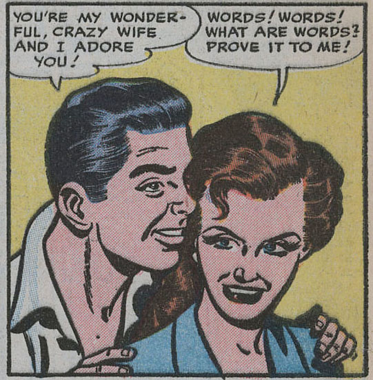
Three or four years back I was to appear on a TV arts program which intended to explain the idea of 'the graphic novel.' When I arrived I realised that my words had already been planned for me. I was supposed to say that comics used to be about superheroes and now thay can be about anything. I refused to say this and it all went badly after that. The fact is that you find the greater variety in comics the further back you go. As I have explained already, I've always valued comics which communicate something about real experience and I'm finding a measure of what appeals to me in a few of these old ROMANCE comics, though you have to sift through a lot of stuff to find one as good as the one I'm going to write about here. It's simple and unpretentious and remarkably naturalistic for its genre and once again it's from Quality. It falls in the second of the three phases I described last time, between the Love Glut and the establishment of the Comics Code. In terms of its outlook, the period of experiment and exoticism is gone; the romances generally are now very domestic. Here's the splash page:
 Love Confessions #29, Apr 1953, lead story, 9 pages
As to who wrote it, we'll never know. There are many instances in art history of which all we know is what we can glean from the body of written complaint that accompanies every age. Take, for example, this passage from Frederic Wertham's Seduction of the Innocent, published in 1954, the year after the story under current scrutiny:
Artists are easier to place. Our story is pencilled (an educated guess) by Charlie Sultan, who was stylistically in Lou Fine's shadow in the early 1940s. Sultan's career path is typical of the first generation of comic book artists. As young guys just out of school they enthusiastically rendered the muscles and poses of the first superheroes. They worked in 'shops' as part of a team. We can catch glimpses of this artist in the background of George Tuska's rememberings, working in the Eisner-Iger shop, and then Harry Chesler's. By the late 40s/early 50s you find the same artists working at home on short stories: crime, romance, horror, war, western, science fiction, alternating them for variety. I like looking back at many of these artists becoming family guys and developing a more rounded sense of the human situation, as in this story.
These artists would visit the city with regularity to pick up assignments from one or more of a large number of comic book publishers whose offices were all situated fairly close. That's speaking from today's perspective, from which a bunch of thirty publishers all in Manhattan sounds pretty damn amazing. At this time, most of these publishers would assign the whole art job to one artist. But Quality, as I outlined in part 11, used a coterie of favourite inkers by which method they maintained a tightly controlled house style. The inker on this one is known in my files as 'fat line inks.' They look not unlike the fat lines used ten years later by Chic Stone, an artist whose movements in the early fifties are not well documented. But I wouldn't be so bold to make an attribution as I get that sort of thing wrong at least twice a day.
The splash page above is a great view of rural America, unusual in a romance comic as hard work does not usually play a part in the proceedings. The woman appearing in bare feet and ragged hem overstates the case somewhat, but by convention the splash is a nutshell summary of the argument.
 Love Confessions #29, Apr 1953, lead story, 9 pages
As to who wrote it, we'll never know. There are many instances in art history of which all we know is what we can glean from the body of written complaint that accompanies every age. Take, for example, this passage from Frederic Wertham's Seduction of the Innocent, published in 1954, the year after the story under current scrutiny:
Their ambition is to write a "Profile" for the New Yorker, or articles or stories for national magazines, or to write the great American novel. The scripts or scenarios they write for comic books are not anything which they wish to express or anything they wish to convey to their child public. They want to get their ten dollars a page and pay the rent. They do not write comic book stories for artistic or emotional self-expression. On the contrary, they write them in the hope of finding eventually the chance for self-expression somewhere else.I imagine that I catch a glimpse of the kind of writer I spotlighted in my parts 12 and 13 in the above, and It's logical to assume that there would be well known writers of the latter half of the 20th century from tv and books who anonymously wrote comic book stories in their early days. We would undoubtedly be surprised to find out, just as we are surprised the first time we hear that artist Kinstler, whom I discussed in part 9, went on to paint presidential portraits.
The ideas for their stories they get from anywhere, from other comic books, from newspapers, movies, radio, even jokes.
Believe it or not, some comic book writers are good writers. And the paradox or the tragedy is that when you read a comic book story that is a little better it does not mean that a bad writer has improved, but that a man who was a good writer had to debase himself...
But of course, like comic book vendors, they have to be afraid of the ruthless economic power of the comic book industry. In every letter I have received from a writer, stress is laid on requests to keep his identity secret. I have one letter from a man, evidently a very intelligent writer, who mentions this three times in one letter!
Artists are easier to place. Our story is pencilled (an educated guess) by Charlie Sultan, who was stylistically in Lou Fine's shadow in the early 1940s. Sultan's career path is typical of the first generation of comic book artists. As young guys just out of school they enthusiastically rendered the muscles and poses of the first superheroes. They worked in 'shops' as part of a team. We can catch glimpses of this artist in the background of George Tuska's rememberings, working in the Eisner-Iger shop, and then Harry Chesler's. By the late 40s/early 50s you find the same artists working at home on short stories: crime, romance, horror, war, western, science fiction, alternating them for variety. I like looking back at many of these artists becoming family guys and developing a more rounded sense of the human situation, as in this story.
These artists would visit the city with regularity to pick up assignments from one or more of a large number of comic book publishers whose offices were all situated fairly close. That's speaking from today's perspective, from which a bunch of thirty publishers all in Manhattan sounds pretty damn amazing. At this time, most of these publishers would assign the whole art job to one artist. But Quality, as I outlined in part 11, used a coterie of favourite inkers by which method they maintained a tightly controlled house style. The inker on this one is known in my files as 'fat line inks.' They look not unlike the fat lines used ten years later by Chic Stone, an artist whose movements in the early fifties are not well documented. But I wouldn't be so bold to make an attribution as I get that sort of thing wrong at least twice a day.
The splash page above is a great view of rural America, unusual in a romance comic as hard work does not usually play a part in the proceedings. The woman appearing in bare feet and ragged hem overstates the case somewhat, but by convention the splash is a nutshell summary of the argument.
At the beginning: in the flush of young love, Don and Phyllis are married and he supports her with his job at the filling station. They've obtained 'a cute little attic flat' (this is the first time I've noticed the word 'flat' in a US context)
 One of the set-pieces of the genre is an early close up of the protagonist, as strikingly beautiful as the artist can make her, but that doesn't happen here. The guy is remarkably ordinary too. I like that these characters are regular people without any glamorization about them. There are no attractive leads to seduce us into inhabiting this story vicariously.
 The first thing he thinks of is buying a farm with his buddy 'Jim', and going into business.
 It doesn't last long. Jim bails out and Phyllis is about ready to give up too. Don got into rabbits in a big way and they don't have enough money to feed them. For a whacky business idea in our own times, publishing your own comic books would serve the same narrative purpose.

 Don holds his ground and sticks with the farm. Back home, Phyllis starts seeing another guy, Paul. he's dependable if somewhat predictable.
 This is the point at which the story veers into territory that wouldn't be permissible after the Comics Code, 'with its strict rules about the depiction of marriage', as Michelle Nolan noted. In particular, divorce could not be depicted as desirable, and the above image of the married woman kissing another man would be unacceptable. But in 1953, Phyllis gets a divorce so she can marry Paul:
 She's already having misgivings before she's out of the church. The misgivings are spreading like weeds as she lies in her bed at night (a separate bed, as in the movies of the time.)
 Over four panels they have a baby girl who grows into a toddler.
 Then things get thrown out of shape. Phyllis hears that Don is visiting the old neighborhood.
 She can't stop herself from contriving an accidental meeting.
 She realises she has made a big mistake.
 She should have stuck with Don and his daft business ideas.
 Something I mentioned before (part 11): Quality's colouring at this time was always so carefully done that they could drop a bright red in where you wouldn't think it belongs, without causing any disturbance, as in the park bench at night-time in the above scene. Relatively absent after the title header, here it underlines a frisson of danger as once again she's in the arms of the one she's not married to, except the positions are reversed now.
 However, Phyllis does appear to have gotten herself into a difficult one here since it now involves not just two guys but also a child. The story problem is usually weighed up in the set-piece in which the woman lies on her bed in her solitude. There is no hint of voyeurism in the one above. She has made the decision to go back to Don when a bunch of flowers arrives and jolts her into a realization:
 This is not your mad Heathcliff and Catherine whirlwind-of-destruction kind of romance. Nor has anyone yet made commonplace the option of a later era, of 'doing your own thing'. Phyllis has to make a pragmatic decision.
 She mails her final letter to Don and having done it, the story ends with a silent panel of her standing, framed in the shape of the cloud, in tears by the mail box.

Michelle Nolan, who knows more about such things than I do, notes that of the 36 stories published in Love Confessions in 1953, this is the only one that doesn't end with the romantically afflicted in each others' arms.
entire story at the digital comics museum
 One of the set-pieces of the genre is an early close up of the protagonist, as strikingly beautiful as the artist can make her, but that doesn't happen here. The guy is remarkably ordinary too. I like that these characters are regular people without any glamorization about them. There are no attractive leads to seduce us into inhabiting this story vicariously.
 They're having a hard time making ends meet, but he'll 'think of something, Phyllis.'
 The first thing he thinks of is buying a farm with his buddy 'Jim', and going into business.
 It doesn't last long. Jim bails out and Phyllis is about ready to give up too. Don got into rabbits in a big way and they don't have enough money to feed them. For a whacky business idea in our own times, publishing your own comic books would serve the same narrative purpose.
She gets a neighbor to drop her in town in his pick-up. There's a casual detail at this juncture where the neighbour mentions he noticed the delivery of catalogs about raising hamsters. None of Don's crazy schemes are working out.
 Don holds his ground and sticks with the farm. Back home, Phyllis starts seeing another guy, Paul. he's dependable if somewhat predictable.
 This is the point at which the story veers into territory that wouldn't be permissible after the Comics Code, 'with its strict rules about the depiction of marriage', as Michelle Nolan noted. In particular, divorce could not be depicted as desirable, and the above image of the married woman kissing another man would be unacceptable. But in 1953, Phyllis gets a divorce so she can marry Paul:
 She's already having misgivings before she's out of the church. The misgivings are spreading like weeds as she lies in her bed at night (a separate bed, as in the movies of the time.)
 Over four panels they have a baby girl who grows into a toddler.
 Then things get thrown out of shape. Phyllis hears that Don is visiting the old neighborhood.
 She can't stop herself from contriving an accidental meeting.
 She realises she has made a big mistake.
  She should have stuck with Don and his daft business ideas.
 Something I mentioned before (part 11): Quality's colouring at this time was always so carefully done that they could drop a bright red in where you wouldn't think it belongs, without causing any disturbance, as in the park bench at night-time in the above scene. Relatively absent after the title header, here it underlines a frisson of danger as once again she's in the arms of the one she's not married to, except the positions are reversed now.
The romance story typically involves a dilemma. You will have noticed it in the story of the magistrate in my part 12 where she was lured away by the cheeky charlie but came to know that the District Attorney was the guy she should have been sticking with. John Benson has pointed out that it is often the fallacious 'false dilemma' or a choice between a and b, when in fact there is the option of neither.
 However, Phyllis does appear to have gotten herself into a difficult one here since it now involves not just two guys but also a child. The story problem is usually weighed up in the set-piece in which the woman lies on her bed in her solitude. There is no hint of voyeurism in the one above. She has made the decision to go back to Don when a bunch of flowers arrives and jolts her into a realization:
 This is not your mad Heathcliff and Catherine whirlwind-of-destruction kind of romance. Nor has anyone yet made commonplace the option of a later era, of 'doing your own thing'. Phyllis has to make a pragmatic decision.
 She mails her final letter to Don and having done it, the story ends with a silent panel of her standing, framed in the shape of the cloud, in tears by the mail box.
Michelle Nolan, who knows more about such things than I do, notes that of the 36 stories published in Love Confessions in 1953, this is the only one that doesn't end with the romantically afflicted in each others' arms.
entire story at the digital comics museum
Labels: It's just comics 4
posted by Eddie Campbell at
19:27
2 Comments
![]()
![]()
Saturday, 24 December 2011
Merry Christmas to all!
Uploaded by newhumanistmagazine on Dec 22, 2011
Interviewed backstage at Nine Lessons and Carols for Godless People, 18-23 December 2011 at the Bloomsbury Theatre, by Adam Smith.
Uploaded by newhumanistmagazine on Dec 22, 2011
Interviewed backstage at Nine Lessons and Carols for Godless People, 18-23 December 2011 at the Bloomsbury Theatre, by Adam Smith.
posted by Eddie Campbell at
17:17
2 Comments
![]()
![]()
Thursday, 22 December 2011
I have been recently instructed on how to fix the pictures of the books in the sidebar so that if you click on the image of one it will take you to Amazon.com. I did as I was instructed and then clicked on Alec it and sure enough there I was at Amazon. While I was in the neighbourhood, I thought I'd check out what reviewers were saying about the book. One fellow gives it a good four stars and says "In spite of all my caveats..." One of his caveats is that life is somewhat boring and a comic about life (he's speaking generally rather than specifically about me at this point) is likely to also be boring, unless...

In fact, I would have been happy to tape portraits of these characters on my wall without them being required to say or do anything. I loved them as cartoon inventions, to phrase it in a way that would have been beyond my understanding. To me they were pals named Danny, Plug, Smiffy, Toots and Sid, Wilfrid, Erbert, Spotty and Fatty.
This is still some way from a *purely* aesthetic appreciation of a comic, and to prove that such a thing exists before moving on I could cite my contemplation a couple of weeks back of a certain technique used to render hair that only happens in comics, or Daniel Clowes scanning and cloning the aged colours from old comics and then using these to make up his own 'palette'. This can't be separated from 'reading' comics because we only arrive at such an affection for them from years of reading the things. It may be compared to a scholar of music listening to the 'voicings' where somebody else might just hear a 'tune' (or lack of one).
We come to love the look of a comic, and the feeling expands to a general one of enjoying the way comics are drawn and composed, and even of the ink and paper. We want to make one. And having made one we're not entirely happy with it. Let's say that we've taken a notion to introduce a naturalistic element. So we base our figures on people we know. But the problem is that the things they're saying and doing are not quite authentic. So let's base these aspects on actual situations that we have observed. And so by increments we've put ourselves in the work.
The purpose of the endeavor was not to tell the world how interesting we are and to compete with all the world's monsters for the attention of a sensation hungry public. The purpose was simply to make comics, and to find ways of improving them vis-a-vis the subtlety of the things we wanted to say. It was, Godlike, to create little people who persuade that they live and breathe in their inky environment. And if they say and do no more than you or I, then that should be enough to endear them to a reader, because commonplace life is agreeable enough that we should like to hold onto it. Grant Morrison, to justify his outlandish fantasy worlds recently said "We already have real life, why should we need to duplicate it?" (quoted from memory) Well, yes we have it today, but today's is gone tomorrow, and if nobody was paying attention, then it is gone forever.
You may say that naturalism doesn't belong in comics and that might be an argument worth having. But introducing naturalism, in large measure or small, is not a new idea. It's been there at least (to pick one that everybody has heard of) since Frank King decided in 1921 to make Skeezix age day by day in real time from a baby to an adult. And, while there will inevitably be many days when not much is happening, that, when you think about it, is a very ambitious thing to attempt.
While I was writing the above, Matthias Wivel has developed an earlier observation of his from a couple of months back into an lengthy essay at the Hooded Utilitarian:
(Bash Street Kids)
"...let's say, Aleister Crowley or William Burroughs or Charles Manson, to name a few, were to write an autobiographical comic, *that* would be interesting. People who's lives and perceptions are really wacked out, they would make interesting subjects for autobiographical comics. ...I've been at pains in several posts lately to find a semantic for separating the aesthetic experience of a comic from the routine details of 'what happens' in it. While it is true that this is an understanding of the medium achieved by an adult reinventing his interest in an artistic form introduced to him or her when they were a minor, I would argue that this minor's interest (mine) in The Bash Street Kids, to pick an example, involved an understanding that it was drawn better than other comic strips. Well, let's not introduce the concept of 'art' this early; let's say that I knew this was funny not so much because of what was happening, but because of *how* it was happening.
... Can't we say that unless you're a real unadulterated unapologetic jerk and willing to expose yourself at your inhuman human worst don't bother writing an autobiographical comic?"

In fact, I would have been happy to tape portraits of these characters on my wall without them being required to say or do anything. I loved them as cartoon inventions, to phrase it in a way that would have been beyond my understanding. To me they were pals named Danny, Plug, Smiffy, Toots and Sid, Wilfrid, Erbert, Spotty and Fatty.
This is still some way from a *purely* aesthetic appreciation of a comic, and to prove that such a thing exists before moving on I could cite my contemplation a couple of weeks back of a certain technique used to render hair that only happens in comics, or Daniel Clowes scanning and cloning the aged colours from old comics and then using these to make up his own 'palette'. This can't be separated from 'reading' comics because we only arrive at such an affection for them from years of reading the things. It may be compared to a scholar of music listening to the 'voicings' where somebody else might just hear a 'tune' (or lack of one).
We come to love the look of a comic, and the feeling expands to a general one of enjoying the way comics are drawn and composed, and even of the ink and paper. We want to make one. And having made one we're not entirely happy with it. Let's say that we've taken a notion to introduce a naturalistic element. So we base our figures on people we know. But the problem is that the things they're saying and doing are not quite authentic. So let's base these aspects on actual situations that we have observed. And so by increments we've put ourselves in the work.
The purpose of the endeavor was not to tell the world how interesting we are and to compete with all the world's monsters for the attention of a sensation hungry public. The purpose was simply to make comics, and to find ways of improving them vis-a-vis the subtlety of the things we wanted to say. It was, Godlike, to create little people who persuade that they live and breathe in their inky environment. And if they say and do no more than you or I, then that should be enough to endear them to a reader, because commonplace life is agreeable enough that we should like to hold onto it. Grant Morrison, to justify his outlandish fantasy worlds recently said "We already have real life, why should we need to duplicate it?" (quoted from memory) Well, yes we have it today, but today's is gone tomorrow, and if nobody was paying attention, then it is gone forever.
You may say that naturalism doesn't belong in comics and that might be an argument worth having. But introducing naturalism, in large measure or small, is not a new idea. It's been there at least (to pick one that everybody has heard of) since Frank King decided in 1921 to make Skeezix age day by day in real time from a baby to an adult. And, while there will inevitably be many days when not much is happening, that, when you think about it, is a very ambitious thing to attempt.
While I was writing the above, Matthias Wivel has developed an earlier observation of his from a couple of months back into an lengthy essay at the Hooded Utilitarian:
"...such criticism is often informed by a kind of ideological Puritanism that has gained traction in our current culture of taking offense — a Puritanism often blind to aesthetic quality, resistant to uncomfortable discourse, and prone to censorious action...These critics he refers to are not unlike the first one quoted above, whose interaction with an artistic work does not go much beyond a simplistic 'what happens' in it. I mean on the level of a statue being naked rather than on the finesse of its chiasmos. Allowing for exceptions of course, they do not have a concept of what the 'aesthetic' aspect of comics might consist of beyond being obliged to acknowledge that Thompson is very good with the pen and brush. It's as though the Thompson who drew it might have a different worldview from the one who typed it, or from the other one who thought it all up in the first place.
In the case of Habibi, it seems to me facile and unproductive to harp for too long on its sexism and Orientalism. Yes, it offers both and it suffers from it, but why does that have to be the full story? It is simultaneously, and obviously, a book so generous in intent and so voracious of ambition, that such criticism risks coming off as petty and, more importantly, ends up lacking in resonance."
(Bash Street Kids)
Labels: thoughts
posted by Eddie Campbell at
21:34
7 Comments
![]()
![]()
Tuesday, 20 December 2011
Them other Eddie Campbells
There's a book by somebody named Eddie Campbell, titled 44 Horrible dates:

How difficult can it be?
(link thanks to Aziz G in comments yesterday)
During the year I wasn't blogging there was another Eddie Campbell who became famous overnight after being arrested for having sex with an armless mannequin in a public park. He is not to be identified with any of the above-mentioned Eddie Campbells.
Eddie has been on more terrible dates than entire villages. Now, for our amusement, our intrepid dater relates 44 of his most hilarious, unbelievable dates, ranging from the guy who immediately farted upon entering his car to the guy who drove him to a fast-food burger joint (Eddie is a vegetarian) before admitting he was high on cocaine.I presume it's NOT by the Eddie Campbell who wrote the book about the TV soap opera Days of Our Lives, but Barnes and Noble have used HIS photo and MY bio, thus conflating three Eddie Campbells all in one promotional page.

How difficult can it be?
(link thanks to Aziz G in comments yesterday)
During the year I wasn't blogging there was another Eddie Campbell who became famous overnight after being arrested for having sex with an armless mannequin in a public park. He is not to be identified with any of the above-mentioned Eddie Campbells.
When the deputy moved closer, he found a shirtless Campbell sitting on a bench with his pants down around his ankles. On Campbell's lap was an armless mannequin - The apparent recipient of Campbell's lewd acts.
Labels: them other eddie campbells
posted by Eddie Campbell at
23:07
2 Comments
![]()
![]()
Monday, 19 December 2011


Friday, 16 December 2011
I was quoting Joe Simon on Wednesday, the day he died. He was 98.
LA Times Obituary

LA Times Obituary
Simon died Wednesday night in New York City after a brief illness, according to a statement from his family, and his death adds a solemn final note to the 70th anniversary of his greatest creation, Captain America, who leaped across the big screen this summer with the Marvel Studios film "Captain America: The First Avenger." The film grossed $369 million in worldwide box office and earned strong reviews despite early skepticism about the 21st century pop culture potential of a Roosevelt-era character who looks like a walking American flag.The obit talks about the '40s and jumps to the 60s. No mention of the romance stuff. they use that great photo of him and Kirby though.

posted by Eddie Campbell at
05:55
1 Comments
![]()
![]()
As hinted earlier, I'm going on tour for a couple of weeks. I still don't have ALL the dates, but things are starting to fall into place. I'll be in Angouleme from Thursday Jan 26 till Sunday Jan 29.I'll be interviewed onstage by Paul Gravett somewhere in there. Then you can find me in Paris, where I'm supposed to be doing a signing between Monday Jan 30 and Weds Feb 1. Then it's off to London where I'll be appearing at Gosh on Friday 3rd Feb. But Phone up and book a seat as they will be limited. I'll do a version of the stand-up picture show I did in one of the studio stages of the Sydney Opera House back in August. Here's a photo from it that may not have been online before. Obviously it won't be a huge big cinema-size screen at Gosh, but I'll make up for it in other ways. Well, you know what I mean. I tried something similar in Spain recently and the sound wouldn't work for a short film I had (nothing works in Spain- I had the nerve to say that and everybody applauded. 'Yeh, you tell em, they won't listen to us!'), so I had to improvise a voice over, which turned out to be funnier that the original anyway. You never know.
 More details later.
 More details later.
posted by Eddie Campbell at
01:39
1 Comments
![]()
![]()
Thursday, 15 December 2011
Charlotte Brontë manuscript bought for £690,000 by Paris museum
Musée des Lettres et Manuscrits purchases miniature booklet created by author when she was 14 at auction
Musée des Lettres et Manuscrits purchases miniature booklet created by author when she was 14 at auction
The manuscript is set in Glass Town, a fictional world created by the teenage Brontës, and contains 4,000 words over 19 pages small enough to fit in the palm of a hand. Formerly in a private collection and previously untraced, it contains ideas later fleshed out in Brontë's novels.There's a photo of the little wee book at the link. Isn't that amazing.
One scene, says Sotheby's book specialist Gabriel Heaton, anticipates one of the most famous episodes in Jane Eyre, in which Bertha, Mr Rochester's mad wife, tries to kill him by setting fire to the curtains in his bedroom.
Labels: writers
posted by Eddie Campbell at
22:55
1 Comments
![]()
![]()
 amazon USA
amazon UK
amazon USA
amazon UK
 amazon USA
amazon UK
amazon USA
amazon UK

 click through
AVAILABLE FROM TOP SHELF PRODUCTIONS:
ALEC: THE YEARS HAVE PANTS
 amazon
download
FROM TOP SHELF and KNOCKABOUT:
FROM HELL
 amazonUK
amazonUS
itunes
amazonUK
amazonUS
itunes
The Playwright
 amazonUS
amazonUK
amazonUS
amazonUK
FROM FIRST SECOND BOOKS:
The Fate of The Artist
 amazon
The Amazing Remarkable Monsieur Leotard
 amazon
FROM KNOCKABOUT:
A Disease of Language

amazonUK
FROM ASTIBERRI:
 buy
buy
Bacchus in Italy
 buy
buy
Alec in France
 buy
buy
other books
art for sale
The Beguiling- New from me! https://issuu.com/fantagraphics/docs...
- In Popverse's Best of 2023!
- My new book is OUT!! Amazon Top Shelf "Durin...
- Check out my new website at eddiecampbelldammit....
- I'm sad to hear that Sheldon Moldoff has died, at ...
- Here's What Rochester Looks Like (as a Police Comp...
- I'm reading the appeal brief in the case of Marvel...
- I'm reading Comics Press's excellent trio of colle...
- From the New York Review of books. Feb 15E-books C...
- Huge 2000 word article at the Columbia Journalism ...
- 19/11/2006 - 26/11/2006
- 26/11/2006 - 03/12/2006
- 03/12/2006 - 10/12/2006
- 10/12/2006 - 17/12/2006
- 17/12/2006 - 24/12/2006
- 24/12/2006 - 31/12/2006
- 31/12/2006 - 07/01/2007
- 07/01/2007 - 14/01/2007
- 14/01/2007 - 21/01/2007
- 21/01/2007 - 28/01/2007
- 28/01/2007 - 04/02/2007
- 04/02/2007 - 11/02/2007
- 11/02/2007 - 18/02/2007
- 18/02/2007 - 25/02/2007
- 25/02/2007 - 04/03/2007
- 04/03/2007 - 11/03/2007
- 11/03/2007 - 18/03/2007
- 18/03/2007 - 25/03/2007
- 25/03/2007 - 01/04/2007
- 01/04/2007 - 08/04/2007
- 08/04/2007 - 15/04/2007
- 15/04/2007 - 22/04/2007
- 22/04/2007 - 29/04/2007
- 29/04/2007 - 06/05/2007
- 06/05/2007 - 13/05/2007
- 13/05/2007 - 20/05/2007
- 20/05/2007 - 27/05/2007
- 27/05/2007 - 03/06/2007
- 03/06/2007 - 10/06/2007
- 10/06/2007 - 17/06/2007
- 17/06/2007 - 24/06/2007
- 24/06/2007 - 01/07/2007
- 01/07/2007 - 08/07/2007
- 08/07/2007 - 15/07/2007
- 15/07/2007 - 22/07/2007
- 22/07/2007 - 29/07/2007
- 29/07/2007 - 05/08/2007
- 05/08/2007 - 12/08/2007
- 12/08/2007 - 19/08/2007
- 19/08/2007 - 26/08/2007
- 26/08/2007 - 02/09/2007
- 02/09/2007 - 09/09/2007
- 09/09/2007 - 16/09/2007
- 16/09/2007 - 23/09/2007
- 23/09/2007 - 30/09/2007
- 30/09/2007 - 07/10/2007
- 07/10/2007 - 14/10/2007
- 14/10/2007 - 21/10/2007
- 21/10/2007 - 28/10/2007
- 28/10/2007 - 04/11/2007
- 04/11/2007 - 11/11/2007
- 11/11/2007 - 18/11/2007
- 18/11/2007 - 25/11/2007
- 25/11/2007 - 02/12/2007
- 16/12/2007 - 23/12/2007
- 13/01/2008 - 20/01/2008
- 20/01/2008 - 27/01/2008
- 27/01/2008 - 03/02/2008
- 03/02/2008 - 10/02/2008
- 10/02/2008 - 17/02/2008
- 17/02/2008 - 24/02/2008
- 24/02/2008 - 02/03/2008
- 02/03/2008 - 09/03/2008
- 09/03/2008 - 16/03/2008
- 16/03/2008 - 23/03/2008
- 23/03/2008 - 30/03/2008
- 30/03/2008 - 06/04/2008
- 06/04/2008 - 13/04/2008
- 13/04/2008 - 20/04/2008
- 20/04/2008 - 27/04/2008
- 27/04/2008 - 04/05/2008
- 04/05/2008 - 11/05/2008
- 11/05/2008 - 18/05/2008
- 18/05/2008 - 25/05/2008
- 25/05/2008 - 01/06/2008
- 01/06/2008 - 08/06/2008
- 08/06/2008 - 15/06/2008
- 13/07/2008 - 20/07/2008
- 20/07/2008 - 27/07/2008
- 10/08/2008 - 17/08/2008
- 17/08/2008 - 24/08/2008
- 24/08/2008 - 31/08/2008
- 31/08/2008 - 07/09/2008
- 07/09/2008 - 14/09/2008
- 14/09/2008 - 21/09/2008
- 21/09/2008 - 28/09/2008
- 28/09/2008 - 05/10/2008
- 05/10/2008 - 12/10/2008
- 12/10/2008 - 19/10/2008
- 19/10/2008 - 26/10/2008
- 26/10/2008 - 02/11/2008
- 02/11/2008 - 09/11/2008
- 16/11/2008 - 23/11/2008
- 23/11/2008 - 30/11/2008
- 30/11/2008 - 07/12/2008
- 07/12/2008 - 14/12/2008
- 01/03/2009 - 08/03/2009
- 08/03/2009 - 15/03/2009
- 15/03/2009 - 22/03/2009
- 22/03/2009 - 29/03/2009
- 29/03/2009 - 05/04/2009
- 05/04/2009 - 12/04/2009
- 26/04/2009 - 03/05/2009
- 03/05/2009 - 10/05/2009
- 10/05/2009 - 17/05/2009
- 21/06/2009 - 28/06/2009
- 28/06/2009 - 05/07/2009
- 05/07/2009 - 12/07/2009
- 12/07/2009 - 19/07/2009
- 19/07/2009 - 26/07/2009
- 26/07/2009 - 02/08/2009
- 02/08/2009 - 09/08/2009
- 09/08/2009 - 16/08/2009
- 16/08/2009 - 23/08/2009
- 23/08/2009 - 30/08/2009
- 30/08/2009 - 06/09/2009
- 06/09/2009 - 13/09/2009
- 27/09/2009 - 04/10/2009
- 04/10/2009 - 11/10/2009
- 11/10/2009 - 18/10/2009
- 18/10/2009 - 25/10/2009
- 25/10/2009 - 01/11/2009
- 08/11/2009 - 15/11/2009
- 15/11/2009 - 22/11/2009
- 19/06/2011 - 26/06/2011
- 26/06/2011 - 03/07/2011
- 03/07/2011 - 10/07/2011
- 10/07/2011 - 17/07/2011
- 17/07/2011 - 24/07/2011
- 24/07/2011 - 31/07/2011
- 31/07/2011 - 07/08/2011
- 07/08/2011 - 14/08/2011
- 14/08/2011 - 21/08/2011
- 21/08/2011 - 28/08/2011
- 28/08/2011 - 04/09/2011
- 04/09/2011 - 11/09/2011
- 11/09/2011 - 18/09/2011
- 18/09/2011 - 25/09/2011
- 25/09/2011 - 02/10/2011
- 02/10/2011 - 09/10/2011
- 09/10/2011 - 16/10/2011
- 16/10/2011 - 23/10/2011
- 23/10/2011 - 30/10/2011
- 30/10/2011 - 06/11/2011
- 06/11/2011 - 13/11/2011
- 27/11/2011 - 04/12/2011
- 04/12/2011 - 11/12/2011
- 11/12/2011 - 18/12/2011
- 18/12/2011 - 25/12/2011
- 25/12/2011 - 01/01/2012
- 01/01/2012 - 08/01/2012
- 08/01/2012 - 15/01/2012
- 22/01/2012 - 29/01/2012
- 12/02/2012 - 19/02/2012
- 19/02/2012 - 26/02/2012
- 26/02/2012 - 04/03/2012
- 18/02/2018 - 25/02/2018
- 30/07/2023 - 06/08/2023
- 10/12/2023 - 17/12/2023
- 27/10/2024 - 03/11/2024
- new books, old books
- his own books
- classic comic strips
- comic book craft
- music
- art
- the great Illustrators
- screen
- writers
- genre fiction
- court sketching
- travels
- sights
- dates
- people
- heavy stuff
- light stuff browse
most recent posts
archives
posts by category
blather elsewhere
- Guest Blog at First Second
- Guest Blog at Powell's
- slide show q&a
- good 2001 interview
- '06 interview at Comicsreporter
- audio at Inkstuds '07
- audio at inkstuds '08
- video at Bookslut
- Youtube snippet 1
- Youtube snippet 2
- Index of works
- wayback when
good blogs

Subscribe to
Posts [Atom]
gallery of amusements
 click
click
